
In case you were in any doubt about which ink I’m talking about
Rikyucha (Green Tea Brown) is part of Sailor’s Shikiori (Four Seasons) range of inks. Although it is a new ink to me, a bit of research suggests it was part of the Sailor line-up for a while, before disappearing to wherever discontinued inks go. The translation of Rikyucha is a good one in terms of describing what is quite a complex ink. It’s also a more palatable descriptor than some that might be applied to it. Any resemblance between this ink and something that you might find lurking at the bottom of a pond is, of course, entirely coincidental…
Lookalikes
My interest in inks of this colour started with a couple of Diamine inks – Safari and Salamander. While I’ve liked the colour of these inks, I’ve found them a little dry for my liking. In a quest for something more to my liking I tried Robert Oster Bronze. I love the colour of this ink, but again it’s a bit too dry for me.

Can you pick out the culprit from this lineup?

The same swatches in closer detail
As you might expect from an ink made by Sailor, Rikyucha is a well-behaved, low maintenance ink. That said, I suspect it’s the kind of colour that will polarise opinions. I may well be biased, but it was appealing enough to make me buy a bottle. As I’ve used it in anger I’ve grown increasingly fond of it.
As well as these basic properties, Rikyucha has one or two extra tricks up its sleeve. The most on noticeable thing is that it looks dark green with a slight hint of blue while wet, but dries to a much browner shade. I tried to capture this difference, but failed miserably so you’ll have to take my word for it.
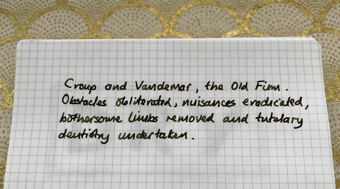
Some of my favourite literary villains and yet another chance to flaunt my awful handwriting
On top of the colour shift, there’s a cheeky bit of sheen thrown into the package. Like a number of other Sailor inks I’ve used, it’s not the raison d’etre of this ink, but it’s a nice addition without dominating proceedings. I used some ink splats to highlight this, but (on the right paper) broader, wetter nibs will also show this off.

The obligatory ink splats to highlight the sheen
As befits an ink with these properties, its make up is a bit complicated and unexpected. Some simple kitchen chromatography shows a range of colours. I certainly wasn’t expecting the blue component…

There’s more to Rikyucha than meets the eye
Economics
This is one of the first bottles of Sailor ink that I’ve bought in the new, smaller bottles that are replacing the old 50ml ones. I like the design of the bottles and I’m generally a fan of smaller ink bottles. I already have more ink than I’m likely to get through in my lifetime, so not having to add another 50ml to my list of guilty excess is to be welcomed. What is not so welcome is the big shift in the unit cost of Sailor inks. In the UK, a 50ml bottle of the old Sailor Jentle Four Seasons ink cost in the order of £16-20, which I thought was pretty good value for money for the quality of the ink.
The new 20ml bottles, however pretty they might be, weigh in at around £11 or £12, which shifts the cost from around 35p per ml to approximately 60p per ml. Much as I love Sailor inks, this will certainly make me a little more selective about future purchases.

Is it small or just very far away?
Conclusion
Overall I really like this ink. I like the new packaging and bottles and I definitely like how Rikyucha behaves and how it looks on the page. The colour shift as the ink dries and the sheen add to the interest, so if the colour of this ink appeals I’d recommend checking it out. The only fly in the ointment is the pricing. To be frank, the jump in price per ml seems excessive to me. I get that smaller volumes will be relatively more expensive, but this is going a bit far. That said, none of the other inks I’ve tried in this corner of the colour chart have worked nearly so well for me, so I’m prepared to live with the relatively high price.

I’m in the US where the price of these smaller bottles is also quite high, and I also think it’s excessive generally. Rikyu-Cha is a really special and unusual ink, of course, so if you love it, it’s worth it. But it’s harder to justify the average blue-black or blue. 🙂
LikeLiked by 2 people
I think you’ve called it right. The older pricing structure made Sailor inks a really interesting prospect across the range. Now I think I’ll find myself being much more selective. On the plus side, it opens up other possibilities as it’s more likely to make me look at alternatives.
LikeLiked by 1 person