After a bit of an Indian Summer, it really feels like Autumn has arrived in the UK now – a bit chilly in the mornings, but with plenty of bright sunshine. The leaves are turning colour and we’ve been busy looking for conkers.
All of this prompted me to do something with a bunch of orange inks I’ve been accumulating over the summer. I think there is a tendency to treat orange as something of a novelty colour when it comes to inks. Most of my writing goes on at work, and while that may limit uses for orange as a colour, I do find it handy when reviewing/annotating documents as well as mind-mapping type stuff.
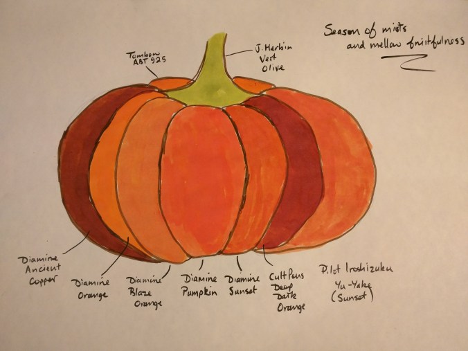
Taking into account the time of year, I thought about some ways of trying to demonstrate the range of colours I had. Even with my (extremely) limited drawing abilities I figured I could just about make a pumpkin recognisable and use each segment to highlight a different ink. Some of the vividness of colour has been lost along the way, but hopefully you can see how they compare.
Oranges are not the only fruit
Diamine’s Orange is probably the most vivid of the inks I tried – it reminds me of the kind of orange-esque drinks that were around when I was a child. They’re probably banned by international treaty now, but at the time no-one seemed to worry about the additives they contained.
Not surprisingly, Pumpkin is very pumpkin-like, having a redder tone than the Orange. The two Sunsets (Diamine and Iroshizuku) are quite closely matched and Blaze Orange is quite aptly named – you almost feel you could warm your hands over it. Deep Dark Orange is made for Cult Pens by Diamine and for me is reminiscent of a good, spicy marmalade – a welcome addition to a slice of toast at this time of year (with a nice mug of tea, of course).
Ancient Copper is a bit of an imposter, but I needed another ink to fill the final segment and this was the nearest to another shade of orange than anything else I had.
J. Herbin’s Vert Olive was the only green ink I had, so it had to suffice for the pumpkin’s stalk. I clearly need to investigate green inks further!
Technical
- Paper – Tomoe River (68gsm)
- Outlines – Sepia Mangaka Flexible pen
- Text – Black Mangaka Flexible pen
The Tomoe River once again did what it does so well – taking a lot of ink (applied with a cotton bud) and showing no sign of any bleed-through.
All of think inks were purchased from Cult Pens, apart from the Yu-yake, which was bought as a sample from eBay.