Pebble Stationery Co. A5 Chiyogami Notebook review

If you have more than a passing interest in fountain pens, chances are that you will have at least heard of Tomoe River paper.  You may have tried it.  You may love it or you may wonder what all the fuss is about.  I’m firmly in the “love it” camp and have been on a bit of a Tomoe River kick in the past few months.

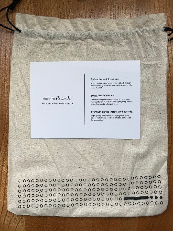
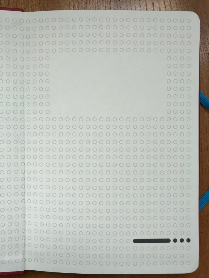
One of my last notebook reviews was of the Endless Recorder – a hardback A5 notebook based on 68gsm Tomoe River (TR) paper.  In that review, I wished that the growth in people making Tomoe RIver notebooks would extend from 68gsm, where all the action seemed to be, down to the thinner 52gsm version (which I much prefer).

My theory is that the 52gsm TR is so prone to creasing and damage from handling that notebook makers have shied away from it.  Recent experience suggests that might be changing.  It would be nice to think that someone saw my plea and took pity on me, but in all likelihood, it’s just coincidence.  Either way, over the past few months, the opportunity has come my way to acquire some hardback A5 notebooks based on 52gsm TR paper.

Chronologically, the first of these to come my way came with a chunk of air miles and something of a guilt trip about the accompanying carbon footprint.

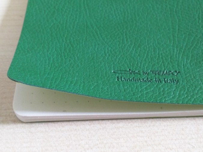
The books in question came from Pebble Stationery.  I first came across this company when I bought one of their 52gsm TR pocket notebooks from Nero’s Notes.  Since then, Pebble have extended their regular range to include a soft cover A5 book, which is quite widely available.  What caught my eye was a post in Pebble’s Instagram feed of some A5 hardback books, covered with decorative Chiyogami paper (another favourite of mine).

Pebble Stationery Chiyogami Notebook cover details

Can you judge a book by its cover?

Missing out first time round taught me that these handmade books come up as small batches and don’t hang around for long when they do.  I presume this is why they don’t appear for sale through their regular distributors.  As a result, I ended up ordering direct from Pebble which, of course, meant ordering from Australia.

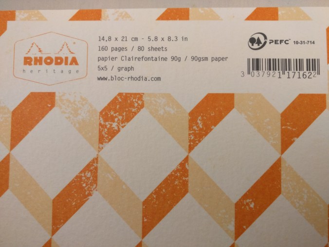
If you’ve ever bought a notebook containing TR paper, you’ll know they’re not the cheapest.  Assessing the value for money of these books is not easy, but to me they’re worth the expense.  The Pebble Chiyogami books weigh in at AUS$28 (about £14 at current exchange rates) for 200 pages in A5 size.  The downside is their location – I had  two of them shipped from Australia and the shipping cost almost as much as a single notebook!

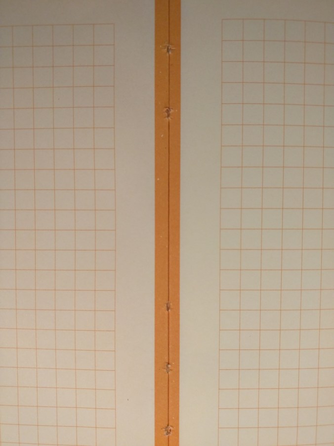
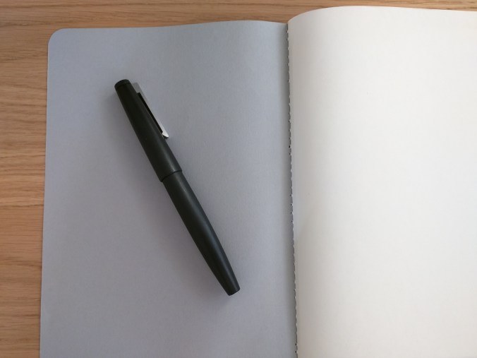
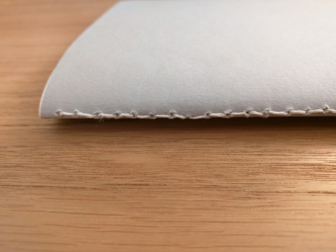
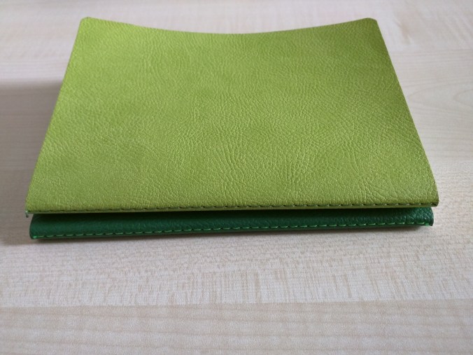
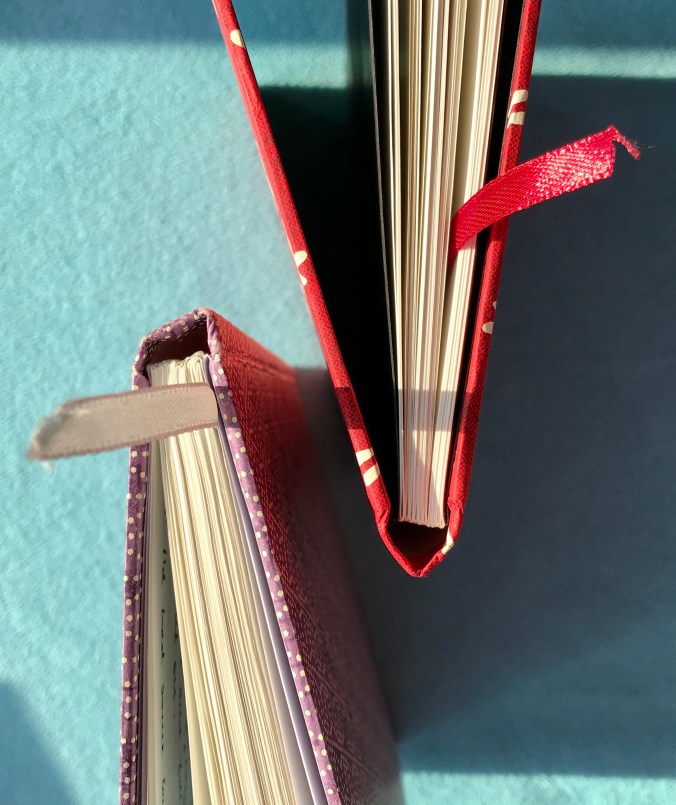
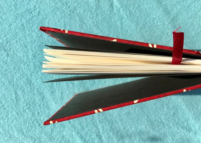
In terms of structure and features, the Pebble Chiyogami books are pretty straightforward and minimalist, but I don’t mean that in any negative sense.  The paper is sewn in small signatures and traditionally bound.  From my experience (n=2), the end papers are chosen to compliment the cover papers – white for the geometric pattern on one and black for the dragonfly design on the other.  Page corners are left square. In terms of extras, you get a ribbon page marker, but no back cover pocket or index pages.

Detail of the notebook binding

Simple, beautiful binding

Chiyogami notebook detail

Square corners are the order of the day

The books are bound by hand, and the website description warns of possible imperfections and creases.  The books I bought were both executed to a very high standard, with no noticeable flaws.  I’ve finished one of them and didn’t find a dud page anywhere.  The binding is very tight, which means that some gentle persuasion was needed at first to get the book to open flat.  After that, I had no issue whatsoever and the book held together without any signs of structural issues.  The Chiyogami paper that I’ve handled has never felt like it was robust enough to survive for long as the cover on a notebook, and I think the covers of the Pebble notebooks are coated with something to make them more durable.  It changes the feel slightly, but is no bother and worth it in terms of making the covers more durable.
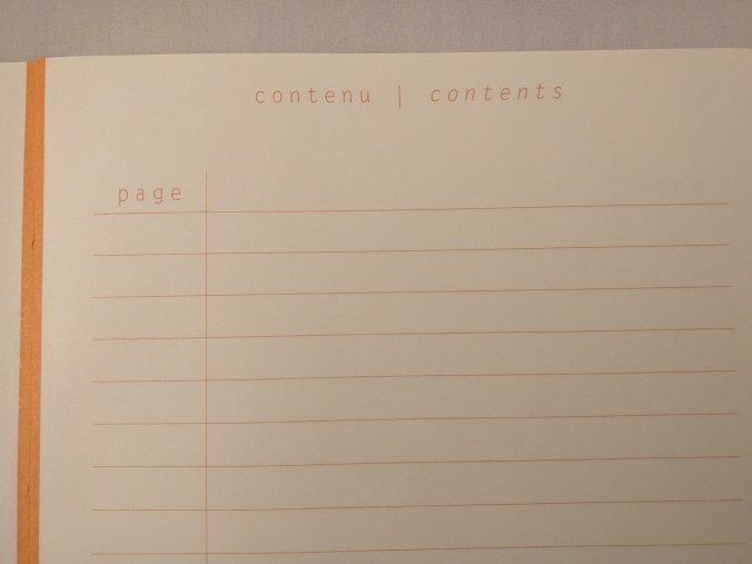
What’s inside?

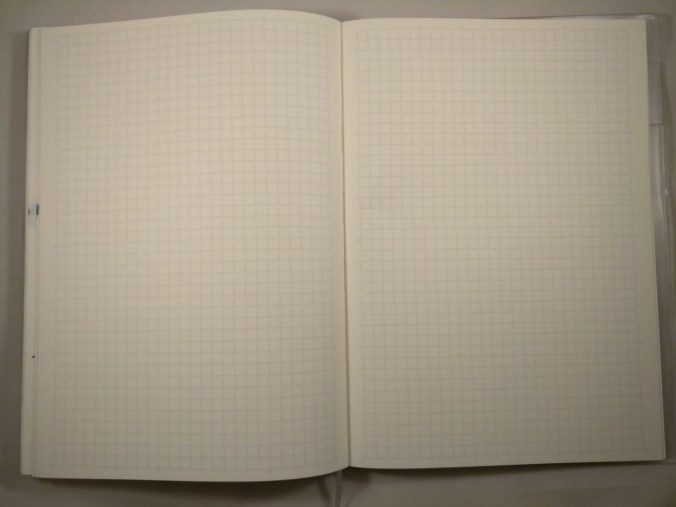
You can have any page layout option you want, as long as what you want is blank.  This is not uncommon with handmade TR notebooks and not something I’d penalise Pebble for. I’m learning to embrace the blank page and use a guide sheet to stop my crappy lefty handwriting nosediving as I work across the page.  With hindsight, it might have been nice to have a guide sheet included with the book, but I just used one from another book so it’s hardly a major issue.

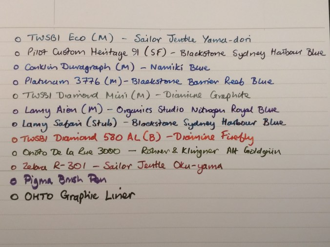
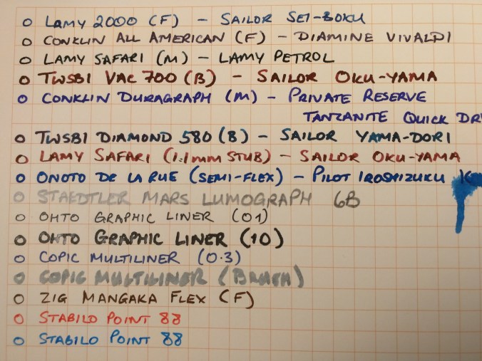
Getting down to use, I could say there’s nothing much to report.  The properties of 52gsm TR paper are described extensively and it is my absolute favourite paper to write on.  It’s unfeasibly thin, but will take pretty much any ink from any nib in any fountain pen with no feathering or bleed through.  If you want to show off shading and sheen in your inks, then this is the paper to do it with.  Both my Pebble books came with off-white/cream paper, but that’s fine as I prefer it to pure white.  The base colour of the paper does affect how some inks look (compared to pure white paper), but you can have great fun figuring out which inks work best!

Showing off ink sheen on Tomoe River paper

There might be a hint of sheen here!

Heretics Detractors will point out the ghosting (show through) and long dry times.  The first is simply a function of the thinness of the paper, and you’ll have to decide whether you can live with that or not.  I have 2 words for the second – BLOTTING PAPER!  In practice, I find I only need to use blotting paper when I’m about to turn a page, so it’s more backup than absolute necessity.

Summary

I know I’m biased, but these Pebble Chiyogami notebooks are beautiful to look at and skilfully made (by hand) to show off some wonderful Japanese papers.  If none of these elements are your thing, you’ll probably find richer pickings elsewhere.  If you like 52gsm Tomoe River paper, these books are a great platform to showcase its properties.  Sure they’re not cheap, but I think the pricing is reasonable and if you want to know what an expensive TR paper notebook looks like, check out Musubi!

One thing I did like about the Pebble notebooks was the page count.  Pebble have avoided the tendency of some 52gsm TR books to counter the thinness of the paper by having a huge page count.  200 pages makes for a manageably slim book that’s easy to write in and transport.

I think high page counts can create practical and psychological problems.  Physically, a notebook that is too thick can be uncomfortable to write in, especially as you get towards the bottom of the page.  Everyone’s tolerances are different, but something resembling a telephone directory will be a challenge.  Psychologically, a book with a high page count can seem a bit daunting to start and can become a marathon chore to complete.

My journaling has become a bit sporadic of late and I found the Pebble notebook to be just about right in this respect – easy to handle, long-lasting enough to justify its price tag but not so long that I came to resent using it.

Do I recommend these books – yes, absolutely!

Will I buy more of these?  Honestly, I’m not sure.  I have loved owning and using these books, but the relative cost associated with having to ship them half way round the world is a bit of an issue for me.  If these books were available through a local distributor such as Nero’s, I’d have no qualms in buying them regularly.  This point comes into starker relief following my discovery of Flyght of Fantasy Studio notebooks at the Bristol pen show earlier this year.  Based in Scotland, they hand make notebooks using 52 and 68gsm TR paper and cover the books in some amazing Japanese and Japanese-inspired fabrics.  OK, these have a higher page count (and proportionately higher price tag) than the Pebble notebooks but, in other respects, I’ve may well have found a way to feed my addiction to eye-catching TR paper notebooks from more local sources.


Notebook Review – Nero’s Notes Basics

I have an interesting relationship with pocket-sized notebooks.  I like the idea and I seem to buy a lot of them, but using them has proved more of a problem.  That’s partly down to the way I use notebooks in everyday life, but it’s also down to an irrational fear of ‘spoiling’ them by writing in them.  The result is a hoard of pocket notebooks, some of which are exquisite in their design and execution.

It’s not a straightforward case of White Page Anxiety, there’s also awe and respect for the (often) handmade nature of books like those from Back Pocket and Dapper Notes.  I know that the people behind these companies intended their notebooks to be used, but I have yet to convince myself that this is entirely OK.

Back Pocket and Field Notes editions

When notebooks look this good, why spoil them?

To try to disrupt this mindset, I’ve decided to force myself to use pocket notebooks more. To help prevent backsliding on my part, I went all in and signed up for the Nero’s Notes pocket notebook subscription.  This means a bunch of pocket notebooks turn up at my door every 3 months and can only be interrupted by active intervention on my part.

Given the difficulties I seem to have using notebooks that feature amazing artwork on their covers, Nero’s came to my rescue – albeit unintentionally.  My first shipment included a set of 3 Nero’s ‘Basics’ notebooks and set of 3 ‘1857’ notebooks (Stuart Lennon who owns Nero’s, is also one of the hosts/presenters of the excellent 1857 podcast).

Structure and Format

The term ‘Basic’ can sometimes be synonymous with cheap and nasty, but not so with these notebooks.  As the information on the inner and outer faces of the cover tells you, these notebooks are handmade in the UK using 240gsm card stock for the covers and 70gsm dot grid paper for the 36 page interior.  The books are saddle-sewn (i.e. stapled), which is pretty common for notebooks of this size.  Corners are rounded, which is a nice touch.

Front cover of Nero’s Notes Basics notebook

Keeping it simple up front…

The outside of the covers is suitably simple – the front cover sports the Nero’s logo and the word ‘Basics’, while the rear cover has the company name, the notebook’s dimensions and a legend telling you that the notebook is handmade in England.  The inside front cover allows you to record some basic information about the contents, while the inside rear cover provides some space to record your details and details of the materials used to make the notebooks.

Nero’s Notes Basics inside front cover detail

Worth making a note of

Nero’s Notes Basics inside rear cover detail

I love the idea that someone might expect a reward for returning the sort of drivel I write in my notebooks

In Use

The term ‘Basics’ distinguishes this notebook from another in the Nero’s line-up – the ‘Ink Friendly’.  The clue is in the name, with the latter being heavier weight, coated and meant to be more fountain pen-friendly.  To be honest, I haven’t found much of a problem using fountain pens with the Basics notebook.  On the face of it, the Basics notebooks are cheaper, but the page count is lower.  When this is factored in, prices are pretty similar between the 2 sets of notebooks.

Testing the ink friendliness of the Basics paper

Testing the ink-friendliness of the Basics paper

Show-through

Show-through but no major bleed-through

The paper performed pretty well, all things considered.  Based on previous experience with notebooks like Field Notes, I didn’t have particularly high expectations, but there was nothing really to complain about at all with the Nero’s notebooks.  All the fountain pens I tried performed just fine, although I didn’t use any particularly broad nibs.  The only obvious sign of feathering in my (non-exhaustive) test came with a thick OHTO Graphic Liner.

There was a fair amount of show-through, with a Sharpie being the worst offender (no real surprise there).  The Sharpie was also the only pen that gave a hint of bleed-through.  Again, not entirely surprising.

Conclusion

Nero’s themselves describe these books as simple, practical and super-stylish.  The first 2 are undoubtedly true.  The third is a little more subjective, but I must admit I like the plain and uncluttered look.  It reminds me slightly of an old school exercise book.

I’ve been pleasantly surprised by how the Basics notebooks have performed.  At £9 for a set of 3, they’re pretty reasonable value for money.  They’ve definitely helped me get started on using pocket notebooks, and I even left the house once with one stashed in my pocket!  That provoked another crisis about which pen to take with me, but that’s a whole other can of worms best left unopened for now.


Notebook Review – Endless Recorder

Front cover shot Endless Recorder

The front end(less)

At first second glance, the Endless Recorder looks like many other A5 hardcover notebooks, with faux leather covers in a range of relatively muted colours.  (The first glance highlights a cream coloured drawstring bag that holds the book.)  What (hopefully) sets the Recorder apart from the also-rans is that they’re put together around Tomoe River paper.  This paper has something between cult and legendary status in the fountain pen world but, even with some recent entrants to the market, there are still relatively few makes of Tomoe River-based notebooks out there (check out GLP Creations and Taroko Designs for some alternative offerings).

Endless notebook storage bag

Are notebook bags your bag?

It’s hard these days to be truly innovative when it comes to design and construction of notebooks, and the Recorder follows a pretty well tried and tested design.  The faux leather hard cover I mentioned earlier comes embossed with the company logo on the front and “ENDLESS” on the back.  It’s all done quite subtly and without ostentation.  This leads quite nicely to the end papers, which feature an open dot layout with a blank space to fill in with the details of your choice,  There is also a repeat of the Endless logo, which adds a touch of class.

Endless Notebook rear cover

The back end(less)

Endless Recorder end papers

Subtle, stylish end papers

Perhaps it won’t set the world alight, but it makes the Recorder smart and subtle enough for use in a work setting, but the design accents are well executed and should satisfy the stationery aficionado.

The business end of the book is made up of small, thread-bound signatures, which help the book to open flat without the need to resort to coercion or physical violence.  Page corners are rounded (as are the corners of the cover).  There is a pocket inside the back cover.  It seems to be de rigeur for this type of notebook, but I can’t recall the last time I actually used one in a notebook.  The pocket is worth exploring when you get your Recorder, because there’s a small goody in there (I won’t give the game away) along with some promotional material.

Details of the binding

In case you lose your thread

There is no index and pages aren’t numbered, but I don’t find it that much of a chore to make my own index and number pages as I go.

Tomoe River 68gsm paper

Round corners, no page numbers

The ribbon and elastic closure come in a pleasantly contrasting turquoise colour.  I bought two Recorders, one in dark blue and one in red, and the ribbon and elastic are the same colour in both books.

The paper itself

There’s not much more to say about Tomoe River paper that hasn’t already been said.  In the case of the Endless Recorder, you get the thicker 68gsm paper, rather than the 52gsm you’ll find in things like the Hobonichi Techo or Seven Seas notebooks.  It takes pretty much any ink you care to throw at it from any width of nib, without feathering or bleed-through.  The coating means that dry times are not particularly quick, and I tend to have a piece of blotting paper to hand when I’m writing my journal.  It will also come as no surprise that there is some show-through, but this is just something you have to embrace if you’re going to write on Tomoe River paper.  It’s certainly less noticeable with the 68gsm than with the 52gsm paper.

Currently inked on Tomoe River paper

I’ll take any ink you can throw at me…

The paper in the Recorder is off-white.  I bought mine from Pen Venture in Romania, which gave me the choice of either blank or with a dot grid layout.  I bought dot gridded ones.  I used to think that dot grids were the best layout since whatever the last best layout was.  Over time, I’m less convinced of this, particularly when I’m using it for journaling.  I can see the merits in some applications, but I’m starting to come back to ruled or even blank for journaling. If you buy the blank notebook, you get a guide sheet included.  If I buy any more Recorders I might well try the blank version.


If you buy direct from Endless Works you get a choice of 4 layouts – blank, ruled, grid and dot.

I paid around €24 for each book from Pen Venture, rather than the £18 that Endless Works charge if you buy direct.  My reasoning was that buying from mainland Europe would be cheaper and less hassle than buying from the US.  It may have been less hassle, but my only option was some DHL priority service which added substantially to my bill.  Maybe I’ll buy direct from the US next time.

Practicalities of ownership

I’ve finished one of the two books I bought and didn’t experience any major issues.  I found that there was a little bit of lift on one corner of the cover material cover where it’s gathered and folded over.  My Endless Recorder didn’t travel further than between my desk and the living room sofa, but if you were to take it further afield maybe this points to it being a bit less durable than desired.  The ribbon page marker has also ended up looking a little fluffy and ragged.  This doesn’t bother me too much, but if you like a book that remains pristine looking through thick and thin, you might want to think more carefully.

Beyond that I had no issues with the Endless Recorder.  The book opened flat and the binding has never shown any indication of falling apart.  I mentioned the absence of page numbers or an index.  In practice, most notebooks I’ve ever bought haven’t had page numbers or an index and I haven’t felt like there has been a hole in my life as a consequence.

The Tomoe River paper does its job as you might expect.  I experienced no problems beyond the show-through, which I was expecting.

It’s not a criticism of Endless, but I wish someone would take this approach to notebooks, but with the 52gsm Tomoe River instead.  Whether it’s a cost thing or the sheer hassle of dealing with a paper that creases when you look at it, I don’t know, but I can’t believe there wouldn’t be a demand for it.

I’d certainly buy some.

Update

Since I published this post, Endless Works got in touch to let me know that they’ve recently updated the Recorder so that it now has an index and numbered pages.  There is also a block of perforated pages that allow you to remove them easily, if needed.  I’m happy to set the record straight. 😀

Mnemosyne 194 – The Perfect Work Notebook?

I like notebooks.  I buy lots of them.  More than I can reasonably use any time soon.  That leads me to the harsh (but entirely fair) realisation that I’m a hoarder.  If it looks like it might have decent, fountain pen-friendly paper and is well put together, then I want one.

The need for good paper is a given, since I use a fountain pen every day.  The construction is important to me because I like a book that opens easily and stays open on the page you chose.  As a left-hander, the flatter it opens, the better.  Anything resembling a small hill in the middle of a notebook is a right royal pain in the proverbial.

The one thing you wouldn’t normally find me rushing to pick up is a spiral-bound book.  Most of my encounters with books of this sort haven’t ended well.  The wire starts to unravel, and before you know it, the book is in bits in front of you.  Not a good outcome.

With this in mind, I approached the Mnemosyne 194 with a bit of trepidation.  Sure I’d read good things about the quality of the paper, but I wasn’t too sure how I’d get on with the book overall.

Mnemosyne was the Greek goddess of memory and mother of the nine muses.  Precisely what this has to do with notebooks, I’m not sure, but it’s one of those things you feel you have to point out for the purpose of education and factual/mythological correctness.

I use a notebook a lot at work and have been searching for something sober enough to take to meetings, but which is enjoyable to use and can cope with ‘proper’ ink.  Made by Maruman, the Mnemosyne 194 fits this bill well.  It is bounded by two black plastic covers, with simple gold embossing on the front proclaiming the word ‘Mnemosyne’ and the model number which relates to the format (194 for B5, 195 for A5, 199 for A4).  These examples are all side-bound, but there are also a couple of top-bound books in the range.  The front cover also bears a sticker giving some technical details about the book (page layout, number of sheets etc.).  You could remove the sticker to further tidy up its appearance, but so far I haven’t bothered.  The covers are thick enough to provide a decent amount of protection, as well as being quite flexible.

IMG_20171123_220305

I tend to use A5 books for journaling and most of my other writing, but I’ve made the switch to B5 for work and so far I’ve liked it.  B5 is somewhere in between A5 and A4 (apparently B sizes are calculated from the geometric mean of adjacent A sizes, which I think you’ll find explains things nicely).  I like the added real-estate without the full-on bulk of an A4 book.  From my limited experience, it seems that the majority of B5 notebooks available in the UK are Japanese (Mnemosyne, Life, Apica, Swallow etc.).  That works just fine for me because I love Japanese notebooks.  The only non-Japanese B5 book I’ve tried was a Leuchtturm 1917 softcover book.  I don’t know where Leuchtturm get their reputation for good notebooks as this proved to be a fully paid-up, card-carrying pile of rubbish.  Aside from a disintegrating binding, I had major paper quality issues – with inks feathering and bleeding through without the slightest provocation.  It was an out and out horror show.  If you take nothing else from this review, DON’T BUY THE LEUCHTTURM!

Back to the Mnemosyne.  Under the front cover is a very cheery, bright yellow front sheet, embossed with ‘Mnemosyne’ in gold at the bottom.  On the reverse of this are some cartoons with captions and some additional text.  The only two words in English are “Basic Style” which, as statements go, should win a prize for irony.  The rest is in Kanji (which I’m afraid I can’t read).

Once you’re past the front sheet, you’re straight into the book itself.  You get 80 sheets (160 pages) in each notebook.  There’s no index and no page numbering, although there’s also nothing to stop you numbering pages yourself and creating an index.  That’s not something that bothers me, but if you really need a ready-made index you’ll probably want to look elsewhere.

Each page is ruled with separate date and title boxes at the top.  Line spacing is quoted at 7mm and measures exactly that.  Lines are pale grey and pages are sub-divided into 3 sections by darker grey lines.  Each sheet is micro-perforated, should you want to remove any.

On to the paper itself.  It is a pale cream colour, exceptionally smooth and a joy to write on.  I’m well into my second 194 and they have both been great.  The paper is perhaps a little more forgiving of some pen/ink combinations than others, so you may need a bit of trial and error to find what works best for you.  I’ve had no disasters, but some combinations were slightly harder work than others.

IMG_20171123_215241

The paper has coped well with a range of inks and shows off shading pretty well and sheen to some extent.  I found that Sailor Jentle inks, for example, only sheened with broader, wetter nibs.  Blackstone and some of the new Organics Studio inks will sheen on pretty much any paper, so it’s no surprise that you’ll see sheen from them on the Mnemosyne paper.

Nitrogen Royal Blue sheen

Nitrogen Royal Blue sheen

That said, the paper isn’t completely flawless.  However, the overall writing experience has been such that I can easily forgive the minor issues that have cropped up.

What about those flaws?  You get some show-through when writing on the reverse of a page, but that tends to be with darker inks and wetter nib/ink combinations.  I don’t find it too intrusive and it’s far from the only paper to show this.  Where things get a bit more tricky is that on some pages, I’ve encountered small areas where there has been some feathering.  I’ve put this down to inconsistencies in the paper coating/finishing process as it has only occurred very occasionally and has been a localised effect.  I tend to doodle in meetings and where there’s a lot of ink put down on a small area you can get some bleed-through.  I could easily solve this problem by listening more and doodling less!

What about my prejudice against spiral-bound notebooks?  The Mnemosyne 194 has transformed my view of this type of binding.  I think the fact that I’m omy second one of these books for work and am about to order a third says it all.  What seals the deal for me is the price.  I got my 194 from Cult Pens for the princely sum of £6.75 (the A5 size is £5.95), while The Journal Shop carries the 194 for £6.50.  You can also buy it from Goulet Pens (among others) for $7.50. On a per page basis, this puts the Mnemosyne at around half the cost of a Life or a Swallow B5 notebook.  The very existence of the B5 Leuchtturm becomes even harder to justify when you realise that its price per page is around 3 times that of the Mnemosyne!

Whatever your preferred paper size, the pricing of Mnemosyne notebooks makes them well worth checking out.  The paper is pretty darned good and they are well put together.  As for B5 as a format, it may not be everyone’s cup of tea, but it works well for me.


Rhodia Heritage A5 Notebook Review

IMG_20170611_215025

When it comes to discovering and writing about things in the world of pens, inks and paper, I’m usually way behind the curve.  What is new and exciting to me is usually old hat to others.  For once (and more by luck than judgement) I seem to be an early adopter.  The item in question is the Rhodia Heritage notebook.  In reality this is more of a ‘first impressions’ than a full-blown review as I’ve only just got my hands on some, but I suspect that they will be popular and wanted to share my thoughts.

In the fountain pen world, Rhodia is probably best known for its range of notepads.  Pretty much every ink review you read is written on a Rhodia pad of some kind – and with good reason.  Apart from the quality of the paper, the other distinguishing feature of Rhodia pads is their covers: orange, black or white.   It’s these colours that form the basis of the cover designs for the Heritage range.  That said it’s also about the point where any similarity with the notepads finishes.

Rhodia Heritage notebook covers

Escher and Chevron

Rhodia has backed up the Heritage name with a very retro-looking notebook.  Covers come in a choice of geometric patterns – Tartan, Escher, Quadrille and Chevron.  (Rhodia don’t list the Chevron design on their own web pages, but I have one so they must exist, right?).  I like the Tartan most, but the Escher and Chevron are pretty appealing too.  My least favourite is the Quadrille pattern, but that’s just a matter of personal preference.

IMG_20170611_214719

Chevrons do exist!

The covers are made from a nicely textured cold pressed papers onto which the design is printed.  Beneath these is a quality codex-bound book made up of multiple signatures.  Each signature is made up of three sheets, by which I mean once the paper is folded and stitched you have 12 pages of A5.  These are well stitched together and bound,  meaning the book opens flat without any need to even threaten the use of force, so a big thumbs up to Rhodia.  Perhaps it’s only to be expected from such a giant of the paper world, but it’s also a relief that they got this absolutely on the money – not everyone does.

Rhodia Heritage notebook covers

Escher cover

Where the binding and finishing differs from most notebooks is that there is no cover on the spine, what Rhodia calls ‘raw’.  Where you might expect to see at least some binding tape, if not something more elaborate, you get nothing.   This differs from pretty much every notebook I’ve ever owned.  The only thing remotely close is a Moo notebook.  Although the Moo is hardbound, when you open the book up, the front cover falls away to reveal the spine.

IMG_20170611_214835

The ‘raw’ binding

I suspect this may make the Heritage a little more vulnerable to damage, particularly if you treat your books harshly.  In practice this is only likely to enhance the vintage look and feel.  I guess time will tell, but I’m not unduly worried about this.

So, we have a notebook that looks good and opens properly – what’s it like on the inside?  I suspect reactions will depend on how you like your paper.  If crisp white is your thing, you may struggle with these notebooks.  I prefer my paper off-white and with a bit of warmth and I’m pleased to say that Rhodia has backed up the exterior looks with paper that also looks fantastic and is a joy to write on.  You get 80 sheets (160 pages) of 90g A5 Clairefontaine ivory-coloured vellum paper, which comes as either a 5mm grid or 7mm ruled.

IMG_20170611_214852

In case you were in any doubt about the source of paper…

Lines and grids are orange, with an approximately 1cm margin all round (slightly wider on the bound side of the page).  The edge of the page that faces into the binding also has a narrow orange margin, which (I think) further adds to the appeal.  Corners are rounded.  In case you haven’t had enough orange, guess what colour the end papers are.

IMG_20170611_214938

In terms of layout the 160 pages breaks down as a 6 page index with 152 numbered pages of notebook.  The top right corner of every other page has a rectangular box you could use for the date or some other reference point for your notes/writing.

Rhodia Heritage Notebook

IMG_20170611_214819

In use, the paper performs well with no apparent signs of feathering.  As it’s 90g paper, you get very little show-through.  I did have some issues with show-through using Pilot Iroshizuku Kon-peki, but that was from my slightly temperamental Onoto semi-flex pen.  It’s nearly 100 years old and has a tendency to ‘sneeze’ from time to time, depositing way more ink than it should.  That said I’m pretty confident that under more normal conditions, this paper will take pretty much whatever you can throw at it.

IMG_20170611_215131

The obligatory writing samples

This paper has no problem bringing out shading, if that’s your thing.  Where it struggles is with sheen.  In my experience, pretty much every Rhodia or Clairefontaine paper I’ve tried will suppress sheen, and this one doesn’t seem to be any different.  While I like my sheen, this is not enough to be a deal-breaker for me on these books.

A couple of issues with these notebooks seem to be availability and pricing.  The Rhodia website won’t sell you a Heritage notebook direct – you have to email them for details of a retailer that stocks them.  In the UK, they initially appeared exclusive to Bureau Direct, although Pure Pens have recently announced that they are stocking them.  Prices from Bureau Direct are £12.95 per book (you can get free postage on orders over £10), and from Pure Pens are £9.95 per book (you have to spend over £20 to get free postage).

UpdateCult Pens are now also selling these books, but they are asking £16.95!  It definitely pays to shop around.

While I was waiting for mine to arrive from Bureau Direct, I wandered into The Pen and Paper and found they were selling the same said books at £6.50 a time!  These books aren’t listed on their website at the time of writing and I don’t know if it’s possible to place an order over the phone or by email with them.  I should also say that since I discovered what they were charging, I bought 5 of them!  I didn’t completely empty the display so good luck in bagging a bargain.

Hopefully these books will become more widely available and pricing will settle down a little.  At £12.95 these books are not cheap, but aren’t outrageous when compared to (say) Midori MD or Life Noble notebooks.  At £9.95, they become a much more attractive proposition and if you can pick them up for anything like £6.50 – knock yourself out!

Overall I really like these notebooks.  In terms of function, they deliver what you’d expect from a high end notebook.  In terms of look, they’re really striking and visually appealing.  Rhodia has managed to pull off the trick of producing something that simultaneously fits their product range while managing to look nothing like any of their other offerings.

Midori MD A5 Notebook Review

For many people, when you mention Midori, they think of the very popular Traveler’s Notebook.  Compared to such a high profile range, the MD notebooks are less well known, which is a shame because they really are great notebooks.  I’ve been using one as a journal of sorts for a few months now and think they deserve a great deal more recognition.

The A5 notebooks can be had plain, rules or with a grid pattern.  They’re fairly widely available with similar £/$ prices.  I bought mine from the Journal Shop for £12.95.

In my (so far) limited experience of Japanese stationery, packaging has tended to be simple but exquisite.  The story is no different for the MD.  The simple but beautiful cream card cover is wrapped in a sheet of glassine paper with a wraparound paper sleeve.  The cover is vulnerable to marking easiliy, so this is pretty much a necessity in packaging terms.

Midori MD notebook packaging front view

A plain version of the MD, fresh out of its wrapper


Midori MD notebook packaging rear view

Once you get into using the notebook, the cover is embossed with the MD symbol.  This simple design touch adds to the overall sense of class you get from using these notebooks.

Embossed Midori MD logo

Construction

The MD has sewn binding made up of a large number of small signatures, giving a usable page count of 176.  The main result is that the book opens flat without the need to inflict physical violence on it.  As a left-hander, I’ve really come to appreciate the importance of this property in a notebook.  The quality of the stitching is excellent.  The binding is a little unusual in that mull has been used on the spine instead of regular binding tape.  It’s very neatly finished and further adds to the sense of class that goes with these notebooks.

Such a light-coloured cover is vulnerable to marking, but an inexpensive clear plastic cover is available from most of the stockists who sell the notebooks.

Midori MD notebook binding (#2)

Inside you get gorgeous cream paper with a light blue 5mm grid pattern.  If you like your paper to be a crisp white, this may not appeal to you.  I tend to prefer off-white paper, so this works just fine for me.  Unlike some gridded notebooks, the grid blends nicely with the paper stock meaning it does its job unobtrusively – allowing you to get on with the business of writing.  I couldn’t find any definitive information on the weight of the paper, but I’d hazard a guess at 80gsm.

Midori MD grid detail

What’s it like to use?

Here’s a sample written with a fine nibbed Lamy 2000, inked with J. Herbin Perle Noire…

Midori MD handwriting sample

Trying a range of nib sizes and inks didn’t phase the MD paper in the slightest.  There was no sign of any feathering or bleed-through, even with some very wet pen/ink combinations.  This does mean that drying times are not always the quickest, but I’d say it’s no worse for the MD paper compared to other quality papers.  I even tried a Tombow ABT brush pen and the paper behaved itself impeccably.

The paper does have a bit of tooth to it.  This meant getting feedback with some of the drier pen/ink combinations I tried, but it was never enough to be a problem.  I found that some of these were harder work to write with than others, so you might have a bit of trial and error figuring out which ones work well for you and which ones less so if you write a lot in one sitting.

It won’t come as a surprise that the cream paper base affects the appearance of some inks.  Darker inks fared pretty well, but some lighter inks like Rohrer and Klingner Alt Goldgrun lost a bit of their punch compared to when used on lighter papers.

These are minor niggles, though, and in my opinion are outweighed by the performance and quality of these notebooks.

Midori MD various pen samples

There is some show-through, but I haven’t found it at all intrusive when writing on the reverse of a page.

Midori MD show-through

Wrap-up

In conclusion, these are fantastic quality notebooks which I’ve come to love over the past couple of months of use.  Any negatives are pretty small and vastly outweighed by the positives of design, execution and function.  The paper is exquisite and takes pretty much any ink you might choose to throw at it.  If you haven’t tried one and are looking for a new notebook to try, I thoroughly recommend them.


Out of the Grey: A homemade Tomoe River notebook

IMG_20160829_072339

Why do this in the first place?

Put simply, I love Tomoe River paper.  Ever since I got my hands on my first Hobonichi Techo, I’ve admired this thin, but ever so fountain pen-friendly paper.  Although there seem to be a growing number of notebooks made using Tomoe River, these are generally not easy to come by in the UK.  I recently took the plunge and ordered a couple of Nanami Paper’s Seven Seas notebooks – all the way from California.  These are fairly expensive notebooks in their own right.  Add in the cost of shipping from the US and these become a luxury rather than an everyday notebook.

There aren’t too many options for buying Tomoe River as loose sheets in the UK, but I managed to find a UK seller on eBay offering 300 sheets of Tomoe River paper for just under £30.  So far, so good.  After all, how hard can it be to make a notebook using ridiculously thin paper that creases easily?

Format

I made an A5 book, simply because I bought A4 paper and this meant the least amount of work in terms of folding and cutting.  A5 also happens to be my format of choice, so it wasn’t such a hard decision.  I also settled on a single signature exercise book, rather than a more complicated journal-type notebook.  I’ve been experimenting with this type of book as inserts for my Start Bay Navigator.

I can never figure out how notebook makers count their pages. What I do know is that I used 24 sheets of A4, folded down, giving a total of 96 pages of A5 in the finished book.

Finish

IMG_20160829_072430

The book contains plain paper, more out of necessity than choice.  I tend to prefer dot grids, but the printable dot grids I’ve found on the web so far have been downright patchy in terms of the density of the dots.  I’ve put together my own, but since Tomoe River paper doesn’t fare very well in your average printer this is somewhat moot.  The seller that I got this paper from has now started selling 68gsm Tomoe River and I intend to see whether this will work any better in a printer.

Cover and Binding

In keeping with the exercise book theme, I went for a simple grey card cover (hence the title of the post and a bit of musical nostalgia – a 1986 album by the The Dream Syndicate).

I wanted a sewn binding, similar to the CIAK Appuntino I reviewed recently. From what I can find out, this is known as a Singer Sewn Binding (Made on a Singer sewing machine?), but I didn’t manage to find a handy diagram of the stitching pattern.  Instead, I ended up more or less using backstitch.  This gave the right appearance on the outside, but looks a bit messy on the inside.

IMG_20160829_072430


IMG_20160829_072512

After consultation with an embroidery and patchwork expert (my mum), I think the answer is to use a simple running stitch down the spine and then back up again.  With an odd number of holes, this should give the same pattern inside and out, offset by one hole.

IMG_20160829_072606

As you can see from the photos, the binding could have been straighter.  I was drinking a gin and tonic as I made the notebook (Tanqueray Export if you must know), but that wasn’t the cause (honest!).  I folded and clamped the pages before I marked out and punched the holes, so when I came to stitch the block of paper things weren’t as well aligned as I might have hoped.  Next time out I’ll clamp the block and punch the binding holes before I fold the paper and cover.

Finishing

One of the consequences of stacking this many sheets of paper is that those in the middle of the book stick out further than those nearest the cover.  To get a neat looking notebook, this means having to trim the edges.  I used a steel rule and a craft knife and to be frank it got a little messy.  Definitely something I need to practice at.

I used a 10mm corner punch to round the corners, and again I need a bit more practice to make these as neat as possible.

In use?

Overall, I’m quite pleased with the outcome.  Sure, there are things that I need to improve and a few things that I will do differently next time, but from nothing to a finished book in a couple of hours didn’t seem too shabby.

IMG_20160829_072527

In use, the paper performs as you might expect.  Tolerant of lots of pens and inks.  Drying times are long and you get show-through, but that’s something I’m happy to live with.  The sample of writing I’ve shown was written with a medium-nibbed Sheaffer Legacy (not the Lamy 2000 in the photos), inked with Pilot Iroshizuku ku-jaku – a combination that puts down a pretty wet line.  Even so, it was pretty well behaved, coping with my handwriting and showing off the shading you get with this ink.

What next?

I’ll certainly try this again, looking to improve in the areas I’ve highlighted.  I also plan to try a multi-signature book at some point.  As well as a more complicated binding, this will mean a more elaborate cover, end papers (I have some gorgeous Chiyogami paper that I’m itching to use) etc.  It should be fun!  After all, what’s the worst that can happen?

Notebook Review – CIAK Appuntino

As with many of my purchases, I came across these notebooks by accident.  CIAK is not a brand I was familiar with and after a bit more digging there seems to be a vanishingly small amount of information out there on the Appuntino range (even on the company’s own website).  I bought medium and large sized notebooks. This is a review of the medium.

The books come in packs of two and a pair of the medium notebooks will set you back £8.95 (around US$12) from The Journal Shop.  I chose Lime and Green for my pair and the colour combination is very pleasant indeed.

Vital Statistics

CIAK’s definition of medium is 12cm x 17cm, making the books around 3cm bigger than a Field Notes book in both directions.  This could restrict their use as genuine pocket notebooks, but mine fit quite nicely in the same pocket of my work bag as my Hobonichi.

IMG_20160725_123622

Textured cover, dot grid paper

What drew me to the books is that they contain dot grid paper (I’m a big fan) – 64 pages in all.  I couldn’t find any particular information about the paper in in terms of weight etc., although in my estimate it is lower than 80gsm.  If anyone can tell me more about the paper, I’d be happy to hear it and update this post accordingly.

In action

Before I go into more detail on the paper, the covers are worth a comment.  The textured outer is soft, with a slightly battered feel to it – far more tactile than a simple card covering.  It is laminated to a card inner in a complimentary colour.  Rather than being stapled, the books are stitched in contrasting thread which is visible along the spine.

IMG_20160725_123602

Because of the way the books are bound, they don’t lie flat when opened but are much more compliant once they’ve been broken in.  Something further on that binding: I’ve just passed half way in one book and noticed as I type this that one of the knots tying the binding thread has pulled apart.  I don’t know if this is a one-off or a common problem, but may be a factor if you are particularly hard on your notebooks.

Now to the important bit, how does the paper perform?  In terms of look and feel, it works for me.  The paper is a cream/ivory colour, printed with a 5mm dot grid pattern and with rounded corners.  The paper is a little softer than Rhodia dot grid paper and much softer than Field Notes paper.

IMG_20160725_123706

Dot grid paper (look hard and you’ll see the pulled thread at the top)

I’ve mainly used fountain pens in these books and I think it’s fair to say that the results haven’t been brilliant.  I’ve tried a variety of pen and ink combinations, but the overall trend was towards feathering and show through.

I’ve been considering trialing bullet journaling, and thought I’d use the Appuntino to jot down some notes to  help me visualise  how bullet journaling might work for me.  As you can see in the photograph Noodler’s Squeteague and Bad Belted Kingfisher, along with Pelikan Topaz didn’t fare too well. The pens I used with these inks (MontBlanc, Conklin and Baoer) tend to put down quite a wet line and that certainly didn’t help to limit feathering.

IMG_20160725_123722

Trying to make sense of bullet journaling – simple!


IMG_20160725_123759

IMG_20160725_123743

Considering I find the nib to be on the fine side of medium, my Noodler’s Ahab pen also produced a fair amount of feathering with Diamine Damson ink.  The least amount of problem came from a Copic Multiliner!  You can see from the next photograph just how much show-through there is.

IMG_20160725_123815

Show-through on the Appuntino

I did some comparison tests with a Field Notes Pitch Black book and got (I think) fairly similar results in terms of feathering.  There was less show-through, but I put this down to Field Notes paper being thicker.


IMG_20160726_141233

Field Notes Pitch Black for comparison

IMG_20160726_141251

Tricky Ahab

In conclusion

After all that, you might think I’d be steering readers away from these notebooks.  Sorry to disappoint, but I’m not going to.  I really like these notebooks, despite their flaws.  It’s hard to express in words, but there is something about these little books that makes me want to take them out and use them.  It’s a tactile thing and that trumps the shortcomings, or as I choose to view them – idiosyncrasies.