P-p-p-pick up a Prefounte? A look at one of Platinum’s budget fountain pens

I stumbled on the Platinum Prefounte as I was browsing Cult Pens’ website a couple of months ago. I’ve previously enjoyed the Plaisir from the more budget-friendly end of Platinum’s line-up and for under £10 (£8.99 to be precise) I thought I’d see how the Prefounte fared. In fact, I bought two – a fine in ‘Vermillion Orange‘ and a medium in ‘Night Sea‘.

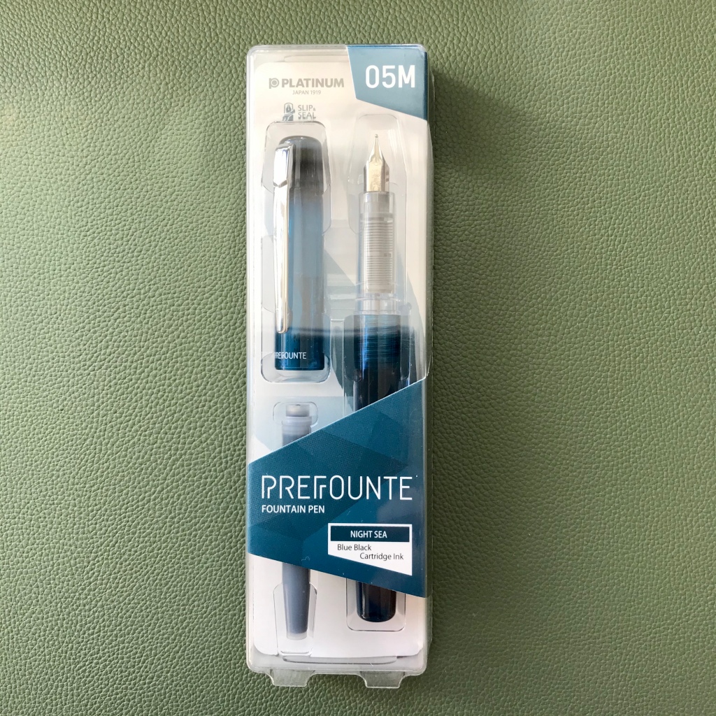
In terms of presentation, the Prefounte comes in some fairly simple plastic and card packaging. It’s inoffesnive and appropriate for the price of the pen, but doesn’t really have a second use and mine went straight into the recycling once I’d unpacked the pen.
Prefounte packaging
The Prefounte comes in plain, simple packaging
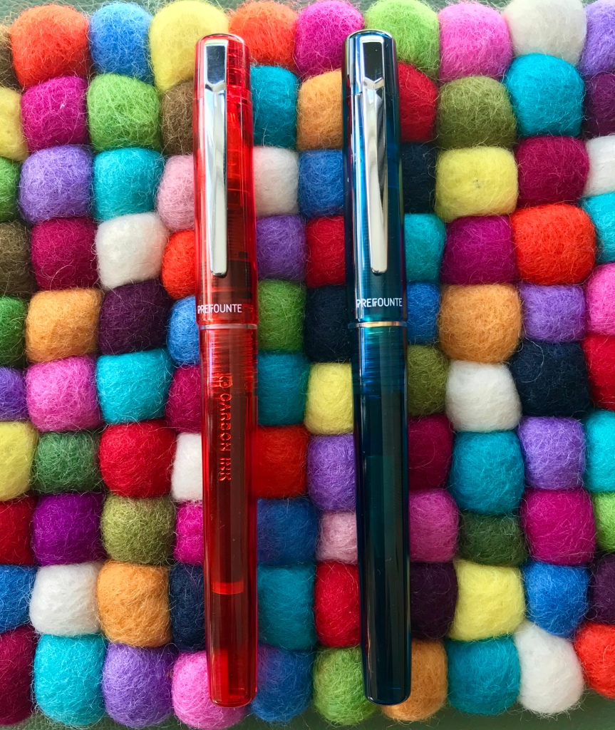
Two of the Prefounte colour options – Vermillion Orange and Night Sea

Quick on the uptake as ever, I also realised that (with the exception of the very different Curidas), all of Platinum’s readily available steel-nibbed pens have names starting with a ‘P’ – even the PGB-3000A ‘Cool’. Cool name? Definitely. Well…maybe…

Anyway, back to the Prefounte. It’s a fairly slim and lightweight pen with a translucent cap and barrel, which makes it look more up-market than the Preppy and (arguably), not as smart as the Plaisir. Price-wise, between these two pens is exactly where the Prefounte sits – the Preppy is about half the price (around £4-5) and the Plaisir around 50% more expensive (around £13-15). As other reviewers have noted, whether there was a genuine gap in the line-up that needed filling is open to debate.

Of nibs and feeds

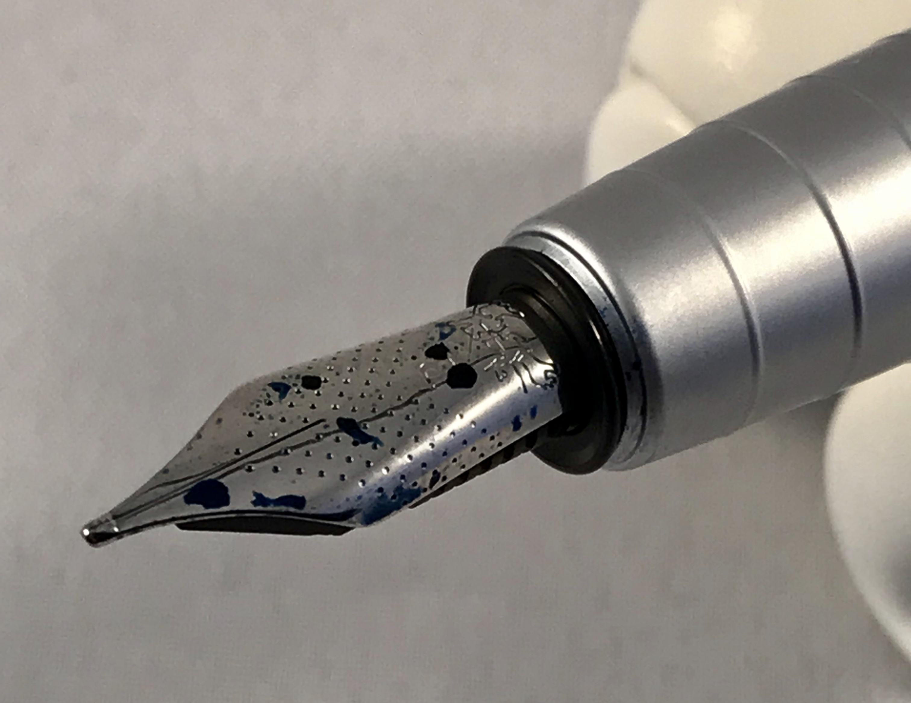
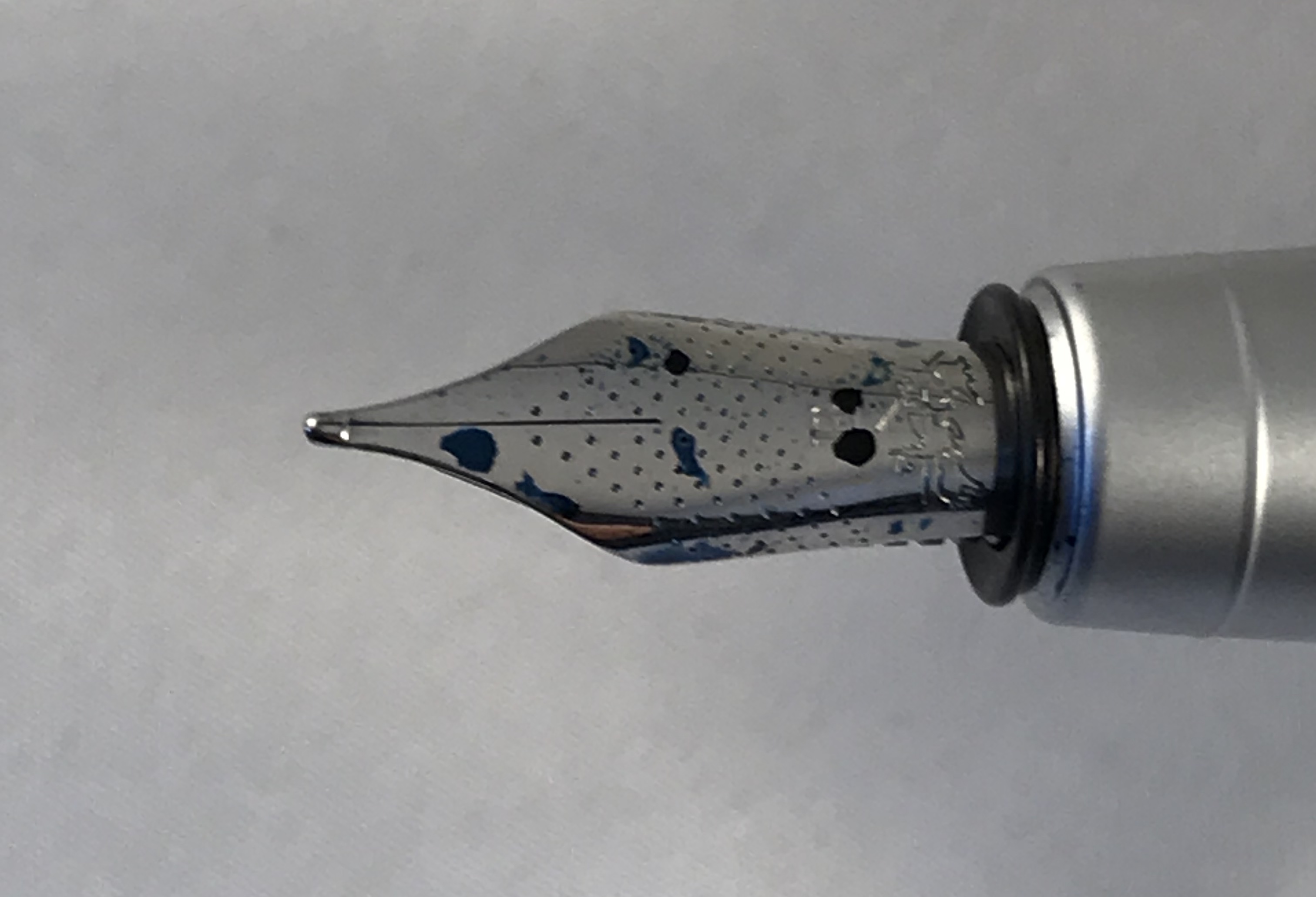
Keeping the Preppy and Plaisir in mind, all three pens share a common section, nib and feed, meaning that switching nibs is dead easy. I’ve always been intrigued by Platinum’s approach of incorporating the feed into the grip section. By making the section translucent as well, you can see the arrangement of fins within. This set-up makes the already small nib unit look more like it could be a replacement unit for a fibre-tip pen than a fountain pen, but in practice it all fits together nicely and works well.
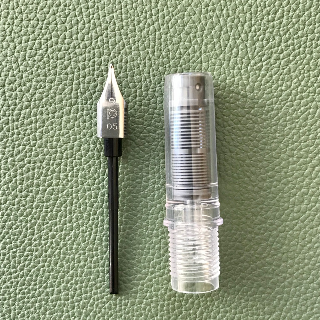
Detail of Platinum's steel nib, feed and section
Platinum’s ubiquitous steel nib and feed/section

Staying on the subject of the nib, the business end of this pen is great. It may be small and plain to look at, but I think the simple approach works well here. The key question is ’how does it write?’ The answer to that is – ‘really well!’ I’ve had 5 of these nib units in various pens over the years and all have been excellent writers – very smooth with no scratchiness or hard starts. I did read some reports of problems with the Prefounte, but that doesn’t match my experience.
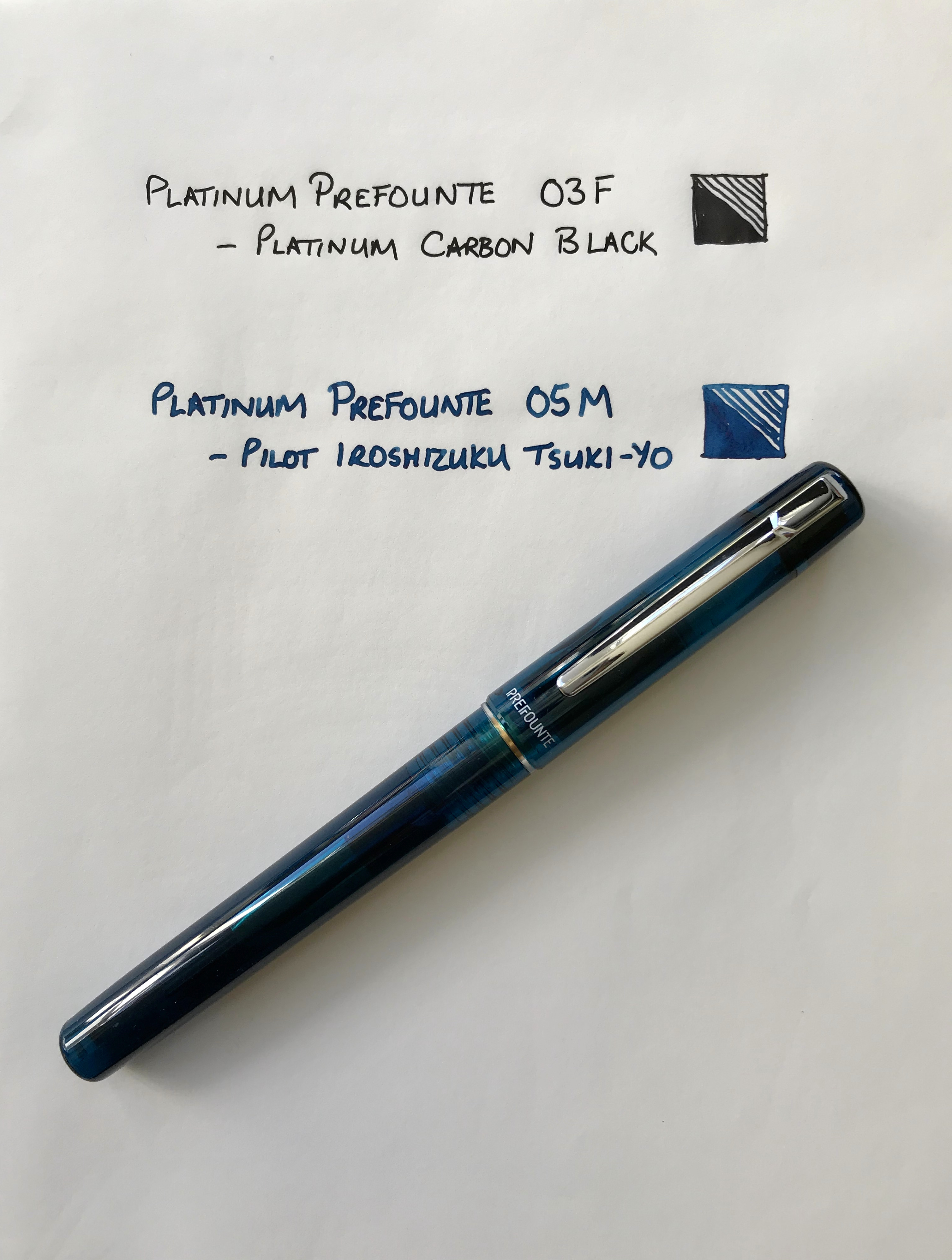
I’ve mentioned the translucent barrel and cap already, and I have to say I really like both the colours I picked. If neither of these appeal, you can also have Crimson, Dark Emerald or Graphite Blue.

The barrel is smoothly cylindrical, with a slight taper. The cap is a slip fit and snaps on and off crisply. The name ‘Prefounte’ is painted on just below the metal clip and the ‘opposite’ side of the cap tells you the nib width – 03F (or 05M) together with Platinum’s name and logo and the fact that the pen is made in Japan.

Being translucent means you can see the cartridge or converter in the barrel as well as the nib and feed in the section. You can also see the spring inner cap that makes up the ‘Slip and Seal’ mechanism. I like the fact that Platinum has extended this design right the way down its range of pens – even the Preppy has it. Platinum claim that you can leave a pen inked for a year and it won’t dry out. I haven’t fully tested this claim, but it certainly holds true for several months.

Filling options

The Prefounte comes supplied with a Platinum ink cartridge, because as with many Japanese pen brands, Platinum uses a proprietary fitting. This means you’re (mostly) restricted to using their own cartridges which in the UK come in a very limited selection of colours.

If you want to extend your choice of ink, you could clean and refill an empty Platinum cartridge, but that has ‘faff’ written all over it. Another alternative is to use a Platinum converter, but unless you have a spare one lying around the price of buying a new one (£6-9) can be almost as much as the cost of the pen itself! A more economical solution is to consider Platinum’s adapter for international cartridges at around £1.50. These do what the name suggests and open up a much wider set of options in terms of ink brands and colours.
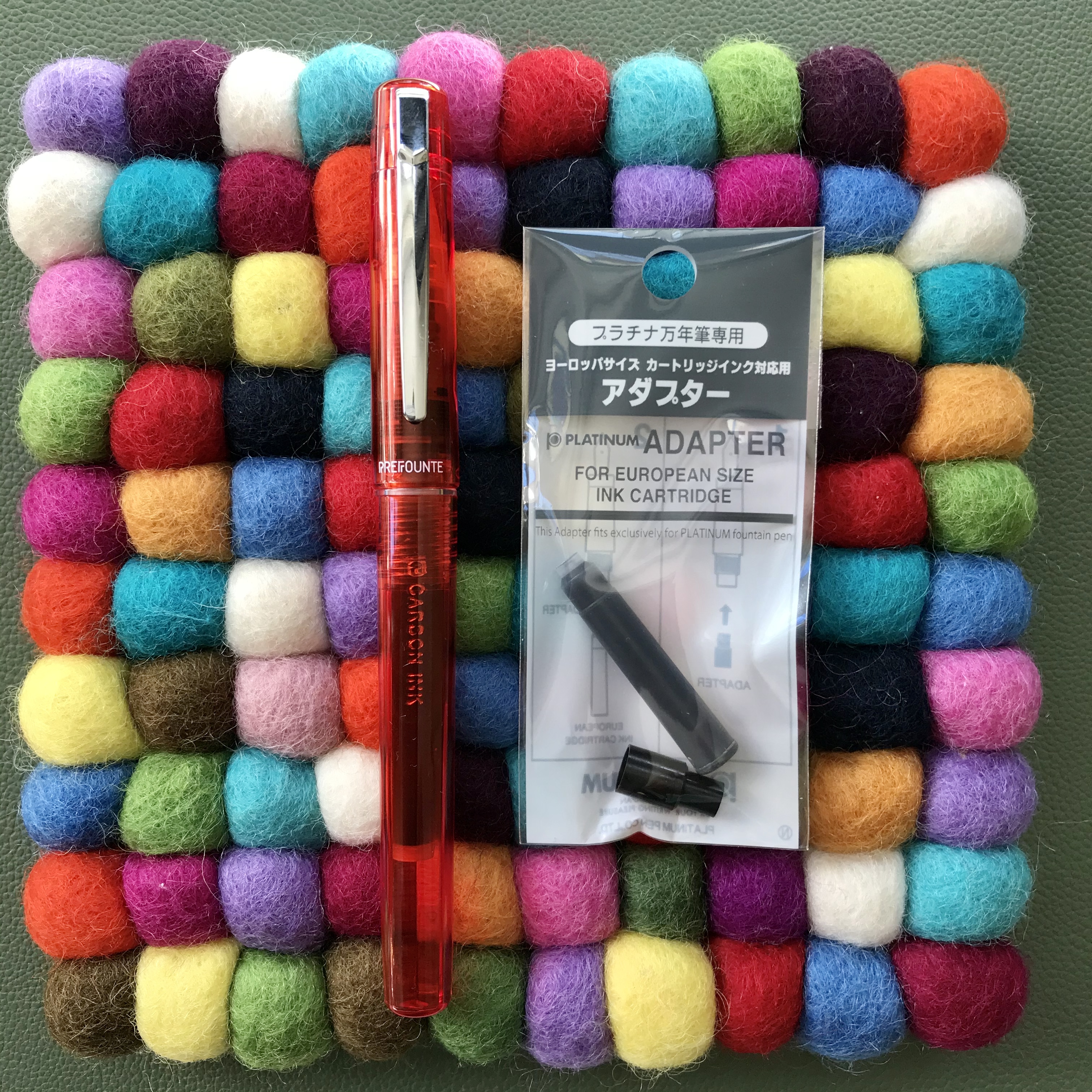
It pays to be adaptable

One of my preferences is to use less expensive Platinum pens like the Prefounte with Platinum’s Carbon Black ink cartridges. Carbon Black is a fantastic waterproof, pigment ink which I love but don’t use a huge amount. A pen like the Prefounte is a great choice here. The basic writing experience is great and worst case, if it does get clogged up because of the ink particles, it’s not going to be too traumatic a loss. So far that hasn’t happened because the Slip and Seal cap is great at preventing the pen from drying out and the ball bearing that’s used to seal the cartridges gets punched out when you fit the cartridge and helps keep the ink in the cartridge agitated.

What/who is the Prefounte for?

This was essentially the theme of some of the reviews that I read. Was it a necessary addition to Platinum’s range of pens? Who is the target market? I did wonder whether the Prefounte is considered to be a school pen. It’s not marketed as such, but maybe that’s its purpose? Within Platinum’s range you already have the Preppy if keeping costs down is your only consideration, or if you have a little more cash available you could have the Plaisir. If you really don’t want a metal pen like the Plaisir, I guess the Prefounte offers something more aesthetically pleasing than the Preppy and made with nicer materials.
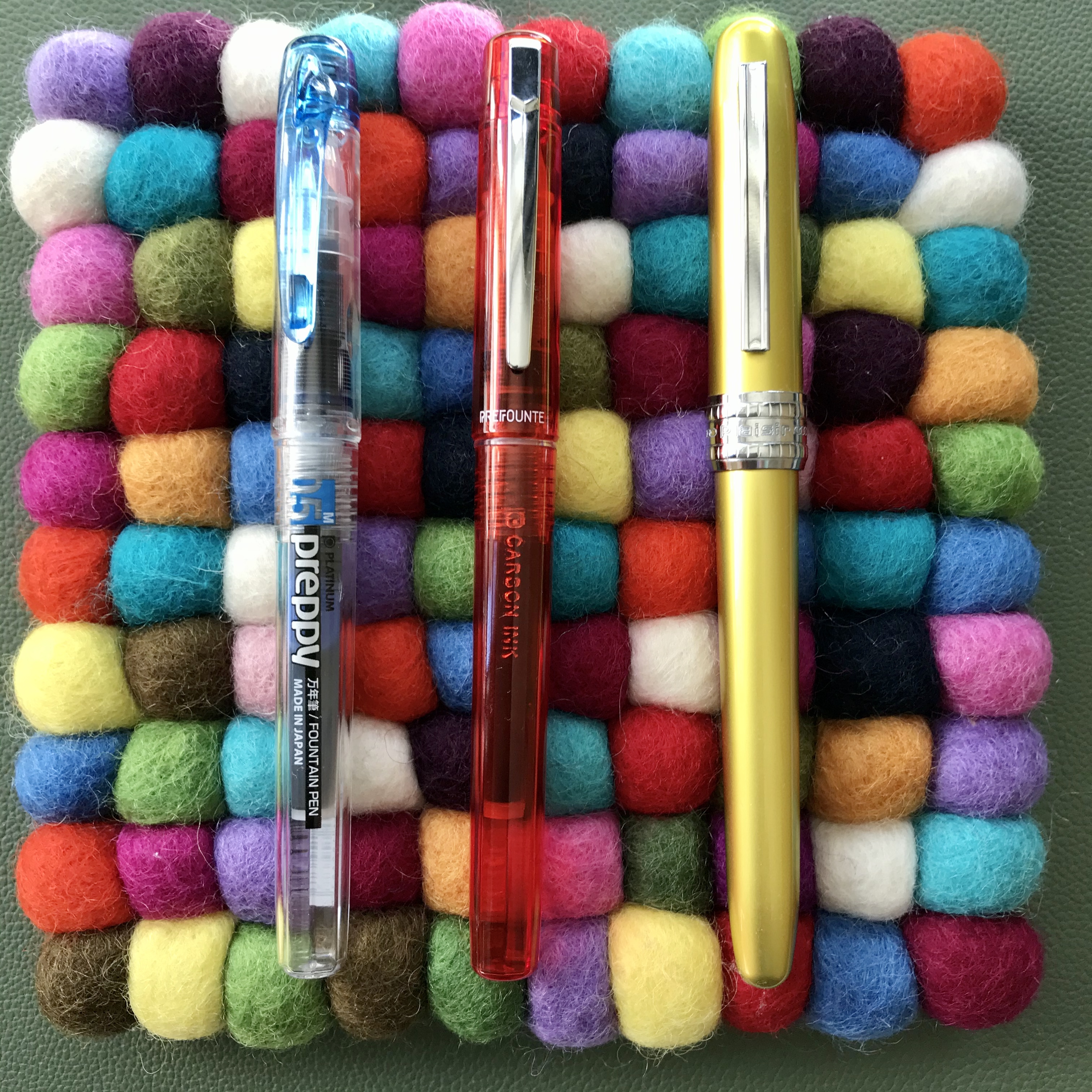
Platinum Preppy, Prefounte and Plaisir
Where does the Prefounte fit into Platinum’s line-up? Right there…

The Prefounte is just about smart enough to be used in a work context and you could probably lend it to a friend or colleague and not worry if it got lost or damaged as it’s cheap to replace .
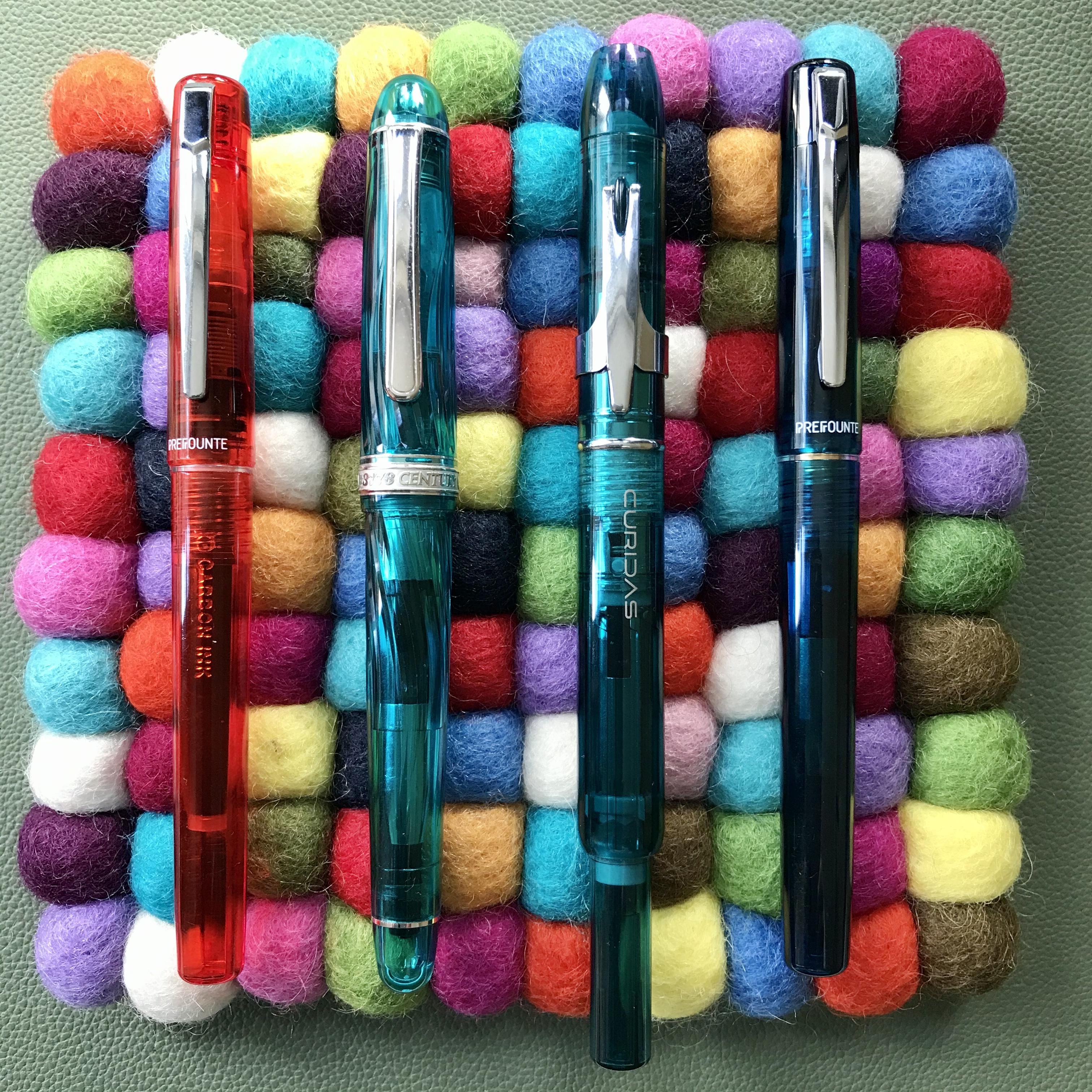
You probably wouldn’t lend some of these pens to a friend or a colleague!

In isolation, I find it really hard to dislike the Prefounte. There’s nothing intrinsically wrong with it. It’s a nice enough looking pen, without being distinctive and it feels good in the hand. Platinum have got the writing experience with their steel nibs completely sorted, so that’s not an issue. It’s only when you start to think of it alongside other pens that you start to think about why you might buy it. There’s certainly lots of competition at this end of the market.

I bought mine as a bit of an experiment to see what they were like. If you were in the market for your first fountain pen, you could definitely do worse than pick the Prefounte. At least if your usage is going to be low/infrequent you can be comfortably certain that your pen won’t dry out when not in use.

While the usual recommendations for a first fountain pen are the Lamy Safari or Kaweco Perkeo, these will cost you quite a bit more (in relative terms). It’s arguable that you are getting better design and materials for your money and a better selection of inks that can be used with those pens, so there are other factors to consider here besides price.

At almost the same price as for the Prefounte, you could have the Kaco Retro. Based on my experience, deciding between these two is a much more marginal call. Price-wise there’s hardly anything in it. Both are fun designs and remarkably competent performers for such cheap pens. The Retro comes in some fun colours and has a converter as standard, but there’s only one nib size. The Prefounte colour choices may be slightly less fun, but I really like them, plus the Prefounte has interchangeable nibs and Slip and Seal. Here I’d say it really comes down to which one you prefer the look of. Neither has let me down and I’d recommend either.
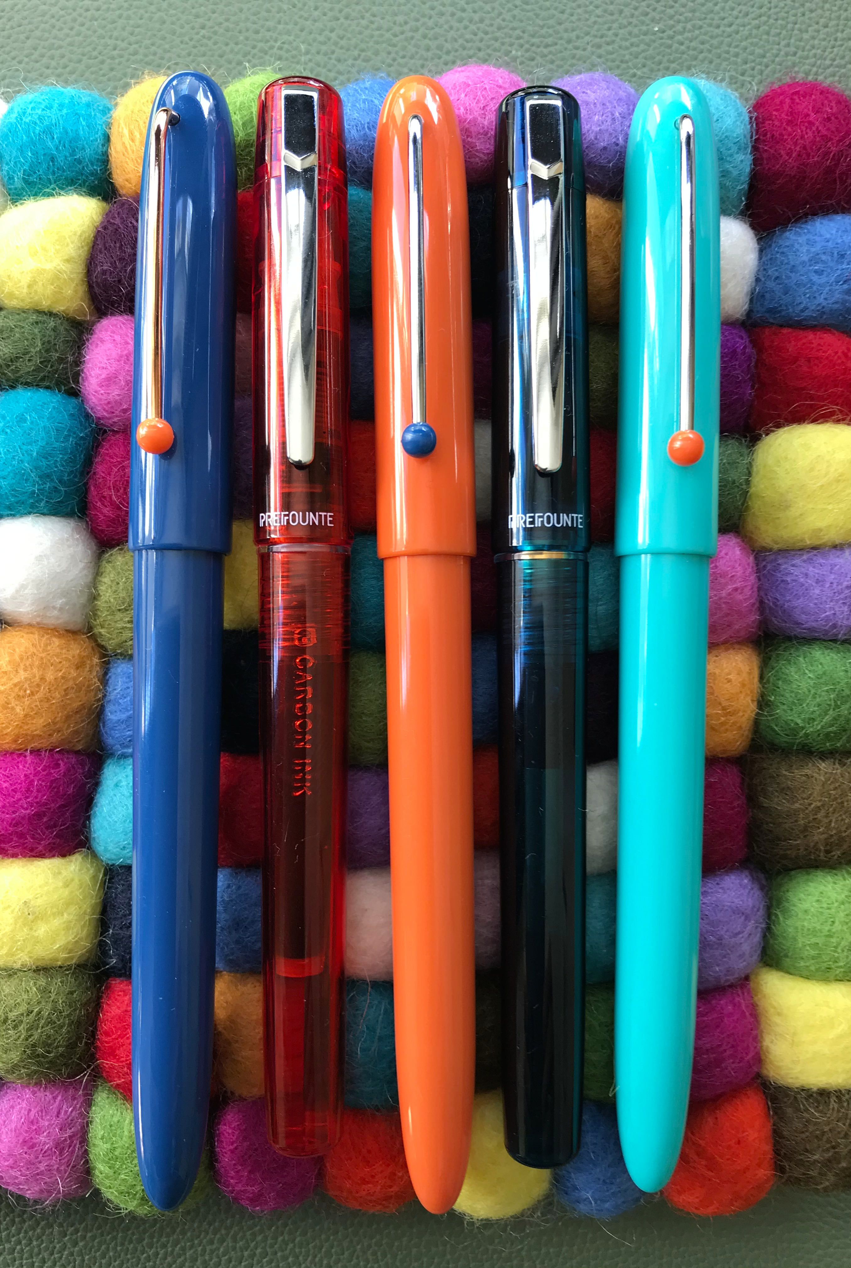
Platinum Prefounte and Kaco Retro side-by-side
Prefounte or Retro? Your choice.

I’ve always enjoyed writing with Platinum’s budget steel-nibbed pens, and the Prefounte has lived up admirably to those expectations. Whether it has enough going for it in the face of competition is a more tricky question to answer.

Learning to stay on the bus

When I started my blog, I was in part looking for a creative outlet that could serve as a substitute for photography.  Sure I’ve liked and used fountain pens for years, but it never occurred to me that I would start collecting them in earnest, or writing about them, or (here was the big surprise) finding that other people might actually want to read what I had to say about them.

Black and white photo of a Hosta flower

Hosta flower

I’ve never really taken to digital photography beyond the acceptance that these days it’s a convenient way to take photographs.  And while I still can’t be persuaded to spend hours in front of a computer tweaking images, I never had that problem standing for hours in a cramped, darkened space under a red safelight making prints in a darkroom.  Maybe it was the smell of the chemicals, but I’d like to think it was the childlike wonder of watching an image gradually materialising on the paper as it rocked gently in the tray of developer and thinking “I did that”.  Of course, it applied equally when things went wrong, but I’m pleased to say that this sense of magic has never gone away.

Black and white photo of a waterfall

Waterfall (Cwmorthin, North Wales)

I can’t pretend to be a very good photographer but I need to be able to believe I still am one.  Unfortunately, the time needed for taking and making photographs has not been compatible with work and family commitments in recent years.  I’m hopeful that one day this will change, and that when it does it will actually still be possible to buy film and photographic paper and get back to something that I really love.  In the meantime, my darkroom is mothballed and my beloved Sinar Norma and Mamiya RB67 are more like ornaments in the corner of a room than tools of the trade.  All the gear – no idea when I’m going to get to put it to good use…

Black and white long exposure seascape

Seascape

What does any of this have to do with buses?

On the face of it, not a lot.

I’ve never been to Helsinki and I’ve certainly never seen its bus station, but I’m more familiar with it than any other Scandinavian transportation hub as a result of a lecture given by Amo Rafael Minkkinen a number of years ago.  He was talking about the creative process, the development of one’s own style as a photographer and how it could be compared to taking a journey from Helsinki’s central bus station. You can read a transcript about the Helsinki Bus Station Theory here.  (It’s worth taking the time, I think.)

Old Helsinki main bus terminal

Google tells me this is the old Helsinki bus station… (Courtesy of JIP at English Wikipedia [CC BY-SA 3.0])

In a nutshell, he argued that you will spend years making photographs that look like the work of others, but eventually (and here’s where the bus analogy punchline arrives) your personal route will start to diverge from these others as the journey progresses and your own style will start to become distinct from those around you.  The trick is to stay on the bus and see the journey through.  Going back to the bus station and starting again on another route to see if that offers a better option will just waste precious time and end up leaving you no further forward than before – just on a different route.

This resonated with me at the time, being inspired by the work of photographers like John Davies, Fay Godwin, John Blakemore, Igor Svibilsky and many others while I tried to work out what sort of photographs I wanted to make.  However, I’ve recently found myself reflecting on it in the context of writing my blog and how the focus of my interest in pens, paper and ink has changed with time, practice and seeing what interests other people.

Do I stick with what I’m doing?

Should I follow what I see going on elsewhere?

Sure, at times I’ve followed the same routes as other people, even jumping on the occasional bandwagon.  What I think I’ve learnt along the way is that you should trust your own judgement, follow what interests you and learn from your experiences as you go.  I’ve also learnt that my list of favourite pens (owned or aspirational) or inks and, to a lesser extent, paper now looks nothing like it did a couple of years ago.  Also, I’m fairly confident that my list will almost certainly never entirely match anyone else’s. At first glance there might be similarities, but look at the detail and you’ll start to see the differences.  That’s one of the wonders of this hobby and the wonderfully diverse group of people out there who practice it.

So, whatever your creative endeavour, whether it be one that you do in private or share publicly, you’ll get where you’re going eventually.  Stick with it and try to enjoy the ride.

As Minkkinen himself said – “Stay on the bus.  Stay on the f*cking bus!”

A Helsinki bus

A Helsinki bus. Consider staying on it… (Courtesy of AleWi [CC0])

Sailor Shikiori Rikyucha Ink Review

Sailor Rikyucha ink doodle

In case you were in any doubt about which ink I’m talking about

Rikyucha (Green Tea Brown) is part of Sailor’s Shikiori (Four Seasons) range of inks.  Although it is a new ink to me, a bit of research suggests it was part of the Sailor line-up for a while, before disappearing to wherever discontinued inks go.  The translation of Rikyucha is a good one in terms of describing what is quite a complex ink.  It’s also a more palatable descriptor than some that might be applied to it.  Any resemblance between this ink and something that you might find lurking at the bottom of a pond is, of course, entirely coincidental…

Lookalikes

My interest in inks of this colour started with a couple of Diamine inks – Safari and Salamander.  While I’ve liked the colour of these inks, I’ve found them a little dry for my liking.  In a quest for something more to my liking I tried Robert Oster Bronze.  I love the colour of this ink, but again it’s a bit too dry for me.

Comparison swatches

Can you pick out the culprit from this lineup?

Close-up of ink swatches

The same swatches in closer detail

As you might expect from an ink made by Sailor, Rikyucha is a well-behaved, low maintenance ink.  That said, I suspect it’s the kind of colour that will polarise opinions.  I may well be biased, but it was appealing enough to make me buy a bottle.  As I’ve used it in anger I’ve grown increasingly fond of it.

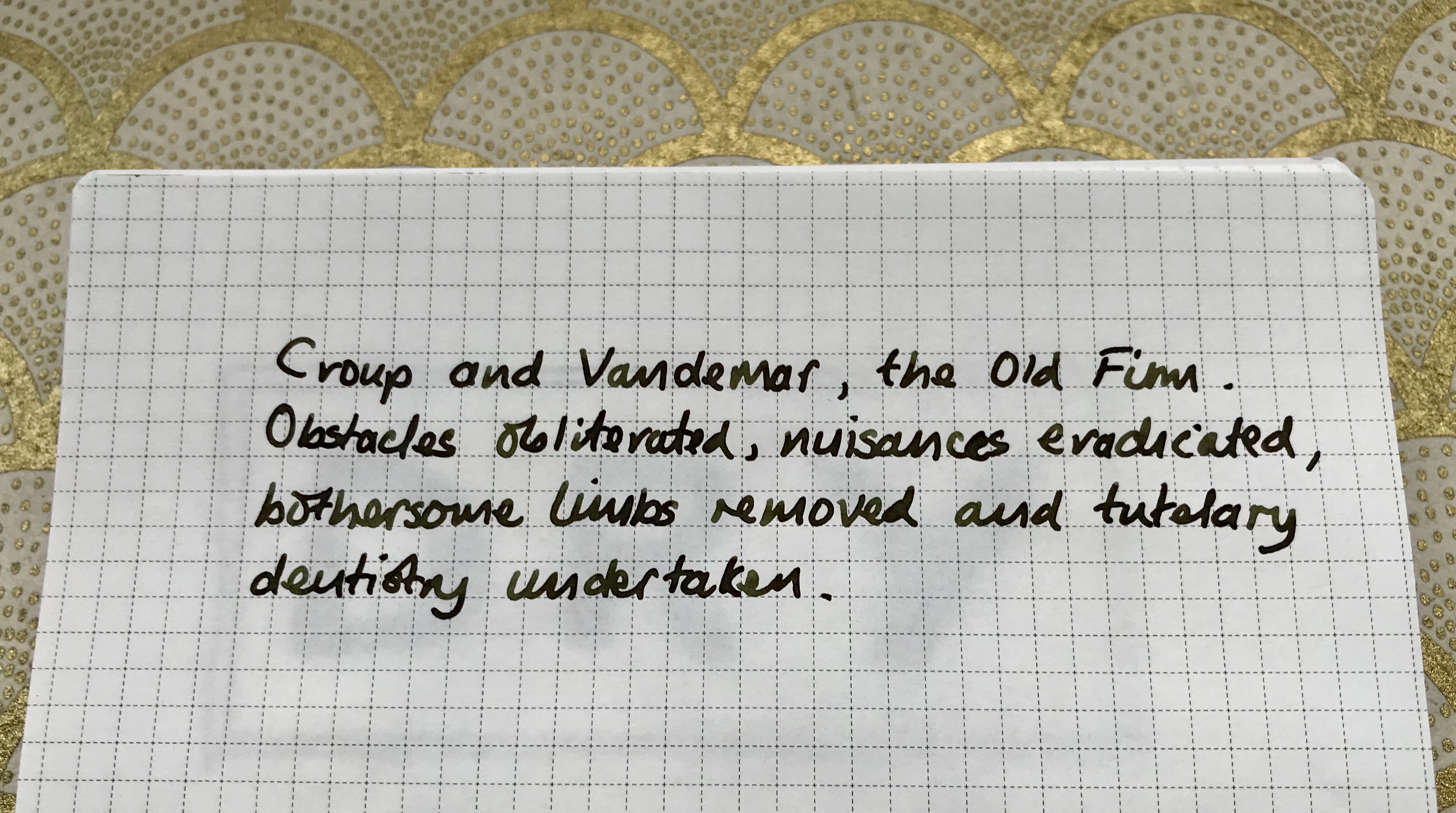
As well as these basic properties, Rikyucha has one or two extra tricks up its sleeve.  The most on noticeable thing is that it looks dark green with a slight hint of blue while wet, but dries to a much browner shade.  I tried to capture this difference, but failed miserably so you’ll have to take my word for it.

Sailor Rikyucha writing sample

Some of my favourite literary villains and yet another chance to flaunt my awful handwriting

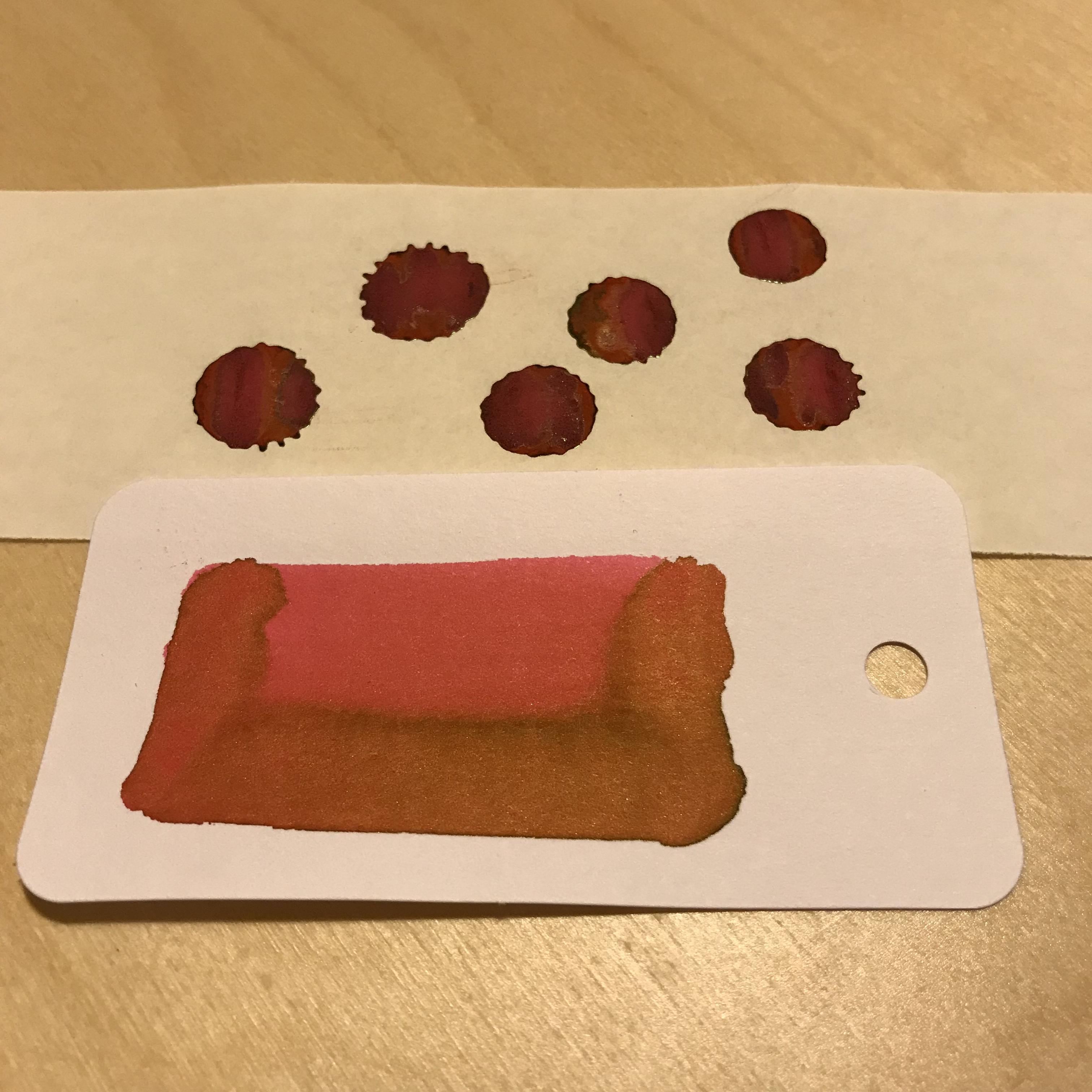
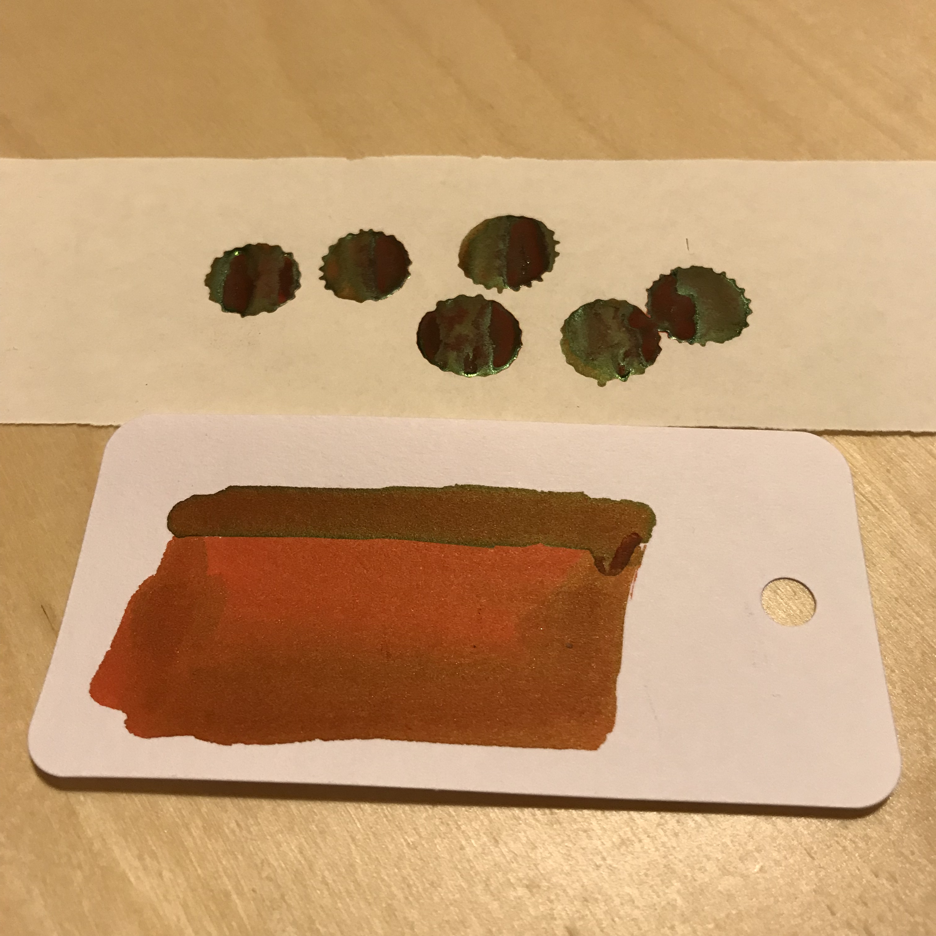
On top of the colour shift, there’s a cheeky bit of sheen thrown into the package.  Like a number of other Sailor inks I’ve used, it’s not the raison d’etre of this ink, but it’s a nice addition without dominating proceedings.  I used some ink splats to highlight this, but (on the right paper) broader, wetter nibs will also show this off.

Rikyucha ink splats and sheen

The obligatory ink splats to highlight the sheen

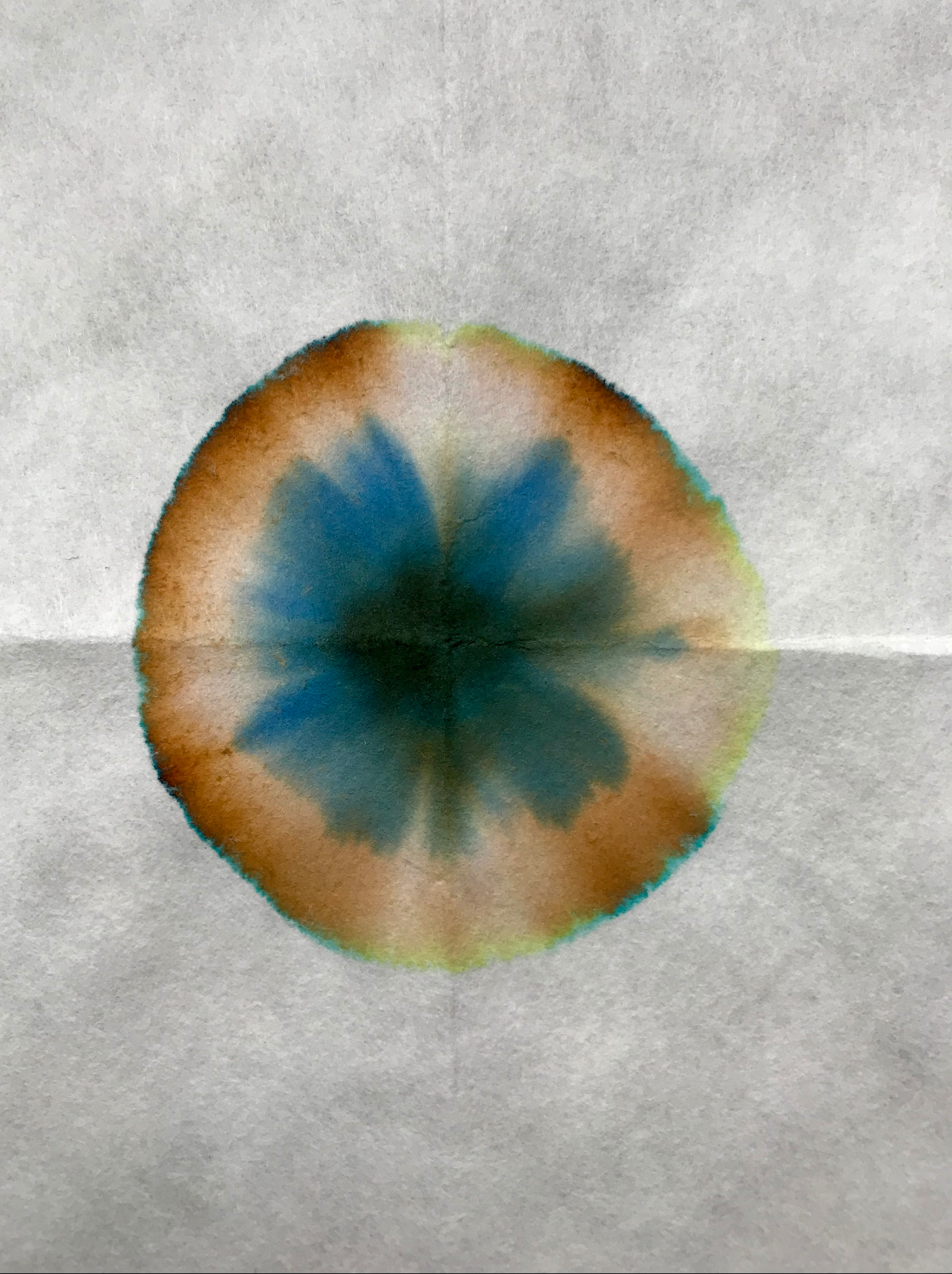
As befits an ink with these properties, its make up is a bit complicated and unexpected.  Some simple kitchen chromatography shows a range of colours.  I certainly wasn’t expecting the blue component…

Sailor Rikyucha chromatography

There’s more to Rikyucha than meets the eye

Economics

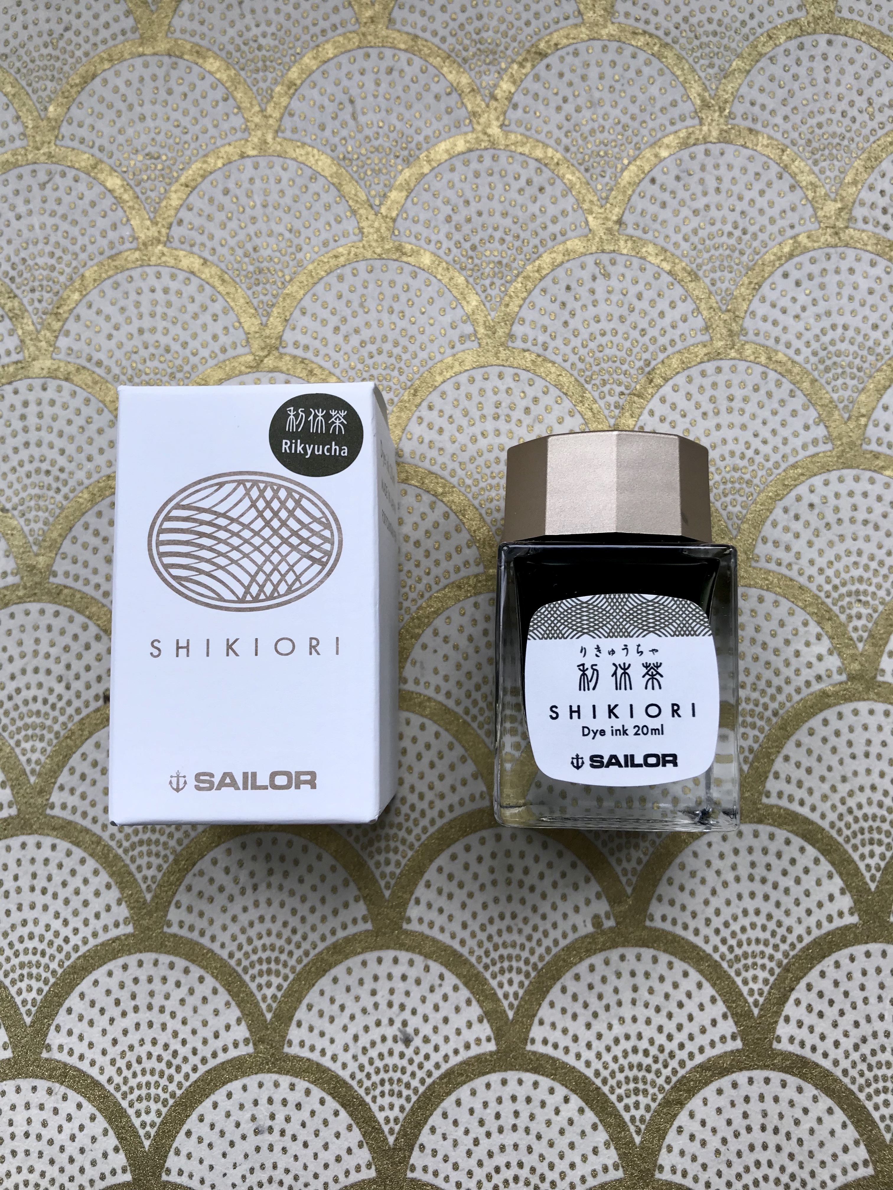
This is one of the first bottles of Sailor ink that I’ve bought in the new, smaller bottles that are replacing the old 50ml ones.  I like the design of the bottles and I’m generally a fan of smaller ink bottles.  I already have more ink than I’m likely to get through in my lifetime, so not having to add another 50ml to my list of guilty excess is to be welcomed.  What is not so welcome is the big shift in the unit cost of Sailor inks.  In the UK, a 50ml bottle of the old Sailor Jentle Four Seasons ink cost in the order of £16-20, which I thought was pretty good value for money for the quality of the ink.

The new 20ml bottles, however pretty they might be, weigh in at around £11 or £12, which shifts the cost from around 35p per ml to approximately 60p per ml.  Much as I love Sailor inks, this will certainly make me a little more selective about future purchases.

Sailor Shikiori Rikyucha box and bottle

Is it small or just very far away?


Conclusion

Overall I really like this ink.  I like the new packaging and bottles and I definitely like how Rikyucha behaves and how it looks on the page.  The colour shift as the ink dries and the sheen add to the interest, so if the colour of this ink appeals I’d recommend checking it out.  The only fly in the ointment is the pricing.  To be frank, the jump in price per ml seems excessive to me.  I get that smaller volumes will be relatively more expensive, but this is going a bit far.  That said, none of the other inks I’ve tried in this corner of the colour chart have worked nearly so well for me, so I’m prepared to live with the relatively high price.

Fountain Pen Review: Faber Castell Loom

The makings of this review have been hanging around for the best part of a year.  I even started a draft back in April of last year, but couldn’t find the right approach.  Fast forward 8 months or so and a comment on Rupert Arzeian’s excellent blog and I figure it’s time to have another go.  After something of a fallow period in terms of posts, I had to start somewhere.  So here it is, a review of the Faber-Castell Loom fountain pen.  Well, 2 of them, actually.

Overview

F-C Loom

Looming on the horizon after 8 months…

For a company with such a long history of making writing instruments, it’s always struck me that the design of a lot of Faber-Castell’s fountain pens is remarkably contemporary.  So it is with the Loom.  Its clean lines and distinctive shape make for an interesting starting point.  I’d admired the Loom for a while before I bought my first one.  Owning that one didn’t deter me and I’ve since bought a second.  My first Loom came in a matt silver finish, but these don’t seem to be very widely available any more.  The second came in a gloss silver finish, which I think looks more stylish.  There are also some options in a gunmetal finish, although these command a premium on price.

The Loom is quite widely available from the usual sources.  In UK pricing terms, the gunmetal version costs around £40, with the silver version coming in at around £30.

A Sense of Proportion

The Loom is not overly long, but looks stocky.  The constant diameter of the barrel coupled with the limited taper of the section make it feel quite chunky.  The photos below show some comparisons.

Pen size comparison

Capped size comparison.  L-R: Sailor Pro Gear Earth, Faber-Castell Loom, Faber-Castell Loom, Pelikan M400 White Tortoise, Pelikan M600 Vibrant Orange, Platinum 3776 Kumpoo. (Polar bear not to scale)

Pen size comparison

Uncapped size comparison…

Some Details

If the Loom was a more high end pen, the barrel might be milled from a single rod of metal.  Instead, it comes as a plastic-lined cylinder with a concave plug at the end. It’s all well finished and it gets the job done, but it does look a little unusual.  The plug looks a little less attractive  on the matt version compared to the gloss.  Luckily the pen posts easily and without any negative effects on balance so you can at least cover this up whilst writing.

Once you’ve decided on finish, the only other option to consider is what colour you’d like the cap.  When I bought my orange one there was quite a wide range of colours, but this seems to have reduced over the past couple of years with more of a focus on muted and pastel shades.  Not as much fun, but there are still options.  The lack of threads is a bit of a giveaway – the cap is a snap on, rather than screw-on and it does so with a very satisfying ‘click’.  You’re left in absolutely no doubt when the Loom is safely capped.

Faber-Castell Loom cap detail

If the cap fits…

The cap is engraved with the company name and logo down one ‘side’ (relative to the clip).  There’s no separate finial, but the part of the clip where it fits into the cap is engraved with the Faber-Castell logo as well.  As seems to be the case with a number of Faber-Castell pens, the Loom’s clip is a fully-functional and substantial affair.

F-C Loom cap detail

Cap detail

The cap is slightly bulbous in shape.  From its widest point at mid-height, it tapers slightly towards the base and slightly more markedly towards its tip.  I find the profile easy on the eye, and when the pen is capped it breaks up what would otherwise be a very angular profile to the Loom.

I mentioned the contemporary look of several Faber-Castell fountain pens, and one area the company seems to have gone its own way on is in the design of the section.  On first reading, cylindrical and slightly tapered sounds pretty conventional, but I haven’t  come across a design quite like this before.  On both of my Looms, the finish of the section matches that of the barrel so there’s no concession there to promote grip.  There’s also a slightly disconcerting lack of any flaring to stop your fingers sliding off the end of the section and onto the nib.  The only feature to help keep your hand where it should be is a series of 5 rings that act as ridges to provide something to grip.

F-C Loom section

The section won’t be to everyone’s taste

This works perfectly well in terms of stopping the Loom from sliding out of your grasp.  Even so, I do find the section a bit ‘squirrely’.  It has a slight tendency to try and rotate in your grip.  That persists with use, but you do get used to it and everything settles down.  I wrote the first draft of this review by hand with the Loom (and in 1 sitting) and it was fine.  I don’t find that I have to grip the section any more tightly than normal and I haven’t experienced any noticeable fatigue as a result.

The Sharp End

I’ve spent a bit of time now highlighting some of the Loom’s quirks and (ahem) features, but it does have a trick up its metaphorical sleeve – the nib.

Faber-Castell has a reputation for high quality steel nibs, and the units I’ve got on my Looms are crackers.  The nib is a #5 in size and suits the proportions of the Loom well.  I think it’s the same as used in a number of other Faber-Castell pens, including the Ondoro and eMotion.  Absence of a breather hole and a stippled finish in the form of a chevron add to the attraction, but at the end of the day it’s the performance that counts.


F-C Loom nib

Nib details

Nib detail

The nib housing protrudes a bit from the section…

I have a fine and a broad nib and both have worked flawlessly out of the box.  Ink flow is good, even with drier inks.  Both nibs give feedback on a range of papers, but it’s not too intrusive.

Writing samples

The obligatory writing samples

The Loom takes either an international cartridge or converter, meaning there is a wide range of ink options available.  As a slight note of caution, I’ve found that not all international converters fit equally well, so a bit of trial and error might be needed if you’re thinking of re-purposing another brand of converter.

Conclusion

I can see the Faber-Castell Loom being a pen that divides opinions.  I’ve highlighted a number of ‘quirks’ in the design and execution of the Loom.  The overall design might not appeal to everyone.  Similarly the shape of the section won’t be everyone’s cup of tea.  While none of them are likely to be killer blows in isolation, I could see how they might start to accumulate in the ‘deficit’ column of any evaluation of the Loom.

My take is that the overall design and feel of the pen, coupled with the quality of the nibs, make the Loom worth having.  To reject it on the grounds of some kind of cumulative scoring system would be rather harsh.

Don’t smash the Loom! (As Ned Ludd almost certainly didn’t say.)

Ink review – Krishna ink round up

Overview

Krishna inks are made in a place called Palakkad in Kerala, India and are the brainchild of a Dr Sreekumar.  Their trademark features are some interesting names and some vivid colours.  There is a reasonably large (and growing) line-up and they are becoming more widely available outside India.

Presentation-wise they come in 20ml glass bottles, which are perfectly functional but which won’t win any design awards.  Packaging is similarly, how shall I put this, simple.

Simple packaging

Prize-winning packaging? Not really

Given that many of the ones I’ve tried are a little (ahem) flamboyant and may not always be suitable for everyday use, the relatively small size makes them quite an attractive proposition.  It also makes it easy to justify buying multiple inks, which is how I’ve ended up with 7 of them so far.

Jungle Volcano, Anokhi and Sumukhi

Rumble in the jungle

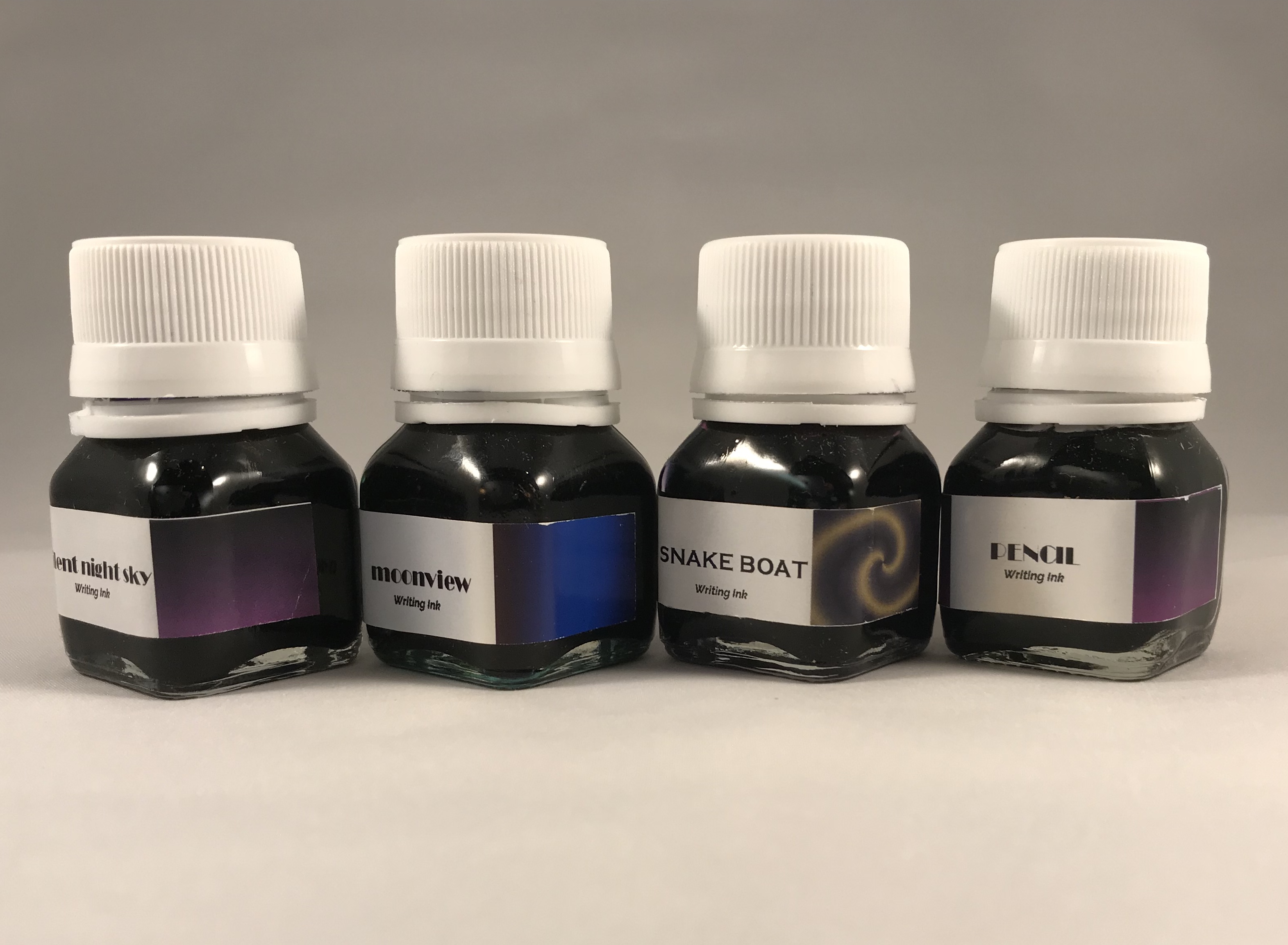
Silent Night Sky, Moonview, Snake Boat, Pencil

Bad Moon Rising

My overriding impression of Krishna inks so far is that they flow well and major on sheen.  The latter feature is subject to some confirmation bias in that I mainly chose inks that looked like they would sheen.  If you do like some sheen with your inks, you’ll find plenty to interest you in this range.

I’ve tried these inks over a number of weeks and in a variety of pens, but I’m just going to give a brief summary of each one.  I may get round to writing up more detailed reviews at some point, but given how long it’s taken me to pull this together, hopefully there’s enough here to whet appetites.

Moonview

Krishna Moonview

Krishna Moonview

I’ll kick things off with Moonview as it’s perhaps the easiest one to relate to other inks.  It is a rich blue ink with a strong red/pink sheen.  When I say strong sheen, what I mean is that Moonview is another sheen monster in the same vein as Diamine Skull and Roses or Organics Studio Nitrogen Royal Blue.  It flows well and I’d say it’s better behaved than OS Nitrogen Royal Blue, but you might not feel the need to add it to your collection if you already have a number of inks of this nature.

Anokhi

Krishna Anokhi

I’m not normally a big fan of purple inks, but I’ve quite enjoyed dabbling with this one.  On top of the purple base colour, there’s a hefty dose of green sheen to accompany it.

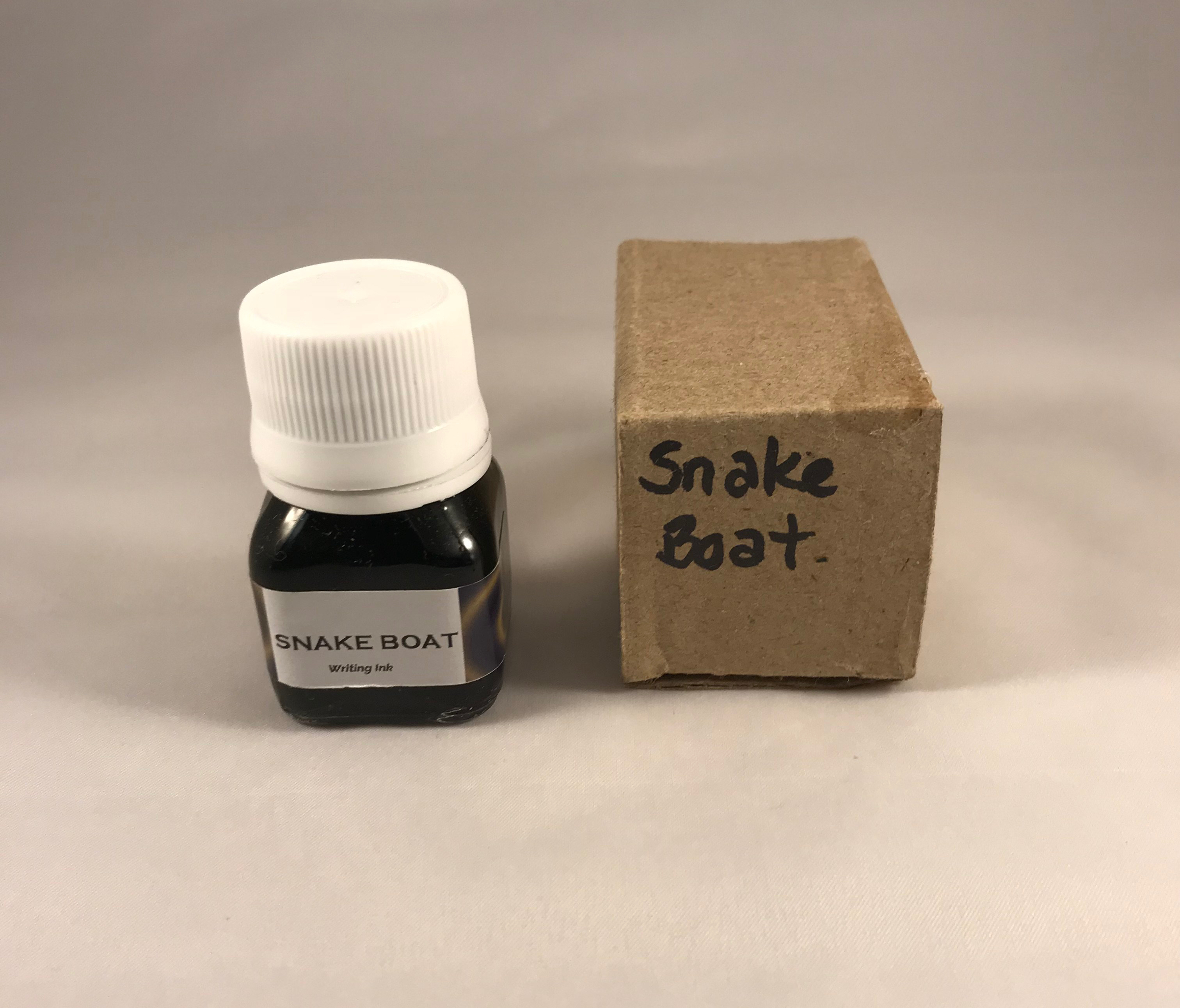
Snake Boat

Krishna Snake Boat

Aside from the fantastic name, which raises all sorts of questions about its meaning, Snake Boat has a sort of muddy purple as a base colour, but with a green sheen.  Again, there’s a really strong component of sheen, but the resultant combination is intriguing.   Of the two, I’d probably choose this one over Anokhi because it’s not such an obvious purple and the overall result appeals to me much more.

Sumukhi

Krishna Sumukhi

Sumukhi is a bright pink ink with some green sheen to further spice it up.  I’ll come clean – I have no idea why I picked this ink.  It’s definitely not a colour I would ever consider using for normal writing purposes.  I have used it in ink doodles, though, and it’s proved to be quite good fun for that.

Pencil

Krishna Pencil

This is a seemingly random name for an ink, and based on the swatch it seems a bit of a misnomer.  You can see the logic when the ink is wet as there is a grey look to it, but when dry the colour is more of a washed-out purple.  I was drawn to this ink as it reminded me of Robert Oster Summer Storm, an ink that I love the colour of.  My problem with Summer Storm is that I find it dry, verging on arid, and difficult to get on with.  Pencil, on the other hand, has worked well with both fine and broad nibs, giving quite varied properties.

Silent Night Sky

Silent Night Sky is perhaps the most mundane of the Krishna inks that I’ve tried.  So much so that I forgot to photograph it.  To help conjure up a mental image, it’s quite a rich purple, but it’s also quite ‘safe’ compared to some of its stable-mates with only a little sheen.  (That helped, didn’t it?). To be frank I haven’t felt anything resembling a strong urge to do much with this ink.

Jungle Volcano

Krishna Jungle Volcano

Perhaps saving the best until last, Jungle Volcano is ink making at its brilliantly bonkers best.  I seem to recall it got its name as a result of a competition on Instagram, but it’s a name that suits.  It has attracted quite a lot of attention and I have yet to read a review by anyone who didn’t like it.  I love orange inks, but often find them a bit too ‘thin’ in practice.  It may explain why I like darker, more complex inks like Monteverde Fireopal and Diamine Ancient Copper.  Jungle Volcano is a similarly complex orange ink, further enhanced by some crazy green sheen.  Using it is proper fun and brings a smile to your face. I can’t imagine a situation where it would be suitable for work purposes, but it’s an ink you may well find yourself looking for excuses to use.

All fun and games?

Well it is until someone loses an eye (see the book of the same name by Christopher Brookmyre for that one).  While my overriding experience of using Krishna inks has been a positive one, it hasn’t entirely been plain sailing.  It was probably too much to expect that such richly coloured and highly-sheening inks would be trouble-free and I have had a couple of issues.  I inked a TWSBI Eco with Sumukhi and it was fine in use, but when I came to clean the pen I found the feed to be quite gunked up and some staining in the barrel.  They good news is that the staining isn’t permanent, the bad news is that it took about 4 days of soaking and flushing with water to shift this.  I inked another Eco with Snake Boat, and although it has been fascinating to look at the ink while it has sloshed about in the pen, I fully anticipate another pain in the proverbial to clean this out when the time comes.


Jungle Volcano was also a little problematic.  I didn’t have any noticeable staining issues, but there was some nib creep (not uncommon with orange inks) and a bit of gunking up of the feed.  Again it took a bit of soaking to shift this.

In the interests of balance, I’ve also cleaned Moonview and Anokhi out of other pens, and these were pretty well behaved and straightforward by comparison.

Availability and pricing

Krishna inks are reasonably widely available.  In the UK, Izods seems to be the only supplier.  Unfortunately, I found their website so frustrating to use that I went a bit further afield, namely Belgium (Sakura Fountain Pen Gallery and Germany (Fountainfeder).  In both instances, the process was smooth and quick with excellent customer service (a hand-written note and some chocolate always helps).  I paid around €8 a bottle, plus shipping, on both occasions.  In the US, you can buy from Vanness at around $8 a bottle.

Summary

Of the 7 Krishna inks I’ve dabbled with, only Silent Night Sky hasn’t really hit the mark.  I’ll probably struggle to get through Sumukhi, but that’s a matter of colour preference.  The remainder will continue to get use.  In terms of favourites, Jungle Volcano is great fun, Moonview is probably the most ‘practical’, while Snake Boat and Pencil are probably the most complex and interesting.

Unexpected Discoveries

Serene Serendipity

Alongside the hours of meticulous research, cross-referencing reviews, finding the best price and generally procrastinating over purchases, I like the occasional moments of serendipitous joy that come with spur-of-the-moment purchases.  Sometimes it’s completely out of the blue, but more often than not it’s the little extra you add to your shopping cart as part of a bigger order.  After all, what’s the harm?

So it was with some recent ink purchases from Fountainfeder in Germany.  My main objective was getting my hands on a couple of German-only inks from Diamine – Skull and Roses and November Rain.

The process from order to delivery was smooth and the wait wasn’t too long.  As well as the ink, I got a nice, hand-written note and some chocolate – always welcome.  Both Skull and Roses and November Rain look interesting in a “sheen-turned-up-to-11” kind of way. Even so, they weren’t the stars of the show.  That honour goes to the contents of an unassuming sample vial – Super 5 Atlantic

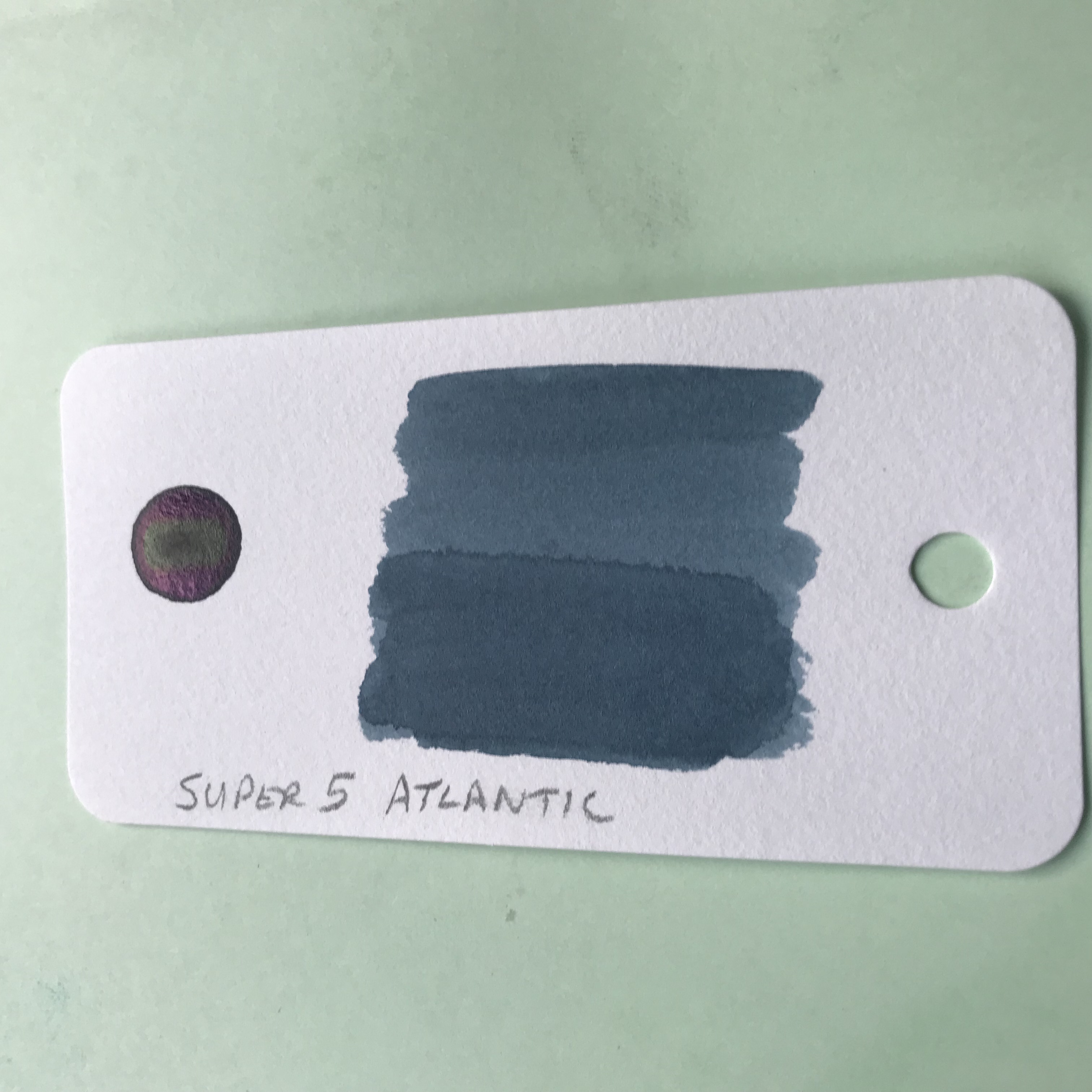
From swatches on the web, it looks to be somewhere on the teal spectrum, but as it turns out, the online photos rather undersell Super 5 Atlantic (unless you love teal, of course).

I’m rediscovering my love for the sea in all sorts of ways at the moment, including inks that reflect its myriad colours.  As a result, this ink has struck a chord with me, helped by the massive clue in the name.  Not the Super 5 bit – that sounds like a posh upgrade from the Fantastic 4 (imagine it said in a plummy English accent) – I meant the Atlantic part.

Super 5 Atlantic ink swab

Avast ye swab!

Swabbed, you get a beautiful blue/green/grey kind of colour, which indeed evokes the ocean.  Used in anger, it has plenty of shading to add interest.  On 52 gsm Tomoe River paper, there’s some cheeky sheen.  In fact, there’s wall-to-wall sheen.  It’s a silvery sort of sheen, so it manages to be both subtle and extravagant at the same time.  The sheen doesn’t dominate though and the true colour of the ink shines through.

Super 5 Atlantic writing sample

All at sea

Of course, there are risks and potential pitfalls with these impulse purchases.  Failure to do any meaningful research meant that I didn’t pick up on the fact that it’s a permanent ink.  If I’d known this I might have picked a different pen to my ghostly Franklin-Christoph 45.  The cap has a habit of collecting ink spots that are hard to shift so I’m being a bit wary and handling the pen gingerly until I’ve written it dry.

At around €16 for 30ml, Super 5 Atlantic is not a cheap ink.  It doesn’t seem to be available in the UK, so shipping costs from Europe add to the challenge.  It’s such a beautiful colour though, that I didn’t hesitate and I should have a bottle in a few days.  I can easily see this becoming one of my favourite inks – high praise from someone who has the attention span of a gnat when it comes to sticking with one ink.

Getting mixed up – into the Wild Blue Yonder

To begin at the beginning…

It started with something innocuous, as these things often do – a seemingly innocent purchase of a 30 ml bottle of Diamine ASA Blue.  At £2.35 it seemed rude not to.  But of course, that’s how they get you.  Added to the Mnemosyne 194 that I wanted, that almost got me to the £10 needed to qualify for free postage.  90p short, I needed something else…

…and that’s how I ended up with a bill for £45!

Enough about my lack of will power.  ASA Blue is great in its own right, carrying off  a passable impersonation of Pilot Iroshizuku Kon-peki at a fraction of the price.
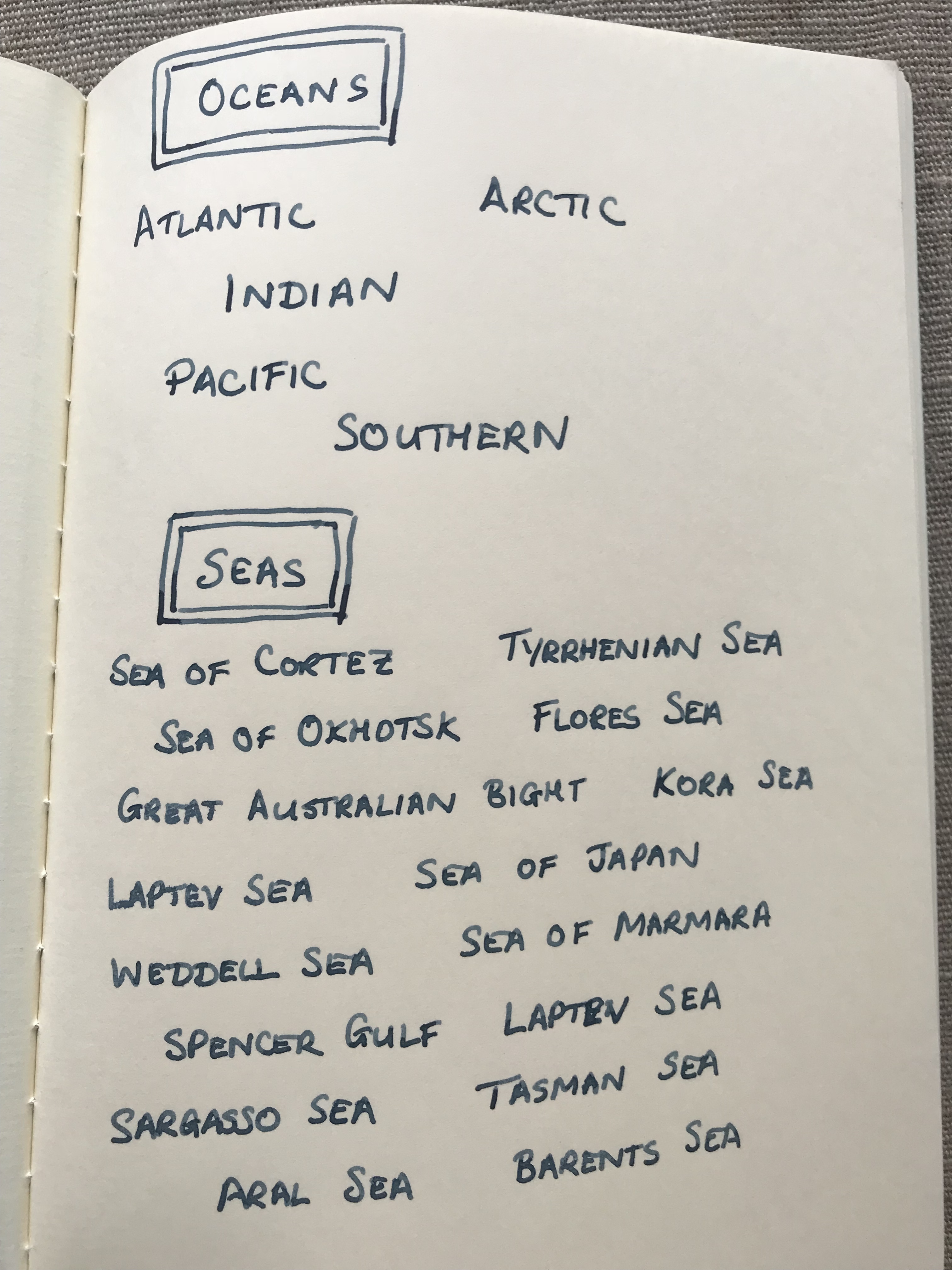
TWSBI Precision and Diamine ASA Blue

Are you sitting comfortably?

While I was looking for write ups about this ink, I found an old thread on FPN where someone had mixed ASA Blue with Sapphire Blue in equal parts with interesting results.

So, I thought, how hard can it be and what’s the worst that can happen?  The answers are: ‘easy’ and ‘nothing untoward’.  No explosions, fires or gunky messes.  Instead, you get a really nice blue ink for your troubles.

Text from Under Milk Wood

Truly beginning at the beginning

Ink splats showing sheen

There’s sheen there if you look for it

What happens when you mix ASA Blue and Sapphire Blue

…something about a glass and a half?

Not an original idea and I can’t guarantee that I haven’t just made another ink from the Diamine range.  Either way, it was a bit of fun to try.  What I didn’t realise was that I was also demonstrating the pervasive and subliminal power of advertising.  It wasn’t until a couple of days after I’d done it that I realised why the image above looked kind of familiar.  Any resemblance to the logos and advertising imagery of a major UK chocolate manufacturer are entirely coincidental.  Honest.  No, really.

One thing that I do take issue with is the name.  The creator of this mix named it Asphire.  I see the logic and it gets a cheap laugh (or was that just me) but I can’t say I’m entirely impressed with the result.  I came up with was Wild Blue Yonder, but I’m open to suggestions.

Any thoughts?

Ink review – Sailor Jentle Oku-yama

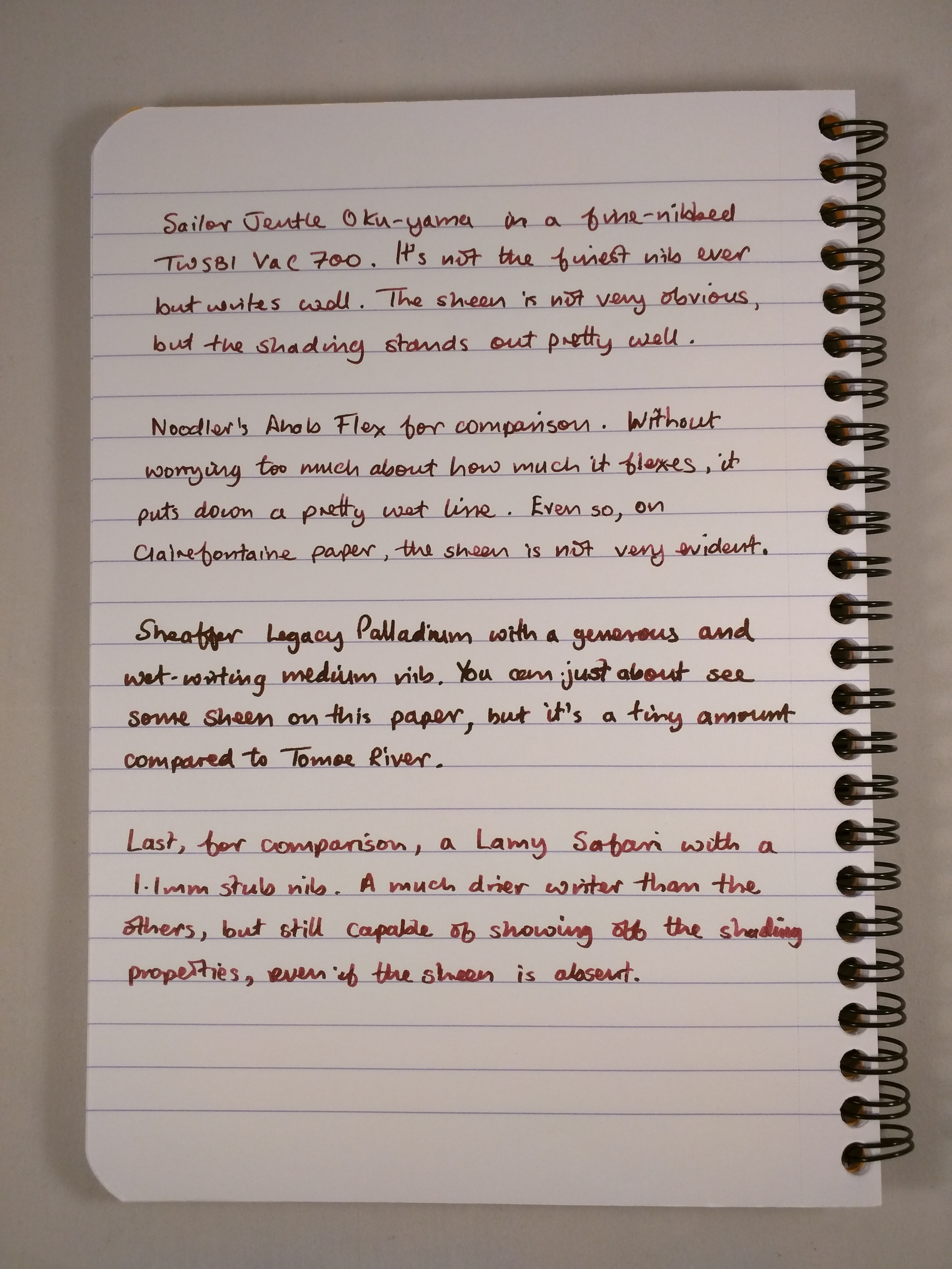
Oku-yama, Vac700 and Clairefontaine notebook

One of those times when pen, ink and notebook come together brilliantly

Sailor Jentle Oku-yama is part of the Four Seasons range of inks.  I believe that it was originally introduced as a limited edition ink, but is now a fixture in the range.  Oku-yama apparently translates as “remote mountain” or “deep mountain”, but that’s not much help in trying to figure out what colour it actually is.  Reading other reviews suggests maroon, pomegranate or cranberry.  Garnet is another possible descriptor.  Take your pick.

Despite all the rave reviews, my first instinct was that this is not the sort of ink colour that I go for.  Blues, greys and the occasional green are much more my normal hunting ground.  I decided to buy a sample to see how I got on, and as you can see from the first photo, I liked it enough to buy a whole bottle.  However you choose to describe it, this ink is striking and a really interesting colour.

I bought my bottle for £16.20 from the nice people at The Writing Desk, but it’s fairly  widely available in the UK.  In the US, Jet Pens will sell you a bottle for $14.25, Anderson Pens for $18.  Wonderpens in Canada also have it listed at Can$24.75.  This is definitely not a budget ink, but it’s still way cheaper than inks like Caran d’Ache, Graf von Faber Castell and Pilot Iroshizuku.

As with other Four Seasons inks, Oku-yama comes in a round and fairly squat 50ml bottle.  The bottle contains an insert that is meant to make filling your pen easier.  With the bottle capped, turn it upside down to fill this internal reservoir.  Turn the bottle the right way up, uncap it and fill your pen.  With larger nibbed pens, filling may be tricky depending on how far you need to insert the pen.  Some people seem to find this insert infuriating to use, but so far I haven’t found it too much of a chore.
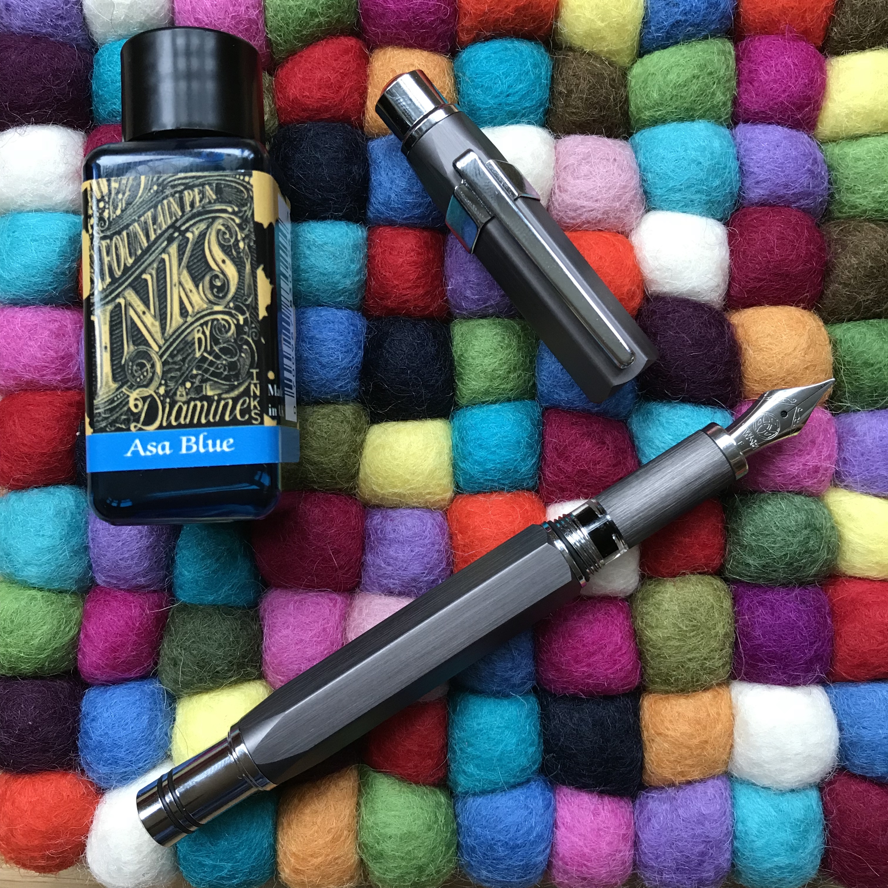
What’s it like?

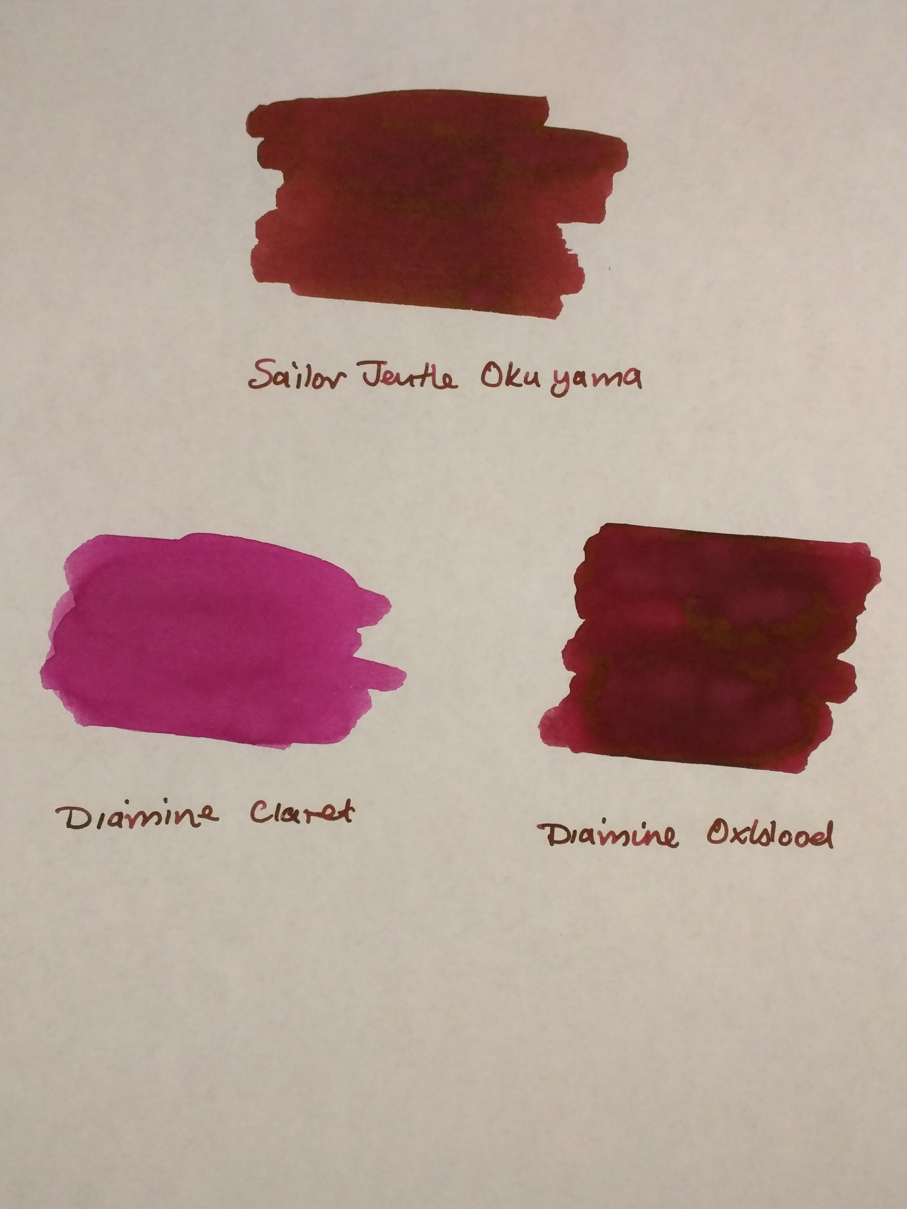
Oku-yama is pretty well saturated, although it does get a bit darker with multiple passes when swabbing it.  As I’ve already said, inks of this colour are off my normal radar, so I don’t have a huge back catalogue to compare it with.  Some internet research throws up names like Diamine Syrah, Montblanc Bordeaux and Pilot Iroshizuku Yama-budo as being close.  The only inks I have that come remotely close are from a mixed pack of Diamine cartridges.

As you can see, Diamine Claret is nothing like it.  Oxblood is not dissimilar but Oku-yama has more of a red tint to it.

IMG_20170526_220202

Oku-yama alongside Diamine Claret and Oxblood on Tomoe River paper

A bit of kitchen chromatography throws up an interesting mix of colours as you might expect for an ink like this.

IMG_20170526_220222

Oku-yama in action

I’ve tried this ink out in a Sheaffer Legacy Heritage (medium), a Noodler’s Ahab Flex (fine medium), a TWSBI Vac700 (fine and broad) and a Lamy Safari (1.1mm stub).  As I found with the Vac700, it’s a great ink for a demonstrator pen – the sort of colour you’d want to see and not hide away.

In terms of papers, I’ve used Oku-yama on Tomoe River, Clairefontaine, Life Noble, Rhodia and TWSBI paper.  One observation is that I think it looks better on cream-coloured papers compared to the white of Rhodia and standard-issue Clairefontaine.

It’s most definitely not waterproof, but it doesn’t make itself out to be so.  Dry times are reasonable – a little over 20 seconds on Clairefontaine paper with a broad nib in my Vac700.  Expect it to be longer on something like Tomoe River and allow for quicker drying times with a finer nib/dryer pen.  My non-scientific assessment is that I’ve used it quite extensively for journaling in an A5 notebook and not had any issues with the ink not being dry when it’s time to turn the page.

I’d describe Oku-yama as a “wet” ink, so although it performed well on these papers it won’t come as a surprise to learn that there was some show-through.  There was no bleed-through at all.  In fact the only real surprise was some feathering on Life Noble paper with the Sheaffer.  It’s the first time I’ve experienced feathering on this paper, but the Sheaffer bears more than a passing resemblance to a fire hose in terms of the amount of ink it puts down, so I can forgive that.

IMG_20170526_220506

Feathering on Life Noble paper

Aside from the gorgeous colour, Oku-yama has a reputation for two things – shading and sheen.  I found that it will shade without any need for encouragement.  Even with a relatively dry-writing pen like the Safari, I couldn’t have stopped this ink from shading if I’d wanted to.  Similarly, I found that Oku-yama shaded on all the papers I tried it on.IMG_20170526_220257

IMG_20170526_220452


Oku-yama on Clairefontaine (top) and Life Noble (bottom) paper

The Sheen, What About The Sheen?

As with a number of other Sailor inks, Oku-yama will produce sheen.  In this case it’s a green/gold sheen.  It will come as absolutely no surprise that the easiest paper to see sheen on is Tomoe River.

IMG_20170520_173402

Oku-yama ink splat on Tomoe River paper

It’s there, even with normal writing – you really don’t have to try very hard at all.  My photos don’t show it very well, so you’ll have to take my word for it.

IMG_20170526_215919

Sheen on Tomoe River paper

I also managed to get some sheen on Life Noble and TWSBI papers, but there’s clearly something in the surface finish of Rhodia and Clairefontaine papers that kills it off.

Summary

At the outset, I didn’t know what to expect from Sailor’s Oku-yama or what I would make of it.  In the end I kind of fell for it.  It’s not really a colour for work use, but it’s both cheery and complex and a joy to write with in most other situations.  I’ve used it quite a bit for journal keeping and I haven’t found it to be overpowering when used page after page.

As a measure of how much I like it, I’ve written the Sheaffer dry and am probably down to a fifth of a tank in the Vac700, which has a huge ink capacity.  I’ll certainly refill the Vac700 with it when it runs dry.

This one’s a keeper!

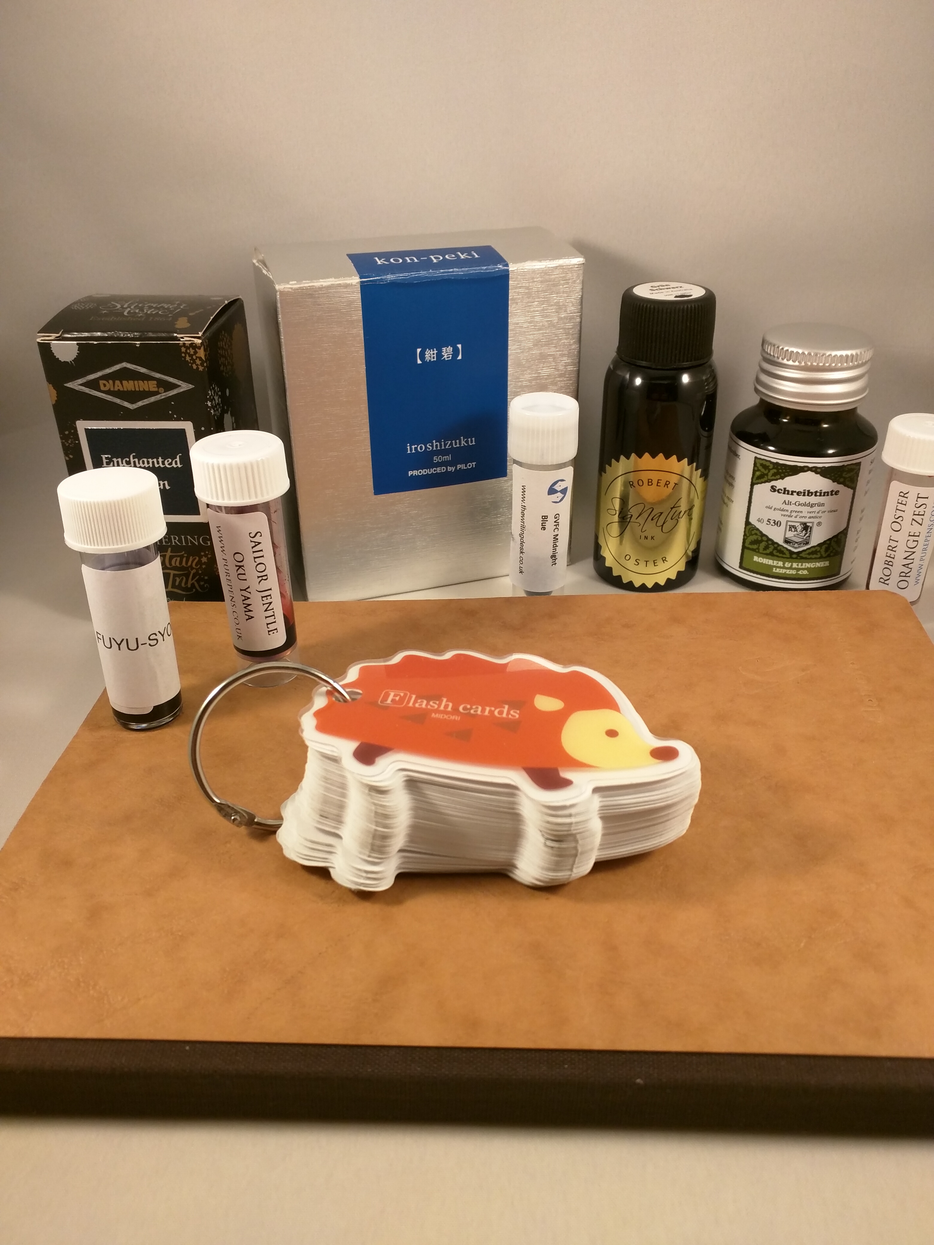
The Hedgehog of Wisdom – using Midori Flash Cards to index inks

IMG_20170507_222334

“The fox knows many things, but the hedgehog knows one big thing.”  (Archilochus)

…hedgehogs aren’t simpletons; they have a piercing insight that allows them to see through complexity and discern underlying patterns. Hedgehogs see what is essential, and ignore the rest.”  (Jim Collins)

At the start of 2017 I resolved to expand the range of inks in my possession and I’m happy to say it’s a resolution I’ve managed to keep to, buying both bottles and samples to test different makes and colours.  This creates its own problems: i) where to keep the ink; and ii) how to keep track of what I’ve got.  I haven’t really solved the first one, but I’ve made a start on the second.  Enter the Hedgehog…

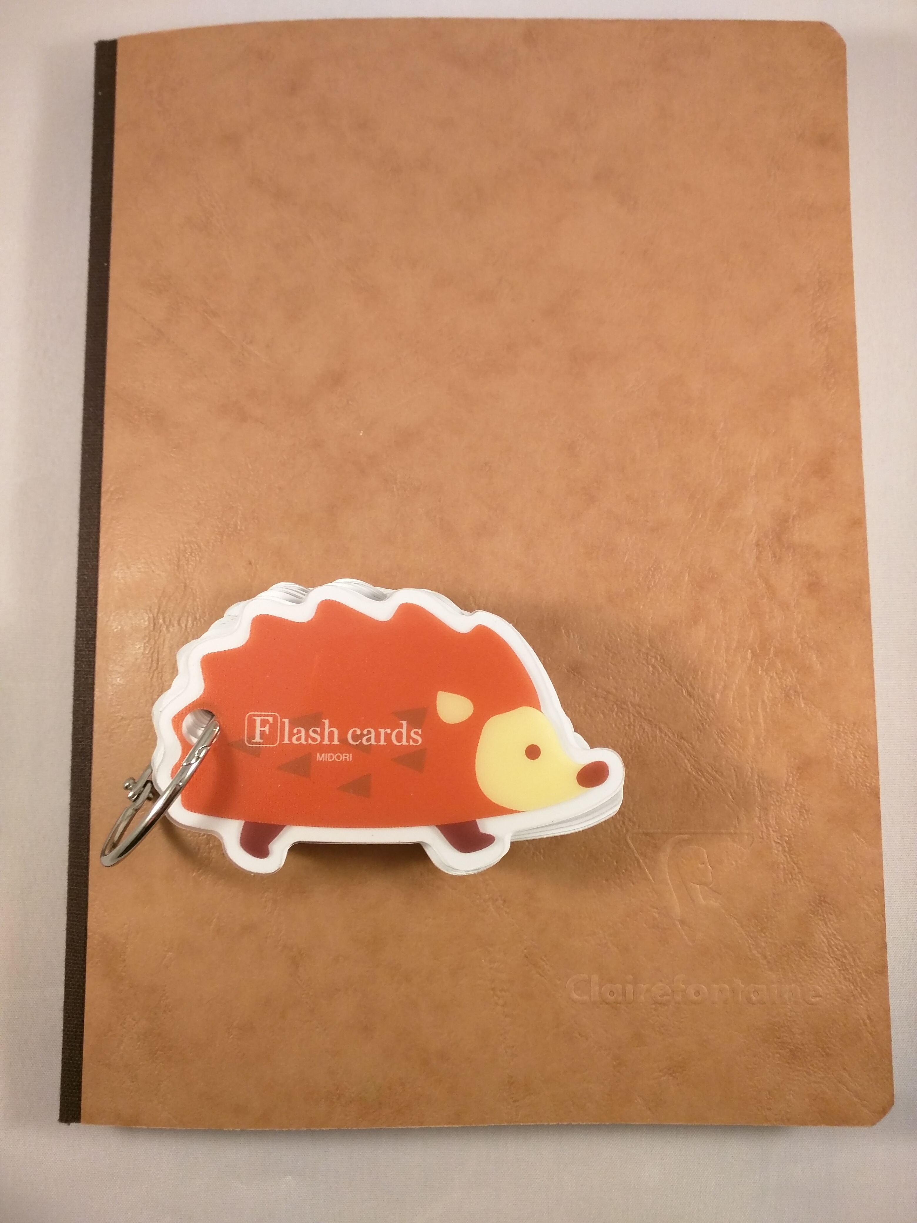
Like many people, when I first discovered the Midori Traveler’s Notebook I also stumbled on the vast array of stationery items that Midori also produces.  They all seemed like a good idea at the time I bought them, but have mostly sat around my desk looking for a purpose in life.  And so it was with a set of flash cards in the shape of a hedgehog.  Nice enough to look at, but what on earth was I going to do with them?

IMG_20170507_222436

The Hedgehog of Wisdom

Cataloguing inks

With the number of inks I owned growing fast, I realised I needed to do something to keep a handle on what I had.  My first attempt to catalogue my inks was with a Clairefontaine Age Bag notebook.  Great idea I thought.  Lots of high quality pure-white pages.  What’s not to like?  Well, a couple of things actually…

Sure the paper is good, but I really, really hate the way this book is put together.  To say it’s not a lay-flat binding is an understatement.  Call me squeamish, but I can’t quite bring myself to inflict the level of physical violence on a poor, defenceless book that is necessary to make it stay open at the page I’m interested in.  Also, and presumably to save cost, the faux aged card covers are stuck on top of the spine tape, rather than integral to the binding.

The flaw in the plan with notebooks

There also some practical problems on the horizon.  However you group inks and categorise them, if you use a book you are almost guaranteed to want to compare two inks that are on different pages.  Short of tearing out pages, you’re going to struggle to make all the side-by-side comparisons you’ll want.  Also, unless you’re brilliant at predicting how many inks of each colour you’re going to end up with, allowing enough space for each in (say) the blue section is going to be tricky.

IMG_20170507_222541

You can get a lot on a page in a notebook, but the format is not very flexible

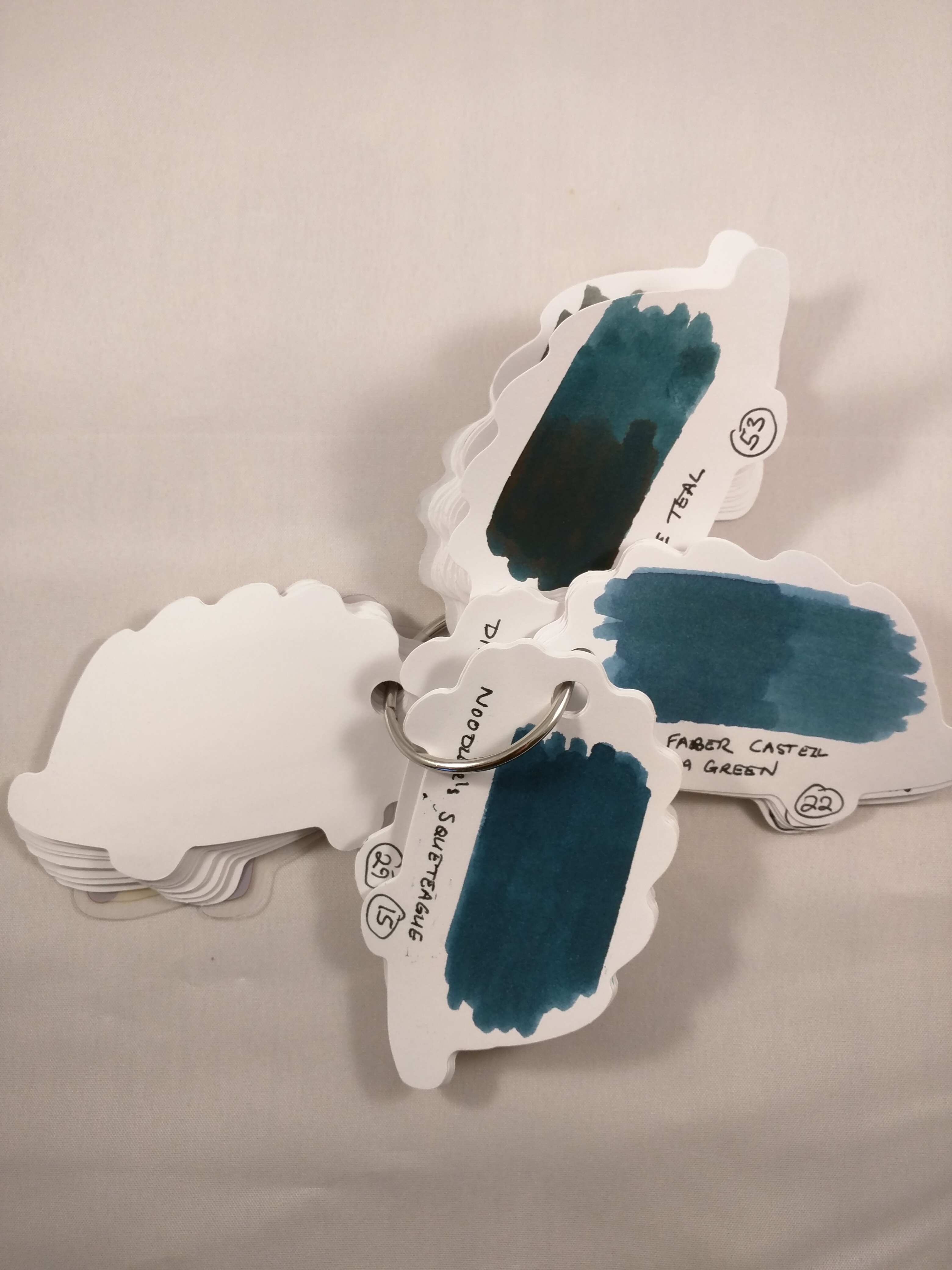
Here’s where the Hedgehog comes in.  It’s a stack of 80 flash cards, held together by a metal ring.  The ring can be opened to add, remove, move cards, but you can just add a swatch for each new ink without worrying about any particular sequence.

I’ve taken to numbering each swatch and keeping a list of which ink the number corresponds to.  I also try to “double up” on half of the swatch (i.e. two passes of the cotton bud) as a means of getting an idea about saturation and also to help spot things like sheen.

IMG_20170507_223055

Until I put this together, I’d never noticed the sheen that comes with Diamine Teal (if you apply enough of it!)

I like to compare how one ink looks against another.  It helps me figure out what to make of a new ink, if I can look at it alongside one that I already know.  The real utility of the Hedgehog is the ability to pull out several colours and compare them…

IMG_20170507_223004

A set of flash cards will cost you around £3/$3.  As well as hedgehogs you can have ducks, cats, dogs, bears, strawberries (you get the picture).  I got mine from the Journal Shop, but Jet Pens and the Tokyo Pen Shop also sell them.  I haven’t managed to figure what weight the paper is, but it’s plenty heavy enough and there’s been no hint of feathering, show-through or bleed-through.

Hedgehogs are truly wise creatures.

Out with the old…

As 2017 gets under way, I thought I would take a moment to look back at how 2016 ended and also to look forward to 2017

What Santa brought me

The festive period at Slightly Unnerved Towers saw me the happy recipient of  several pen-related gifts.

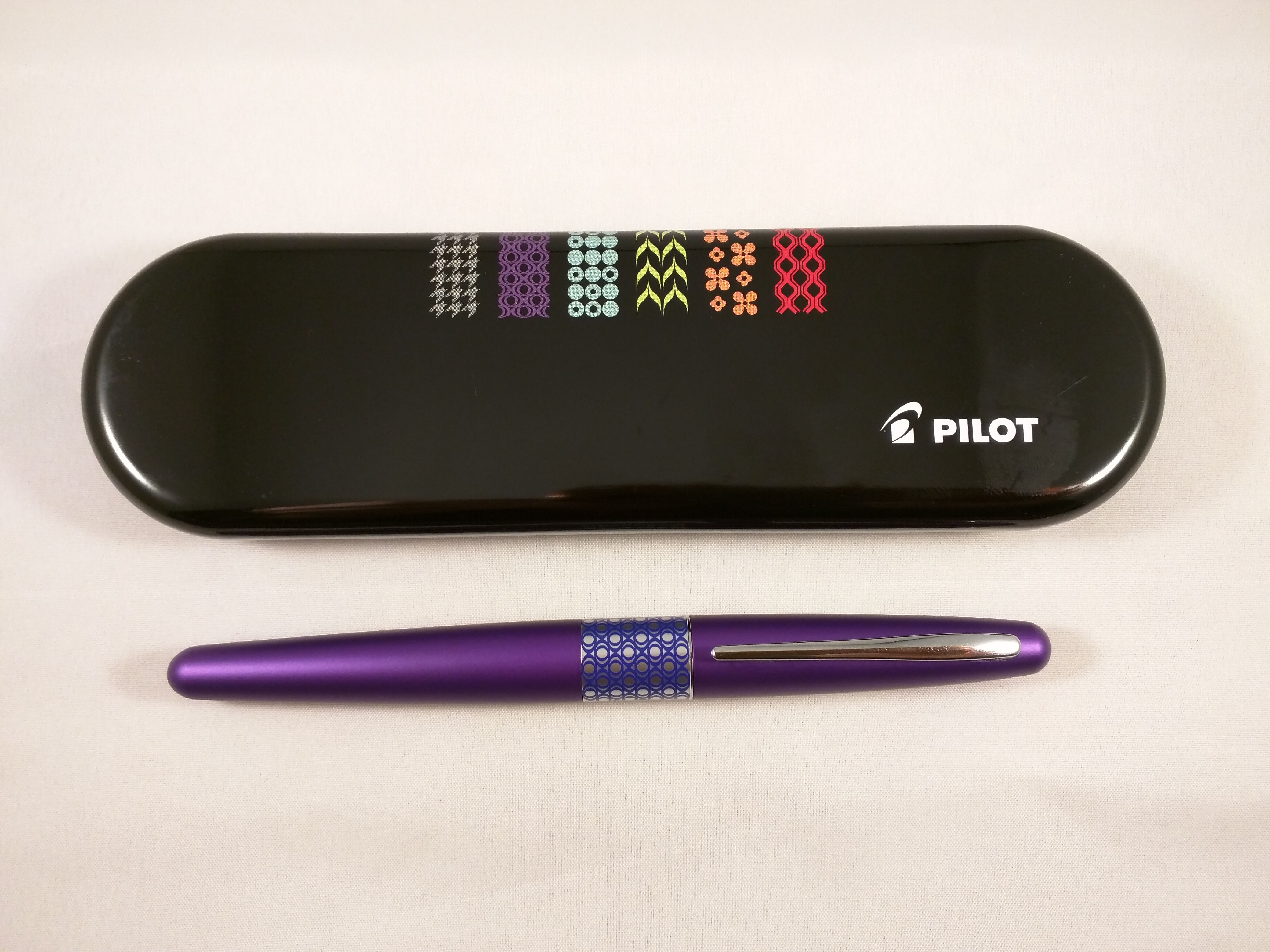
The Pilot MR/Metropolitan is an inexpensive, but very highly rated pen which has so far been missing from my collection.  In the sparkly spirit of Christmas I chose the suitably unsubtle Retro Pop in Ellipse Violet.  I don’t yet have a converter for it, so it’s currently running on a cartridge.  Early scribblings seem very promising.

img_20170103_063012

Pilot MR Retro Pop

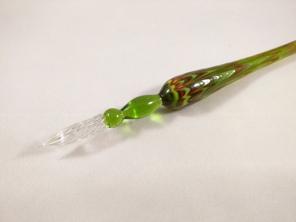
I’m not really a fan of calligraphy, but I was intrigued by J Herbin’s glass dip pens.  They are certainly striking and I thought might be useful as a way of trying out new inks.

img_20170103_063108

img_20170103_063122

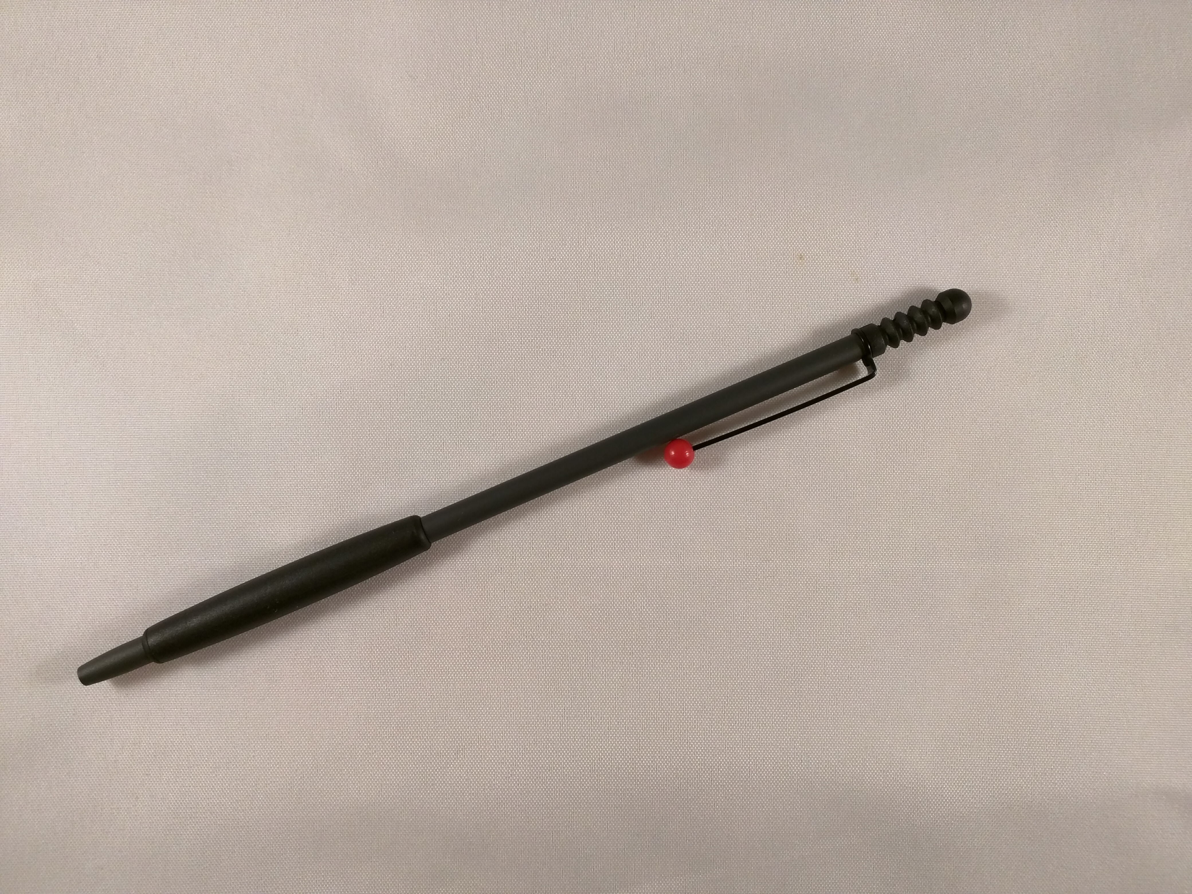
This is the joker in the pack – a ballpoint pen!  Ballpoints are probably my least favourite kind of pen, but I like the minimalist style of this Tombow Zoom.  I knew it was a slim pen, but I was still taken aback when I opened the box.  It’s positively skeletal, but writes surprisingly well.

img_20170103_063242

Tombow Zoom 707

New pens can look a bit lonely without some ink to keep them company.  Luckily Santa had that covered as well with some goodies from the Diamine stable.  First up is one of their shimmering inks – Enchanted Ocean.  I’m not sure when or where I’ll use this ink, but I was intrigued by the concept and it’s substantially cheaper than the J Herbin alternatives.  I have one of those crazy Sailor Fudé pens with the 55° angled nib and I might team the two up and see what happens.  After all, what’s the worst that can happen?

img_20170103_062823

Diamine shimmering ink

At a more down to earth level, I also received three bottles of Diamine ink – Graphite, Twilight and Prussian Blue.  Diamine have revamped the desing of their labels and I think I like them.  The swabs look interesting but so far the only one I’ve tried in anger is Twilight.  First impressions are good so far…

img_20170103_062744

Diamine inks with the new label design

Looking ahead

That was how 2016 ended, what about 2017?

My pen buying has been rather scattergun to date.  If I see something I like, I tend to go ahead and buy it.  This has netted me some great pens, but the focus has been at the more budget end of the market.  Nothing wrong with that in itself, but I have designs on some more expensive pens and need to stop blowing my budget and save up.

Pens that I have my eye on include:

  • Platinum #3776 – although this more or less hits 3 figures in GB£, it still has a reputation for being good value for money in terms of nib quality.  I’d like to find out first hand…
  • Pilot Custom Heritage 912 – I bought a Custom Heritage 91 with a soft fine nib from Japan last year (it’s not available in the UK) and was impressed.  The 912 is intriguing because of the selection of nibs available.  I had originally thought about the PO nib, but from what I understand this is even finer than the soft fine, so is probably a step too far for me (although I do love the shape of it).  I might be tempted by the Waverly nib instead. This has an upward curve reminiscent of Sheaffer nibs, and although being more or less a medium nib, this is Pilot’s version of ‘medium’, so nearer to a western ‘fine’.  This will have to be another order from Japan.
  • A Pelikan of some description.  Such a venerable and respected pen manufacturer, but one I know little about.  Do I buy vintage?  Do I buy new?  I need to think a bit more about this one but it’s definitely on the list, just rather fuzzy.
  • Pilot Vanishing Point – a pen that no-one seems to have a bad word to say about, but one I haven’t quite got my head around.  This is one that I think I’ll need to try in a real shop in order to figure out whether the design works for me or not.
  • Sailor – a bit like Pelikan, this is more a feeling that I should own one at some point, rather than desire to have a specific model.  That said, the Professional Gear range looks good and might the right place to start for me.
  • Sheaffer – I have a bit of a hankering for a vintage Sheaffer of some description.  The design of some of the nibs is really appealing, but I need to do some research first as there is a huge back catalogue to choose from.

Most of these will have to be long term projects as a result of cost, but it’s nice to have something to aspire to.  One brand I don’t feel particularly drawn towards is Montblanc.  I don’t know where my prejudice comes from, but somehow it doesn’t feel like a pen for me (even though I own a dog-eared Montblanc 24).  Maybe one day I’ll see the light, but for now I have plenty of other things to focus on.

Inks

My thoughts on inks are less well-defined than those on pens.  I suspect my Diamine collection will continue to expand.  After all, the pricing of their 30ml bottles makes them hard to resist.

Among my favoured brands I’d like bottles of Iroshizuku Shin-kai and Fuyu Syogun.  I’ve tried samples of both and really like them.  They are premium inks at premium prices, but I have enough of these already to have confidence that they will be worth the investment.

More of a resolution than a plan – I should expand my inky horizons and try some other brands.  Sailor and Graf von Faber Castell are among those that look interesting.  Some other brands are hard to come by in the UK, so maybe I should look further afield.  Also I wish more UK retailers would sell samples or expand the ranges that they offer as samples.  If you’re going to commit £30 to a bottle of ink, you generally want to have an idea that you like the colour and know how it will perform with the pens and papers that you use.

Notebooks and paper

I have a whole shelf filled with unused notebooks – everything from Field Notes, through Clairefontaine and Leuchtturm to Fabriano, Mnemosyne, Nuuna, Life and Nanami Seven Seas.  Maybe I should stop being so reverential and actually get on and use some of these…

I plan to continue tinkering with making my own notebooks.  Each time I make one I see ways to improve the design and also my technique.

Just one or two things to keep me busy in 2017…