P-p-p-pick up a Prefounte? A look at one of Platinum’s budget fountain pens

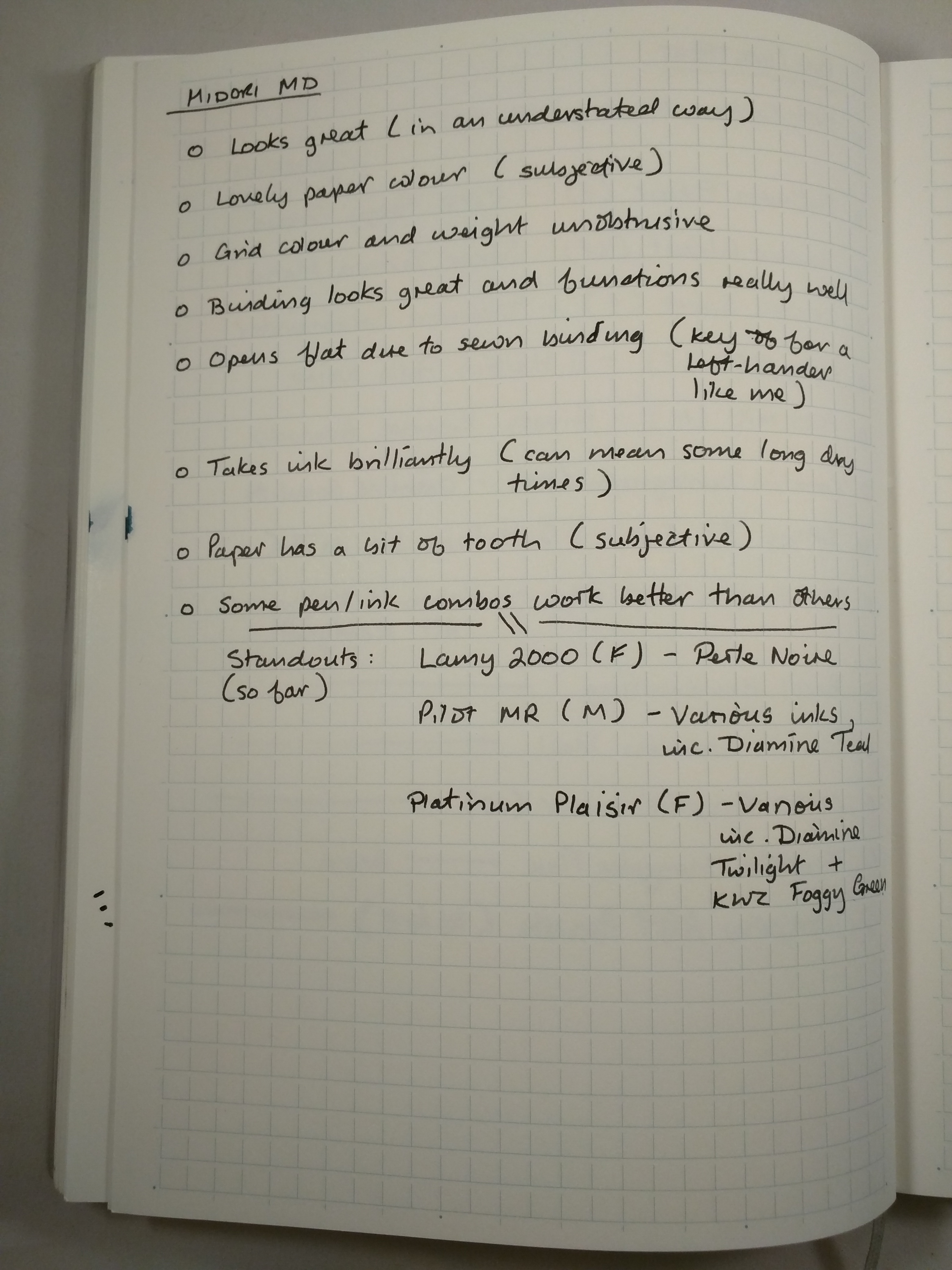
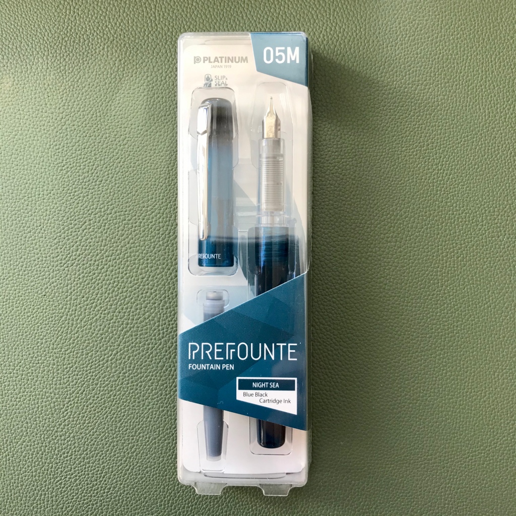
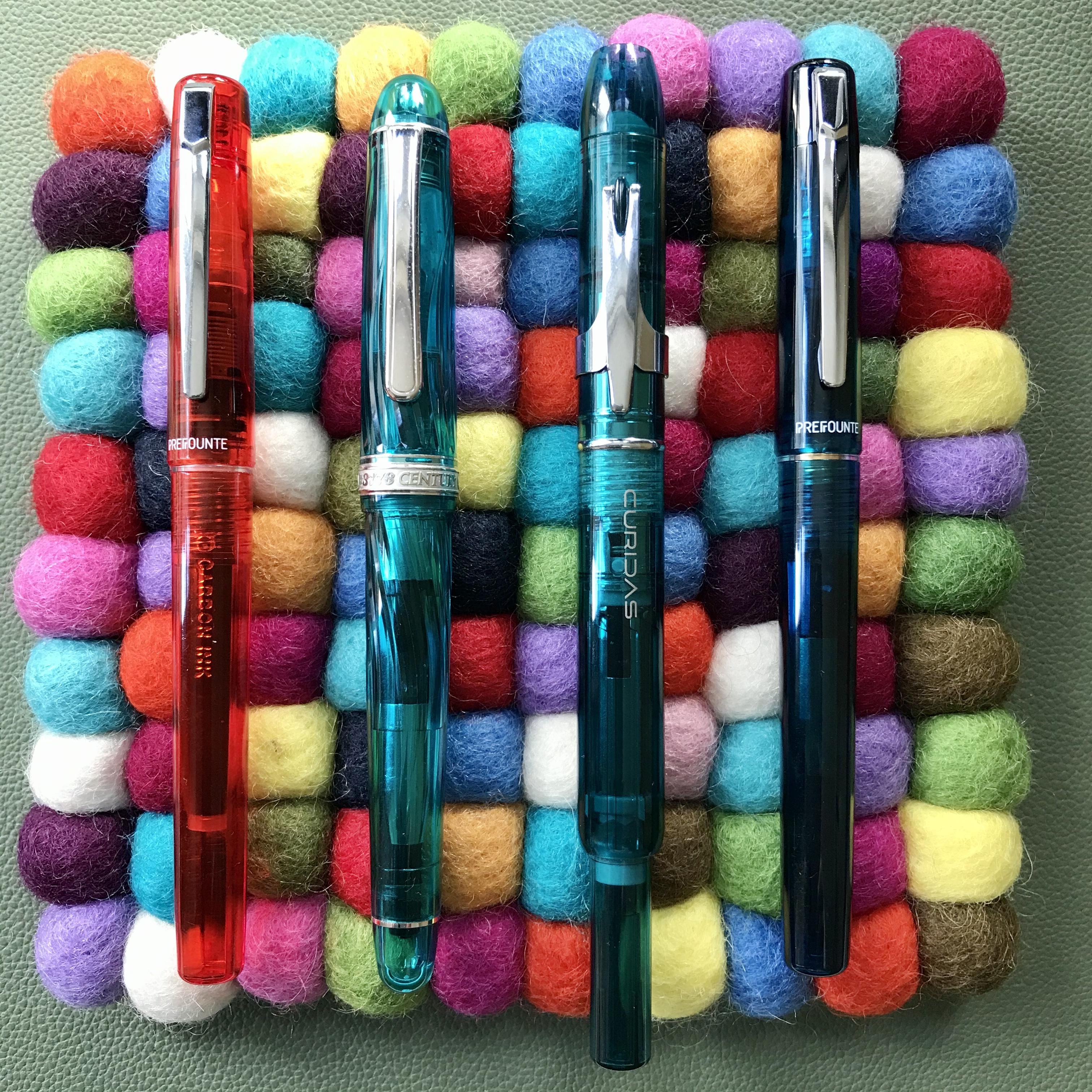
I stumbled on the Platinum Prefounte as I was browsing Cult Pens’ website a couple of months ago. I’ve previously enjoyed the Plaisir from the more budget-friendly end of Platinum’s line-up and for under £10 (£8.99 to be precise) I thought I’d see how the Prefounte fared. In fact, I bought two – a fine in ‘Vermillion Orange‘ and a medium in ‘Night Sea‘.

In terms of presentation, the Prefounte comes in some fairly simple plastic and card packaging. It’s inoffesnive and appropriate for the price of the pen, but doesn’t really have a second use and mine went straight into the recycling once I’d unpacked the pen.

Prefounte packaging
The Prefounte comes in plain, simple packaging
Two of the Prefounte colour options – Vermillion Orange and Night Sea

Quick on the uptake as ever, I also realised that (with the exception of the very different Curidas), all of Platinum’s readily available steel-nibbed pens have names starting with a ‘P’ – even the PGB-3000A ‘Cool’. Cool name? Definitely. Well…maybe…

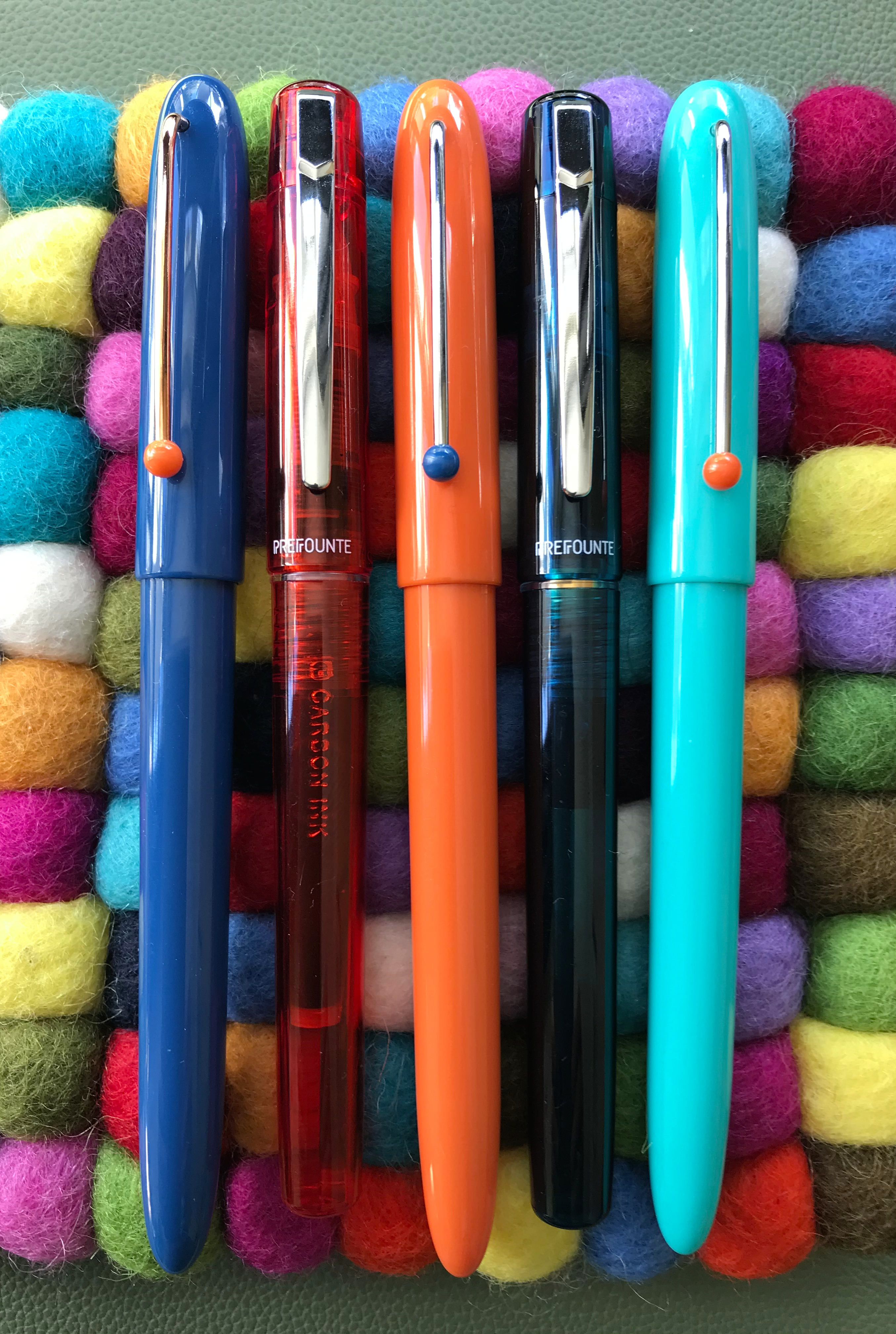
Anyway, back to the Prefounte. It’s a fairly slim and lightweight pen with a translucent cap and barrel, which makes it look more up-market than the Preppy and (arguably), not as smart as the Plaisir. Price-wise, between these two pens is exactly where the Prefounte sits – the Preppy is about half the price (around £4-5) and the Plaisir around 50% more expensive (around £13-15). As other reviewers have noted, whether there was a genuine gap in the line-up that needed filling is open to debate.

Of nibs and feeds

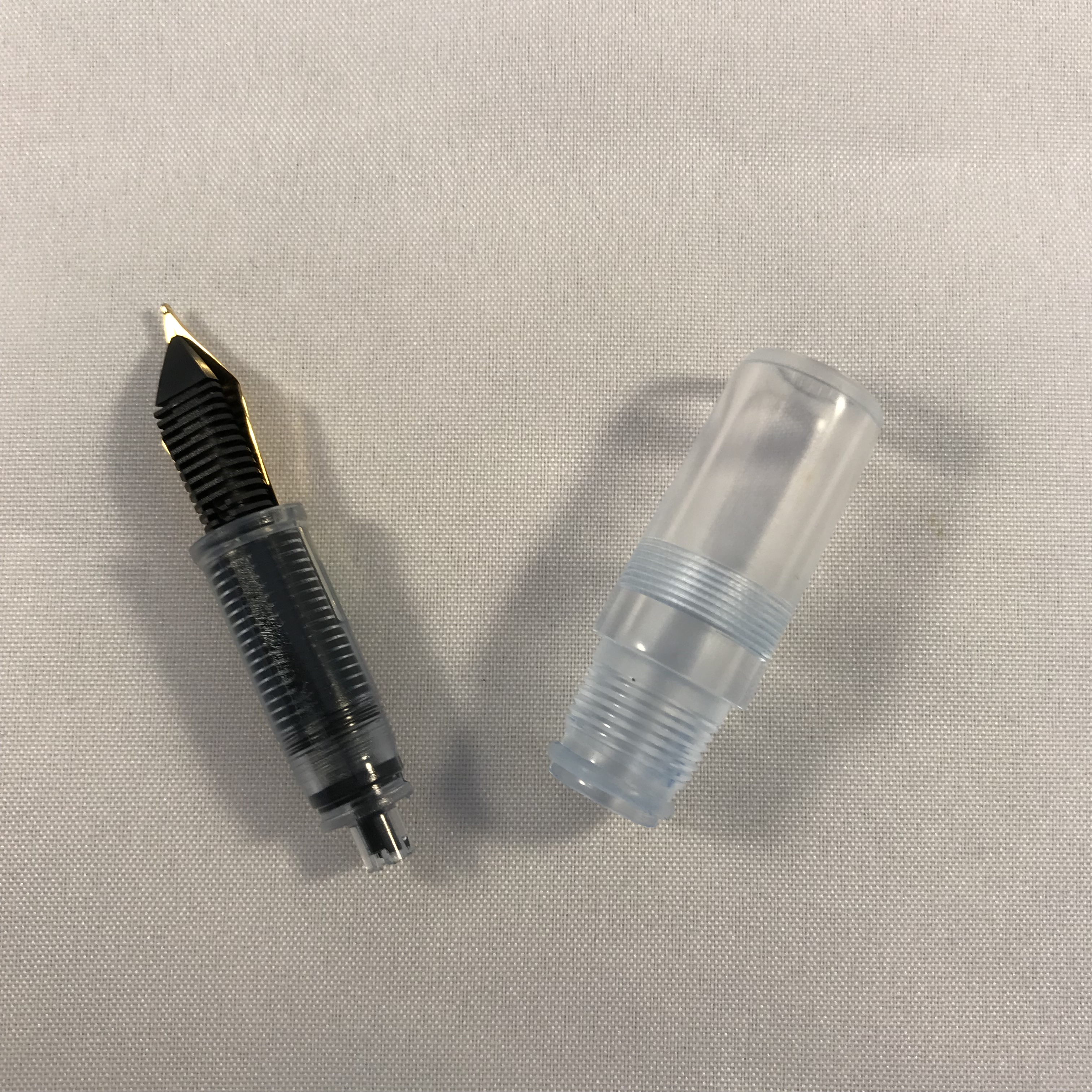
Keeping the Preppy and Plaisir in mind, all three pens share a common section, nib and feed, meaning that switching nibs is dead easy. I’ve always been intrigued by Platinum’s approach of incorporating the feed into the grip section. By making the section translucent as well, you can see the arrangement of fins within. This set-up makes the already small nib unit look more like it could be a replacement unit for a fibre-tip pen than a fountain pen, but in practice it all fits together nicely and works well.

Detail of Platinum's steel nib, feed and section
Platinum’s ubiquitous steel nib and feed/section

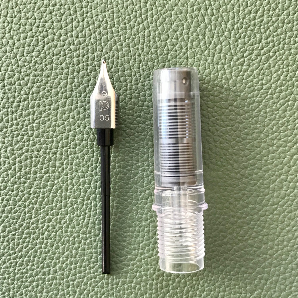
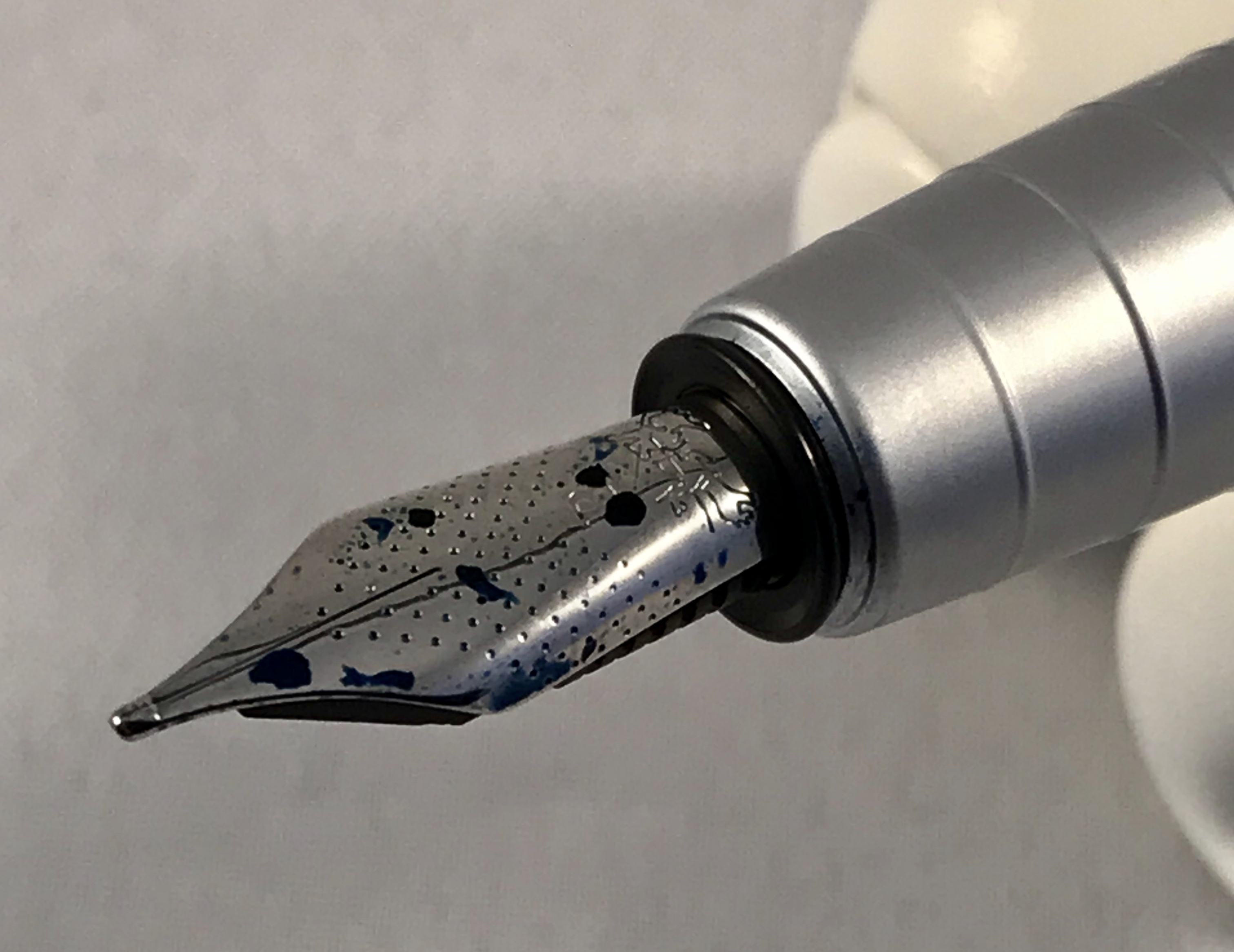
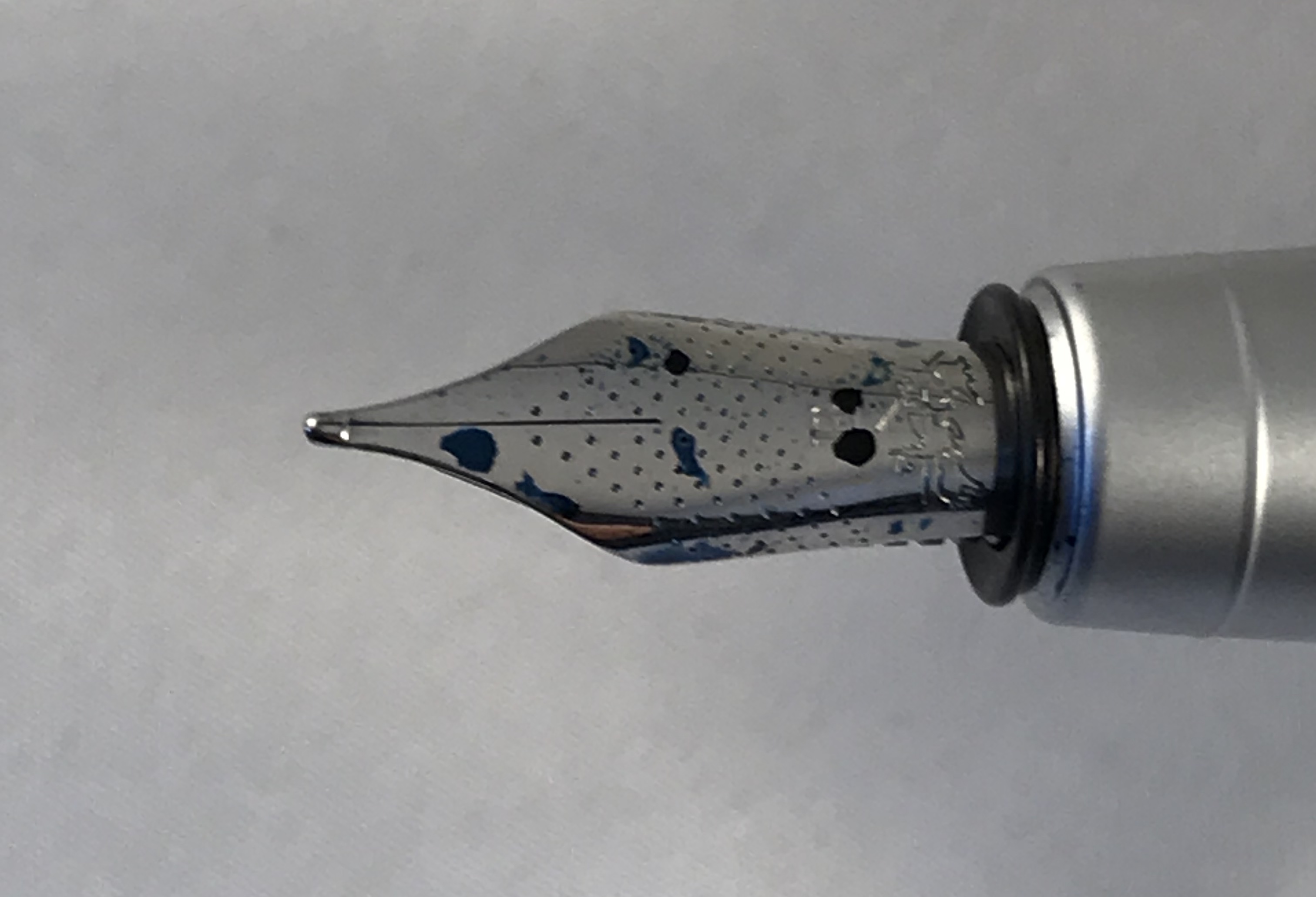
Staying on the subject of the nib, the business end of this pen is great. It may be small and plain to look at, but I think the simple approach works well here. The key question is ’how does it write?’ The answer to that is – ‘really well!’ I’ve had 5 of these nib units in various pens over the years and all have been excellent writers – very smooth with no scratchiness or hard starts. I did read some reports of problems with the Prefounte, but that doesn’t match my experience.

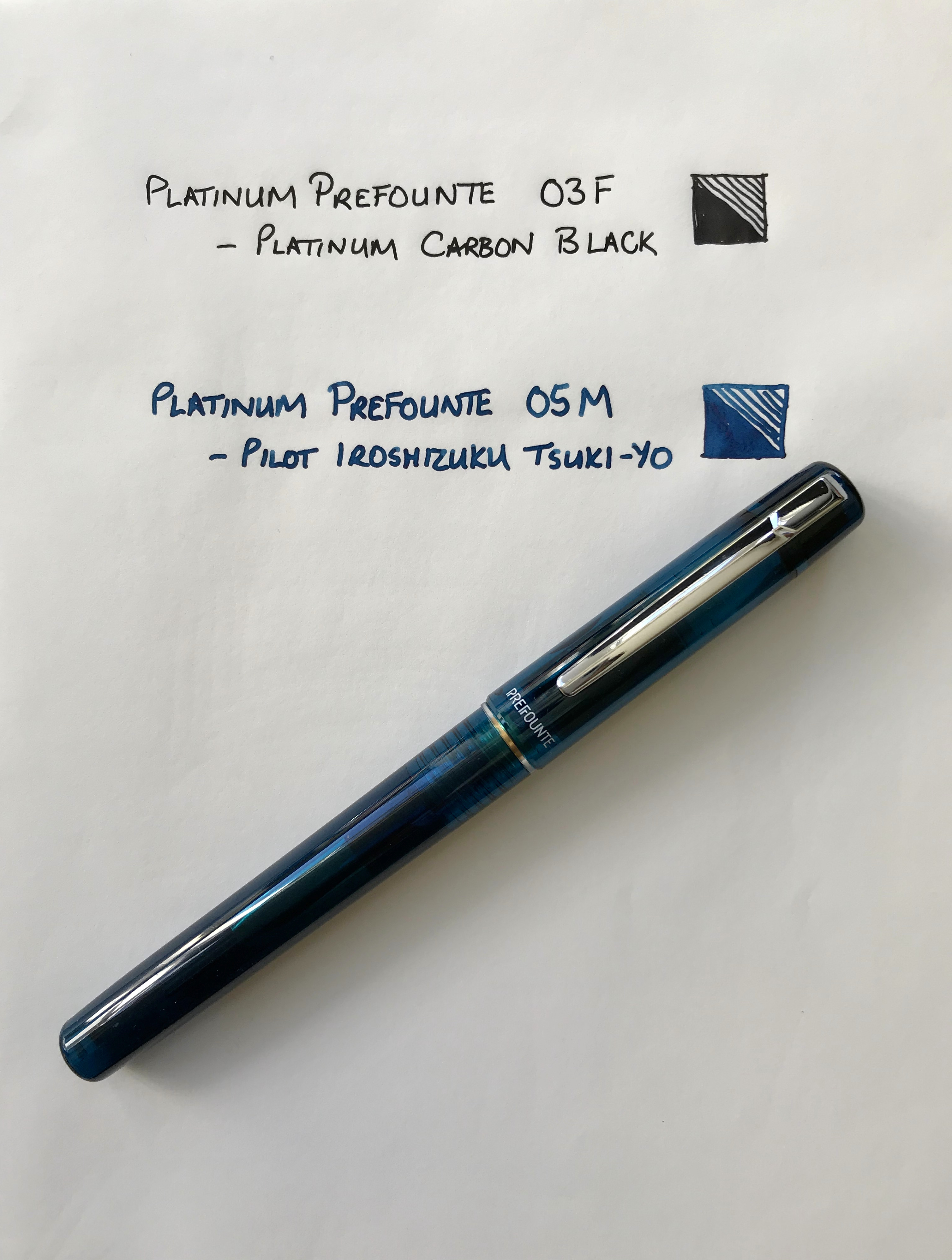
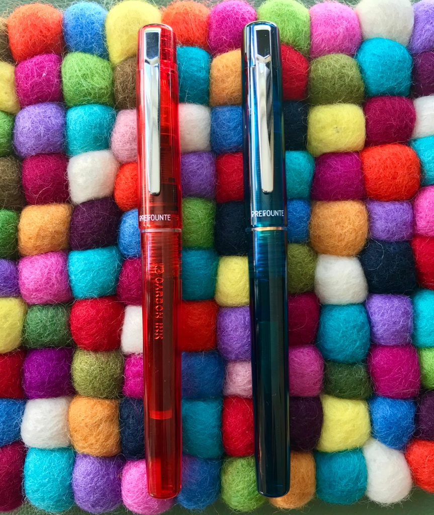
I’ve mentioned the translucent barrel and cap already, and I have to say I really like both the colours I picked. If neither of these appeal, you can also have Crimson, Dark Emerald or Graphite Blue.

The barrel is smoothly cylindrical, with a slight taper. The cap is a slip fit and snaps on and off crisply. The name ‘Prefounte’ is painted on just below the metal clip and the ‘opposite’ side of the cap tells you the nib width – 03F (or 05M) together with Platinum’s name and logo and the fact that the pen is made in Japan.

Being translucent means you can see the cartridge or converter in the barrel as well as the nib and feed in the section. You can also see the spring inner cap that makes up the ‘Slip and Seal’ mechanism. I like the fact that Platinum has extended this design right the way down its range of pens – even the Preppy has it. Platinum claim that you can leave a pen inked for a year and it won’t dry out. I haven’t fully tested this claim, but it certainly holds true for several months.

Filling options

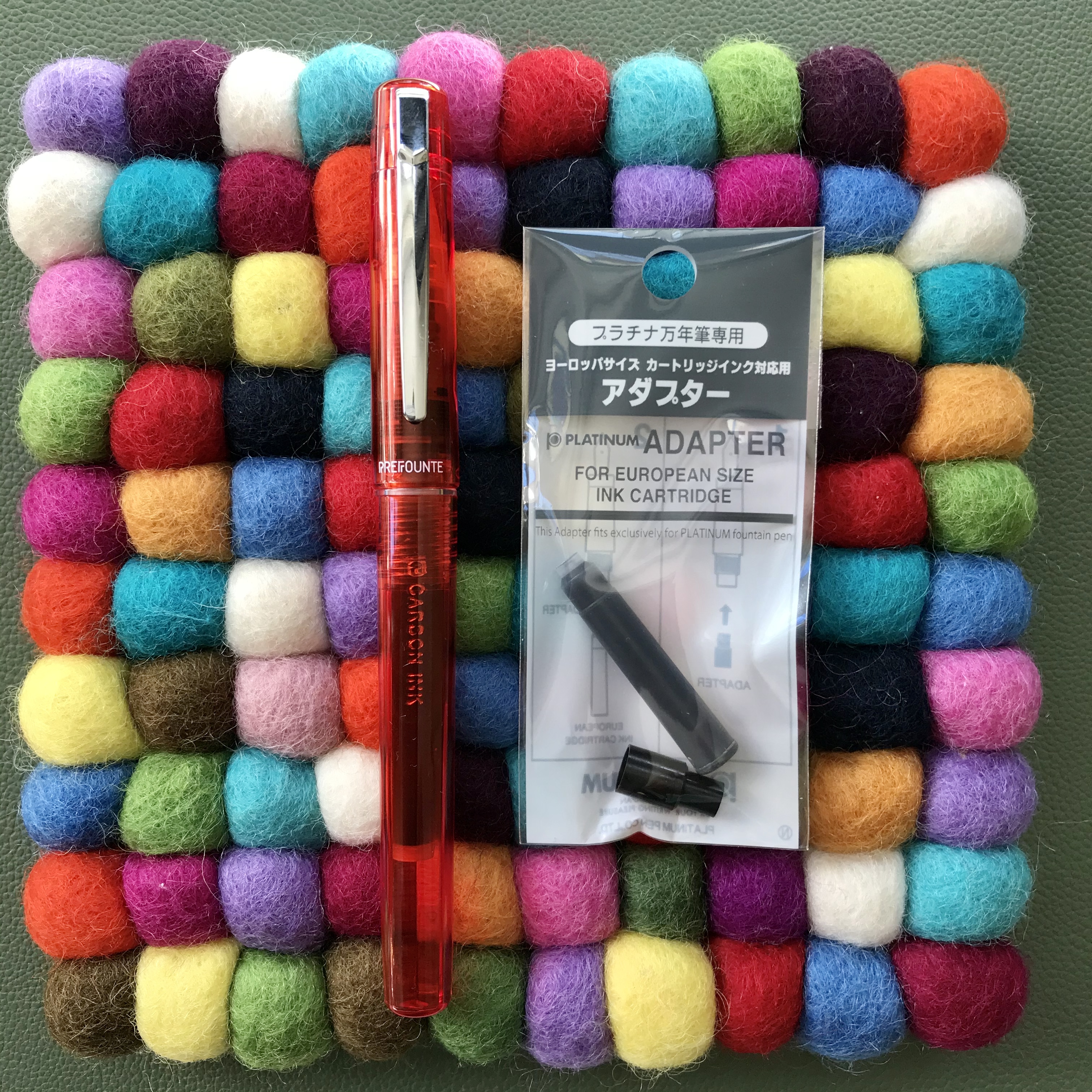
The Prefounte comes supplied with a Platinum ink cartridge, because as with many Japanese pen brands, Platinum uses a proprietary fitting. This means you’re (mostly) restricted to using their own cartridges which in the UK come in a very limited selection of colours.

If you want to extend your choice of ink, you could clean and refill an empty Platinum cartridge, but that has ‘faff’ written all over it. Another alternative is to use a Platinum converter, but unless you have a spare one lying around the price of buying a new one (£6-9) can be almost as much as the cost of the pen itself! A more economical solution is to consider Platinum’s adapter for international cartridges at around £1.50. These do what the name suggests and open up a much wider set of options in terms of ink brands and colours.

It pays to be adaptable

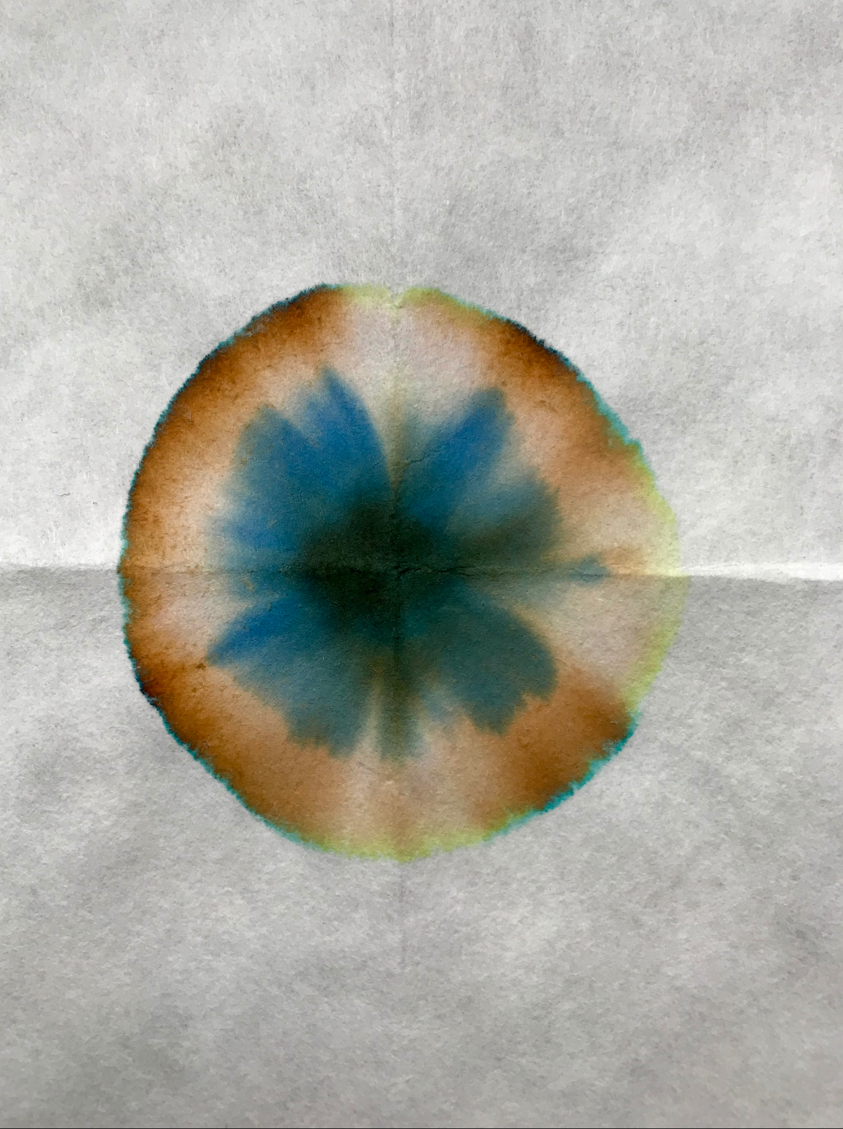
One of my preferences is to use less expensive Platinum pens like the Prefounte with Platinum’s Carbon Black ink cartridges. Carbon Black is a fantastic waterproof, pigment ink which I love but don’t use a huge amount. A pen like the Prefounte is a great choice here. The basic writing experience is great and worst case, if it does get clogged up because of the ink particles, it’s not going to be too traumatic a loss. So far that hasn’t happened because the Slip and Seal cap is great at preventing the pen from drying out and the ball bearing that’s used to seal the cartridges gets punched out when you fit the cartridge and helps keep the ink in the cartridge agitated.

What/who is the Prefounte for?

This was essentially the theme of some of the reviews that I read. Was it a necessary addition to Platinum’s range of pens? Who is the target market? I did wonder whether the Prefounte is considered to be a school pen. It’s not marketed as such, but maybe that’s its purpose? Within Platinum’s range you already have the Preppy if keeping costs down is your only consideration, or if you have a little more cash available you could have the Plaisir. If you really don’t want a metal pen like the Plaisir, I guess the Prefounte offers something more aesthetically pleasing than the Preppy and made with nicer materials.

Platinum Preppy, Prefounte and Plaisir
Where does the Prefounte fit into Platinum’s line-up? Right there…

The Prefounte is just about smart enough to be used in a work context and you could probably lend it to a friend or colleague and not worry if it got lost or damaged as it’s cheap to replace .

You probably wouldn’t lend some of these pens to a friend or a colleague!

In isolation, I find it really hard to dislike the Prefounte. There’s nothing intrinsically wrong with it. It’s a nice enough looking pen, without being distinctive and it feels good in the hand. Platinum have got the writing experience with their steel nibs completely sorted, so that’s not an issue. It’s only when you start to think of it alongside other pens that you start to think about why you might buy it. There’s certainly lots of competition at this end of the market.

I bought mine as a bit of an experiment to see what they were like. If you were in the market for your first fountain pen, you could definitely do worse than pick the Prefounte. At least if your usage is going to be low/infrequent you can be comfortably certain that your pen won’t dry out when not in use.

While the usual recommendations for a first fountain pen are the Lamy Safari or Kaweco Perkeo, these will cost you quite a bit more (in relative terms). It’s arguable that you are getting better design and materials for your money and a better selection of inks that can be used with those pens, so there are other factors to consider here besides price.

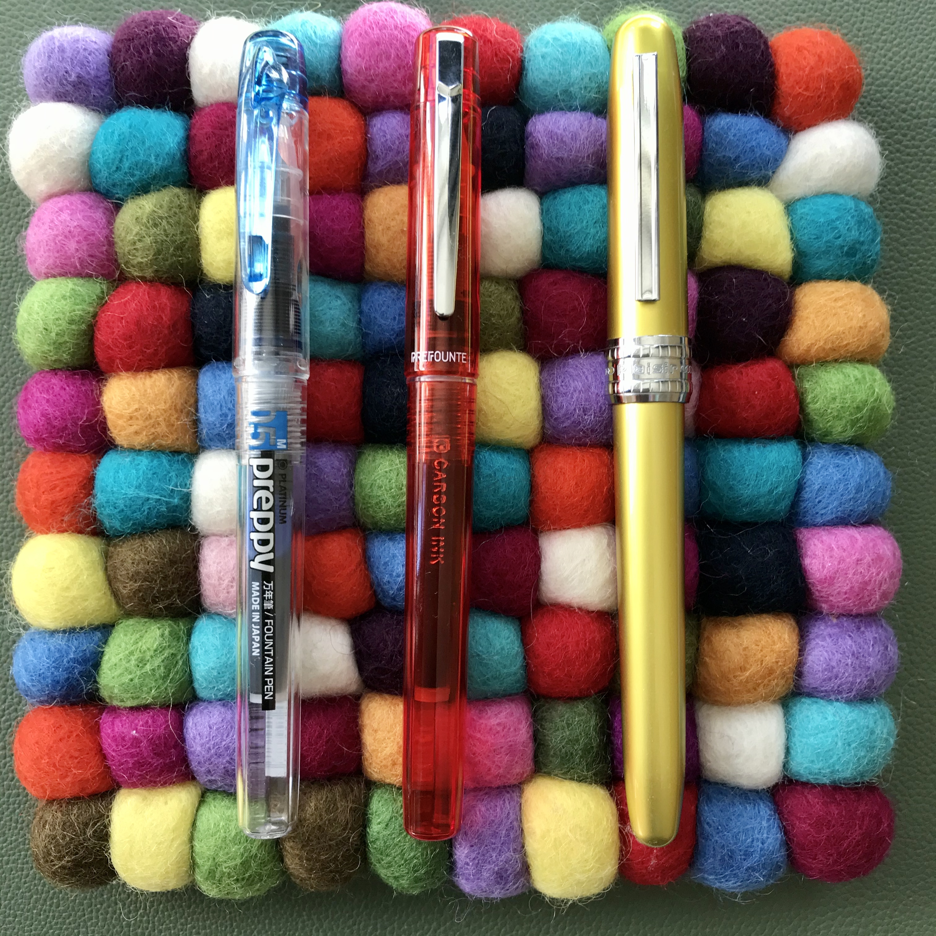
At almost the same price as for the Prefounte, you could have the Kaco Retro. Based on my experience, deciding between these two is a much more marginal call. Price-wise there’s hardly anything in it. Both are fun designs and remarkably competent performers for such cheap pens. The Retro comes in some fun colours and has a converter as standard, but there’s only one nib size. The Prefounte colour choices may be slightly less fun, but I really like them, plus the Prefounte has interchangeable nibs and Slip and Seal. Here I’d say it really comes down to which one you prefer the look of. Neither has let me down and I’d recommend either.

Platinum Prefounte and Kaco Retro side-by-side
Prefounte or Retro? Your choice.

I’ve always enjoyed writing with Platinum’s budget steel-nibbed pens, and the Prefounte has lived up admirably to those expectations. Whether it has enough going for it in the face of competition is a more tricky question to answer.

Ink Review – Diamine Pelham Blue

Oh no – it’s another blue ink!

One of the upsides to posting so sporadically is that it takes away some of the sense of needing to write about new products or little-known makers.   Pelham Blue is not a new ink and Diamine is definitely not a little-known maker.

Gratuitous pen shot

Gratuitous pen shot

Pelham Blue is one of the Gibson Guitar series of inks.  I believe these were originally a Germany-only exclusive, but they were subsequently made generally available and have become a routine fixture in Diamine’s product line-up.  That’s good news because it means that Pelham Blue is widely available and fits into Diamine’s regular pricing structure.

On to the ink itself.  I’ve struggled to categorise it within the pantheon of blue inks.  Pelham Blue is a bit of a chameleon, looking slightly different according to which pen and paper you use.  I’ve seen ‘blue-black’ inks that are lighter than Pelham Blue.  What I can say is that it’s definitely not out there with azure and sapphire blues and it’s definitely not turquoise.  Before writing this post I read some other reviews and was struck by the difference in appearance between my use of Pelham Blue and the review on the Pen Addict.  That said I had a look at some examples of Gibson guitars that were finished in Pelham Blue and the photos of these were hugely variable too,

Coloring swatches

Some Col-o-ring swatches

If you swatch Pelham Blue, you could convince yourself that there some green in there, but that doesn’t really come through in normal use – i.e. writing.  Cult Pens, who I bought the ink from describe it as a deep, rich blue.  I think that sums it up quite nicely.

Comparison ink swatches

It’s definitely a blue of some description

I don’t see it as my mission in life to categorise and catalogue inks.  The key things for me are: ‘Do I like the colour?’, and ‘Does it suit my pens and the way I write?’

The answer to both of these is a resounding ‘Yes’.

The key things for me are...

Do I like the colour? Yes!

I really like this colour.  Pelham Blue manages to achieve the balance of being dark enough for serious things like work, but lively enough to be pleasant to use rather than utilitarian.

I tend to use Japanese paper in most situations, and this brings out some wonderful shading.  I didn’t think there was any sheen to be had, even on Tomoe Rive paper.  Then I tried some ink splats and these duly showed up some red sheen, but only where a considerable amount of ink had pooled.

Ink splats - sheen

There’s some sheen there if you really look for it

In my experience you won’t see any sheen in regular use, even on papers that normally deliver on that front.  But that’s OK, it’s not promoted as an ink that sheens, and the shading is more than adequate compensation.

Pelham Blue in various pens

You have to love the consistency in nib widths

Pelham Blue works in pretty much any pen.  It’s free-flowing and what I would call a wet ink.  I like inks that are wet, so that probably endears it to me.  I’ve found it works well in  my Montblanc Heritage 1912 – to the extent that I can’t remember the last time I inked this pen with anything else.  As I was writing out this post, my Montblanc ran dry and I had absolutely no hesitation in just filling it up and carrying on.

One benefit of being a ‘regular’ Diamine ink is that Pelham Blue is relatively inexpensive.  I started with a 30ml bottle for £2.35 from Cult Pens, but got increasingly frustrated with trying to fill a piston filler from such a narrow bottle neck.  The only and obvious solution was trading up to an 80ml bottle instead (a massive £5.90).  I gave the 30ml to a friend and am quite prepared to believe that I will empty the 80ml bottle.  It may take me a while, but I can’t see me losing interest in this ink any time soon.

Depending on what you like, Diamine inks can be a bit hit and miss in terms of colour and properties but, as far as I’m concerned, they got it spot on with Pelham Blue.

Definitely not just another blue ink.

Fountain Pen Review – Kaco Retro

Kaco is a pen brand that I’m not at all familiar with.  I bought my Retro from Cult Pens as a top-up to an order I was placing.  The Kaco Retro is a cheap Chinese fountain pen.  It’s also very retro in style terms (who’d have thought it?).  Pens of this sort can be a bit hit and miss in terms of quality and whether (or not) they work.  The last one of these I tried was the Moonman M2.  That turned out to be a good buy (and my most read post).  Is the Kaco Retro good enough to recommend as a beginner’s pen?  Does it offer enough to be of interest to a pen aficionado?  Read on to find out what I made of it…

What’s in the box?

For it’s £10 price tag, you get a surprising amount.  Of course there’s the pen and also a couple of anonymous short international cartridges.  So far, so predictable.  What makes the proposition more interesting is the inclusion of a converter.  These aren’t usually included with pens from major manufacturers that cost several times more, so to see one here is a definite bonus.

Contents of Kaco Retro box

I’m not in the box (anymore)

On to the pen itself…

Materials

The Retro is made from some kind of ABS-type plastic, which apparently means that it’s an opaque thermoplastic and an amorphous polymer.  Well that’s good to know.  The really good news is that there’s absolutely no danger of the term ‘precious resin’ being used in the marketing blurb.  It makes for a lightweight pen and one that feels like it was made to a price point – which, of course, it is.

The material and overall weight don’t necessarily inspire a sense that the Kaco Retro will survive long enough to become a family heirloom, but it’s tough enough for the here and now and my guess is that it will be fun while it lasts.

The pen I bought is described as ‘green’, but I’d say that turquoise would be a better description.  That said, the lid of the box says KacoGreen and the ‘KG’ is etched into the cap, so who am I to argue with that?

Form and function

The shape of the Kaco Retro is that of a rather familiar slim cigar.  It also has a hooded nib.  Of course, any resemblance between the Retro and a Parker 51 is entirely coincidental.  To be fair, rather than going all out and ripping off the Parker design in its entirety, Kaco have added one or two touches that are presumably enough to fend off a lawsuit for infringement of design rights.

Photo of capped Kaco Retro

Now which pen do you remind me of?

The hooded nib

Nibz in the hood?

The barrel and the cap are each made in single pieces, so there are no finials and no adornments at either end.  There are small indentations at each end that look like manufacturing artefacts, but these have been tidied up well enough that I have no complaints about them.

Cap detail

That’s one end of it

The section is essentially the same diameter as the barrel, so there is no step-down between the two.  Also, being a slip cap pen there are no threads to get in the way.  This smooth profile, coupled with the materials it’s made from, might make the Kaco Retro a slippery customer, but I’ve experienced no problems holding on to it while I write.  It’s also worth noting that top of the section which screws into the barrel is clear and doubles as an ink window.  I’m not sure how much use this will be, but it breaks up the otherwise uniform colour of the pen.

5A9C4E2A-FA24-4E15-81C5-0B614A9CF743

Size comparison #1 (L-R: Kaweco Perkeo, Kaco Retro, TWSBI Eco)

8790A985-9143-4D84-AD32-C11042AB564E

Size comparison #2

The clip

Normally I don’t worry much about clips on fountain pens.  Their main benefit to me is as a roll-stop to prevent pens sky diving from my desk.  Despite this, I felt it was worth highlighting the clip on the Retro.

From a design point of view, I think the clip works really well.  The simple form suits the pen.  One end vanishes inside the cap with no obvious means of attachment, the other end sports a plastic ball in a colour that contrasts the rest of the pen.  On the green (turquoise) Retro that I have, the ball is orange.  If you buy a blue Retro, you also get an orange ball.  Buy an orange pen and the ball is blue – and so on.

Clip detail

Clippety doo-dah

Where the clip is less successful is in terms of its utility.  I’d go as far as to say that as a clip and all that’s implied by that term, it’s a complete failure.  It’s extremely rigid.  It looks and feels like a nail.  The clip is so rigid, in fact, that it’s hard to lift it to clip the pen to anything.  I wrote the notes for this review in a Paperchase notebook with 100gsm paper and I couldn’t clip the pen to a single sheet of this.  My suspicion is that any attempt to persuade the clip to live up to its name would not end well.  Consequently I haven’t forced the issue.

The nib

The Kaco Retro comes with an extra fine nib.  That’s it.  You don’t get a choice of other widths.  In practice, I’d put the width as being nearer to what I would call a fine and it suits me well enough.  If you like your nibs on the broad side of things, you’ll probably be disappointed.

Handwriting sample comparing nib widths

Extra fine or fine? My money’s on fine!

At the price the Retro comes in at, the most you can hope for is that the nib will write well enough and do so without too much hassle.  It may have been luck, but mine has proved to be an excellent writer.  To be on the safe side, I inked my Retro with Pure Pens’ Celtic Sea.  This was partly to (vaguely) match the colour of the pen, but mainly because it’s a free-flowing ink and I wanted to avoid a writing experience that was dry and scratchy.

The Retro writes well on a range of papers, putting down a smooth and wet line of ink.  I’ve experienced no skipping or hard starts.  To be honest the pen hasn’t lain unused for long, but I’ve had no indications of the nib drying out or being reluctant to start.  This is probably also helped by an insert inside the cap. This incorporates a clutch ring to hold the cap on and a plastic liner that looks like it’s there to help stop the nib from drying out.

In conclusion

I tend to shy away from the ‘best pen for…’ type of recommendation, but I’ve been very pleasantly surprised and impressed by the Kaco Retro.  I find it visually appealing.  It also comes with the added bonus of functioning really well as a fountain pen.  Sure, it’s not made from the highest quality materials, but neither does it pretend to be more than it is, and it does only cost £10.

If you like the design and colour scheme, the Kaco Retro is a great place to start with fountain pens.  The fact that you get a converter thrown in is a huge bonus. Being able to buy from a reputable pen retailer like Cult Pens means that if you do have any issues (like a dud nib), you have some customer support to engage with.  All of that said, this pen has something to offer even if you already own a heap of fountain pens and want something a bit different to add to your collection.

I got mine from Cult Pens for £9.99.  Prices on eBay and Amazon look to be broadly similar.  I couldn’t immediately spot a mainstream US retailer that carries them.  If anyone knows of one, let me know and I’ll update this post.  If money is no object, you can buy what appears to be exactly the same pen from Choosing Keeping for £18.00.  Although, if you feel the need to spend the sort of money that Choosing Keeping are charging, I’d suggest sticking with Cult Pens and buying two of them.  The orange one is next on my list…

Notebook Review – Endless Recorder

Front cover shot Endless Recorder

The front end(less)

At first second glance, the Endless Recorder looks like many other A5 hardcover notebooks, with faux leather covers in a range of relatively muted colours.  (The first glance highlights a cream coloured drawstring bag that holds the book.)  What (hopefully) sets the Recorder apart from the also-rans is that they’re put together around Tomoe River paper.  This paper has something between cult and legendary status in the fountain pen world but, even with some recent entrants to the market, there are still relatively few makes of Tomoe River-based notebooks out there (check out GLP Creations and Taroko Designs for some alternative offerings).

Endless notebook storage bag

Are notebook bags your bag?

It’s hard these days to be truly innovative when it comes to design and construction of notebooks, and the Recorder follows a pretty well tried and tested design.  The faux leather hard cover I mentioned earlier comes embossed with the company logo on the front and “ENDLESS” on the back.  It’s all done quite subtly and without ostentation.  This leads quite nicely to the end papers, which feature an open dot layout with a blank space to fill in with the details of your choice,  There is also a repeat of the Endless logo, which adds a touch of class.

Endless Notebook rear cover

The back end(less)

Endless Recorder end papers

Subtle, stylish end papers

Perhaps it won’t set the world alight, but it makes the Recorder smart and subtle enough for use in a work setting, but the design accents are well executed and should satisfy the stationery aficionado.

The business end of the book is made up of small, thread-bound signatures, which help the book to open flat without the need to resort to coercion or physical violence.  Page corners are rounded (as are the corners of the cover).  There is a pocket inside the back cover.  It seems to be de rigeur for this type of notebook, but I can’t recall the last time I actually used one in a notebook.  The pocket is worth exploring when you get your Recorder, because there’s a small goody in there (I won’t give the game away) along with some promotional material.

Details of the binding

In case you lose your thread

There is no index and pages aren’t numbered, but I don’t find it that much of a chore to make my own index and number pages as I go.

Tomoe River 68gsm paper

Round corners, no page numbers

The ribbon and elastic closure come in a pleasantly contrasting turquoise colour.  I bought two Recorders, one in dark blue and one in red, and the ribbon and elastic are the same colour in both books.

The paper itself

There’s not much more to say about Tomoe River paper that hasn’t already been said.  In the case of the Endless Recorder, you get the thicker 68gsm paper, rather than the 52gsm you’ll find in things like the Hobonichi Techo or Seven Seas notebooks.  It takes pretty much any ink you care to throw at it from any width of nib, without feathering or bleed-through.  The coating means that dry times are not particularly quick, and I tend to have a piece of blotting paper to hand when I’m writing my journal.  It will also come as no surprise that there is some show-through, but this is just something you have to embrace if you’re going to write on Tomoe River paper.  It’s certainly less noticeable with the 68gsm than with the 52gsm paper.

Currently inked on Tomoe River paper

I’ll take any ink you can throw at me…

The paper in the Recorder is off-white.  I bought mine from Pen Venture in Romania, which gave me the choice of either blank or with a dot grid layout.  I bought dot gridded ones.  I used to think that dot grids were the best layout since whatever the last best layout was.  Over time, I’m less convinced of this, particularly when I’m using it for journaling.  I can see the merits in some applications, but I’m starting to come back to ruled or even blank for journaling. If you buy the blank notebook, you get a guide sheet included.  If I buy any more Recorders I might well try the blank version.


If you buy direct from Endless Works you get a choice of 4 layouts – blank, ruled, grid and dot.

I paid around €24 for each book from Pen Venture, rather than the £18 that Endless Works charge if you buy direct.  My reasoning was that buying from mainland Europe would be cheaper and less hassle than buying from the US.  It may have been less hassle, but my only option was some DHL priority service which added substantially to my bill.  Maybe I’ll buy direct from the US next time.

Practicalities of ownership

I’ve finished one of the two books I bought and didn’t experience any major issues.  I found that there was a little bit of lift on one corner of the cover material cover where it’s gathered and folded over.  My Endless Recorder didn’t travel further than between my desk and the living room sofa, but if you were to take it further afield maybe this points to it being a bit less durable than desired.  The ribbon page marker has also ended up looking a little fluffy and ragged.  This doesn’t bother me too much, but if you like a book that remains pristine looking through thick and thin, you might want to think more carefully.

Beyond that I had no issues with the Endless Recorder.  The book opened flat and the binding has never shown any indication of falling apart.  I mentioned the absence of page numbers or an index.  In practice, most notebooks I’ve ever bought haven’t had page numbers or an index and I haven’t felt like there has been a hole in my life as a consequence.

The Tomoe River paper does its job as you might expect.  I experienced no problems beyond the show-through, which I was expecting.

It’s not a criticism of Endless, but I wish someone would take this approach to notebooks, but with the 52gsm Tomoe River instead.  Whether it’s a cost thing or the sheer hassle of dealing with a paper that creases when you look at it, I don’t know, but I can’t believe there wouldn’t be a demand for it.

I’d certainly buy some.

Update

Since I published this post, Endless Works got in touch to let me know that they’ve recently updated the Recorder so that it now has an index and numbered pages.  There is also a block of perforated pages that allow you to remove them easily, if needed.  I’m happy to set the record straight. 😀

Sailor Shikiori Rikyucha Ink Review

Sailor Rikyucha ink doodle

In case you were in any doubt about which ink I’m talking about

Rikyucha (Green Tea Brown) is part of Sailor’s Shikiori (Four Seasons) range of inks.  Although it is a new ink to me, a bit of research suggests it was part of the Sailor line-up for a while, before disappearing to wherever discontinued inks go.  The translation of Rikyucha is a good one in terms of describing what is quite a complex ink.  It’s also a more palatable descriptor than some that might be applied to it.  Any resemblance between this ink and something that you might find lurking at the bottom of a pond is, of course, entirely coincidental…

Lookalikes

My interest in inks of this colour started with a couple of Diamine inks – Safari and Salamander.  While I’ve liked the colour of these inks, I’ve found them a little dry for my liking.  In a quest for something more to my liking I tried Robert Oster Bronze.  I love the colour of this ink, but again it’s a bit too dry for me.

Comparison swatches

Can you pick out the culprit from this lineup?

Close-up of ink swatches

The same swatches in closer detail

As you might expect from an ink made by Sailor, Rikyucha is a well-behaved, low maintenance ink.  That said, I suspect it’s the kind of colour that will polarise opinions.  I may well be biased, but it was appealing enough to make me buy a bottle.  As I’ve used it in anger I’ve grown increasingly fond of it.

As well as these basic properties, Rikyucha has one or two extra tricks up its sleeve.  The most on noticeable thing is that it looks dark green with a slight hint of blue while wet, but dries to a much browner shade.  I tried to capture this difference, but failed miserably so you’ll have to take my word for it.

Sailor Rikyucha writing sample

Some of my favourite literary villains and yet another chance to flaunt my awful handwriting

On top of the colour shift, there’s a cheeky bit of sheen thrown into the package.  Like a number of other Sailor inks I’ve used, it’s not the raison d’etre of this ink, but it’s a nice addition without dominating proceedings.  I used some ink splats to highlight this, but (on the right paper) broader, wetter nibs will also show this off.

Rikyucha ink splats and sheen

The obligatory ink splats to highlight the sheen

As befits an ink with these properties, its make up is a bit complicated and unexpected.  Some simple kitchen chromatography shows a range of colours.  I certainly wasn’t expecting the blue component…

Sailor Rikyucha chromatography

There’s more to Rikyucha than meets the eye

Economics

This is one of the first bottles of Sailor ink that I’ve bought in the new, smaller bottles that are replacing the old 50ml ones.  I like the design of the bottles and I’m generally a fan of smaller ink bottles.  I already have more ink than I’m likely to get through in my lifetime, so not having to add another 50ml to my list of guilty excess is to be welcomed.  What is not so welcome is the big shift in the unit cost of Sailor inks.  In the UK, a 50ml bottle of the old Sailor Jentle Four Seasons ink cost in the order of £16-20, which I thought was pretty good value for money for the quality of the ink.

The new 20ml bottles, however pretty they might be, weigh in at around £11 or £12, which shifts the cost from around 35p per ml to approximately 60p per ml.  Much as I love Sailor inks, this will certainly make me a little more selective about future purchases.

Sailor Shikiori Rikyucha box and bottle

Is it small or just very far away?


Conclusion

Overall I really like this ink.  I like the new packaging and bottles and I definitely like how Rikyucha behaves and how it looks on the page.  The colour shift as the ink dries and the sheen add to the interest, so if the colour of this ink appeals I’d recommend checking it out.  The only fly in the ointment is the pricing.  To be frank, the jump in price per ml seems excessive to me.  I get that smaller volumes will be relatively more expensive, but this is going a bit far.  That said, none of the other inks I’ve tried in this corner of the colour chart have worked nearly so well for me, so I’m prepared to live with the relatively high price.

Fountain Pen Review: Faber Castell Loom

The makings of this review have been hanging around for the best part of a year.  I even started a draft back in April of last year, but couldn’t find the right approach.  Fast forward 8 months or so and a comment on Rupert Arzeian’s excellent blog and I figure it’s time to have another go.  After something of a fallow period in terms of posts, I had to start somewhere.  So here it is, a review of the Faber-Castell Loom fountain pen.  Well, 2 of them, actually.

Overview

F-C Loom

Looming on the horizon after 8 months…

For a company with such a long history of making writing instruments, it’s always struck me that the design of a lot of Faber-Castell’s fountain pens is remarkably contemporary.  So it is with the Loom.  Its clean lines and distinctive shape make for an interesting starting point.  I’d admired the Loom for a while before I bought my first one.  Owning that one didn’t deter me and I’ve since bought a second.  My first Loom came in a matt silver finish, but these don’t seem to be very widely available any more.  The second came in a gloss silver finish, which I think looks more stylish.  There are also some options in a gunmetal finish, although these command a premium on price.

The Loom is quite widely available from the usual sources.  In UK pricing terms, the gunmetal version costs around £40, with the silver version coming in at around £30.

A Sense of Proportion

The Loom is not overly long, but looks stocky.  The constant diameter of the barrel coupled with the limited taper of the section make it feel quite chunky.  The photos below show some comparisons.

Pen size comparison

Capped size comparison.  L-R: Sailor Pro Gear Earth, Faber-Castell Loom, Faber-Castell Loom, Pelikan M400 White Tortoise, Pelikan M600 Vibrant Orange, Platinum 3776 Kumpoo. (Polar bear not to scale)

Pen size comparison

Uncapped size comparison…

Some Details

If the Loom was a more high end pen, the barrel might be milled from a single rod of metal.  Instead, it comes as a plastic-lined cylinder with a concave plug at the end. It’s all well finished and it gets the job done, but it does look a little unusual.  The plug looks a little less attractive  on the matt version compared to the gloss.  Luckily the pen posts easily and without any negative effects on balance so you can at least cover this up whilst writing.

Once you’ve decided on finish, the only other option to consider is what colour you’d like the cap.  When I bought my orange one there was quite a wide range of colours, but this seems to have reduced over the past couple of years with more of a focus on muted and pastel shades.  Not as much fun, but there are still options.  The lack of threads is a bit of a giveaway – the cap is a snap on, rather than screw-on and it does so with a very satisfying ‘click’.  You’re left in absolutely no doubt when the Loom is safely capped.

Faber-Castell Loom cap detail

If the cap fits…

The cap is engraved with the company name and logo down one ‘side’ (relative to the clip).  There’s no separate finial, but the part of the clip where it fits into the cap is engraved with the Faber-Castell logo as well.  As seems to be the case with a number of Faber-Castell pens, the Loom’s clip is a fully-functional and substantial affair.

F-C Loom cap detail

Cap detail

The cap is slightly bulbous in shape.  From its widest point at mid-height, it tapers slightly towards the base and slightly more markedly towards its tip.  I find the profile easy on the eye, and when the pen is capped it breaks up what would otherwise be a very angular profile to the Loom.

I mentioned the contemporary look of several Faber-Castell fountain pens, and one area the company seems to have gone its own way on is in the design of the section.  On first reading, cylindrical and slightly tapered sounds pretty conventional, but I haven’t  come across a design quite like this before.  On both of my Looms, the finish of the section matches that of the barrel so there’s no concession there to promote grip.  There’s also a slightly disconcerting lack of any flaring to stop your fingers sliding off the end of the section and onto the nib.  The only feature to help keep your hand where it should be is a series of 5 rings that act as ridges to provide something to grip.

F-C Loom section

The section won’t be to everyone’s taste

This works perfectly well in terms of stopping the Loom from sliding out of your grasp.  Even so, I do find the section a bit ‘squirrely’.  It has a slight tendency to try and rotate in your grip.  That persists with use, but you do get used to it and everything settles down.  I wrote the first draft of this review by hand with the Loom (and in 1 sitting) and it was fine.  I don’t find that I have to grip the section any more tightly than normal and I haven’t experienced any noticeable fatigue as a result.

The Sharp End

I’ve spent a bit of time now highlighting some of the Loom’s quirks and (ahem) features, but it does have a trick up its metaphorical sleeve – the nib.

Faber-Castell has a reputation for high quality steel nibs, and the units I’ve got on my Looms are crackers.  The nib is a #5 in size and suits the proportions of the Loom well.  I think it’s the same as used in a number of other Faber-Castell pens, including the Ondoro and eMotion.  Absence of a breather hole and a stippled finish in the form of a chevron add to the attraction, but at the end of the day it’s the performance that counts.


F-C Loom nib

Nib details

Nib detail

The nib housing protrudes a bit from the section…

I have a fine and a broad nib and both have worked flawlessly out of the box.  Ink flow is good, even with drier inks.  Both nibs give feedback on a range of papers, but it’s not too intrusive.

Writing samples

The obligatory writing samples

The Loom takes either an international cartridge or converter, meaning there is a wide range of ink options available.  As a slight note of caution, I’ve found that not all international converters fit equally well, so a bit of trial and error might be needed if you’re thinking of re-purposing another brand of converter.

Conclusion

I can see the Faber-Castell Loom being a pen that divides opinions.  I’ve highlighted a number of ‘quirks’ in the design and execution of the Loom.  The overall design might not appeal to everyone.  Similarly the shape of the section won’t be everyone’s cup of tea.  While none of them are likely to be killer blows in isolation, I could see how they might start to accumulate in the ‘deficit’ column of any evaluation of the Loom.

My take is that the overall design and feel of the pen, coupled with the quality of the nibs, make the Loom worth having.  To reject it on the grounds of some kind of cumulative scoring system would be rather harsh.

Don’t smash the Loom! (As Ned Ludd almost certainly didn’t say.)

Fountain pen review – Moonman M2

Moonman M2, Diamine Firefly

If you believed, they put a man on the moon

The Moonman M2 eyedropper fountain pen has been attracting quite a bit of interest recently, so I thought I’d join the bandwagon and find out what the fuss was about.  In trying to write this post, it has has turned into a bit of a hybrid of a review and an account of my first encounter with the world of eyedropper pens.  Please read on to find out how I got on with it.

My Chinese pen history

Chinese fountain pens are cheap and  widely available.  I own a number of them.  Aside from the amazingly bonkers Snake pen, made by Jinhao, most of mine are copies or derivatives of western pens.  Despite being fuelled by naive optimism, none of them have had much merit beyond being cheap to buy.  To give one example I brought a Baoer copy of a Starwalker.  The nib is reasonable enough, but sadly it’s more Mont Clonk than Mont Blanc, requiring a prodigious amount of plumber’s PTFE tape to make the section and barrel fit together.  Of the other Chinese pens that I own, all of them have needed a tweak or two to make work well.  At the prices you pay for these pens, you’re not going to get much in the way of quality control, but the flip side is that it’s a real lottery as to whether you get a good ‘un or a dud.

Thankfully that might be starting to change.  Frank Underwater has done some great work to highlight and introduce a new wave of Chinese pens that seem to be challenging stereotypes and injecting design and quality along the way.  The Moonman M2 is one such of these…

Eyedroppers

In case you didn’t already know it, an eyedropper is a pen that has no filling mechansim.  The barrel itself holds the ink, giving you a much higher ink capacity than a pen that fills by a piston or converter.  Ever since I came across the concept, I’ve been slightly unnerved about trying one.  Most seem to be conversions of standard fountain pens and depend on how well you can seal the joint between the section and barrel.  In the same vein, I’ve never understood why you’d want to do this with a pen where you can’t see the ink.  Fine if your pen is transparent or translucent, but otherwise, why bother?  Surely part of the point is to be able to see your ink of choice sloshing about (and know when it’s about to run dry)?

Is it a demonstrator?

Is it a demonstrator if there’s no filling mechanism to ‘demonstrate’?

I’m also very fickle and like to switch inks around on a regular basis.  Having  a huge ink capacity is not necessarily a bonus – it just means I have to write a lot more before I can change ink.

The ‘open-plan’ approach also means that while you can vastly increase ink capacity, failure of the seal means a lot of spilt ink!  Thankfully there seem to be more pens coming out that are intended to be eyedroppers from the outset.  As a result these come equiped for the purpose.  The Moonman M2 falls into this category, being made of transparent acrylic and set up to be an eyedropper from the outset.

On to the pen itself.

Presentation

In keeping with the clean and simple design of the pen, it comes with a perfectly presentable cardboard sleeve which sports the Moonman logo.  It contains a case made of similar plastic to the one that you get with a TWSBI Eco.  The box contains a striking red foam insert into which are cut slots for the pen and a glass eyedropper.  The pen fits snugly, meaning it can be a bit of a struggle to extract, but that’s no big deal.  If you’re anything like me, that’s the last time the pen will see the box anyway.

CE33C681-DA18-471E-8D0B-13738D69BA7B

moonman M2 in box

I was too keen to try the pen out and forgot the unboxing shot until after I’d filled the pen.  I hope you like red.

Size and shape

The Moonman M2 is basically a classic, pointy-ended torpedo shape.  Absence of a clip enhances the clean lines.  I’d call it medium-sized in terms of length and diameter, coming in at around 14cm long when capped and 13mm in diameter, with a screw cap (no clip).  Being made of plastic, it’s not too heavy.  My not-very-accurate kitchen scales tell me that it weighs in at 14 grammes.  To put it in a more real-world context, it’s similar in proportion to a Lamy 2000, just a lot pointier.

The nib is a fairly standard looking gold-esque #5, stamped with the immortal words “Iridium Point Germany”.  It’s probably meant to inspire confidence that you’re getting a certain level of quality, but it always makes me think someone is trying too hard to make the point.

Look and feel

I really like the clean, sleek looks of the M2.  Coupled with the way the acrylic has been milled, it looks very smart.  In place of finials and end caps you get tapered, polished acrylic, which catches the light nicely.

Moonman M2 catching the light

Catching some rays with Diamine Firefly

The other thing of note in the appearance of the Moonman M2 is a bright red anodised ring which bears the company’s name.  This won’t be to everyone’s taste, and some will argue that it interferes with the overall clean look of the pen.  I quite like it and certainly don’t find it offensive.  This marks the step-down from the barrel to the section.  Because of the overall proportions of the pen, this is quite moderate and the threads for the cap are also fairly unobtrusive.  I’ve had no issues of discomfort when holding the M2.

EFDF6FF8-E198-476C-A58F-294913E505FE

It’s a Moonman, in case you were wondering

Filling

Not surprisingly, filling this pen is pretty straightforward.  Put some ink in the barrel and that’s about it.  The key thing to remember is that everything needs to be done ‘upside down’ to avoid messy accidents and spills.  Keep things ‘nib up’ until the whole thing is assembled.  I haven’t tried the glass pipette (eyedropper) that came with the pen, preferring to use a syringe.  I’ve no reason to doubt that the eyedropper works, but I prefer the control you get with a syringe.

You can get a good 2.5ml of ink into this pen without any trouble, although there’s probably a little bit more headroom to be had.  The top of the section protrudes into the barrel when you assemble the pen, so if you’re over-enthusiastic with the filling you may find yourself re-acquainting yourself with the principles of Archimedes and with ink everywhere!  I’ve erred on the side of caution and managed to avoid that so far.

It’s probably the right point to talk about Leak Prevention System.  OK, there isn’t a system as such, but the Moonman M2 does come with two silicone O-rings installed to keep the ink where it’s meant to be.  One is around the top of the section, where it screws into the barrel and the other at the top of the nib unit.

The second O-ring is very fine, so you will need to keep a particularly close eye on it if you remove it for any reason.  I took it off mine and put it on a piece of kitchen paper (white, textured background – brilliant thinking).  I then spent several minutes trying to work out where I’d put it!

nib and section

Spot the O-rings. (If I had remembered to draw in some arrows, they’d be easier to see!)

In use

I wasn’t certain whether the O-rings would be enough to seal the pen, so my first fill of the M2 was with water.  I left the pen nib-down overnight and was pleased to find that there was no hint of any leakage.  Buoyed up by this, I took the plunge and inked the M2 with Sailor Jentle Yama-dori.  It didn’t take much more than a couple of inversions and gravity to prime the feed and start the pen writing.

The Moonman M2 is available with two choices of nib size – 0.38 or 0.5mm.  These sizes equate roughly to extra fine or fine.  Given how much nib sizes vary in reality, I love the aspiration that nibs can be produced to this level of precision.

I chose the 0.5mm option and it’s a pretty solid fine.  It’s not the smoothest nib I’ve ever used, but I wouldn’t say mine was scratchy either.  I might try smoothing it out a little at some point, but for now I’m happy enough the way it is.  I’ve had no issues at all with skipping or hard starts, so all good there.  Opinion seems to be generally favourable  about the quality of the nibs on the M2, and my experience backs that up.

I’ve written a fair number of pages now on Tomoe River, Clairefontaine and TWSBI paper and the M2 has performed pretty well on all of them.

EFF114CE-292A-42A5-BAEA-00920DE6D3B9

Testing the Moonman M2 – Sailor Jentle Yama-dori on Tomoe River

Cleaning

One potential concern about a pen like this is whether it will be easy to clean and how likely it is to stain.  So far, no problems.  I cleaned out the Yama-dori I first inked the M2 with and the barrel cleaned up with no issues at all.  The nib and feed took a bit more work, but came out with a clean bill of health.  A bulb syringe is a helpful tool for this.  Ditto the section, although the O-ring on this could have a tendency to trap ink, so might need particular attention.  I’ve since filled the M2 with Diamine Firefly and again the pen cleaned up after this without issue.  I’ve currently got it inked with Diamine ASA Blue and all looks good so far.

Price and availability

The M2 cost me £12.98 on eBay including shipping from China.  The US price is just shy of $16, so pretty comparable.  There are some being re-sold from the UK, but at around twice the price I paid.  Delivery took just over a week, which was more than acceptable.

Overall impressions

The Moonman M2 is a great pen in its own right, and wipes the floor with all the other Chinese pens I’ve tried.  Factor in the price and it’s an absolute bargain.  I love the design, materials and the quality of the finish.  As a first choice for an eyedropper I certainly could have done a lot worse.  I don’t really need a pen that can hold this much ink, but I’ve enjoyed being distracted by the sight of ink sloshing around in it.  The way the acrylic refracts/reflects light, really adds to the overall effect.  As a bonus, it’s certainly helped overcome my concerns about using eyedroppers.  All I have to do now is remember to handle it differently to all my other pens!

Gratuitous ink shot

Gratuitous ink shot


Mnemosyne 194 – The Perfect Work Notebook?

I like notebooks.  I buy lots of them.  More than I can reasonably use any time soon.  That leads me to the harsh (but entirely fair) realisation that I’m a hoarder.  If it looks like it might have decent, fountain pen-friendly paper and is well put together, then I want one.

The need for good paper is a given, since I use a fountain pen every day.  The construction is important to me because I like a book that opens easily and stays open on the page you chose.  As a left-hander, the flatter it opens, the better.  Anything resembling a small hill in the middle of a notebook is a right royal pain in the proverbial.

The one thing you wouldn’t normally find me rushing to pick up is a spiral-bound book.  Most of my encounters with books of this sort haven’t ended well.  The wire starts to unravel, and before you know it, the book is in bits in front of you.  Not a good outcome.

With this in mind, I approached the Mnemosyne 194 with a bit of trepidation.  Sure I’d read good things about the quality of the paper, but I wasn’t too sure how I’d get on with the book overall.

Mnemosyne was the Greek goddess of memory and mother of the nine muses.  Precisely what this has to do with notebooks, I’m not sure, but it’s one of those things you feel you have to point out for the purpose of education and factual/mythological correctness.

I use a notebook a lot at work and have been searching for something sober enough to take to meetings, but which is enjoyable to use and can cope with ‘proper’ ink.  Made by Maruman, the Mnemosyne 194 fits this bill well.  It is bounded by two black plastic covers, with simple gold embossing on the front proclaiming the word ‘Mnemosyne’ and the model number which relates to the format (194 for B5, 195 for A5, 199 for A4).  These examples are all side-bound, but there are also a couple of top-bound books in the range.  The front cover also bears a sticker giving some technical details about the book (page layout, number of sheets etc.).  You could remove the sticker to further tidy up its appearance, but so far I haven’t bothered.  The covers are thick enough to provide a decent amount of protection, as well as being quite flexible.

IMG_20171123_220305

I tend to use A5 books for journaling and most of my other writing, but I’ve made the switch to B5 for work and so far I’ve liked it.  B5 is somewhere in between A5 and A4 (apparently B sizes are calculated from the geometric mean of adjacent A sizes, which I think you’ll find explains things nicely).  I like the added real-estate without the full-on bulk of an A4 book.  From my limited experience, it seems that the majority of B5 notebooks available in the UK are Japanese (Mnemosyne, Life, Apica, Swallow etc.).  That works just fine for me because I love Japanese notebooks.  The only non-Japanese B5 book I’ve tried was a Leuchtturm 1917 softcover book.  I don’t know where Leuchtturm get their reputation for good notebooks as this proved to be a fully paid-up, card-carrying pile of rubbish.  Aside from a disintegrating binding, I had major paper quality issues – with inks feathering and bleeding through without the slightest provocation.  It was an out and out horror show.  If you take nothing else from this review, DON’T BUY THE LEUCHTTURM!

Back to the Mnemosyne.  Under the front cover is a very cheery, bright yellow front sheet, embossed with ‘Mnemosyne’ in gold at the bottom.  On the reverse of this are some cartoons with captions and some additional text.  The only two words in English are “Basic Style” which, as statements go, should win a prize for irony.  The rest is in Kanji (which I’m afraid I can’t read).

Once you’re past the front sheet, you’re straight into the book itself.  You get 80 sheets (160 pages) in each notebook.  There’s no index and no page numbering, although there’s also nothing to stop you numbering pages yourself and creating an index.  That’s not something that bothers me, but if you really need a ready-made index you’ll probably want to look elsewhere.

Each page is ruled with separate date and title boxes at the top.  Line spacing is quoted at 7mm and measures exactly that.  Lines are pale grey and pages are sub-divided into 3 sections by darker grey lines.  Each sheet is micro-perforated, should you want to remove any.

On to the paper itself.  It is a pale cream colour, exceptionally smooth and a joy to write on.  I’m well into my second 194 and they have both been great.  The paper is perhaps a little more forgiving of some pen/ink combinations than others, so you may need a bit of trial and error to find what works best for you.  I’ve had no disasters, but some combinations were slightly harder work than others.

IMG_20171123_215241

The paper has coped well with a range of inks and shows off shading pretty well and sheen to some extent.  I found that Sailor Jentle inks, for example, only sheened with broader, wetter nibs.  Blackstone and some of the new Organics Studio inks will sheen on pretty much any paper, so it’s no surprise that you’ll see sheen from them on the Mnemosyne paper.

Nitrogen Royal Blue sheen

Nitrogen Royal Blue sheen

That said, the paper isn’t completely flawless.  However, the overall writing experience has been such that I can easily forgive the minor issues that have cropped up.

What about those flaws?  You get some show-through when writing on the reverse of a page, but that tends to be with darker inks and wetter nib/ink combinations.  I don’t find it too intrusive and it’s far from the only paper to show this.  Where things get a bit more tricky is that on some pages, I’ve encountered small areas where there has been some feathering.  I’ve put this down to inconsistencies in the paper coating/finishing process as it has only occurred very occasionally and has been a localised effect.  I tend to doodle in meetings and where there’s a lot of ink put down on a small area you can get some bleed-through.  I could easily solve this problem by listening more and doodling less!

What about my prejudice against spiral-bound notebooks?  The Mnemosyne 194 has transformed my view of this type of binding.  I think the fact that I’m omy second one of these books for work and am about to order a third says it all.  What seals the deal for me is the price.  I got my 194 from Cult Pens for the princely sum of £6.75 (the A5 size is £5.95), while The Journal Shop carries the 194 for £6.50.  You can also buy it from Goulet Pens (among others) for $7.50. On a per page basis, this puts the Mnemosyne at around half the cost of a Life or a Swallow B5 notebook.  The very existence of the B5 Leuchtturm becomes even harder to justify when you realise that its price per page is around 3 times that of the Mnemosyne!

Whatever your preferred paper size, the pricing of Mnemosyne notebooks makes them well worth checking out.  The paper is pretty darned good and they are well put together.  As for B5 as a format, it may not be everyone’s cup of tea, but it works well for me.


Rhodia Heritage A5 Notebook Review

IMG_20170611_215025

When it comes to discovering and writing about things in the world of pens, inks and paper, I’m usually way behind the curve.  What is new and exciting to me is usually old hat to others.  For once (and more by luck than judgement) I seem to be an early adopter.  The item in question is the Rhodia Heritage notebook.  In reality this is more of a ‘first impressions’ than a full-blown review as I’ve only just got my hands on some, but I suspect that they will be popular and wanted to share my thoughts.

In the fountain pen world, Rhodia is probably best known for its range of notepads.  Pretty much every ink review you read is written on a Rhodia pad of some kind – and with good reason.  Apart from the quality of the paper, the other distinguishing feature of Rhodia pads is their covers: orange, black or white.   It’s these colours that form the basis of the cover designs for the Heritage range.  That said it’s also about the point where any similarity with the notepads finishes.

Rhodia Heritage notebook covers

Escher and Chevron

Rhodia has backed up the Heritage name with a very retro-looking notebook.  Covers come in a choice of geometric patterns – Tartan, Escher, Quadrille and Chevron.  (Rhodia don’t list the Chevron design on their own web pages, but I have one so they must exist, right?).  I like the Tartan most, but the Escher and Chevron are pretty appealing too.  My least favourite is the Quadrille pattern, but that’s just a matter of personal preference.

IMG_20170611_214719

Chevrons do exist!

The covers are made from a nicely textured cold pressed papers onto which the design is printed.  Beneath these is a quality codex-bound book made up of multiple signatures.  Each signature is made up of three sheets, by which I mean once the paper is folded and stitched you have 12 pages of A5.  These are well stitched together and bound,  meaning the book opens flat without any need to even threaten the use of force, so a big thumbs up to Rhodia.  Perhaps it’s only to be expected from such a giant of the paper world, but it’s also a relief that they got this absolutely on the money – not everyone does.

Rhodia Heritage notebook covers

Escher cover

Where the binding and finishing differs from most notebooks is that there is no cover on the spine, what Rhodia calls ‘raw’.  Where you might expect to see at least some binding tape, if not something more elaborate, you get nothing.   This differs from pretty much every notebook I’ve ever owned.  The only thing remotely close is a Moo notebook.  Although the Moo is hardbound, when you open the book up, the front cover falls away to reveal the spine.

IMG_20170611_214835

The ‘raw’ binding

I suspect this may make the Heritage a little more vulnerable to damage, particularly if you treat your books harshly.  In practice this is only likely to enhance the vintage look and feel.  I guess time will tell, but I’m not unduly worried about this.

So, we have a notebook that looks good and opens properly – what’s it like on the inside?  I suspect reactions will depend on how you like your paper.  If crisp white is your thing, you may struggle with these notebooks.  I prefer my paper off-white and with a bit of warmth and I’m pleased to say that Rhodia has backed up the exterior looks with paper that also looks fantastic and is a joy to write on.  You get 80 sheets (160 pages) of 90g A5 Clairefontaine ivory-coloured vellum paper, which comes as either a 5mm grid or 7mm ruled.

IMG_20170611_214852

In case you were in any doubt about the source of paper…

Lines and grids are orange, with an approximately 1cm margin all round (slightly wider on the bound side of the page).  The edge of the page that faces into the binding also has a narrow orange margin, which (I think) further adds to the appeal.  Corners are rounded.  In case you haven’t had enough orange, guess what colour the end papers are.

IMG_20170611_214938

In terms of layout the 160 pages breaks down as a 6 page index with 152 numbered pages of notebook.  The top right corner of every other page has a rectangular box you could use for the date or some other reference point for your notes/writing.

Rhodia Heritage Notebook

IMG_20170611_214819

In use, the paper performs well with no apparent signs of feathering.  As it’s 90g paper, you get very little show-through.  I did have some issues with show-through using Pilot Iroshizuku Kon-peki, but that was from my slightly temperamental Onoto semi-flex pen.  It’s nearly 100 years old and has a tendency to ‘sneeze’ from time to time, depositing way more ink than it should.  That said I’m pretty confident that under more normal conditions, this paper will take pretty much whatever you can throw at it.

IMG_20170611_215131

The obligatory writing samples

This paper has no problem bringing out shading, if that’s your thing.  Where it struggles is with sheen.  In my experience, pretty much every Rhodia or Clairefontaine paper I’ve tried will suppress sheen, and this one doesn’t seem to be any different.  While I like my sheen, this is not enough to be a deal-breaker for me on these books.

A couple of issues with these notebooks seem to be availability and pricing.  The Rhodia website won’t sell you a Heritage notebook direct – you have to email them for details of a retailer that stocks them.  In the UK, they initially appeared exclusive to Bureau Direct, although Pure Pens have recently announced that they are stocking them.  Prices from Bureau Direct are £12.95 per book (you can get free postage on orders over £10), and from Pure Pens are £9.95 per book (you have to spend over £20 to get free postage).

UpdateCult Pens are now also selling these books, but they are asking £16.95!  It definitely pays to shop around.

While I was waiting for mine to arrive from Bureau Direct, I wandered into The Pen and Paper and found they were selling the same said books at £6.50 a time!  These books aren’t listed on their website at the time of writing and I don’t know if it’s possible to place an order over the phone or by email with them.  I should also say that since I discovered what they were charging, I bought 5 of them!  I didn’t completely empty the display so good luck in bagging a bargain.

Hopefully these books will become more widely available and pricing will settle down a little.  At £12.95 these books are not cheap, but aren’t outrageous when compared to (say) Midori MD or Life Noble notebooks.  At £9.95, they become a much more attractive proposition and if you can pick them up for anything like £6.50 – knock yourself out!

Overall I really like these notebooks.  In terms of function, they deliver what you’d expect from a high end notebook.  In terms of look, they’re really striking and visually appealing.  Rhodia has managed to pull off the trick of producing something that simultaneously fits their product range while managing to look nothing like any of their other offerings.

Midori MD A5 Notebook Review

For many people, when you mention Midori, they think of the very popular Traveler’s Notebook.  Compared to such a high profile range, the MD notebooks are less well known, which is a shame because they really are great notebooks.  I’ve been using one as a journal of sorts for a few months now and think they deserve a great deal more recognition.

The A5 notebooks can be had plain, rules or with a grid pattern.  They’re fairly widely available with similar £/$ prices.  I bought mine from the Journal Shop for £12.95.

In my (so far) limited experience of Japanese stationery, packaging has tended to be simple but exquisite.  The story is no different for the MD.  The simple but beautiful cream card cover is wrapped in a sheet of glassine paper with a wraparound paper sleeve.  The cover is vulnerable to marking easiliy, so this is pretty much a necessity in packaging terms.

Midori MD notebook packaging front view

A plain version of the MD, fresh out of its wrapper


Midori MD notebook packaging rear view

Once you get into using the notebook, the cover is embossed with the MD symbol.  This simple design touch adds to the overall sense of class you get from using these notebooks.

Embossed Midori MD logo

Construction

The MD has sewn binding made up of a large number of small signatures, giving a usable page count of 176.  The main result is that the book opens flat without the need to inflict physical violence on it.  As a left-hander, I’ve really come to appreciate the importance of this property in a notebook.  The quality of the stitching is excellent.  The binding is a little unusual in that mull has been used on the spine instead of regular binding tape.  It’s very neatly finished and further adds to the sense of class that goes with these notebooks.

Such a light-coloured cover is vulnerable to marking, but an inexpensive clear plastic cover is available from most of the stockists who sell the notebooks.

Midori MD notebook binding (#2)

Inside you get gorgeous cream paper with a light blue 5mm grid pattern.  If you like your paper to be a crisp white, this may not appeal to you.  I tend to prefer off-white paper, so this works just fine for me.  Unlike some gridded notebooks, the grid blends nicely with the paper stock meaning it does its job unobtrusively – allowing you to get on with the business of writing.  I couldn’t find any definitive information on the weight of the paper, but I’d hazard a guess at 80gsm.

Midori MD grid detail

What’s it like to use?

Here’s a sample written with a fine nibbed Lamy 2000, inked with J. Herbin Perle Noire…

Midori MD handwriting sample

Trying a range of nib sizes and inks didn’t phase the MD paper in the slightest.  There was no sign of any feathering or bleed-through, even with some very wet pen/ink combinations.  This does mean that drying times are not always the quickest, but I’d say it’s no worse for the MD paper compared to other quality papers.  I even tried a Tombow ABT brush pen and the paper behaved itself impeccably.

The paper does have a bit of tooth to it.  This meant getting feedback with some of the drier pen/ink combinations I tried, but it was never enough to be a problem.  I found that some of these were harder work to write with than others, so you might have a bit of trial and error figuring out which ones work well for you and which ones less so if you write a lot in one sitting.

It won’t come as a surprise that the cream paper base affects the appearance of some inks.  Darker inks fared pretty well, but some lighter inks like Rohrer and Klingner Alt Goldgrun lost a bit of their punch compared to when used on lighter papers.

These are minor niggles, though, and in my opinion are outweighed by the performance and quality of these notebooks.

Midori MD various pen samples

There is some show-through, but I haven’t found it at all intrusive when writing on the reverse of a page.

Midori MD show-through

Wrap-up

In conclusion, these are fantastic quality notebooks which I’ve come to love over the past couple of months of use.  Any negatives are pretty small and vastly outweighed by the positives of design, execution and function.  The paper is exquisite and takes pretty much any ink you might choose to throw at it.  If you haven’t tried one and are looking for a new notebook to try, I thoroughly recommend them.