Ink Review – Sailor Sei-boku

Sailor Sei-boku isn’t a new ink by any measure but seems to have gone relatively unnoticed in terms of reviews, certainly compared to its stable-mate Kiwa-guro.  Having been convinced enough to buy a bottle I thought I would share my impressions.

Sailor Sei-boku bottle and box

Sei-boku in Sailor’s ‘traditional’ bottle

As with other Sailor inks, you get a squat 50ml bottle in a nice cardboard box.  (Sailor are in the process of changing the design of their bottles, so you may find you get a different form factor.)  Unlike the Jentle Four Seasons inks that I’m more familiar, the box design is much bolder and in your face.  It’s also rather shiny, which makes photographing it a bit of a challenge.  You also get that little reservoir in the top of the bottle that’s meant to make filling your pen easier as the level in the bottle drops.  I used to think this was a neat idea, but I’m not so sure these days and tend to use a syringe to fill my pens instead. You can remove the insert, but that seems a recipe for very inky fingers.

Sei-boku is a pigment ink, meaning that its colour comes predominantly from particles suspended in the ink rather than dissolved dyes.  This brings the benefit of being fairly waterproof and the perilous warning that you should be careful lest poor pen hygiene result in blocked feeds, clogged nibs and, if you’re really slap-dash, possibly the end of the universe.  (Note: I may have made one of these up.)

I suspect that this is more of a backside-covering disclaimer because I can’t say that I have experienced any particular (geddit?) problems with Sei-boku.  You can see the settled particles when you pick up the bottle, so there’s a need to give the bottle a bit of a shake to get the particles back into suspension before you ink your pen.  If you’ve used one of the many shimmering inks that are available, then you’ll be familiar with this ritual.  I take a similar approach with pens and invert them a few times before writing with them.  This probably won’t do much for what’s already in the feed, but I figure every little helps in evening out the distribution of the particles.  I maybe wouldn’t  leave a pen inked for months without using it, but I don’t think it’s quite as bad as the warnings suggest.

That’s enough of the perils and practicalities of pigment ink, what’s it like?  I find Sei-boku remarkably blue for a “blue-black” ink, but I also find it a really pleasant and quite distinct colour.  I’ll happily admit to being biased towards blue inks, but it continually amazes me how many different and distinct blue inks there are.

Writing sample, Kaweco Perkeo, medium nib, Sailor Sei-boku, Tomoe River

Telling your Croups from your Vandemars through the medium of Tomoe River

Mr Vandemar, Platinum 3776, Sailor Sei-boku

Mr Vandemar’s lovely smile

Sailor Sei-boku, Tomoe River, Kaweco Lilliputian, fine nib

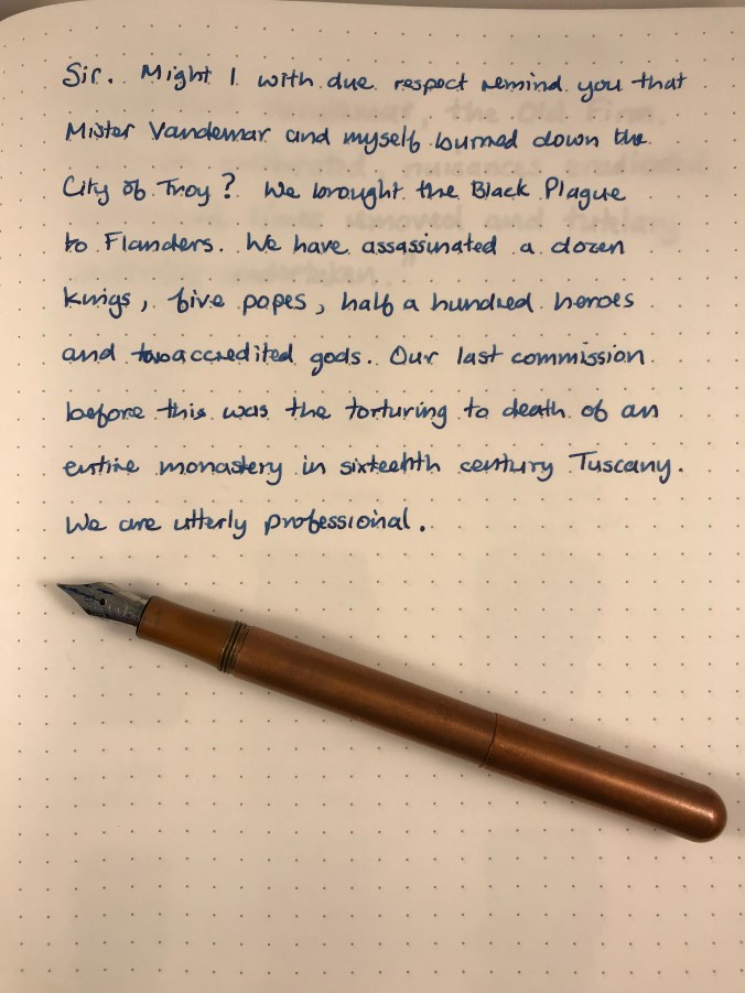
Might I with due respect remind you…

As with the other Sailor inks I’ve used, Sei-boku is well lubricated and flows extremely well.  It may be a feature of the suspended pigment particles, but the colour is not super-saturated, meaning that the ink shades beautifully.  It’ll come as no surprise that the shading is most visible with a broad nib.

Writing sample with broad nib

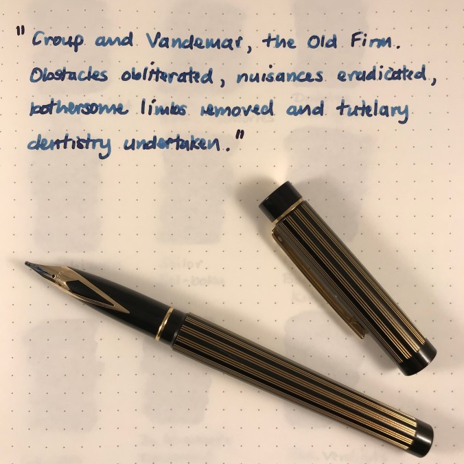
Croup and Vandemar get the broad nib treatment

Another feature in common with other inks that I’ve tried is a cheeky bit of sheen.  I have to say that this was a bit of a surprise, albeit a very welcome one.  I had thought that Sei-boku was going to be a very grown-up ink and therefore a little dull and worthy, so all in all it’s been a pleasant discovery.

Sei-boku ink splats

Sei-boku ink splats on Tomoe River

Sailor Sei-boku sheen

Some cheeky sheen

In terms of colour, none of my other inks quite match Sei-boku.  I had originally thought Iroshizuku Tsuki-yo was a close match, but from looking at the swabs, Tsuki-yo has too much of a turquoise hue to it.  After I’d finished the swabs, I remembered I had a sample of Iroshizuku Shin-kai and wondered whether that might be a match…it isn’t.
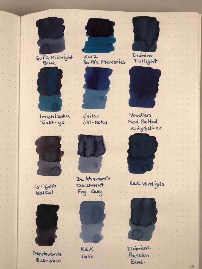
Comparison ink swabs

Nothing compares…

A bit of simple paper chromatography reveals blues of varying shades.  There’s an interesting pattern of dark blue or black dots.  My guess is these are clumps of the pigment particles, but I have no way to be sure.

Sailor Sei-boku chromatography

Chromatography can yield some interesting results

I don’t normally worry about testing waterproof-ness in my inks, and I haven’t done any systematic testing of Sei-boku, either.  I did wet a fingertip and run it over a couple of lines of writing and the ink held fast.

So there we have it, I got past the dire(-ish) warnings and found an ink that I really like.  It’s considerably more expensive than other Sailor inks, being double the price of standard Jentle ink (including blue-black) and about a third more expensive than the Jentle Four Seasons inks.  Maybe the pricing has put people off trying Sei-boku (hence the small number of reviews), but I’m certainly glad I gave it a try.  Pricing makes this a premium ink, but I haven’t tried an ink quite like it and don’t begrudge the cost.  When you compare the price of Sei-Boku to Pilot Iroshizuku inks and newcomers like Colorverse, I don’t think the price is too outrageous.  I bought my bottle from The Writing Desk for £21.60, but you can get it from a variety of sources (including Cult Pens and Andy’s Pens) at a similar price.  Pricing in the US is roughly $ for £ from vendors like Vanness and Jet Pens.  Wonder Pens in Toronto also have Sei-boku for CA$33.


Ink review – KWZ Walk Over Vistula

The back story of KWZ inks is pretty well known.  They’re made in Poland by a husband and wife team and include a range of iron gall inks alongside their “normal” inks.  In late 2017, to mark Polish Independence Day, KWZ added three suitably-themed inks to their standard line-up.  I bought all three earlier this year, but have so far mainly used Walk Over Vistula.

9B7C7FB1-C22B-44C7-A06C-6C5F8F193A63

In search of enlightenment

852C4405-6EB1-4733-873E-B6271D59A049

Ink drops seemed a bit dull, but I have no idea what prompted this combination as an alternative

A brief internet search tells me that the Vistula is Poland’s longest river which flows through Krakow and Warsaw.  I have no idea what colour the waters of the Vistula are, but Walk Over Vistula is a turquoise-blue ink.  I’m reluctant to call it teal, because I don’t think it has enough green in it.  This is quite a crowded field with plenty of competition to be found (see swatches later).  As it turns out, it’s also a colour I like.  Of the 11 inks I swabbed for comparison, I own full-sized bottles of 7 of them!

For some reason, the camera on my iPad had some issues with colour accuracy resulting in the ink looking like it is more blue than turquoise.  I tried persuading it of the error of its  ways, but it wasn’t having any of it.  You’ll have to take my word for it about the true nature of the colour.  Sorry about that.

The ink comes packaged in the same way as other KWZ inks.  You get 60ml of ink in a glass bottle, shipped in a fetchingly minimal box.  Handily, the top of the box has a small colour swatch on it.  If you store your inks inks in a box like me, it makes it easy to pick out the ink you want.  The bonus with the “independence” inks is that you get a postcard that showcases the ink colour.

B96D916B-0C27-430C-BC32-CDA9942FF865

So what’s it like?

Likes and dislikes about ink are very subjective, but I’m definitely in the “like” camp for Walk Over Vistula.  Aside from the rich colour, you get an ink that is pretty well saturated and which flows well.  In my fine-nibbled Lamy 2000, this equated to a wet line with not a lot of shading.  For comparison I also inked up a Lamy Safari with a stub nib.  As well as getting the benefit of a wider line, the relatively stingy ink flow is a good way of holding back more “enthusiastic” inks, helping to show off colour and shading.

DEDC3538-05BD-4A42-98B3-1B7758F14DBC

0146AB42-B644-4992-9E65-89646142E177

Both samples were written in a Taroko Breeze notebook which features white 68gsm Tomoe River.

What the writing samples don’t show is the sheen that comes with this ink.  As someone who enjoys a bit of sheen, I was very slow on the uptake in spotting the sheen on this ink.       You can’t avoid it on Tomoe River paper.  I haven’t tried any Rhodia, but the sheen was also evident on the paper in my TWSBI notebook.

ACE60EAE-080A-48FF-A65B-752538A8C24E

Something tells me that drawing crustaceans is not my strong point

In terms of looky-likeys, one of my first thoughts was Pilot Iroshizuku Ku-jaku.  Looking at the swatches, maybe Blackstone Barrier Reef Blue and various of the Robert Oster inks are nearer to the mark.  I think my reluctance to badge this as a teal ink is borne out by comparison with Sailor Jentle Yama dori.

F9F109AB-5E55-47BC-9E90-44538628A736

Note to self, make sure the page is flat to avoid fuzzy bits

A bit of kitchen chromatography doesn’t reveal any great surprises

991497C6-53F5-4130-B1D0-CB7305D06E9F

I haven’t tested Walk Over Vistula for waterproof-ness, but I’m pretty confident it’s not.  This isn’t a deal-breaker for me as I don’t tend to need waterproof inks.  Similarly, it’s not the quickest drying, but not outrageously slow either.

Despite there being a number of similar alternatives to this colour, I’m enjoying using it. Two pens in my current rotation are inked with it.  I’m more than happy to recommend this ink in its own right, but when you take into account the fact that you get 60ml at the price of KWZ’s standard ink range.

I got my bottle from Bureau Direct for £12.95, but you can also get it from The Hamilton Pen Company.  In the US, you can get Walk Over Vistula from Vanness.

Enjoy.


My First Pen Show

On Sunday 4th February I attended the first pen show on the UK calendar at the Doubletree Hilton on the outskirts of Bristol.  It was also my first pen show, but the coincidence was mainly one of geography as this one is nearest to home.  Despite having read reports of last year’s London pen show and various US pen shows, I wasn’t entirely sure what to expect out here in the provinces.  Luckily I didn’t have to brave things by myself as I managed to persuade my friend, Phil, to tag along.  For us newbies, safety in numbers seemed like a good idea.

We managed to arrive not long after things got going so we had a good chance to scout out the stands before the crowds arrived.  There was mainly a mixture of retailers and dealers, the Writing Equipment Society, plus renowned UK pen maker Adrian Twiss.  I probably should have thought more about what I’d need to write up my trip and taken more note of who else was there, but I’ll plead a novice lack of forethought and feeling like the kid who has been handed the keys to the sweet shop.


IMG_20180204_113605

Pens at a pen show, who’d have thought it?

Despite there being plenty of pens to drool over, I managed to be restrained and not buy any.  I did let the nice people from Pocket Notebooks (in the process of becoming Nero’s Notes) persuade me to buy a Nock Brasstown in the latest fetching shade of orange.  I also took a punt on a Life Schopfer notebook.  The team were really engaging and we spent a bit of time comparing notes on Japanese stationery and the quest for the perfect notebook.  I haven’t previously bought much from these guys, but I will certainly be sending more of my money their way in future.

83923551-4D16-4B3A-8104-00C359B761E2

Brass(town) in pocket

My overall impression was that everyone was friendly and happy to talk pens, but as Phil put it “there’s not a lot of cash changing hands”.  There certainly seemed to be lots of conversations between dealers, but not a lot of buying or selling going on.  Maybe this is how pen shows work, with punters poring over pens without much intention of buying.  Alternatively, maybe dealers get a little too attached to the pens they acquire and are not entirely unhappy if no-one buys their precious stock.  We managed several laps of the room, partly in the hope that if we went round enough times, prices might miraculously come down.  Sadly they stood resolutely firm.

31BDB537-D2D9-485D-B7A3-1D9932323C11

Life’s what you make it

Among the retailers there were a variety of offers to be had, although not all of them worked out to be as generous as they first seemed.  Given that most people can easily check internet prices from their phones, some of the “offers” did seem a bit cheeky.

Although I didn’t go so far as to buy a pen, I did manage to answer a few questions that I’ve been pondering about possible future purchases.

Pilot Vanishing Point – thanks, but no thanks

Despite its clever design and a nib that everyone raves about, the Pilot Vanishing Point is not for me.  The positioning of its clip and my grip are just not compatible.  Now I know this I can (sadly) move on.

Sailor Professional Gear – yes please

I’ve been pondering whether to add Sailor to my list and the chance to handle a few confirmed that this would be a good thing.  The Professional Gear wins out over the 1911, and although I normally prefer rhodium to gold trim, I was rather taken with the limited edition Earth with its gold finishing.  Want one!

Pelikans – to join the flock or not?

My other big unknown was about Pelikan pens.  It seems that you’re not allowed to be serious about fountain pens without owning one (or more).  I’ve been curious about the M400 White Tortoise for a while, but hadn’t seen one for real.  I did find a used one at the show, but it was £300!  Considering you can still buy them new for under £200 I thought this was a tad excessive.

My main learning point was that when it comes to Pelikans, size matters.  You can find plenty of opinion out there that the M40X is a bit on the small side, and I find myself agreeing with that sentiment.  The M60X and M80X are a bit more like it, though.

The M600 falls by the wayside once aesthetics are taken into account as I’m not a huge fan of Pelikan’s stock colours or the current limited edition White Transparent.  The M80X ranges – now we’re getting somewhere.  I could be seriously tempted by the Stresemann and/or the Ocean Swirl.  Both look orders of magnitude better in the flesh than they do in photos.  Somehow they manage to be both more striking and more subtle at the same time.  I did see one M800 Brown Tortoise.  Now that is truly a beautiful pen.  Sadly, well out of my price range any time soon.

Is that it?

I enjoyed my trip to Bristol and I suspect this won’t be my last pen show.  At the same time I don’t think I’m going to be rushing round the UK ticking off the rest of them.  One thing is clear.  If I’m serious about buying a pen, then I know I’ll need to go with a much bigger budget.  Time to get saving…