For many people, when you mention Midori, they think of the very popular Traveler’s Notebook. Compared to such a high profile range, the MD notebooks are less well known, which is a shame because they really are great notebooks. I’ve been using one as a journal of sorts for a few months now and think they deserve a great deal more recognition.
The A5 notebooks can be had plain, rules or with a grid pattern. They’re fairly widely available with similar £/$ prices. I bought mine from the Journal Shop for £12.95.
In my (so far) limited experience of Japanese stationery, packaging has tended to be simple but exquisite. The story is no different for the MD. The simple but beautiful cream card cover is wrapped in a sheet of glassine paper with a wraparound paper sleeve. The cover is vulnerable to marking easiliy, so this is pretty much a necessity in packaging terms.

A plain version of the MD, fresh out of its wrapper

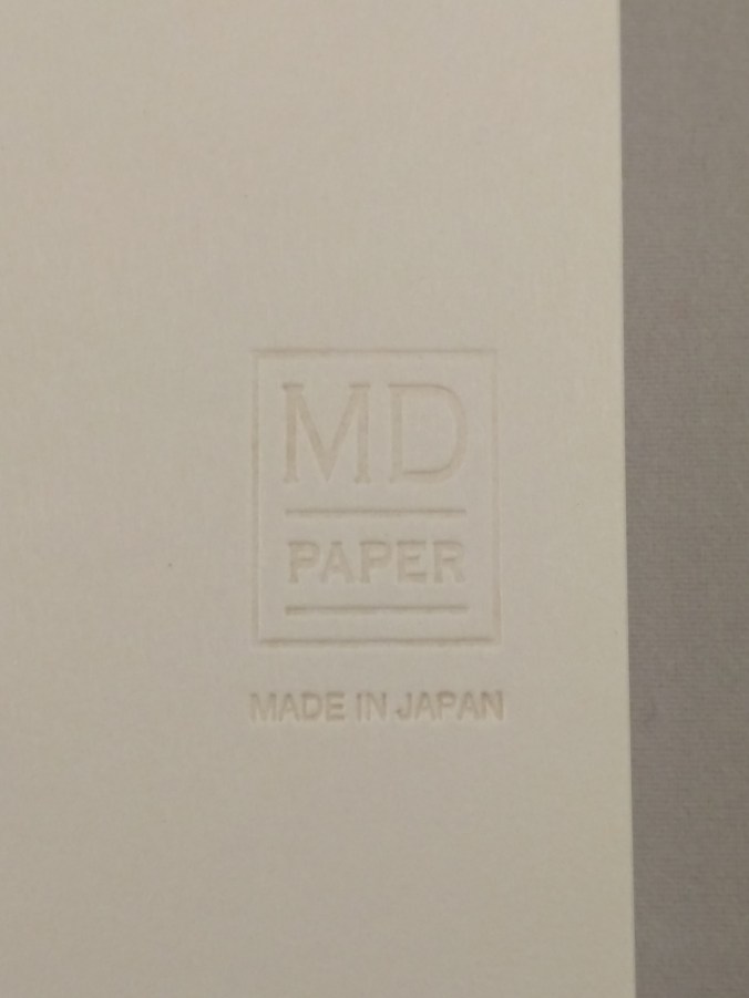
Once you get into using the notebook, the cover is embossed with the MD symbol. This simple design touch adds to the overall sense of class you get from using these notebooks.
Construction
The MD has sewn binding made up of a large number of small signatures, giving a usable page count of 176. The main result is that the book opens flat without the need to inflict physical violence on it. As a left-hander, I’ve really come to appreciate the importance of this property in a notebook. The quality of the stitching is excellent. The binding is a little unusual in that mull has been used on the spine instead of regular binding tape. It’s very neatly finished and further adds to the sense of class that goes with these notebooks.
Such a light-coloured cover is vulnerable to marking, but an inexpensive clear plastic cover is available from most of the stockists who sell the notebooks.

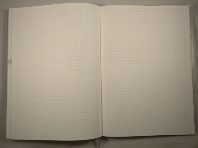
Inside you get gorgeous cream paper with a light blue 5mm grid pattern. If you like your paper to be a crisp white, this may not appeal to you. I tend to prefer off-white paper, so this works just fine for me. Unlike some gridded notebooks, the grid blends nicely with the paper stock meaning it does its job unobtrusively – allowing you to get on with the business of writing. I couldn’t find any definitive information on the weight of the paper, but I’d hazard a guess at 80gsm.
What’s it like to use?
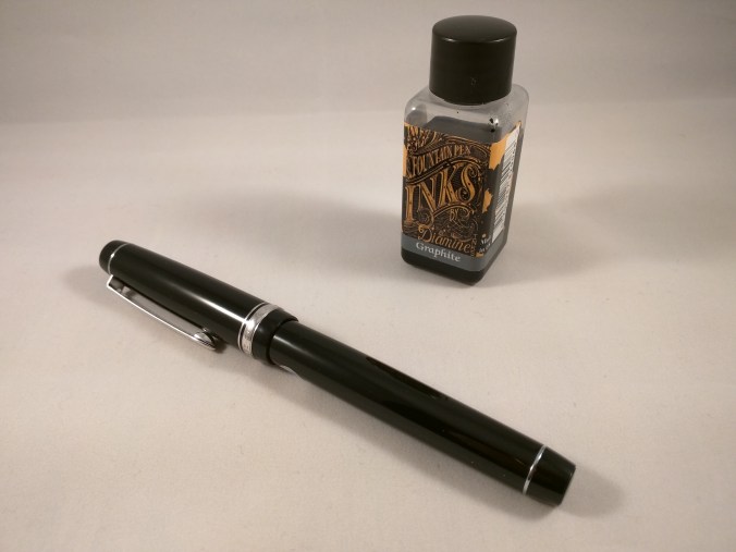
Here’s a sample written with a fine nibbed Lamy 2000, inked with J. Herbin Perle Noire…

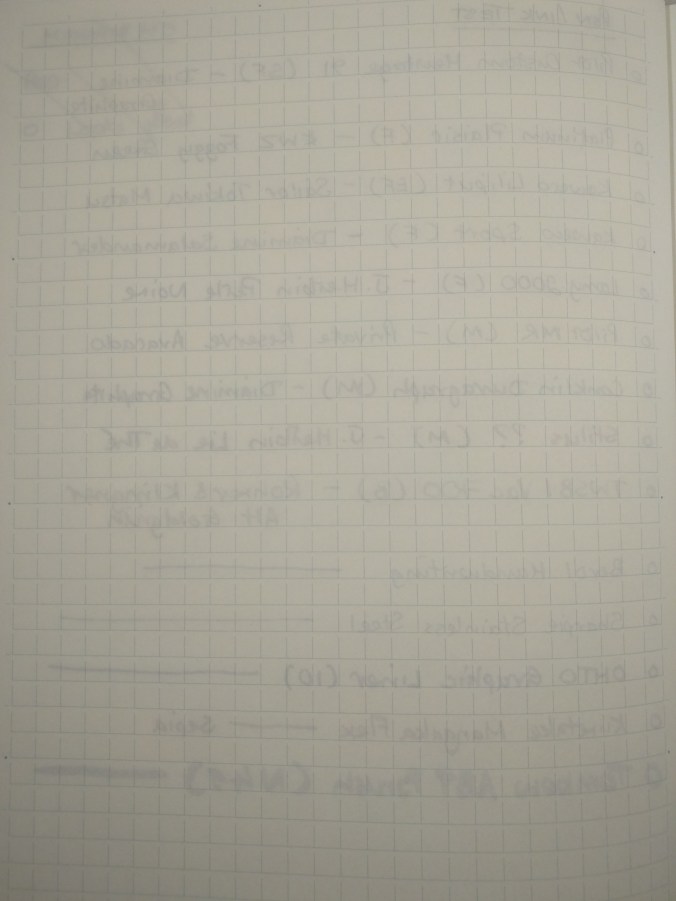
Trying a range of nib sizes and inks didn’t phase the MD paper in the slightest. There was no sign of any feathering or bleed-through, even with some very wet pen/ink combinations. This does mean that drying times are not always the quickest, but I’d say it’s no worse for the MD paper compared to other quality papers. I even tried a Tombow ABT brush pen and the paper behaved itself impeccably.
The paper does have a bit of tooth to it. This meant getting feedback with some of the drier pen/ink combinations I tried, but it was never enough to be a problem. I found that some of these were harder work to write with than others, so you might have a bit of trial and error figuring out which ones work well for you and which ones less so if you write a lot in one sitting.
It won’t come as a surprise that the cream paper base affects the appearance of some inks. Darker inks fared pretty well, but some lighter inks like Rohrer and Klingner Alt Goldgrun lost a bit of their punch compared to when used on lighter papers.
These are minor niggles, though, and in my opinion are outweighed by the performance and quality of these notebooks.

There is some show-through, but I haven’t found it at all intrusive when writing on the reverse of a page.
Wrap-up
In conclusion, these are fantastic quality notebooks which I’ve come to love over the past couple of months of use. Any negatives are pretty small and vastly outweighed by the positives of design, execution and function. The paper is exquisite and takes pretty much any ink you might choose to throw at it. If you haven’t tried one and are looking for a new notebook to try, I thoroughly recommend them.