Out of the Grey: A homemade Tomoe River notebook

IMG_20160829_072339

Why do this in the first place?

Put simply, I love Tomoe River paper.  Ever since I got my hands on my first Hobonichi Techo, I’ve admired this thin, but ever so fountain pen-friendly paper.  Although there seem to be a growing number of notebooks made using Tomoe River, these are generally not easy to come by in the UK.  I recently took the plunge and ordered a couple of Nanami Paper’s Seven Seas notebooks – all the way from California.  These are fairly expensive notebooks in their own right.  Add in the cost of shipping from the US and these become a luxury rather than an everyday notebook.

There aren’t too many options for buying Tomoe River as loose sheets in the UK, but I managed to find a UK seller on eBay offering 300 sheets of Tomoe River paper for just under £30.  So far, so good.  After all, how hard can it be to make a notebook using ridiculously thin paper that creases easily?

Format

I made an A5 book, simply because I bought A4 paper and this meant the least amount of work in terms of folding and cutting.  A5 also happens to be my format of choice, so it wasn’t such a hard decision.  I also settled on a single signature exercise book, rather than a more complicated journal-type notebook.  I’ve been experimenting with this type of book as inserts for my Start Bay Navigator.

I can never figure out how notebook makers count their pages. What I do know is that I used 24 sheets of A4, folded down, giving a total of 96 pages of A5 in the finished book.

Finish
IMG_20160829_072430

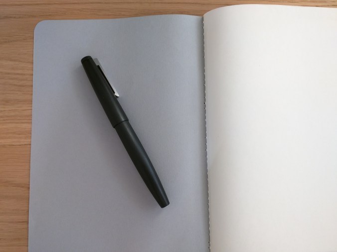
The book contains plain paper, more out of necessity than choice.  I tend to prefer dot grids, but the printable dot grids I’ve found on the web so far have been downright patchy in terms of the density of the dots.  I’ve put together my own, but since Tomoe River paper doesn’t fare very well in your average printer this is somewhat moot.  The seller that I got this paper from has now started selling 68gsm Tomoe River and I intend to see whether this will work any better in a printer.

Cover and Binding

In keeping with the exercise book theme, I went for a simple grey card cover (hence the title of the post and a bit of musical nostalgia – a 1986 album by the The Dream Syndicate).

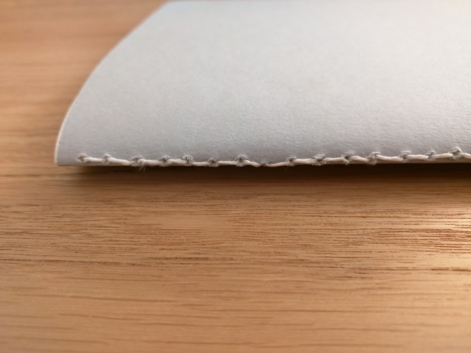
I wanted a sewn binding, similar to the CIAK Appuntino I reviewed recently. From what I can find out, this is known as a Singer Sewn Binding (Made on a Singer sewing machine?), but I didn’t manage to find a handy diagram of the stitching pattern.  Instead, I ended up more or less using backstitch.  This gave the right appearance on the outside, but looks a bit messy on the inside.

IMG_20160829_072430


IMG_20160829_072512

After consultation with an embroidery and patchwork expert (my mum), I think the answer is to use a simple running stitch down the spine and then back up again.  With an odd number of holes, this should give the same pattern inside and out, offset by one hole.
IMG_20160829_072606

As you can see from the photos, the binding could have been straighter.  I was drinking a gin and tonic as I made the notebook (Tanqueray Export if you must know), but that wasn’t the cause (honest!).  I folded and clamped the pages before I marked out and punched the holes, so when I came to stitch the block of paper things weren’t as well aligned as I might have hoped.  Next time out I’ll clamp the block and punch the binding holes before I fold the paper and cover.

Finishing

One of the consequences of stacking this many sheets of paper is that those in the middle of the book stick out further than those nearest the cover.  To get a neat looking notebook, this means having to trim the edges.  I used a steel rule and a craft knife and to be frank it got a little messy.  Definitely something I need to practice at.

I used a 10mm corner punch to round the corners, and again I need a bit more practice to make these as neat as possible.

In use?

Overall, I’m quite pleased with the outcome.  Sure, there are things that I need to improve and a few things that I will do differently next time, but from nothing to a finished book in a couple of hours didn’t seem too shabby.
IMG_20160829_072527

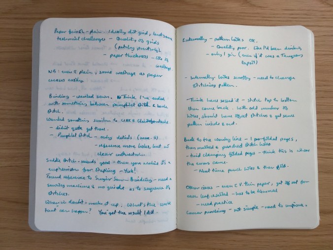
In use, the paper performs as you might expect.  Tolerant of lots of pens and inks.  Drying times are long and you get show-through, but that’s something I’m happy to live with.  The sample of writing I’ve shown was written with a medium-nibbed Sheaffer Legacy (not the Lamy 2000 in the photos), inked with Pilot Iroshizuku ku-jaku – a combination that puts down a pretty wet line.  Even so, it was pretty well behaved, coping with my handwriting and showing off the shading you get with this ink.

What next?

I’ll certainly try this again, looking to improve in the areas I’ve highlighted.  I also plan to try a multi-signature book at some point.  As well as a more complicated binding, this will mean a more elaborate cover, end papers (I have some gorgeous Chiyogami paper that I’m itching to use) etc.  It should be fun!  After all, what’s the worst that can happen?

Frankenpen – A Platinum-Kaweco hybrid

(Disclaimer: The title of this post may be more dramatic than the content, but I couldn’t resist using it.)

IMG_20160816_090157-2

Platinum Preppy – medium nib in blue

Platinum’s Preppy is a very popular pen.  What’s not to like?  For around £3 in the UK ($3-4 in the US) you get a simple, straightforward cartridge pen with a really decent quality steel nib.  Okay, it probably won’t last long enough to become a family heirloom, but it’s robust enough to be a good first fountain pen that writes well and puts more expensive pens to shame.  You get a choice of nibs from medium to extra fine.  Unlike its low-cost rival, the Pilot V series, you also get a pen that you can re-use.  Straight up, you can use Platinum’s own cartridges that come in a range of colours.  Spend a little money on an adaptor and you can use any short international cartridge, opening up the choice of inks to include the likes of Diamine and J Herbin.  (Both provide a good range of colours in cartridges, but their bottled ink ranges are bigger.)

IMG_20160816_090354-2

Nib, section and international adaptor

Cartridges aren’t the most economical way to buy ink and some inks are only available in bottles.  The solution is obvious, buy a converter!  Platinum handily make a couple of converters, but read the small print and you find they work with ‘most’ Platinum pens.  Unfortunately ‘most’ doesn’t include the Preppy, or its more up-market stablemate the Plaisir (which uses the same section and nib assembly).

That’s OK though, because I bought an international adaptor.  I’ll just plug in an international converter and I’ll be good to go, right?  Not really.  The space taken up by the adaptor, plus the relatively short barrel mean that most converters simply won’t fit.

Step forward Kaweco’s Mini Piston Converter.  This pint-sized converter was developed for use in Kaweco Sport pens.  Handily it also fits the remaining space in the barrel of the Preppy.

IMG_20160816_090650-2

Nib, section, adaptor and converter

It’s not the biggest converter in the world, but it does mean you can use bottled inks in the Preppy.  Admittedly, by the time you’ve added in the adaptor and converter you’ve trebled your initial costs.  That brings you up to around £9 (US$12) – which is still cheaper than a Lamy Safari (which needs its own converter if you want to use bottled ink).  If you’re prepared to spend a bit more money  (around £16/$20 all in) you could go through the same exercise with the higher spec and more robust Platinum Plaisir.  I prefer the Platinum nib to the equivalent Lamy, which I find too dry.  When I can get my hands on an orange Plaisir (yum), I plan to repeat the exercise.  The only other thing I would change is to go for fine nib instead of the medium I chose here.

What’s the worst that can happen?


Notebook Review – CIAK Appuntino

As with many of my purchases, I came across these notebooks by accident.  CIAK is not a brand I was familiar with and after a bit more digging there seems to be a vanishingly small amount of information out there on the Appuntino range (even on the company’s own website).  I bought medium and large sized notebooks. This is a review of the medium.

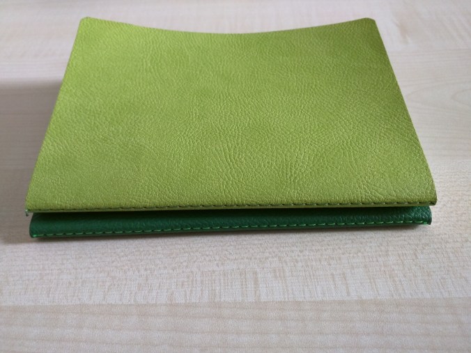
The books come in packs of two and a pair of the medium notebooks will set you back £8.95 (around US$12) from The Journal Shop.  I chose Lime and Green for my pair and the colour combination is very pleasant indeed.

Vital Statistics

CIAK’s definition of medium is 12cm x 17cm, making the books around 3cm bigger than a Field Notes book in both directions.  This could restrict their use as genuine pocket notebooks, but mine fit quite nicely in the same pocket of my work bag as my Hobonichi.

IMG_20160725_123622

Textured cover, dot grid paper

What drew me to the books is that they contain dot grid paper (I’m a big fan) – 64 pages in all.  I couldn’t find any particular information about the paper in in terms of weight etc., although in my estimate it is lower than 80gsm.  If anyone can tell me more about the paper, I’d be happy to hear it and update this post accordingly.

In action

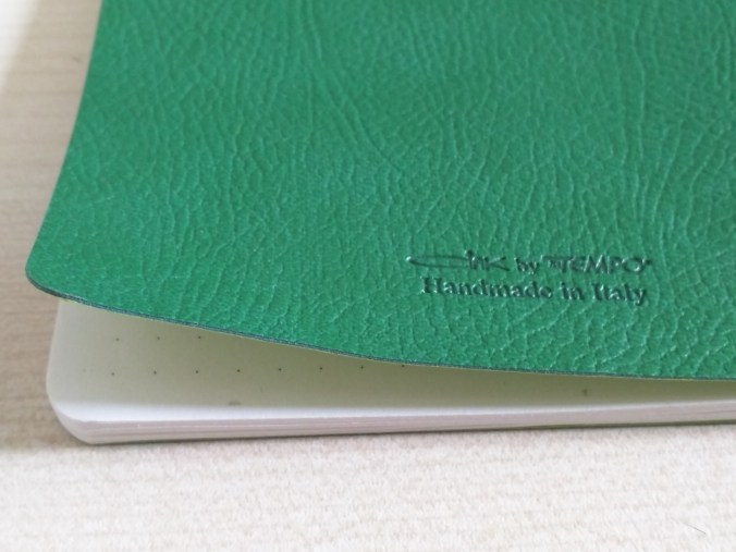
Before I go into more detail on the paper, the covers are worth a comment.  The textured outer is soft, with a slightly battered feel to it – far more tactile than a simple card covering.  It is laminated to a card inner in a complimentary colour.  Rather than being stapled, the books are stitched in contrasting thread which is visible along the spine.

IMG_20160725_123602

Because of the way the books are bound, they don’t lie flat when opened but are much more compliant once they’ve been broken in.  Something further on that binding: I’ve just passed half way in one book and noticed as I type this that one of the knots tying the binding thread has pulled apart.  I don’t know if this is a one-off or a common problem, but may be a factor if you are particularly hard on your notebooks.

Now to the important bit, how does the paper perform?  In terms of look and feel, it works for me.  The paper is a cream/ivory colour, printed with a 5mm dot grid pattern and with rounded corners.  The paper is a little softer than Rhodia dot grid paper and much softer than Field Notes paper.

IMG_20160725_123706

Dot grid paper (look hard and you’ll see the pulled thread at the top)

I’ve mainly used fountain pens in these books and I think it’s fair to say that the results haven’t been brilliant.  I’ve tried a variety of pen and ink combinations, but the overall trend was towards feathering and show through.

I’ve been considering trialing bullet journaling, and thought I’d use the Appuntino to jot down some notes to  help me visualise  how bullet journaling might work for me.  As you can see in the photograph Noodler’s Squeteague and Bad Belted Kingfisher, along with Pelikan Topaz didn’t fare too well. The pens I used with these inks (MontBlanc, Conklin and Baoer) tend to put down quite a wet line and that certainly didn’t help to limit feathering.

IMG_20160725_123722

Trying to make sense of bullet journaling – simple!


IMG_20160725_123759

IMG_20160725_123743

Considering I find the nib to be on the fine side of medium, my Noodler’s Ahab pen also produced a fair amount of feathering with Diamine Damson ink.  The least amount of problem came from a Copic Multiliner!  You can see from the next photograph just how much show-through there is.

IMG_20160725_123815

Show-through on the Appuntino

I did some comparison tests with a Field Notes Pitch Black book and got (I think) fairly similar results in terms of feathering.  There was less show-through, but I put this down to Field Notes paper being thicker.


IMG_20160726_141233

Field Notes Pitch Black for comparison

IMG_20160726_141251

Tricky Ahab

In conclusion

After all that, you might think I’d be steering readers away from these notebooks.  Sorry to disappoint, but I’m not going to.  I really like these notebooks, despite their flaws.  It’s hard to express in words, but there is something about these little books that makes me want to take them out and use them.  It’s a tactile thing and that trumps the shortcomings, or as I choose to view them – idiosyncrasies.