Branching out – of sorts

Anyone who follows me on Instagram (@slightly_unnerved) will know that I have a bit of a thing for the Sailor Pro Gear. In 2020, the number of Pro Gears I own went from a modest three to a more showy eight. These were all limited/special editions of one sort or another. More (or less) interestingly, four out of these five came with medium nibs.

Spot the pattern – (L-R) Pro Gear Earth (Broad), Apres Ski (Medium), Blue Lagoon (Medium), Tequila Sunrise (Medium), Angel’s Delight (Medium), Kure Azur (Medium), Bungubox Omotesando Blue (Fine Medium), Bungubox Sanctuary Blue (Medium)

This didn’t bother me in the slightest as I happen to really like Sailor’s 21K medium nib. It’s a package that just works for me. Hand-finished, in practice, each of the Sailor medium nibs I own is sufficiently different (line width, flow, feedback) that they don’t all blur into one. Combine this with the range of colours I have and it never feels like I don’t have choice.

Besides the pens that I bought, one other Pro Gear I had made up my mind to buy was the Ocean. It too was a limited edition, but limited in the thousands and widely available at regular Sailor prices.

Familiarity did a good job of breeding contempt and I was quite happy to sit and ponder this particular purchase. Unfortunately, I waited too long and by the time I was ready to make the purchase, no-one in the UK had any left. It was sold out with no prospect of a re-stock.

Aaaarrrrgggghhhhh!

As I veered between reconciliation with the situation and the (not entirely rational) notion of ordering one from the US, Anthony from UK Fountain Pens put one up for sale. On the face of it, this solved my problem – the model I wanted, from a UK seller and with the bonus of not having to pay the premium of a brand new pen. I’ve never met Anthony, but if you’ve ever read his blog (and you should) it’s clear that he cherishes and cares for his pens. As such I had no concerns about the condition of the pen I would be buying.

Exhibit A – Sailor Pro Gear Ocean

There was one quite big issue that I needed to address. This pen would come with an extra-fine nib! Japanese fountain pen nibs generally run thinner than their European counterparts. Given that I’d be reluctant to buy a European pen with an extra-fine nib, the prospect of a Japanese extra-fine was quite daunting (well for me anyway).

That extra-fine nib. The extra bonus was a dual-tone nib. I was expecting all rhodium…

Here was my dilemma. If I passed on this, when would I get a chance to buy another Pro Gear Ocean at a sensible price? If I bought it, what if it was effectively useless? In practice, the decision didn’t take long to arrive at. Funds were duly dispatched and a few days later the pen arrived.

Does size matter? L: extra-fine, R: medium
Getting it down on paper

Was it the right decision? Definitely. Inked up with Sailor Yonaga, it writes brilliantly. The flow is good and the nib is not at all scratchy. It has a little of the pencil-like feedback that Sailor nibs are renowned for, but that’s it. All in all a fantastic pen.

Much of this pen was a known quantity, but sometimes it’s good to push your boundaries a bit and try something that differs from the norm.

Next stop a music nib?

Sailor Shikiori Rikyucha Ink Review

Sailor Rikyucha ink doodle

In case you were in any doubt about which ink I’m talking about

Rikyucha (Green Tea Brown) is part of Sailor’s Shikiori (Four Seasons) range of inks.  Although it is a new ink to me, a bit of research suggests it was part of the Sailor line-up for a while, before disappearing to wherever discontinued inks go.  The translation of Rikyucha is a good one in terms of describing what is quite a complex ink.  It’s also a more palatable descriptor than some that might be applied to it.  Any resemblance between this ink and something that you might find lurking at the bottom of a pond is, of course, entirely coincidental…

Lookalikes

My interest in inks of this colour started with a couple of Diamine inks – Safari and Salamander.  While I’ve liked the colour of these inks, I’ve found them a little dry for my liking.  In a quest for something more to my liking I tried Robert Oster Bronze.  I love the colour of this ink, but again it’s a bit too dry for me.

Comparison swatches

Can you pick out the culprit from this lineup?

Close-up of ink swatches

The same swatches in closer detail

As you might expect from an ink made by Sailor, Rikyucha is a well-behaved, low maintenance ink.  That said, I suspect it’s the kind of colour that will polarise opinions.  I may well be biased, but it was appealing enough to make me buy a bottle.  As I’ve used it in anger I’ve grown increasingly fond of it.

As well as these basic properties, Rikyucha has one or two extra tricks up its sleeve.  The most on noticeable thing is that it looks dark green with a slight hint of blue while wet, but dries to a much browner shade.  I tried to capture this difference, but failed miserably so you’ll have to take my word for it.

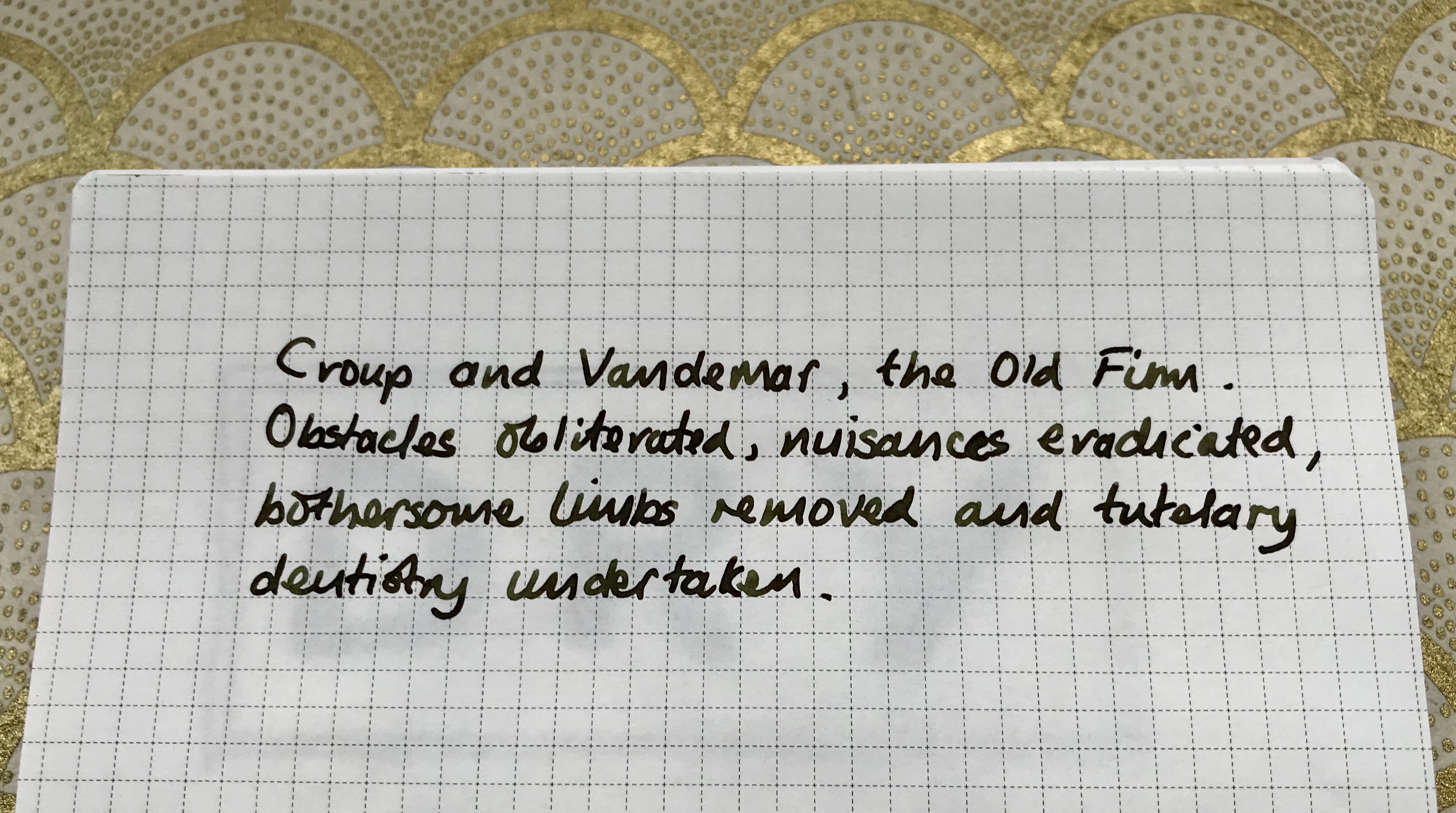
Sailor Rikyucha writing sample

Some of my favourite literary villains and yet another chance to flaunt my awful handwriting

On top of the colour shift, there’s a cheeky bit of sheen thrown into the package.  Like a number of other Sailor inks I’ve used, it’s not the raison d’etre of this ink, but it’s a nice addition without dominating proceedings.  I used some ink splats to highlight this, but (on the right paper) broader, wetter nibs will also show this off.

Rikyucha ink splats and sheen

The obligatory ink splats to highlight the sheen

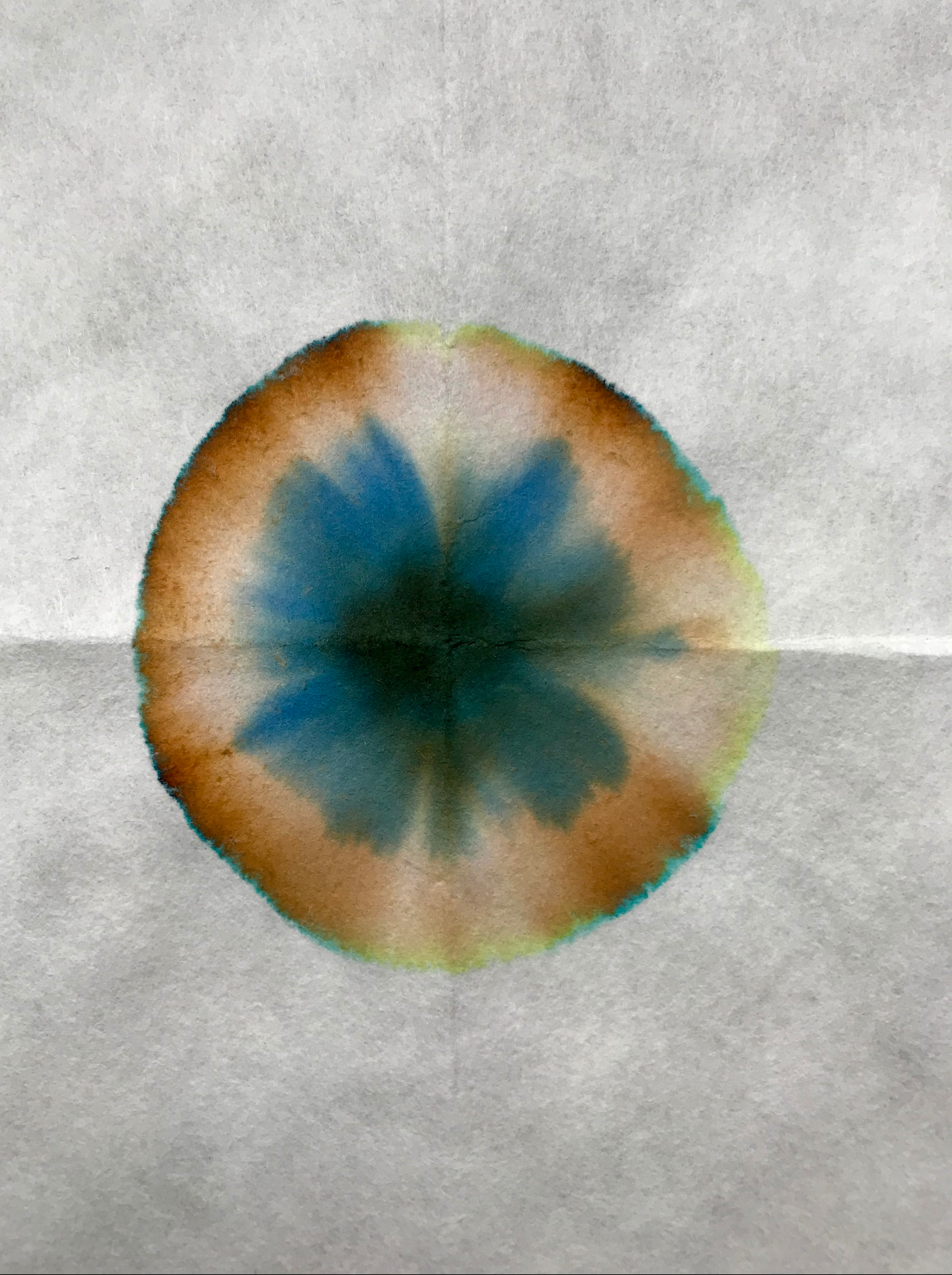
As befits an ink with these properties, its make up is a bit complicated and unexpected.  Some simple kitchen chromatography shows a range of colours.  I certainly wasn’t expecting the blue component…

Sailor Rikyucha chromatography

There’s more to Rikyucha than meets the eye

Economics

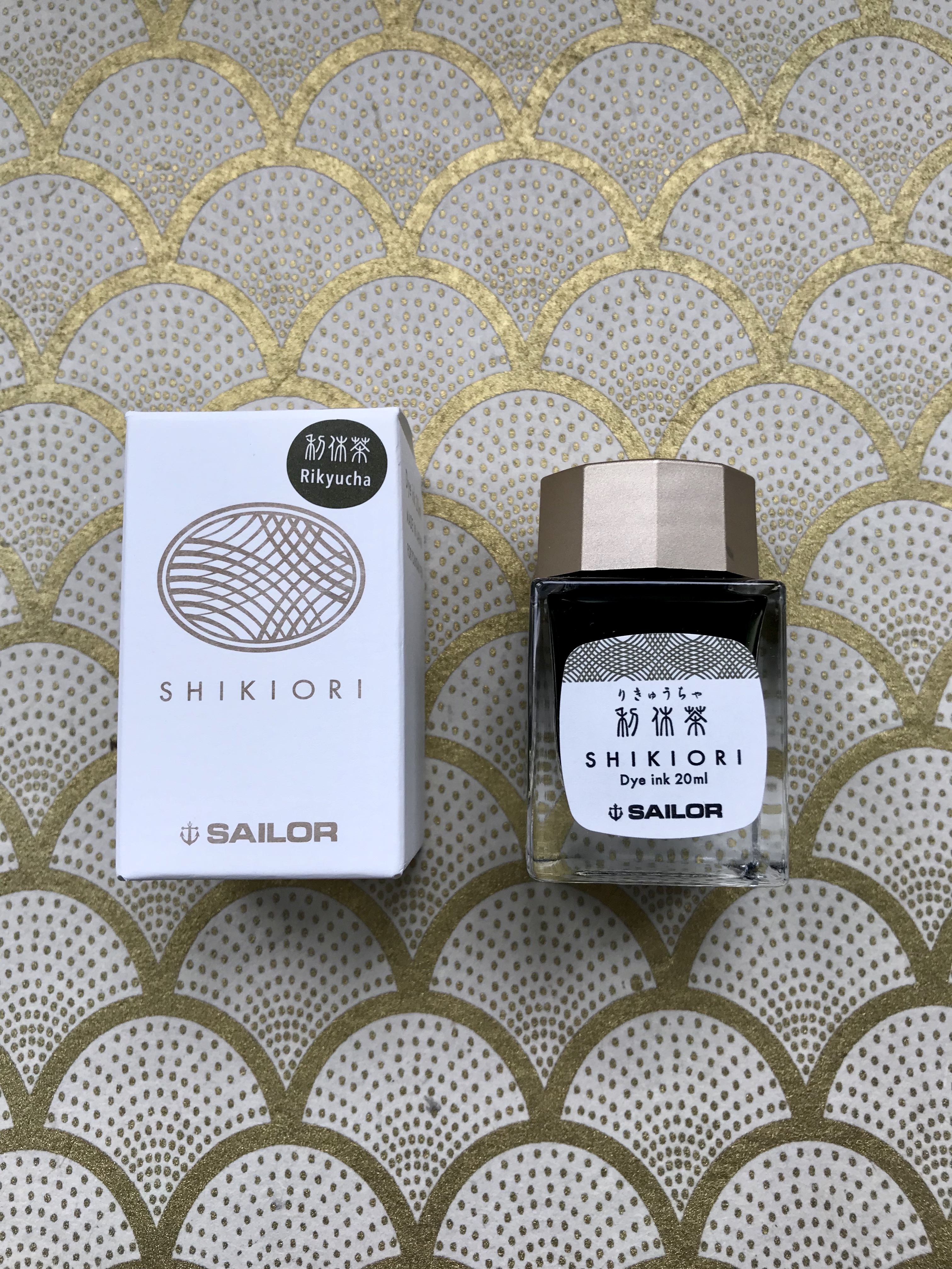
This is one of the first bottles of Sailor ink that I’ve bought in the new, smaller bottles that are replacing the old 50ml ones.  I like the design of the bottles and I’m generally a fan of smaller ink bottles.  I already have more ink than I’m likely to get through in my lifetime, so not having to add another 50ml to my list of guilty excess is to be welcomed.  What is not so welcome is the big shift in the unit cost of Sailor inks.  In the UK, a 50ml bottle of the old Sailor Jentle Four Seasons ink cost in the order of £16-20, which I thought was pretty good value for money for the quality of the ink.

The new 20ml bottles, however pretty they might be, weigh in at around £11 or £12, which shifts the cost from around 35p per ml to approximately 60p per ml.  Much as I love Sailor inks, this will certainly make me a little more selective about future purchases.

Sailor Shikiori Rikyucha box and bottle

Is it small or just very far away?


Conclusion

Overall I really like this ink.  I like the new packaging and bottles and I definitely like how Rikyucha behaves and how it looks on the page.  The colour shift as the ink dries and the sheen add to the interest, so if the colour of this ink appeals I’d recommend checking it out.  The only fly in the ointment is the pricing.  To be frank, the jump in price per ml seems excessive to me.  I get that smaller volumes will be relatively more expensive, but this is going a bit far.  That said, none of the other inks I’ve tried in this corner of the colour chart have worked nearly so well for me, so I’m prepared to live with the relatively high price.

Fountain pen review – Moonman M2

Moonman M2, Diamine Firefly

If you believed, they put a man on the moon

The Moonman M2 eyedropper fountain pen has been attracting quite a bit of interest recently, so I thought I’d join the bandwagon and find out what the fuss was about.  In trying to write this post, it has has turned into a bit of a hybrid of a review and an account of my first encounter with the world of eyedropper pens.  Please read on to find out how I got on with it.

My Chinese pen history

Chinese fountain pens are cheap and  widely available.  I own a number of them.  Aside from the amazingly bonkers Snake pen, made by Jinhao, most of mine are copies or derivatives of western pens.  Despite being fuelled by naive optimism, none of them have had much merit beyond being cheap to buy.  To give one example I brought a Baoer copy of a Starwalker.  The nib is reasonable enough, but sadly it’s more Mont Clonk than Mont Blanc, requiring a prodigious amount of plumber’s PTFE tape to make the section and barrel fit together.  Of the other Chinese pens that I own, all of them have needed a tweak or two to make work well.  At the prices you pay for these pens, you’re not going to get much in the way of quality control, but the flip side is that it’s a real lottery as to whether you get a good ‘un or a dud.

Thankfully that might be starting to change.  Frank Underwater has done some great work to highlight and introduce a new wave of Chinese pens that seem to be challenging stereotypes and injecting design and quality along the way.  The Moonman M2 is one such of these…

Eyedroppers

In case you didn’t already know it, an eyedropper is a pen that has no filling mechansim.  The barrel itself holds the ink, giving you a much higher ink capacity than a pen that fills by a piston or converter.  Ever since I came across the concept, I’ve been slightly unnerved about trying one.  Most seem to be conversions of standard fountain pens and depend on how well you can seal the joint between the section and barrel.  In the same vein, I’ve never understood why you’d want to do this with a pen where you can’t see the ink.  Fine if your pen is transparent or translucent, but otherwise, why bother?  Surely part of the point is to be able to see your ink of choice sloshing about (and know when it’s about to run dry)?

Is it a demonstrator?

Is it a demonstrator if there’s no filling mechanism to ‘demonstrate’?

I’m also very fickle and like to switch inks around on a regular basis.  Having  a huge ink capacity is not necessarily a bonus – it just means I have to write a lot more before I can change ink.

The ‘open-plan’ approach also means that while you can vastly increase ink capacity, failure of the seal means a lot of spilt ink!  Thankfully there seem to be more pens coming out that are intended to be eyedroppers from the outset.  As a result these come equiped for the purpose.  The Moonman M2 falls into this category, being made of transparent acrylic and set up to be an eyedropper from the outset.

On to the pen itself.

Presentation

In keeping with the clean and simple design of the pen, it comes with a perfectly presentable cardboard sleeve which sports the Moonman logo.  It contains a case made of similar plastic to the one that you get with a TWSBI Eco.  The box contains a striking red foam insert into which are cut slots for the pen and a glass eyedropper.  The pen fits snugly, meaning it can be a bit of a struggle to extract, but that’s no big deal.  If you’re anything like me, that’s the last time the pen will see the box anyway.

CE33C681-DA18-471E-8D0B-13738D69BA7B

moonman M2 in box

I was too keen to try the pen out and forgot the unboxing shot until after I’d filled the pen.  I hope you like red.

Size and shape

The Moonman M2 is basically a classic, pointy-ended torpedo shape.  Absence of a clip enhances the clean lines.  I’d call it medium-sized in terms of length and diameter, coming in at around 14cm long when capped and 13mm in diameter, with a screw cap (no clip).  Being made of plastic, it’s not too heavy.  My not-very-accurate kitchen scales tell me that it weighs in at 14 grammes.  To put it in a more real-world context, it’s similar in proportion to a Lamy 2000, just a lot pointier.

The nib is a fairly standard looking gold-esque #5, stamped with the immortal words “Iridium Point Germany”.  It’s probably meant to inspire confidence that you’re getting a certain level of quality, but it always makes me think someone is trying too hard to make the point.

Look and feel

I really like the clean, sleek looks of the M2.  Coupled with the way the acrylic has been milled, it looks very smart.  In place of finials and end caps you get tapered, polished acrylic, which catches the light nicely.

Moonman M2 catching the light

Catching some rays with Diamine Firefly

The other thing of note in the appearance of the Moonman M2 is a bright red anodised ring which bears the company’s name.  This won’t be to everyone’s taste, and some will argue that it interferes with the overall clean look of the pen.  I quite like it and certainly don’t find it offensive.  This marks the step-down from the barrel to the section.  Because of the overall proportions of the pen, this is quite moderate and the threads for the cap are also fairly unobtrusive.  I’ve had no issues of discomfort when holding the M2.

EFDF6FF8-E198-476C-A58F-294913E505FE

It’s a Moonman, in case you were wondering

Filling

Not surprisingly, filling this pen is pretty straightforward.  Put some ink in the barrel and that’s about it.  The key thing to remember is that everything needs to be done ‘upside down’ to avoid messy accidents and spills.  Keep things ‘nib up’ until the whole thing is assembled.  I haven’t tried the glass pipette (eyedropper) that came with the pen, preferring to use a syringe.  I’ve no reason to doubt that the eyedropper works, but I prefer the control you get with a syringe.

You can get a good 2.5ml of ink into this pen without any trouble, although there’s probably a little bit more headroom to be had.  The top of the section protrudes into the barrel when you assemble the pen, so if you’re over-enthusiastic with the filling you may find yourself re-acquainting yourself with the principles of Archimedes and with ink everywhere!  I’ve erred on the side of caution and managed to avoid that so far.

It’s probably the right point to talk about Leak Prevention System.  OK, there isn’t a system as such, but the Moonman M2 does come with two silicone O-rings installed to keep the ink where it’s meant to be.  One is around the top of the section, where it screws into the barrel and the other at the top of the nib unit.

The second O-ring is very fine, so you will need to keep a particularly close eye on it if you remove it for any reason.  I took it off mine and put it on a piece of kitchen paper (white, textured background – brilliant thinking).  I then spent several minutes trying to work out where I’d put it!
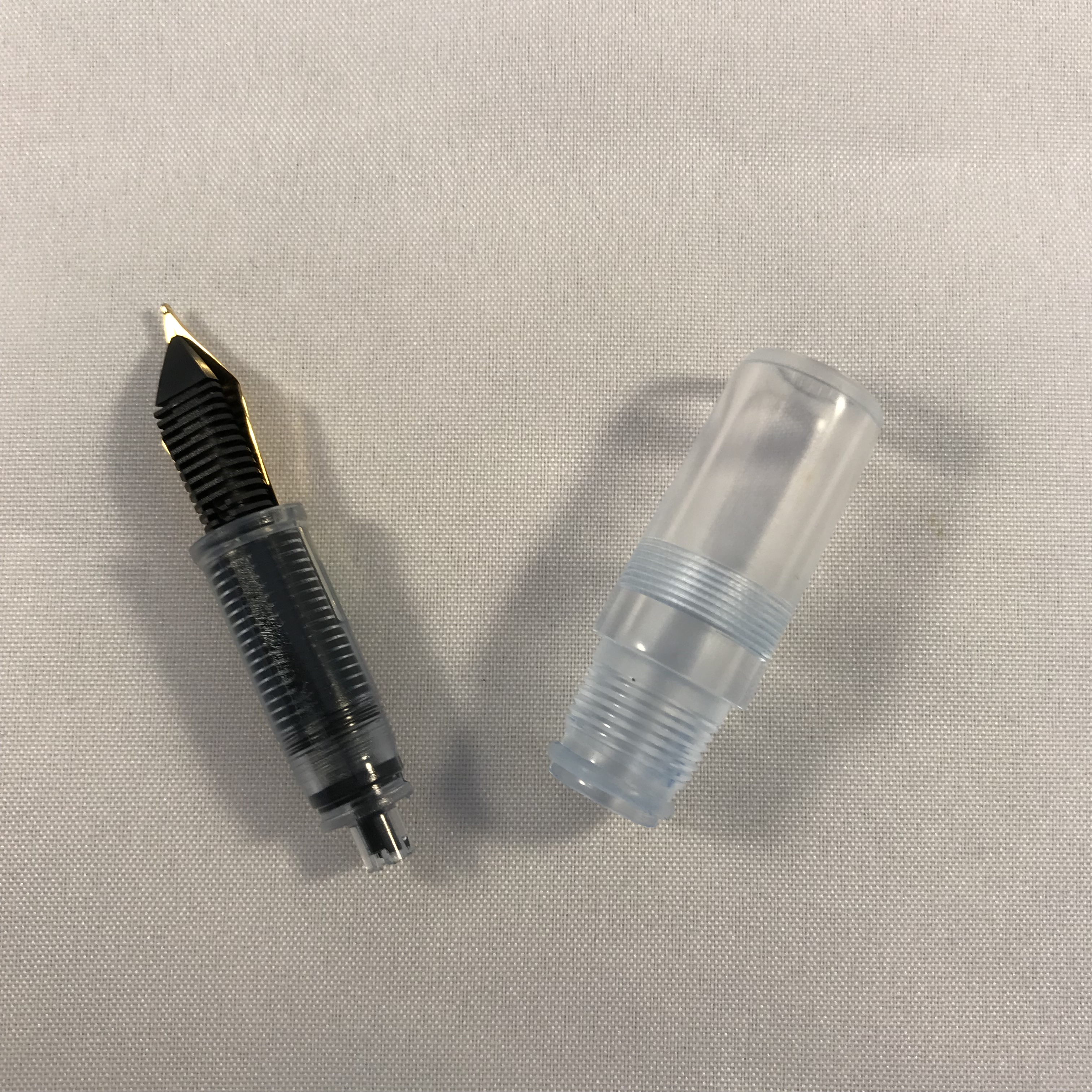
nib and section

Spot the O-rings. (If I had remembered to draw in some arrows, they’d be easier to see!)

In use

I wasn’t certain whether the O-rings would be enough to seal the pen, so my first fill of the M2 was with water.  I left the pen nib-down overnight and was pleased to find that there was no hint of any leakage.  Buoyed up by this, I took the plunge and inked the M2 with Sailor Jentle Yama-dori.  It didn’t take much more than a couple of inversions and gravity to prime the feed and start the pen writing.

The Moonman M2 is available with two choices of nib size – 0.38 or 0.5mm.  These sizes equate roughly to extra fine or fine.  Given how much nib sizes vary in reality, I love the aspiration that nibs can be produced to this level of precision.

I chose the 0.5mm option and it’s a pretty solid fine.  It’s not the smoothest nib I’ve ever used, but I wouldn’t say mine was scratchy either.  I might try smoothing it out a little at some point, but for now I’m happy enough the way it is.  I’ve had no issues at all with skipping or hard starts, so all good there.  Opinion seems to be generally favourable  about the quality of the nibs on the M2, and my experience backs that up.

I’ve written a fair number of pages now on Tomoe River, Clairefontaine and TWSBI paper and the M2 has performed pretty well on all of them.

EFF114CE-292A-42A5-BAEA-00920DE6D3B9

Testing the Moonman M2 – Sailor Jentle Yama-dori on Tomoe River

Cleaning

One potential concern about a pen like this is whether it will be easy to clean and how likely it is to stain.  So far, no problems.  I cleaned out the Yama-dori I first inked the M2 with and the barrel cleaned up with no issues at all.  The nib and feed took a bit more work, but came out with a clean bill of health.  A bulb syringe is a helpful tool for this.  Ditto the section, although the O-ring on this could have a tendency to trap ink, so might need particular attention.  I’ve since filled the M2 with Diamine Firefly and again the pen cleaned up after this without issue.  I’ve currently got it inked with Diamine ASA Blue and all looks good so far.

Price and availability

The M2 cost me £12.98 on eBay including shipping from China.  The US price is just shy of $16, so pretty comparable.  There are some being re-sold from the UK, but at around twice the price I paid.  Delivery took just over a week, which was more than acceptable.

Overall impressions

The Moonman M2 is a great pen in its own right, and wipes the floor with all the other Chinese pens I’ve tried.  Factor in the price and it’s an absolute bargain.  I love the design, materials and the quality of the finish.  As a first choice for an eyedropper I certainly could have done a lot worse.  I don’t really need a pen that can hold this much ink, but I’ve enjoyed being distracted by the sight of ink sloshing around in it.  The way the acrylic refracts/reflects light, really adds to the overall effect.  As a bonus, it’s certainly helped overcome my concerns about using eyedroppers.  All I have to do now is remember to handle it differently to all my other pens!

Gratuitous ink shot

Gratuitous ink shot


Ink Review – Sailor Sei-boku

Sailor Sei-boku isn’t a new ink by any measure but seems to have gone relatively unnoticed in terms of reviews, certainly compared to its stable-mate Kiwa-guro.  Having been convinced enough to buy a bottle I thought I would share my impressions.

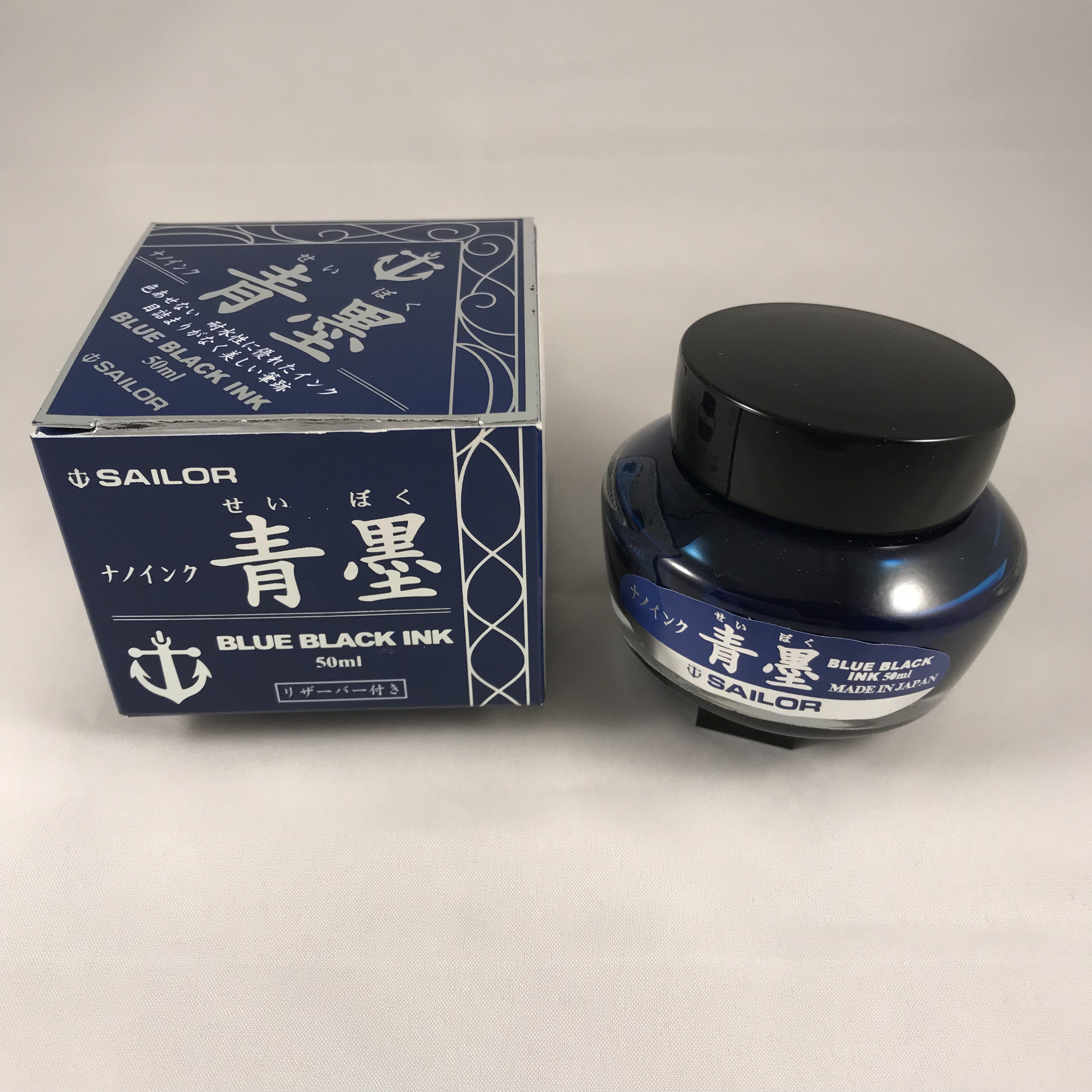
Sailor Sei-boku bottle and box

Sei-boku in Sailor’s ‘traditional’ bottle

As with other Sailor inks, you get a squat 50ml bottle in a nice cardboard box.  (Sailor are in the process of changing the design of their bottles, so you may find you get a different form factor.)  Unlike the Jentle Four Seasons inks that I’m more familiar, the box design is much bolder and in your face.  It’s also rather shiny, which makes photographing it a bit of a challenge.  You also get that little reservoir in the top of the bottle that’s meant to make filling your pen easier as the level in the bottle drops.  I used to think this was a neat idea, but I’m not so sure these days and tend to use a syringe to fill my pens instead. You can remove the insert, but that seems a recipe for very inky fingers.
Sei-boku is a pigment ink, meaning that its colour comes predominantly from particles suspended in the ink rather than dissolved dyes.  This brings the benefit of being fairly waterproof and the perilous warning that you should be careful lest poor pen hygiene result in blocked feeds, clogged nibs and, if you’re really slap-dash, possibly the end of the universe.  (Note: I may have made one of these up.)

I suspect that this is more of a backside-covering disclaimer because I can’t say that I have experienced any particular (geddit?) problems with Sei-boku.  You can see the settled particles when you pick up the bottle, so there’s a need to give the bottle a bit of a shake to get the particles back into suspension before you ink your pen.  If you’ve used one of the many shimmering inks that are available, then you’ll be familiar with this ritual.  I take a similar approach with pens and invert them a few times before writing with them.  This probably won’t do much for what’s already in the feed, but I figure every little helps in evening out the distribution of the particles.  I maybe wouldn’t  leave a pen inked for months without using it, but I don’t think it’s quite as bad as the warnings suggest.

That’s enough of the perils and practicalities of pigment ink, what’s it like?  I find Sei-boku remarkably blue for a “blue-black” ink, but I also find it a really pleasant and quite distinct colour.  I’ll happily admit to being biased towards blue inks, but it continually amazes me how many different and distinct blue inks there are.

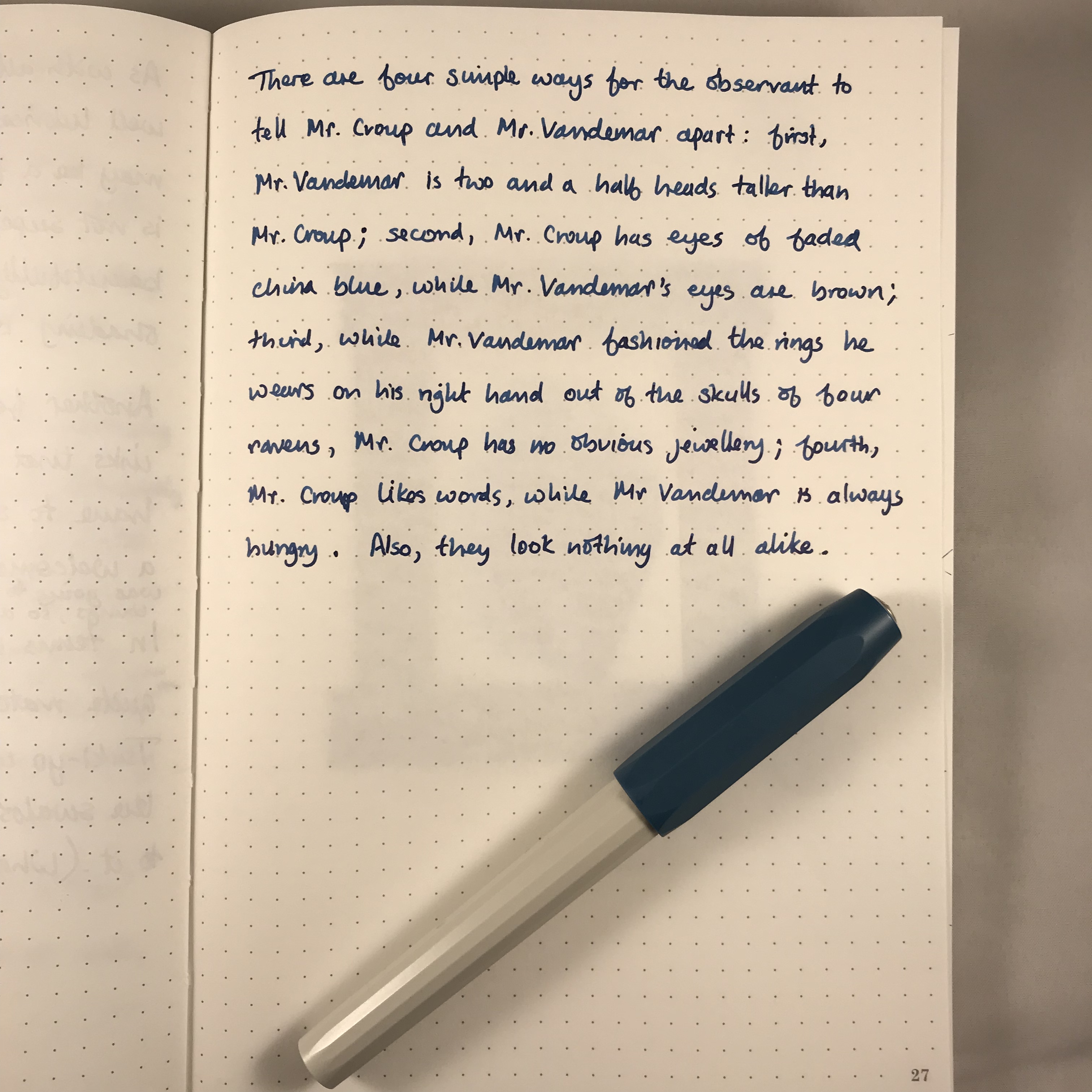
Writing sample, Kaweco Perkeo, medium nib, Sailor Sei-boku, Tomoe River

Telling your Croups from your Vandemars through the medium of Tomoe River

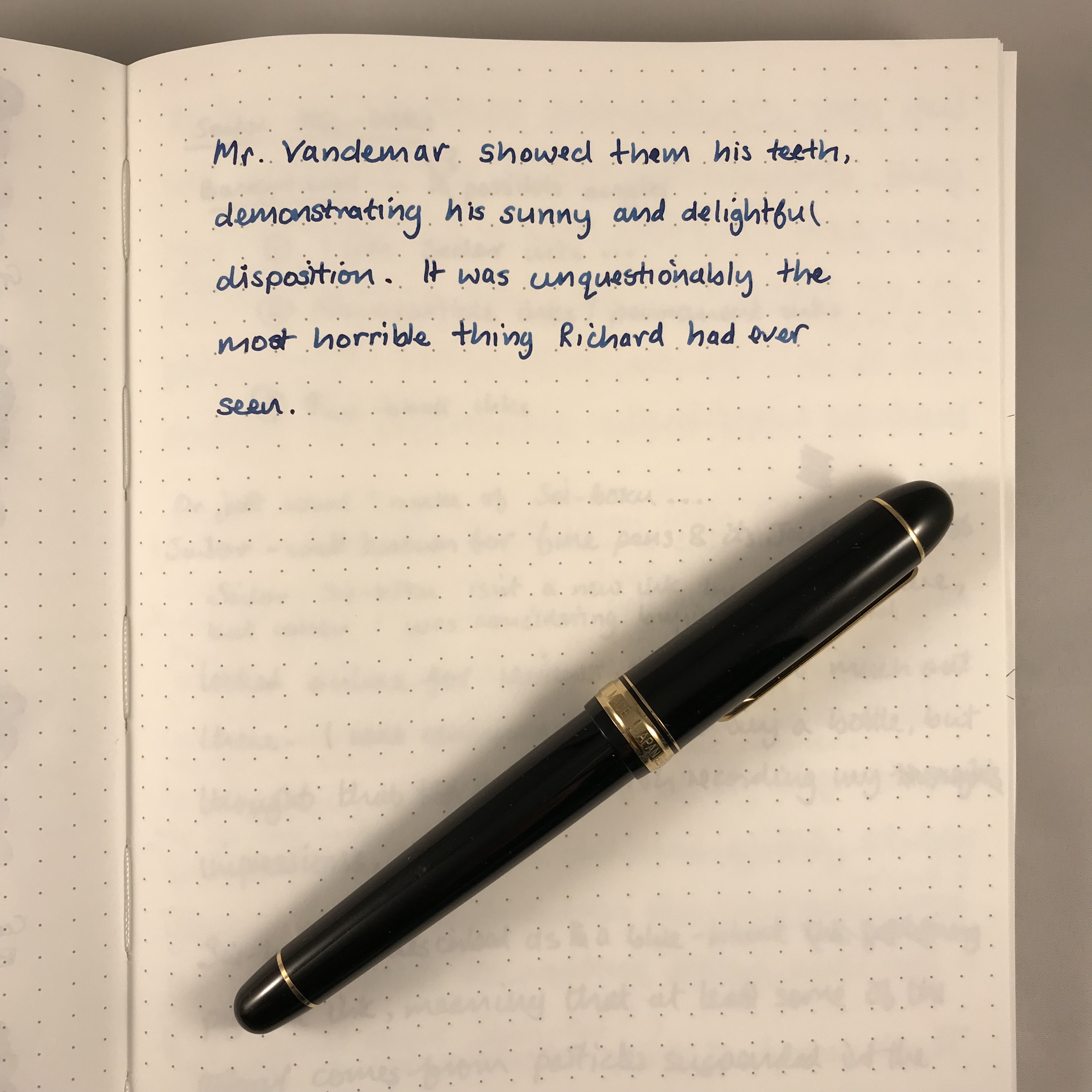
Mr Vandemar, Platinum 3776, Sailor Sei-boku

Mr Vandemar’s lovely smile

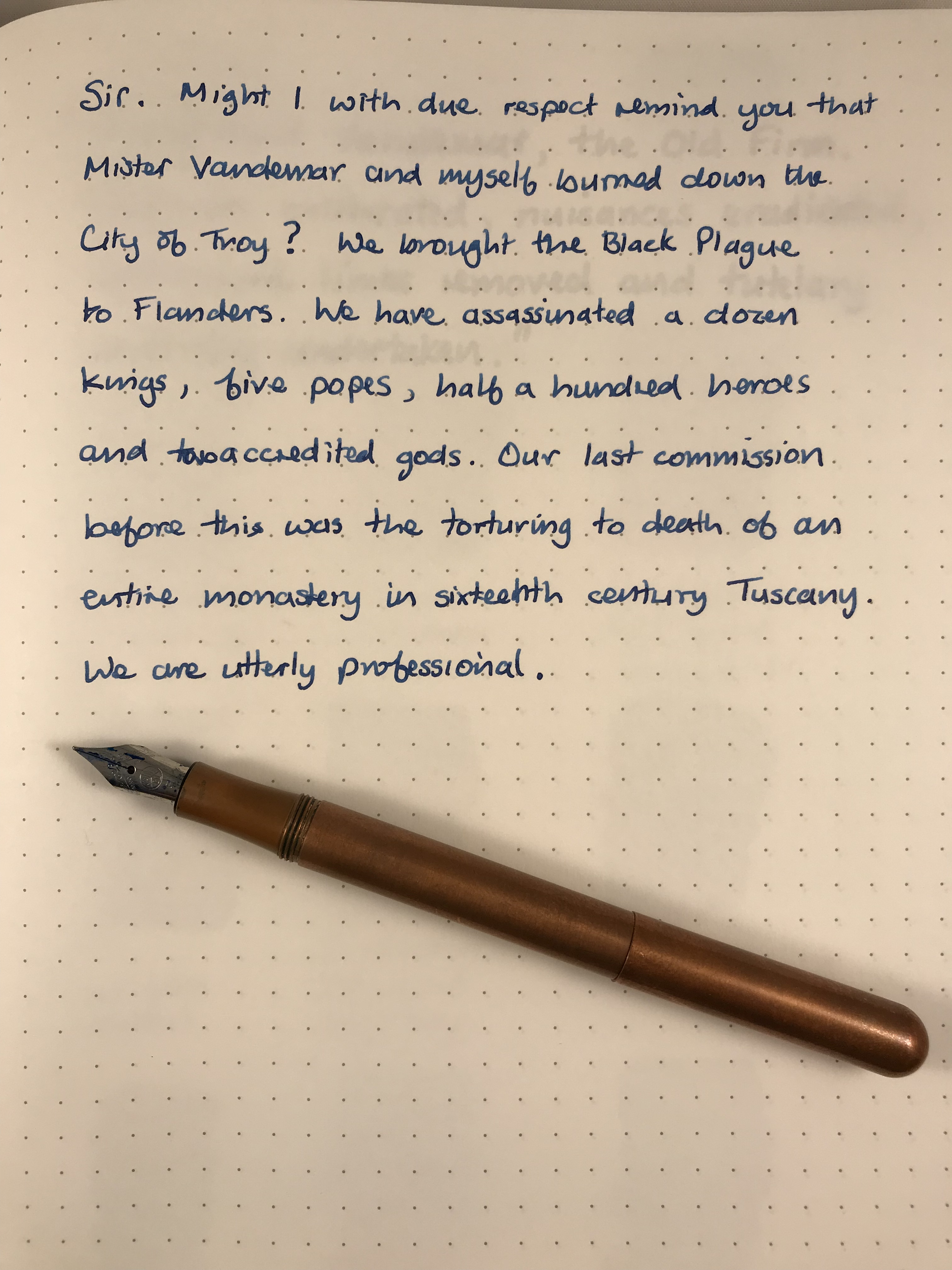
Sailor Sei-boku, Tomoe River, Kaweco Lilliputian, fine nib

Might I with due respect remind you…

As with the other Sailor inks I’ve used, Sei-boku is well lubricated and flows extremely well.  It may be a feature of the suspended pigment particles, but the colour is not super-saturated, meaning that the ink shades beautifully.  It’ll come as no surprise that the shading is most visible with a broad nib.

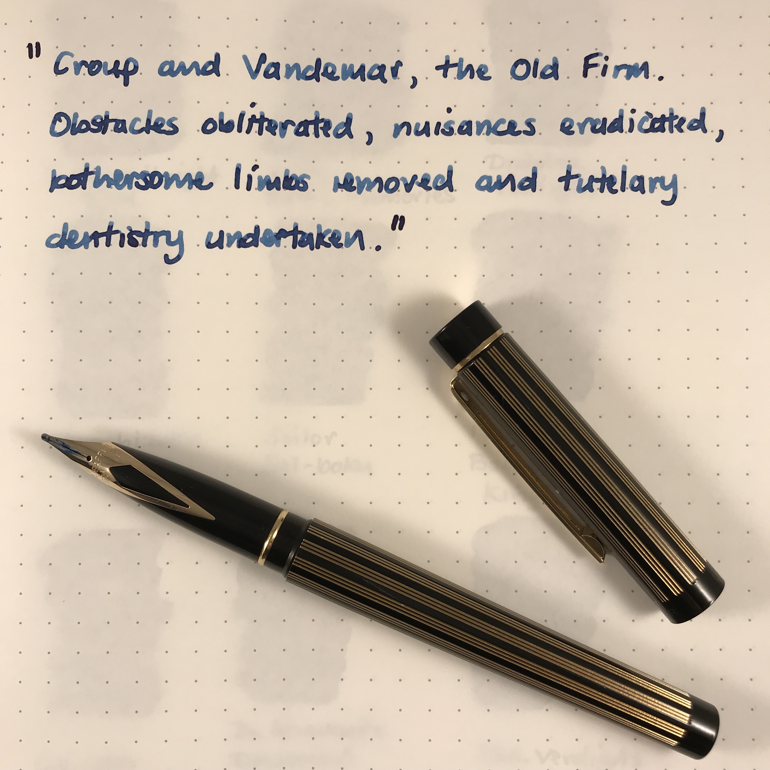
Writing sample with broad nib

Croup and Vandemar get the broad nib treatment

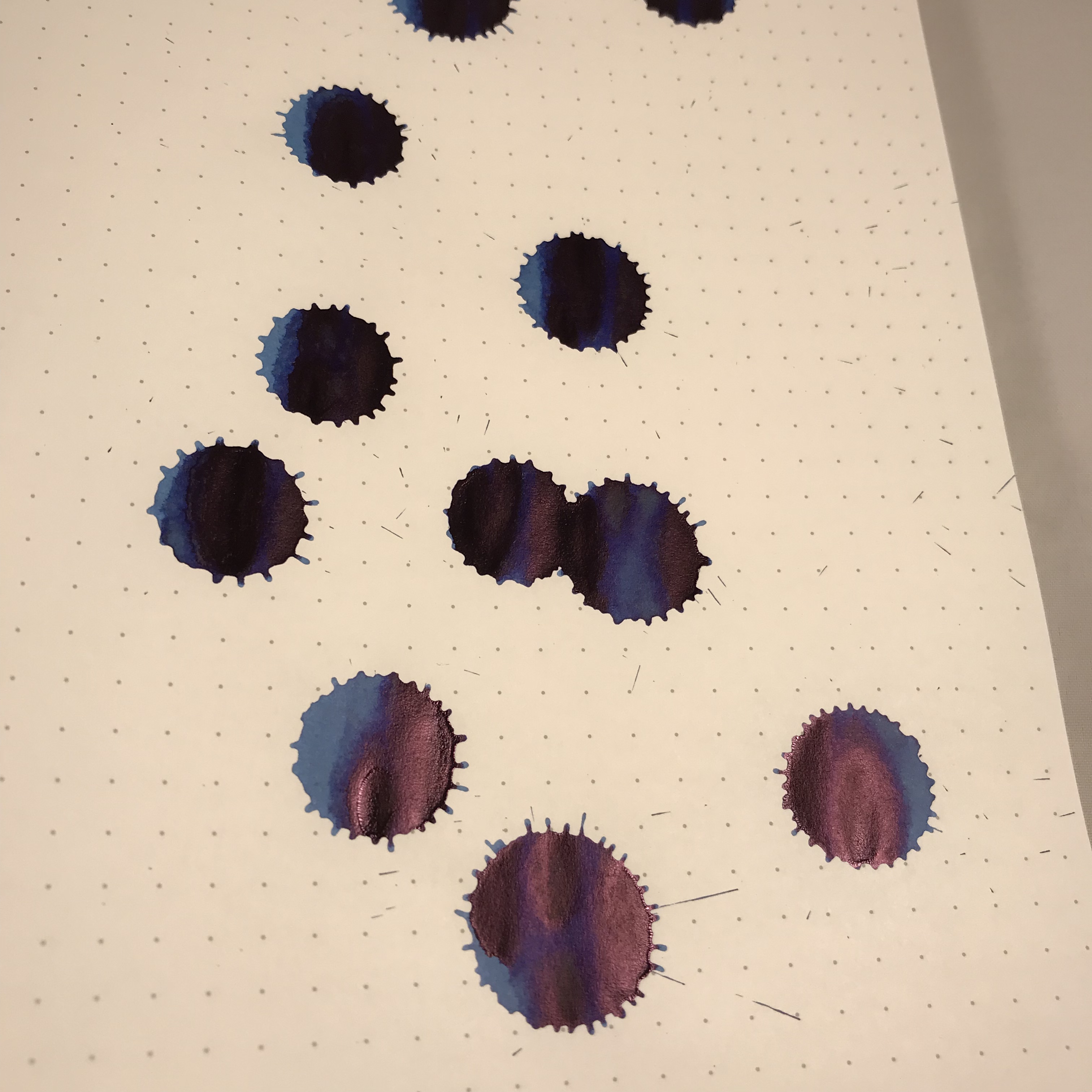
Another feature in common with other inks that I’ve tried is a cheeky bit of sheen.  I have to say that this was a bit of a surprise, albeit a very welcome one.  I had thought that Sei-boku was going to be a very grown-up ink and therefore a little dull and worthy, so all in all it’s been a pleasant discovery.

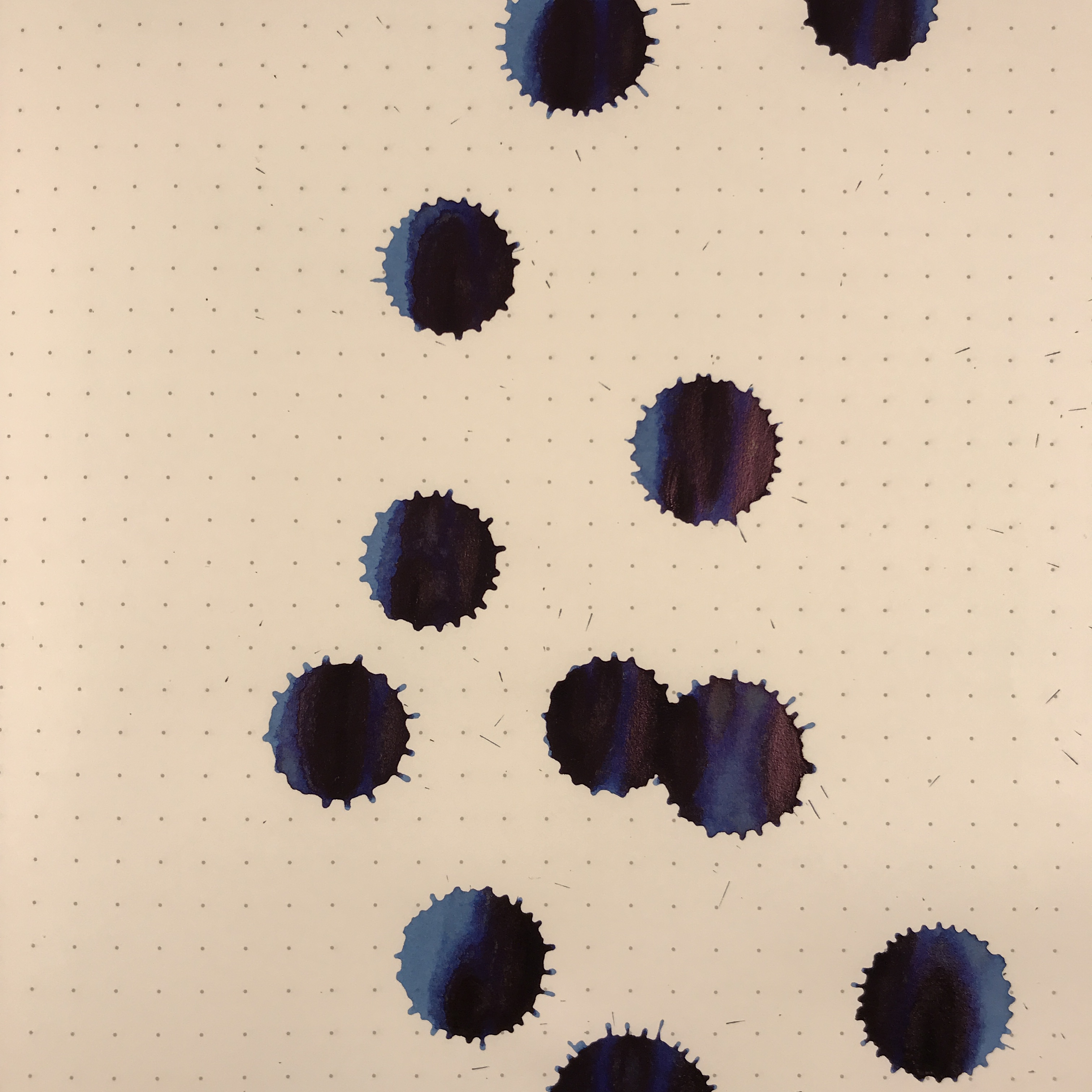
Sei-boku ink splats

Sei-boku ink splats on Tomoe River

Sailor Sei-boku sheen

Some cheeky sheen

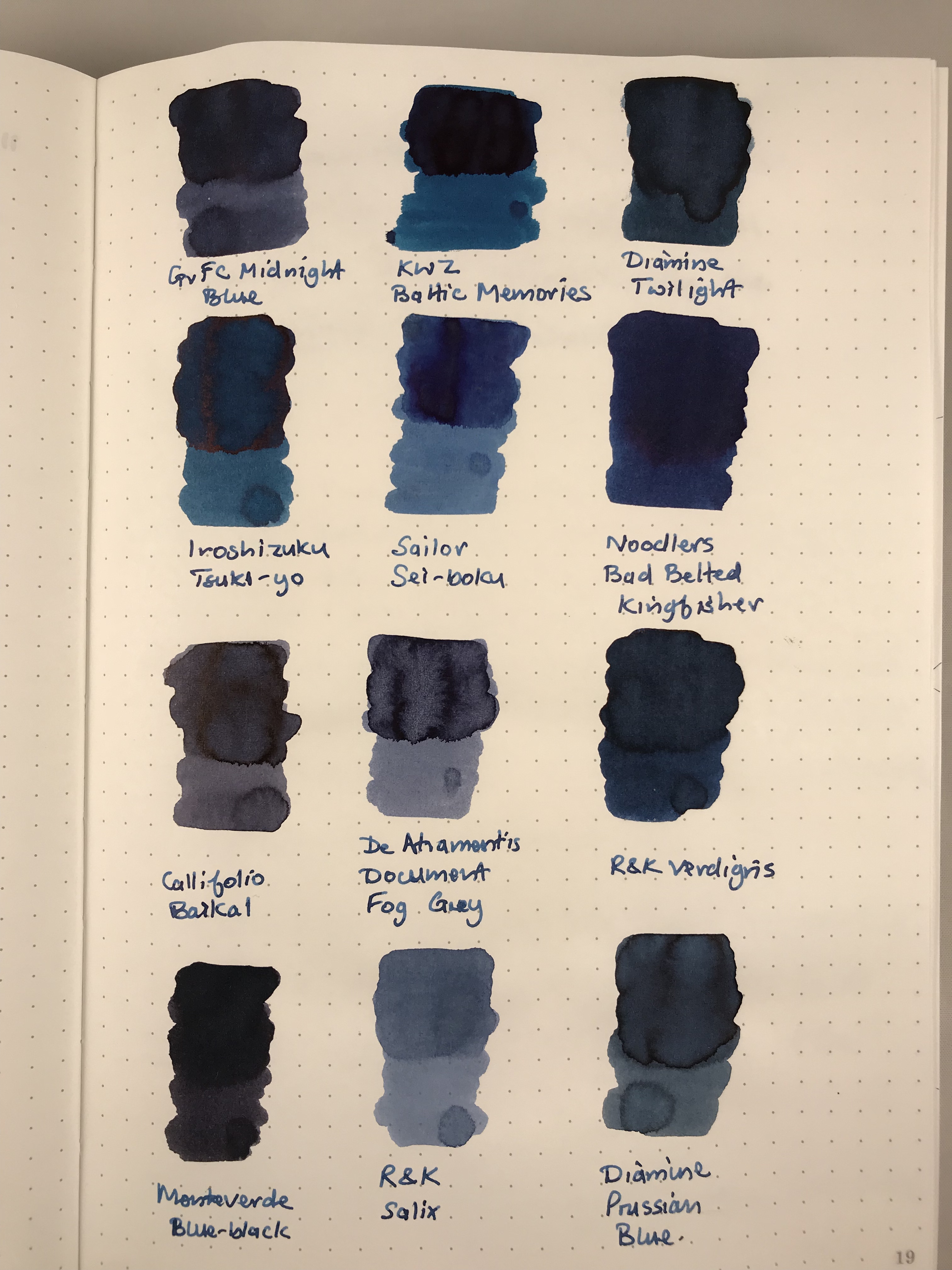
In terms of colour, none of my other inks quite match Sei-boku.  I had originally thought Iroshizuku Tsuki-yo was a close match, but from looking at the swabs, Tsuki-yo has too much of a turquoise hue to it.  After I’d finished the swabs, I remembered I had a sample of Iroshizuku Shin-kai and wondered whether that might be a match…it isn’t.

Comparison ink swabs

Nothing compares…

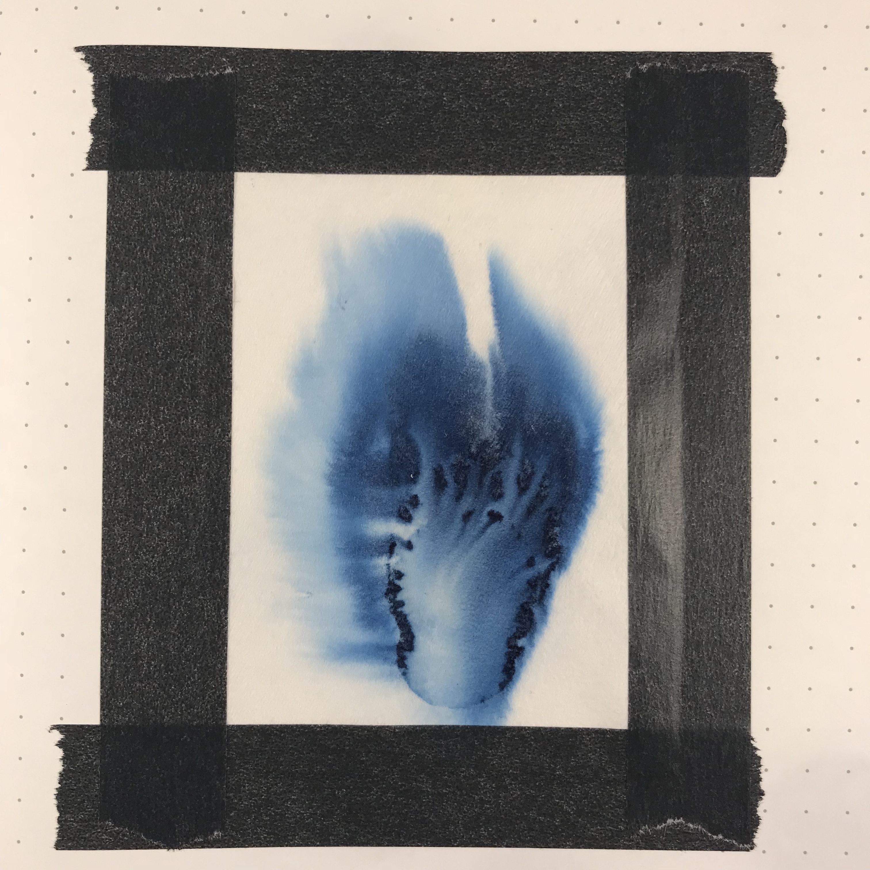
A bit of simple paper chromatography reveals blues of varying shades.  There’s an interesting pattern of dark blue or black dots.  My guess is these are clumps of the pigment particles, but I have no way to be sure.

Sailor Sei-boku chromatography

Chromatography can yield some interesting results

I don’t normally worry about testing waterproof-ness in my inks, and I haven’t done any systematic testing of Sei-boku, either.  I did wet a fingertip and run it over a couple of lines of writing and the ink held fast.

So there we have it, I got past the dire(-ish) warnings and found an ink that I really like.  It’s considerably more expensive than other Sailor inks, being double the price of standard Jentle ink (including blue-black) and about a third more expensive than the Jentle Four Seasons inks.  Maybe the pricing has put people off trying Sei-boku (hence the small number of reviews), but I’m certainly glad I gave it a try.  Pricing makes this a premium ink, but I haven’t tried an ink quite like it and don’t begrudge the cost.  When you compare the price of Sei-Boku to Pilot Iroshizuku inks and newcomers like Colorverse, I don’t think the price is too outrageous.  I bought my bottle from The Writing Desk for £21.60, but you can get it from a variety of sources (including Cult Pens and Andy’s Pens) at a similar price.  Pricing in the US is roughly $ for £ from vendors like Vanness and Jet Pens.  Wonder Pens in Toronto also have Sei-boku for CA$33.


Ink review – Sailor Jentle Oku-yama

Oku-yama, Vac700 and Clairefontaine notebook

One of those times when pen, ink and notebook come together brilliantly

Sailor Jentle Oku-yama is part of the Four Seasons range of inks.  I believe that it was originally introduced as a limited edition ink, but is now a fixture in the range.  Oku-yama apparently translates as “remote mountain” or “deep mountain”, but that’s not much help in trying to figure out what colour it actually is.  Reading other reviews suggests maroon, pomegranate or cranberry.  Garnet is another possible descriptor.  Take your pick.

Despite all the rave reviews, my first instinct was that this is not the sort of ink colour that I go for.  Blues, greys and the occasional green are much more my normal hunting ground.  I decided to buy a sample to see how I got on, and as you can see from the first photo, I liked it enough to buy a whole bottle.  However you choose to describe it, this ink is striking and a really interesting colour.

I bought my bottle for £16.20 from the nice people at The Writing Desk, but it’s fairly  widely available in the UK.  In the US, Jet Pens will sell you a bottle for $14.25, Anderson Pens for $18.  Wonderpens in Canada also have it listed at Can$24.75.  This is definitely not a budget ink, but it’s still way cheaper than inks like Caran d’Ache, Graf von Faber Castell and Pilot Iroshizuku.

As with other Four Seasons inks, Oku-yama comes in a round and fairly squat 50ml bottle.  The bottle contains an insert that is meant to make filling your pen easier.  With the bottle capped, turn it upside down to fill this internal reservoir.  Turn the bottle the right way up, uncap it and fill your pen.  With larger nibbed pens, filling may be tricky depending on how far you need to insert the pen.  Some people seem to find this insert infuriating to use, but so far I haven’t found it too much of a chore.

What’s it like?

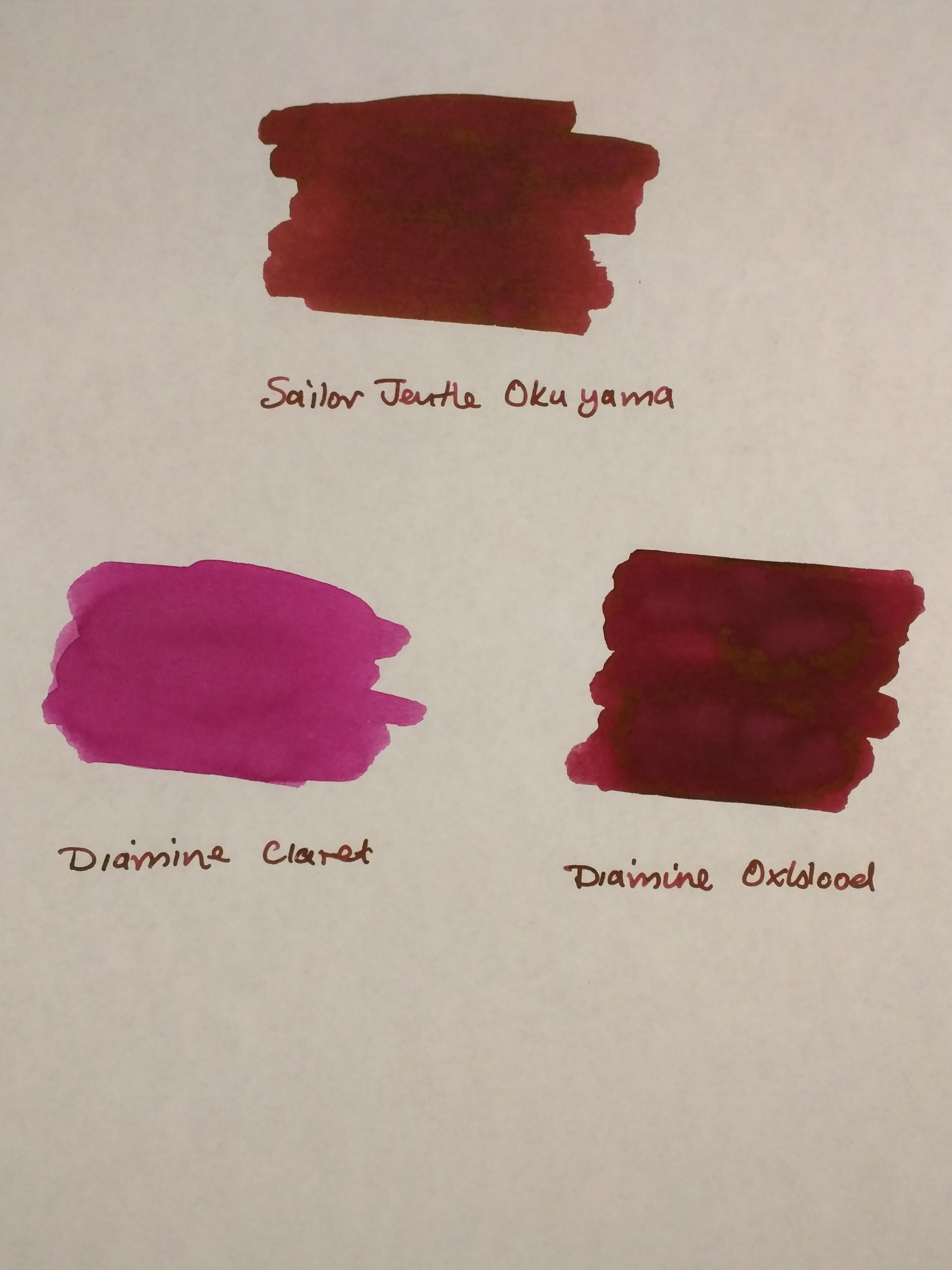
Oku-yama is pretty well saturated, although it does get a bit darker with multiple passes when swabbing it.  As I’ve already said, inks of this colour are off my normal radar, so I don’t have a huge back catalogue to compare it with.  Some internet research throws up names like Diamine Syrah, Montblanc Bordeaux and Pilot Iroshizuku Yama-budo as being close.  The only inks I have that come remotely close are from a mixed pack of Diamine cartridges.

As you can see, Diamine Claret is nothing like it.  Oxblood is not dissimilar but Oku-yama has more of a red tint to it.

IMG_20170526_220202

Oku-yama alongside Diamine Claret and Oxblood on Tomoe River paper

A bit of kitchen chromatography throws up an interesting mix of colours as you might expect for an ink like this.

IMG_20170526_220222

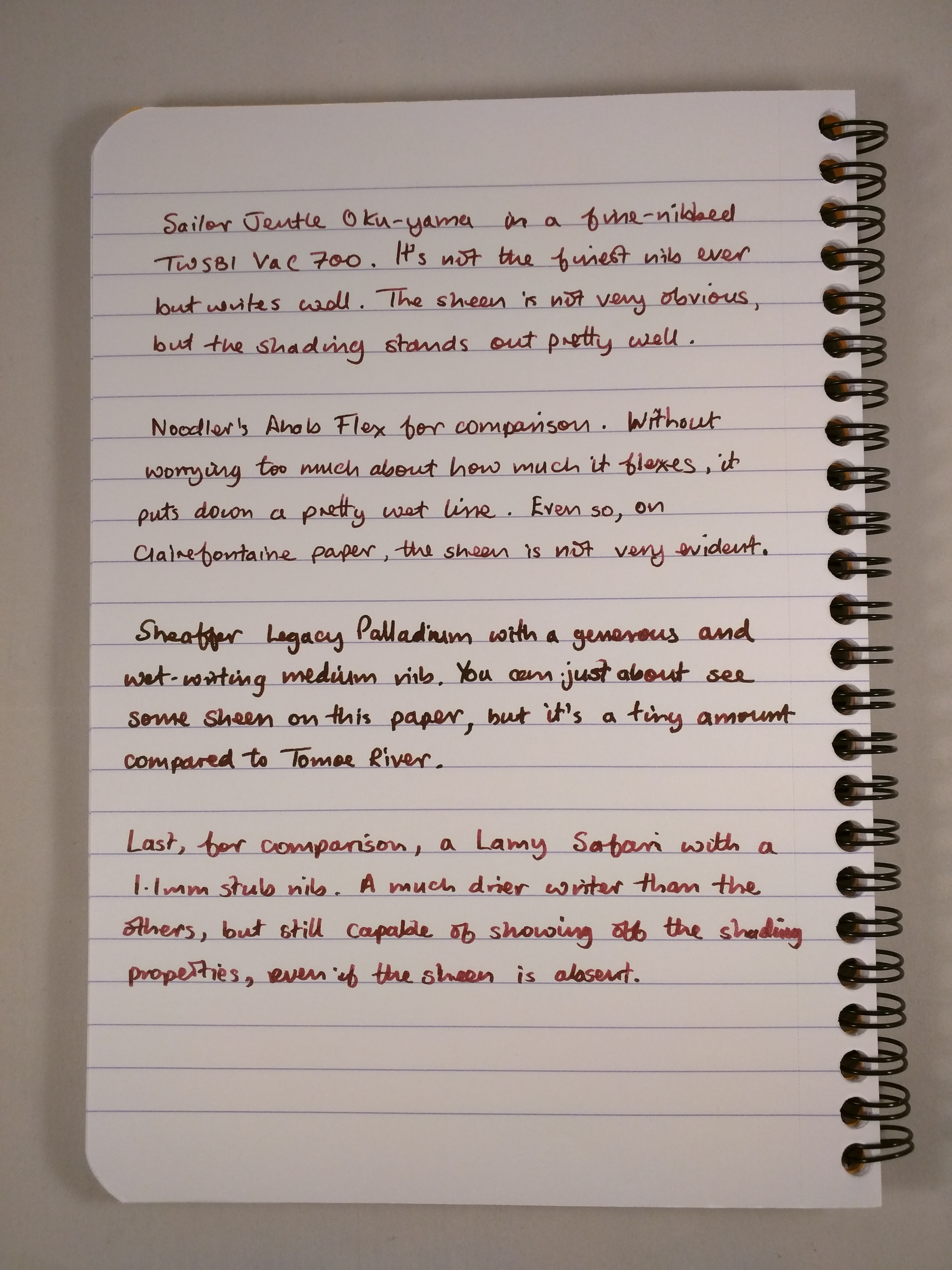
Oku-yama in action

I’ve tried this ink out in a Sheaffer Legacy Heritage (medium), a Noodler’s Ahab Flex (fine medium), a TWSBI Vac700 (fine and broad) and a Lamy Safari (1.1mm stub).  As I found with the Vac700, it’s a great ink for a demonstrator pen – the sort of colour you’d want to see and not hide away.

In terms of papers, I’ve used Oku-yama on Tomoe River, Clairefontaine, Life Noble, Rhodia and TWSBI paper.  One observation is that I think it looks better on cream-coloured papers compared to the white of Rhodia and standard-issue Clairefontaine.

It’s most definitely not waterproof, but it doesn’t make itself out to be so.  Dry times are reasonable – a little over 20 seconds on Clairefontaine paper with a broad nib in my Vac700.  Expect it to be longer on something like Tomoe River and allow for quicker drying times with a finer nib/dryer pen.  My non-scientific assessment is that I’ve used it quite extensively for journaling in an A5 notebook and not had any issues with the ink not being dry when it’s time to turn the page.

I’d describe Oku-yama as a “wet” ink, so although it performed well on these papers it won’t come as a surprise to learn that there was some show-through.  There was no bleed-through at all.  In fact the only real surprise was some feathering on Life Noble paper with the Sheaffer.  It’s the first time I’ve experienced feathering on this paper, but the Sheaffer bears more than a passing resemblance to a fire hose in terms of the amount of ink it puts down, so I can forgive that.

IMG_20170526_220506

Feathering on Life Noble paper

Aside from the gorgeous colour, Oku-yama has a reputation for two things – shading and sheen.  I found that it will shade without any need for encouragement.  Even with a relatively dry-writing pen like the Safari, I couldn’t have stopped this ink from shading if I’d wanted to.  Similarly, I found that Oku-yama shaded on all the papers I tried it on.IMG_20170526_220257

IMG_20170526_220452


Oku-yama on Clairefontaine (top) and Life Noble (bottom) paper

The Sheen, What About The Sheen?

As with a number of other Sailor inks, Oku-yama will produce sheen.  In this case it’s a green/gold sheen.  It will come as absolutely no surprise that the easiest paper to see sheen on is Tomoe River.

IMG_20170520_173402

Oku-yama ink splat on Tomoe River paper

It’s there, even with normal writing – you really don’t have to try very hard at all.  My photos don’t show it very well, so you’ll have to take my word for it.

IMG_20170526_215919

Sheen on Tomoe River paper

I also managed to get some sheen on Life Noble and TWSBI papers, but there’s clearly something in the surface finish of Rhodia and Clairefontaine papers that kills it off.

Summary

At the outset, I didn’t know what to expect from Sailor’s Oku-yama or what I would make of it.  In the end I kind of fell for it.  It’s not really a colour for work use, but it’s both cheery and complex and a joy to write with in most other situations.  I’ve used it quite a bit for journal keeping and I haven’t found it to be overpowering when used page after page.

As a measure of how much I like it, I’ve written the Sheaffer dry and am probably down to a fifth of a tank in the Vac700, which has a huge ink capacity.  I’ll certainly refill the Vac700 with it when it runs dry.

This one’s a keeper!

Baker’s Dozen

I mentioned in a previous post about the need to expand my inky horizons in 2017 and I haven’t let the grass grow under my feet.  After moaning about poor availability of samples in the UK, it turns out that the Writing Desk offer a pretty good range and 12 new inks duly arrived in the mail this week.

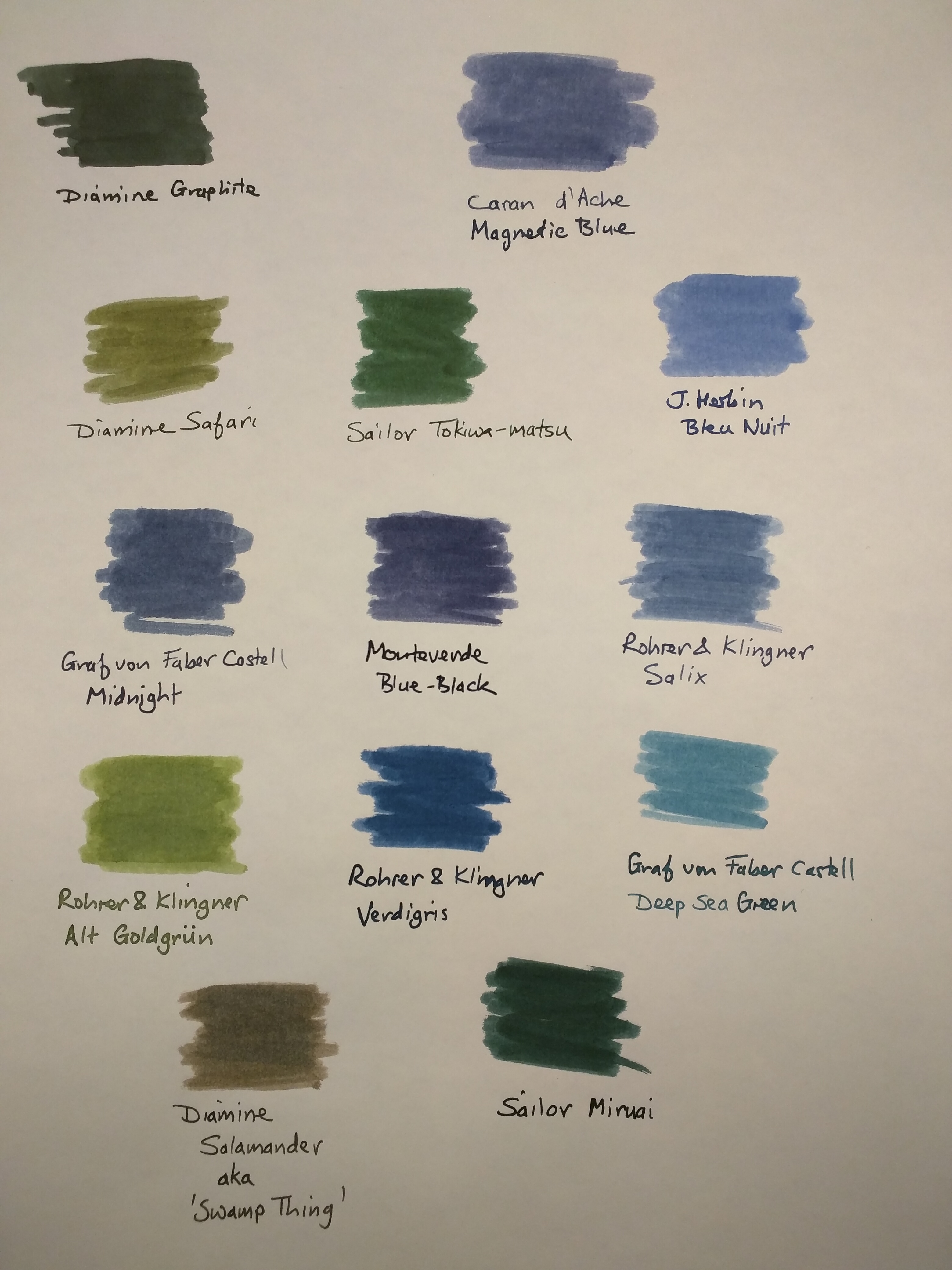
As it’s Friday the 13th, I felt I had to add one more (Diamine Graphite) for the purposes of mildly dramatic effect.  And here they are…

13 ink swatches

Baker’s dozen

Caran d’Ache, Graf von Faber Castell, Monteverde, Rohrer and Klingner and Sailor are all new ink brands to me, so I feel like I’m upholding my new year’s resolution.

Swatches were applied with a cotton bud onto Tomoe River paper, and the names written with my J Herbin glass dip pen.

The Rohrer and Klingner and Sailor inks look really interesting.  In colour terms I particularly like the R&K Alt Goldgrün and Verdigris.  I’ve started using Diamine Graphite a bit, and that looks to be another very interesting ink.

I also bought a Clairefontaine notebook to use as a catalogue  and aide memoire for my inks.  Hopefully it will make writing ink reviews a bit easier too.  As well as the usual swatches and pen tests, I plan to do some simple paper chromatography.  After the issue with my Kaweco Liliput converter and Diamine Twilight, I’ve become quite interested in the dye and pigment combinations used to make the various colours.

I think I’ll be trying more samples this year. The challenge will be affording the full bottles if I decide I like lots of them!  Ho hum.