Oh no – it’s another blue ink!
One of the upsides to posting so sporadically is that it takes away some of the sense of needing to write about new products or little-known makers. Pelham Blue is not a new ink and Diamine is definitely not a little-known maker.

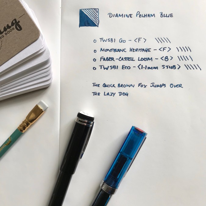
Gratuitous pen shot
Pelham Blue is one of the Gibson Guitar series of inks. I believe these were originally a Germany-only exclusive, but they were subsequently made generally available and have become a routine fixture in Diamine’s product line-up. That’s good news because it means that Pelham Blue is widely available and fits into Diamine’s regular pricing structure.
On to the ink itself. I’ve struggled to categorise it within the pantheon of blue inks. Pelham Blue is a bit of a chameleon, looking slightly different according to which pen and paper you use. I’ve seen ‘blue-black’ inks that are lighter than Pelham Blue. What I can say is that it’s definitely not out there with azure and sapphire blues and it’s definitely not turquoise. Before writing this post I read some other reviews and was struck by the difference in appearance between my use of Pelham Blue and the review on the Pen Addict. That said I had a look at some examples of Gibson guitars that were finished in Pelham Blue and the photos of these were hugely variable too,

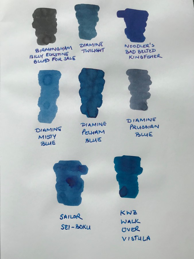
Some Col-o-ring swatches
If you swatch Pelham Blue, you could convince yourself that there some green in there, but that doesn’t really come through in normal use – i.e. writing. Cult Pens, who I bought the ink from describe it as a deep, rich blue. I think that sums it up quite nicely.

It’s definitely a blue of some description
I don’t see it as my mission in life to categorise and catalogue inks. The key things for me are: ‘Do I like the colour?’, and ‘Does it suit my pens and the way I write?’
The answer to both of these is a resounding ‘Yes’.

Do I like the colour? Yes!
I really like this colour. Pelham Blue manages to achieve the balance of being dark enough for serious things like work, but lively enough to be pleasant to use rather than utilitarian.
I tend to use Japanese paper in most situations, and this brings out some wonderful shading. I didn’t think there was any sheen to be had, even on Tomoe Rive paper. Then I tried some ink splats and these duly showed up some red sheen, but only where a considerable amount of ink had pooled.

There’s some sheen there if you really look for it
In my experience you won’t see any sheen in regular use, even on papers that normally deliver on that front. But that’s OK, it’s not promoted as an ink that sheens, and the shading is more than adequate compensation.

You have to love the consistency in nib widths
Pelham Blue works in pretty much any pen. It’s free-flowing and what I would call a wet ink. I like inks that are wet, so that probably endears it to me. I’ve found it works well in my Montblanc Heritage 1912 – to the extent that I can’t remember the last time I inked this pen with anything else. As I was writing out this post, my Montblanc ran dry and I had absolutely no hesitation in just filling it up and carrying on.
One benefit of being a ‘regular’ Diamine ink is that Pelham Blue is relatively inexpensive. I started with a 30ml bottle for £2.35 from Cult Pens, but got increasingly frustrated with trying to fill a piston filler from such a narrow bottle neck. The only and obvious solution was trading up to an 80ml bottle instead (a massive £5.90). I gave the 30ml to a friend and am quite prepared to believe that I will empty the 80ml bottle. It may take me a while, but I can’t see me losing interest in this ink any time soon.
Depending on what you like, Diamine inks can be a bit hit and miss in terms of colour and properties but, as far as I’m concerned, they got it spot on with Pelham Blue.
Definitely not just another blue ink.