Kaco is a pen brand that I’m not at all familiar with. I bought my Retro from Cult Pens as a top-up to an order I was placing. The Kaco Retro is a cheap Chinese fountain pen. It’s also very retro in style terms (who’d have thought it?). Pens of this sort can be a bit hit and miss in terms of quality and whether (or not) they work. The last one of these I tried was the Moonman M2. That turned out to be a good buy (and my most read post). Is the Kaco Retro good enough to recommend as a beginner’s pen? Does it offer enough to be of interest to a pen aficionado? Read on to find out what I made of it…
What’s in the box?
For it’s £10 price tag, you get a surprising amount. Of course there’s the pen and also a couple of anonymous short international cartridges. So far, so predictable. What makes the proposition more interesting is the inclusion of a converter. These aren’t usually included with pens from major manufacturers that cost several times more, so to see one here is a definite bonus.

I’m not in the box (anymore)
On to the pen itself…
Materials
The Retro is made from some kind of ABS-type plastic, which apparently means that it’s an opaque thermoplastic and an amorphous polymer. Well that’s good to know. The really good news is that there’s absolutely no danger of the term ‘precious resin’ being used in the marketing blurb. It makes for a lightweight pen and one that feels like it was made to a price point – which, of course, it is.
The material and overall weight don’t necessarily inspire a sense that the Kaco Retro will survive long enough to become a family heirloom, but it’s tough enough for the here and now and my guess is that it will be fun while it lasts.
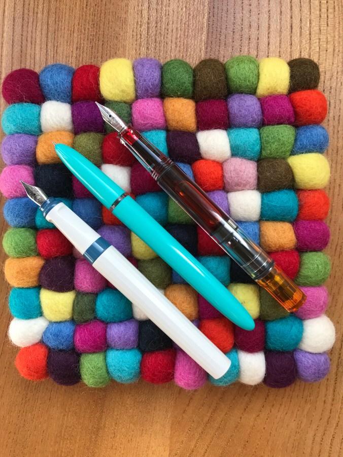
The pen I bought is described as ‘green’, but I’d say that turquoise would be a better description. That said, the lid of the box says KacoGreen and the ‘KG’ is etched into the cap, so who am I to argue with that?
Form and function
The shape of the Kaco Retro is that of a rather familiar slim cigar. It also has a hooded nib. Of course, any resemblance between the Retro and a Parker 51 is entirely coincidental. To be fair, rather than going all out and ripping off the Parker design in its entirety, Kaco have added one or two touches that are presumably enough to fend off a lawsuit for infringement of design rights.

Now which pen do you remind me of?

Nibz in the hood?
The barrel and the cap are each made in single pieces, so there are no finials and no adornments at either end. There are small indentations at each end that look like manufacturing artefacts, but these have been tidied up well enough that I have no complaints about them.

That’s one end of it
The section is essentially the same diameter as the barrel, so there is no step-down between the two. Also, being a slip cap pen there are no threads to get in the way. This smooth profile, coupled with the materials it’s made from, might make the Kaco Retro a slippery customer, but I’ve experienced no problems holding on to it while I write. It’s also worth noting that top of the section which screws into the barrel is clear and doubles as an ink window. I’m not sure how much use this will be, but it breaks up the otherwise uniform colour of the pen.

Size comparison #1 (L-R: Kaweco Perkeo, Kaco Retro, TWSBI Eco)
Size comparison #2
The clip
Normally I don’t worry much about clips on fountain pens. Their main benefit to me is as a roll-stop to prevent pens sky diving from my desk. Despite this, I felt it was worth highlighting the clip on the Retro.
From a design point of view, I think the clip works really well. The simple form suits the pen. One end vanishes inside the cap with no obvious means of attachment, the other end sports a plastic ball in a colour that contrasts the rest of the pen. On the green (turquoise) Retro that I have, the ball is orange. If you buy a blue Retro, you also get an orange ball. Buy an orange pen and the ball is blue – and so on.

Clippety doo-dah
Where the clip is less successful is in terms of its utility. I’d go as far as to say that as a clip and all that’s implied by that term, it’s a complete failure. It’s extremely rigid. It looks and feels like a nail. The clip is so rigid, in fact, that it’s hard to lift it to clip the pen to anything. I wrote the notes for this review in a Paperchase notebook with 100gsm paper and I couldn’t clip the pen to a single sheet of this. My suspicion is that any attempt to persuade the clip to live up to its name would not end well. Consequently I haven’t forced the issue.
The nib
The Kaco Retro comes with an extra fine nib. That’s it. You don’t get a choice of other widths. In practice, I’d put the width as being nearer to what I would call a fine and it suits me well enough. If you like your nibs on the broad side of things, you’ll probably be disappointed.
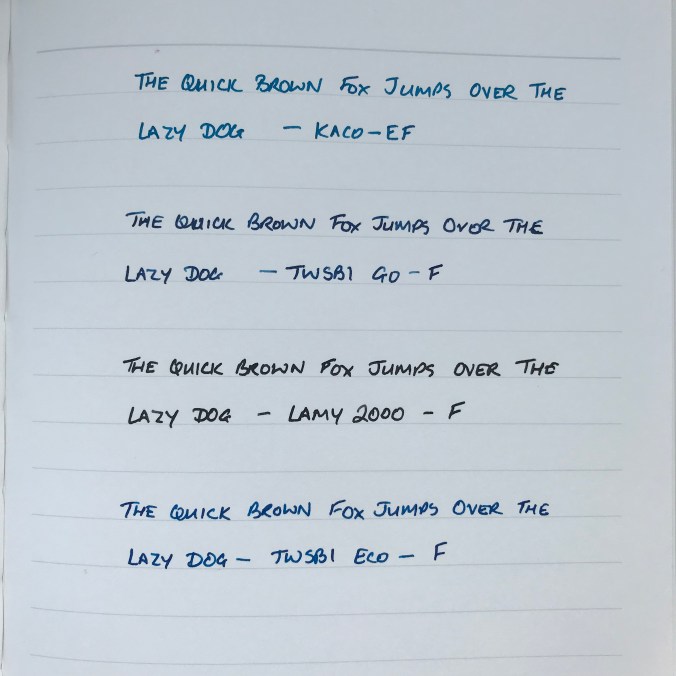
Extra fine or fine? My money’s on fine!
At the price the Retro comes in at, the most you can hope for is that the nib will write well enough and do so without too much hassle. It may have been luck, but mine has proved to be an excellent writer. To be on the safe side, I inked my Retro with Pure Pens’ Celtic Sea. This was partly to (vaguely) match the colour of the pen, but mainly because it’s a free-flowing ink and I wanted to avoid a writing experience that was dry and scratchy.
The Retro writes well on a range of papers, putting down a smooth and wet line of ink. I’ve experienced no skipping or hard starts. To be honest the pen hasn’t lain unused for long, but I’ve had no indications of the nib drying out or being reluctant to start. This is probably also helped by an insert inside the cap. This incorporates a clutch ring to hold the cap on and a plastic liner that looks like it’s there to help stop the nib from drying out.
In conclusion
I tend to shy away from the ‘best pen for…’ type of recommendation, but I’ve been very pleasantly surprised and impressed by the Kaco Retro. I find it visually appealing. It also comes with the added bonus of functioning really well as a fountain pen. Sure, it’s not made from the highest quality materials, but neither does it pretend to be more than it is, and it does only cost £10.
If you like the design and colour scheme, the Kaco Retro is a great place to start with fountain pens. The fact that you get a converter thrown in is a huge bonus. Being able to buy from a reputable pen retailer like Cult Pens means that if you do have any issues (like a dud nib), you have some customer support to engage with. All of that said, this pen has something to offer even if you already own a heap of fountain pens and want something a bit different to add to your collection.
I got mine from Cult Pens for £9.99. Prices on eBay and Amazon look to be broadly similar. I couldn’t immediately spot a mainstream US retailer that carries them. If anyone knows of one, let me know and I’ll update this post. If money is no object, you can buy what appears to be exactly the same pen from Choosing Keeping for £18.00. Although, if you feel the need to spend the sort of money that Choosing Keeping are charging, I’d suggest sticking with Cult Pens and buying two of them. The orange one is next on my list…


