2020 – A year in pens

It might seem a bit off to be writing a round up of 2020 when I haven’t posted very much on my blog. Lack of output doesn’t equate to lack of acquisition, and 2020 has proved to be a year of surprisingly large investment in pens and stationery.

Covid and me

It’s hard to write a round-up of the year just gone without mentioning the C-word. For whatever may have seemed like hardship, I was in fact extremely fortunate as neither I, nor any of my immediate family contracted Covid. Having a partner who works in a hospital meant it was never far away and the challenges faced by healthcare workers all over the world were very real to us, but what went on in hospital stayed there.

My work was minimally affected and I was able to carry on working from home. Like many people I very quickly discovered how to use Zoom and other platforms. Where things got interesting was in trying to balance working with looking after young kids. We’re still talking to one another 😁, but it was tough going at times.

Although it’s easy to form the impression that the various lockdowns and restrictions gave people loads of time to find creative outlets, what I mostly got was tiredness and not much time or inclination for doing a great deal. About the only thing that kept me sane was getting out of the house for some exercise.

Having some time to draw breath over Christmas has at least given me a chance to sit down and write something, even if it reads like a list of who I threw money at over the last 12 months!

Here’s hoping that 2021 brings some new creative opportunities and the time to do something about them!

And now the fun part…

After all that, it’s time I got on with what went on in my little world of stationery.

Plus ca change

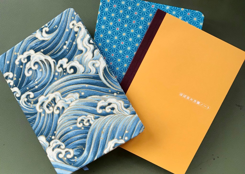
Despite being confined to barracks (in work terms) for the foreseeable future, I’ve stuck with tradition and will be using the Hobonichi Techo as a paper diary again in 2021. I seem to flip-flop between buying direct from Japan and more locally from UK distributors. This year, despite the razzamatazz of the launch in Japan, I took the UK route and purchased from The Journal Shop, along with some A5 Tomoe River notebooks that I’m looking forward to trying.

As far as paper was concerned, Tomoe River paper remained king in 2020. Notebooks from Hobonichi and Flyght of Fantasy Studio.

Learning the art of patience

One of the casualties of the pandemic was international shipping. Having read horror stories of the convoluted routes that some peoples’ purchases took, I’ve been relatively lucky. That said, I had to wait 4 months for one of my Sailors between pre-order and delivery. At least the pen made it safely and (so far) nothing has gone astray.

Jumping in with both feet

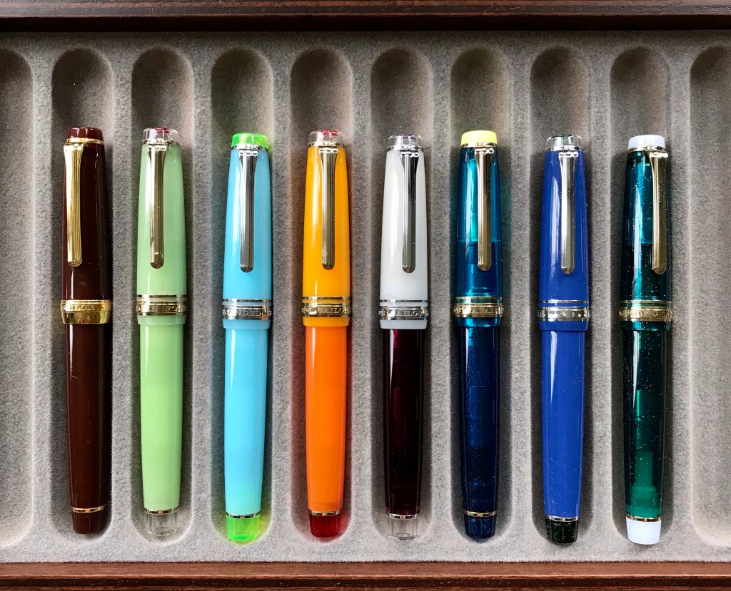
I’ve been an admirer of the Sailor Pro Gear for quite some time. In particular, I like the look of the various special editions that seem to surface with ever-increasing frequency. Missing out on one such edition (Bungubox’s Fujiyama Blue) sparked a reactionary splurge that saw me buy the next two Bungubox editions, along with three pens from the Cocktail series.

My two Bungubox editions – Sanctuary Blue (L) and Omotesando Blue (R)
I really pushed the boat out with these pens – the one on the rights has a fine-medium nib instead of my habitual medium.

On top of the 2020 edition (Kure Azur), Sailor re-released the previous 9 cocktail pens as part of a 10-part set. This retailed with an eye-watering price tag, but despite this I did consider this option. Luckily plenty of retailers seem to have been able to offer individual pens, and so I was able to secure the Blue Lagoon and Apres Ski, along with the Kure Azur to join my Tequila Sunrise and Angel’s Delight.

Anyone for cocktails? (L-R: Apres Ski, Blue Lagoon, Kure Azur – all medium nibs)
3 Sailor nibs and they’re all medium!
The gratuitous shot of all my Pro Gears together. (L-R: Earth, Apres Ski, Blue Lagoon, Tequila Sunrise, Angel’s Delight, Kure Azur, Bungubox Omotesando Blue, Bungubox Sanctuary Blue)

Stilos with style

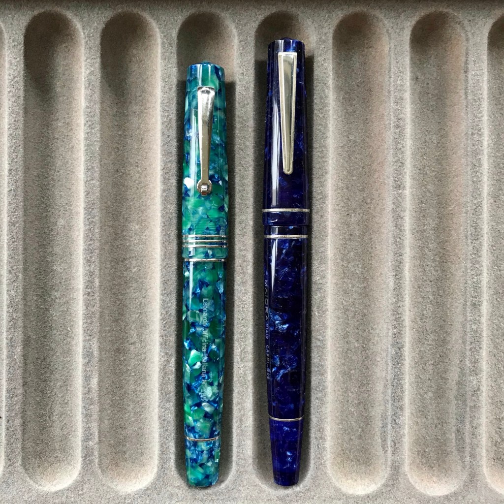
2020 saw me look more closely at Italian pens. In Spring, I bought my first Leonardo (a Momento Zero) and was an early adopter of the Maiora Impronte. The Leonardo has become a firm favourite. Despite its beautiful resin exterior, the Maiora has proved a far less engaging pen. It’s not a bad pen, but it’s not really for me.

The Italian section (L – Leonardo Momento Zero, R – Maiora Impronte). Almost identical in price, but the Leonardo feels a much higher quality pen.

As the end of 2020 approached, the second batch of a collaboration between Leonardo and Jonathan Brooks / Carolina Pen Company was announced. (I missed the first one – are you detecting a common theme here?). Aside from the Leonardo element, I figured this was going to be my best chance to own a pen in the legendary Primary Manipulation acrylic so I jumped at the chance when it came up. I’m happy to say that the result was worth it.

Little Leo, meet big Leo…

Other pens of note

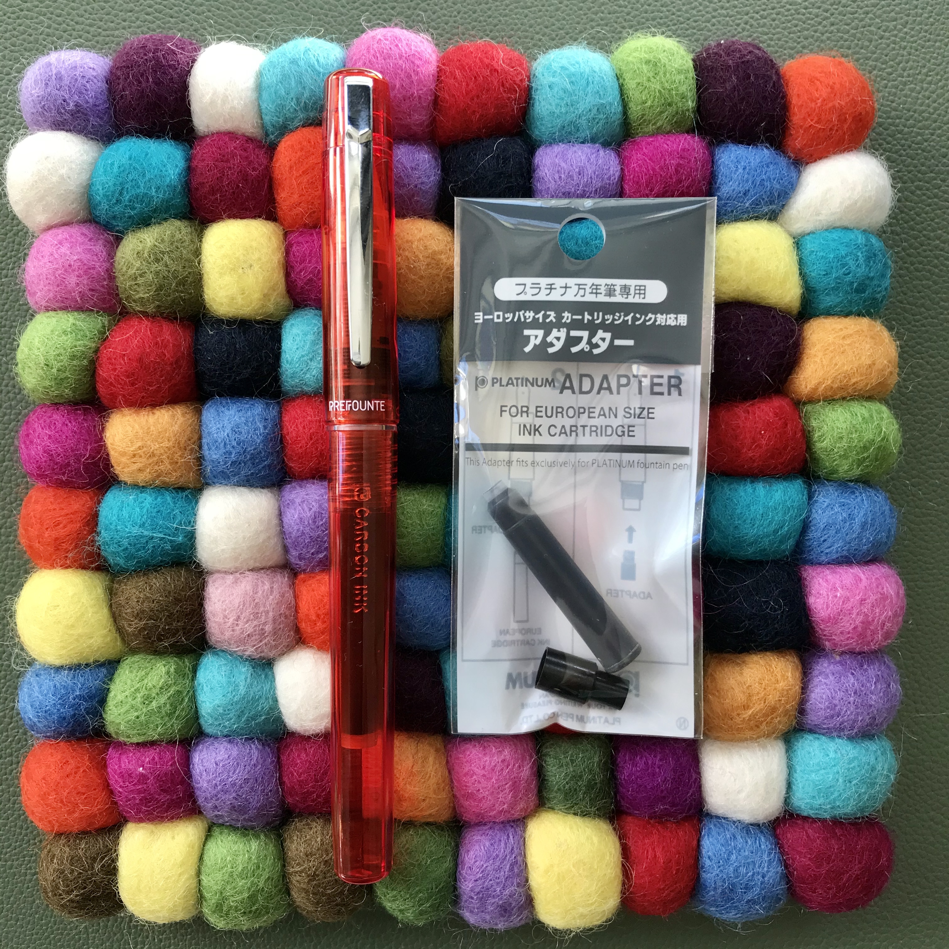
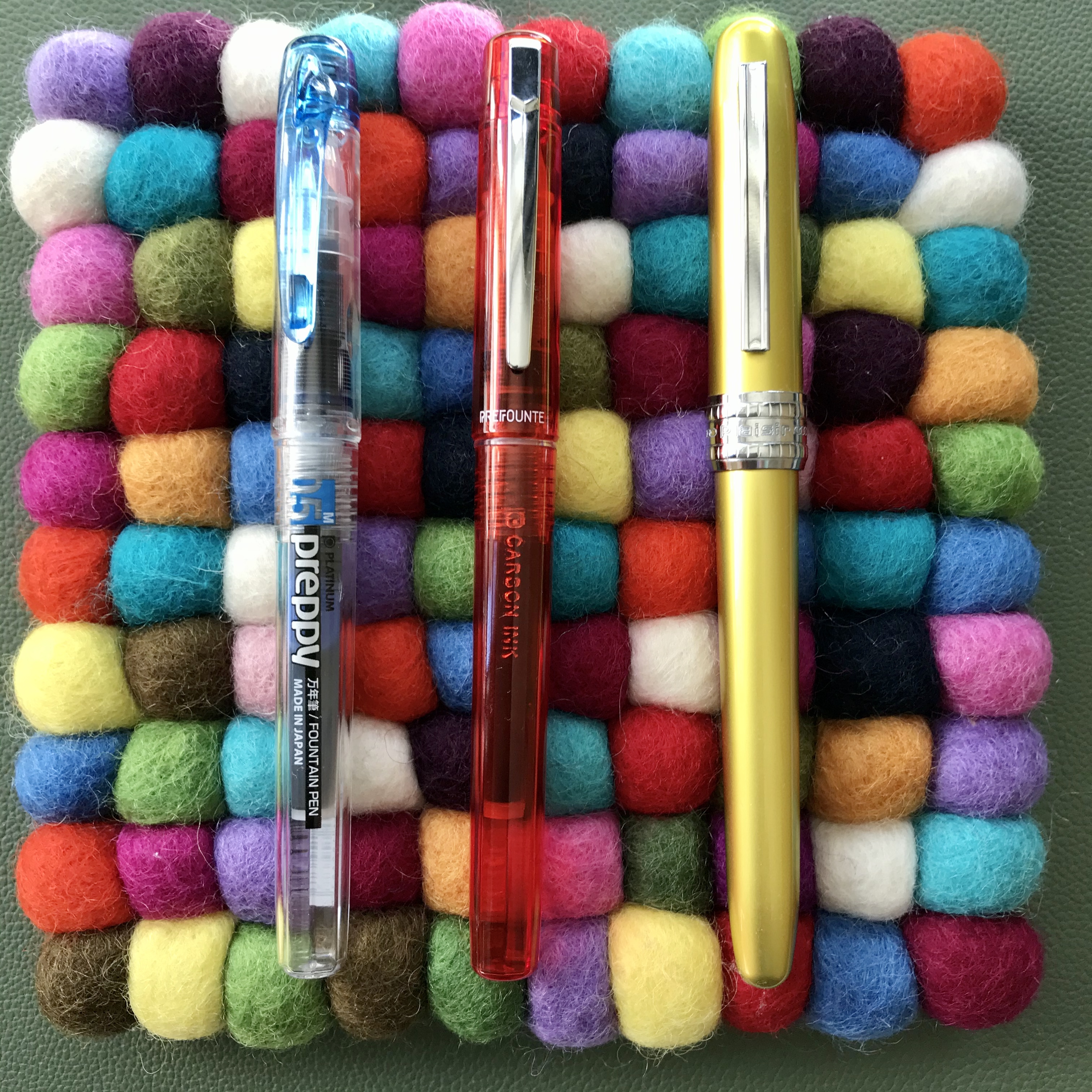
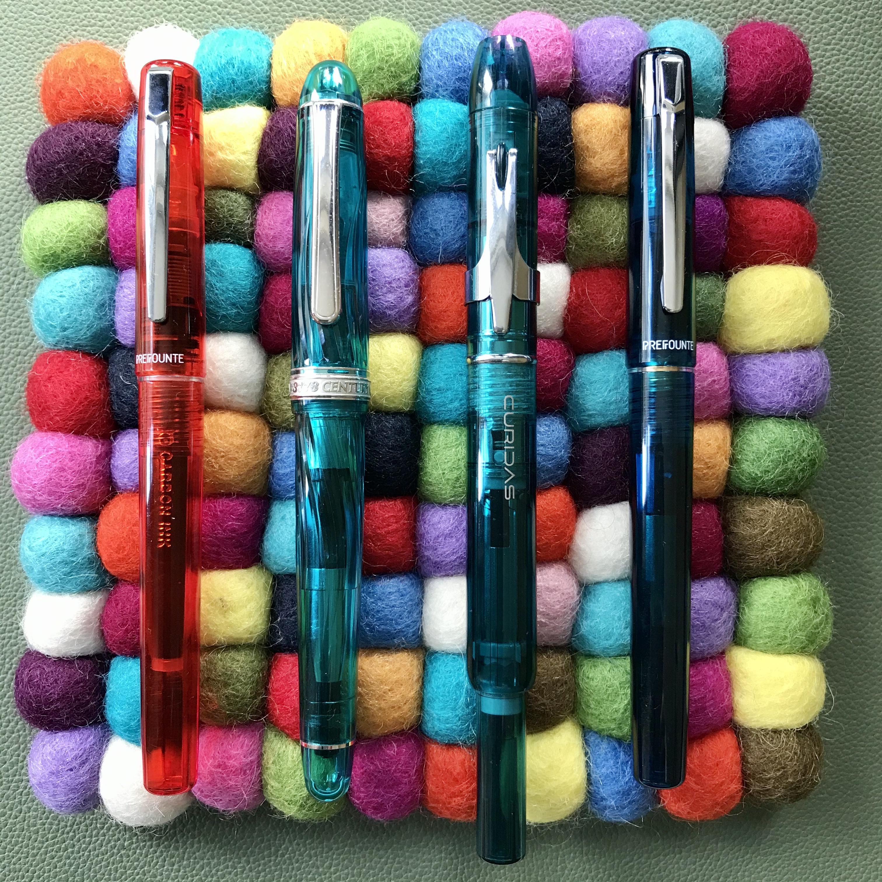
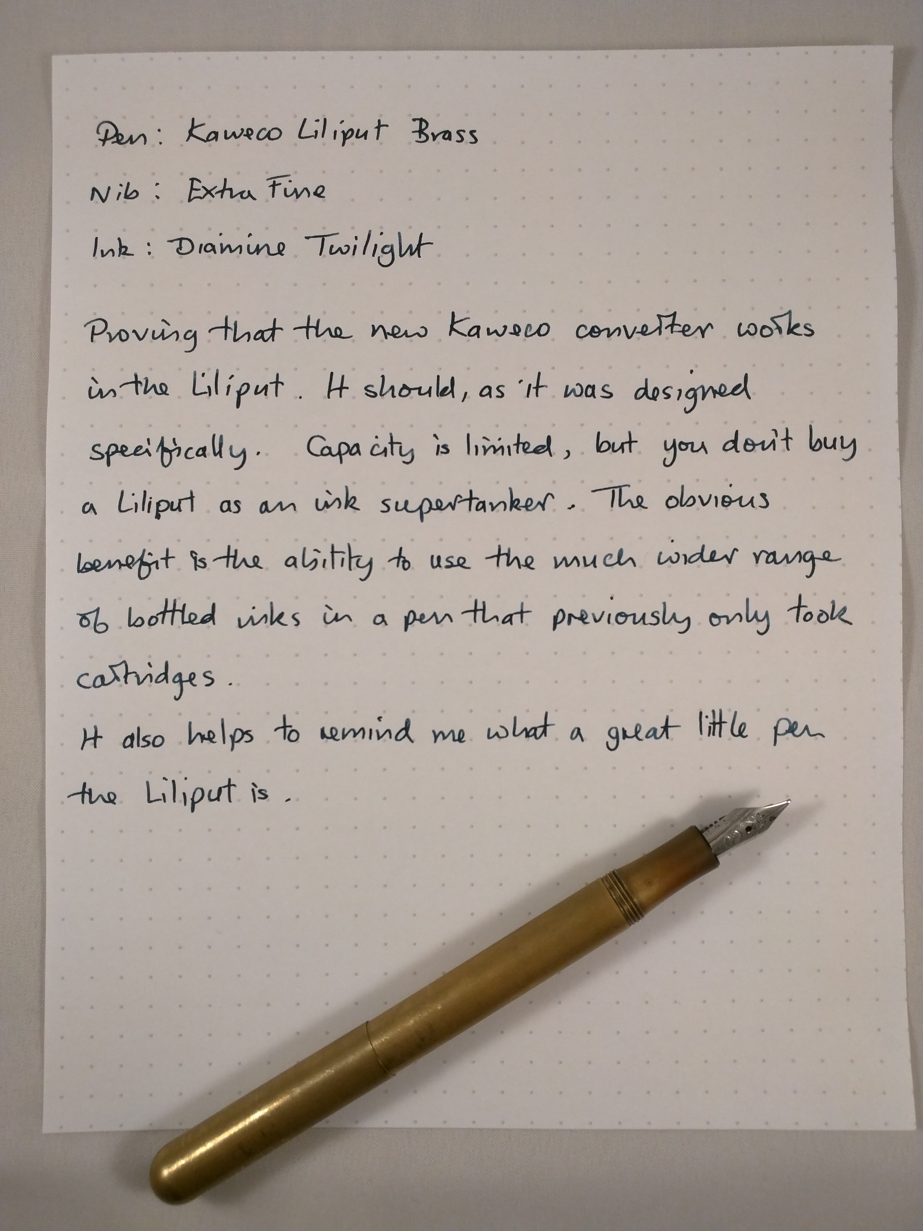
I eventually took the plunge and bought a Platinum Curidas. I’d been put off buying a Pilot Vanishing Point due to concerns about the position of the clip. Taking advantage of a discount from Cult Pens, I managed to bag the Curidas for a good price. To my surprise (and delight) the various protrusions didn’t interfere with my grip and the Curidas is now a regular in my rotation.

Diplomat Aero, Platinum Curidas, TWSBI Eco Cement Grey
Diplomat Aero, Platinum Curidas and one of two TWSBI Ecos I bought in 2020

Late to the party (again), I finally bought a Diplomat Aero. I had assumed that I would end up buying the orange version of this pen, but when the ‘factory’ finish appeared, I was tempted enough to buy it. I don’t own many metal pens, but the Aero is comfortable to hold and the nib is a joy to write with . Coupled with the ‘raw’ aluminium finish, this is one of those pens that I just want to write with.

Getting inked up

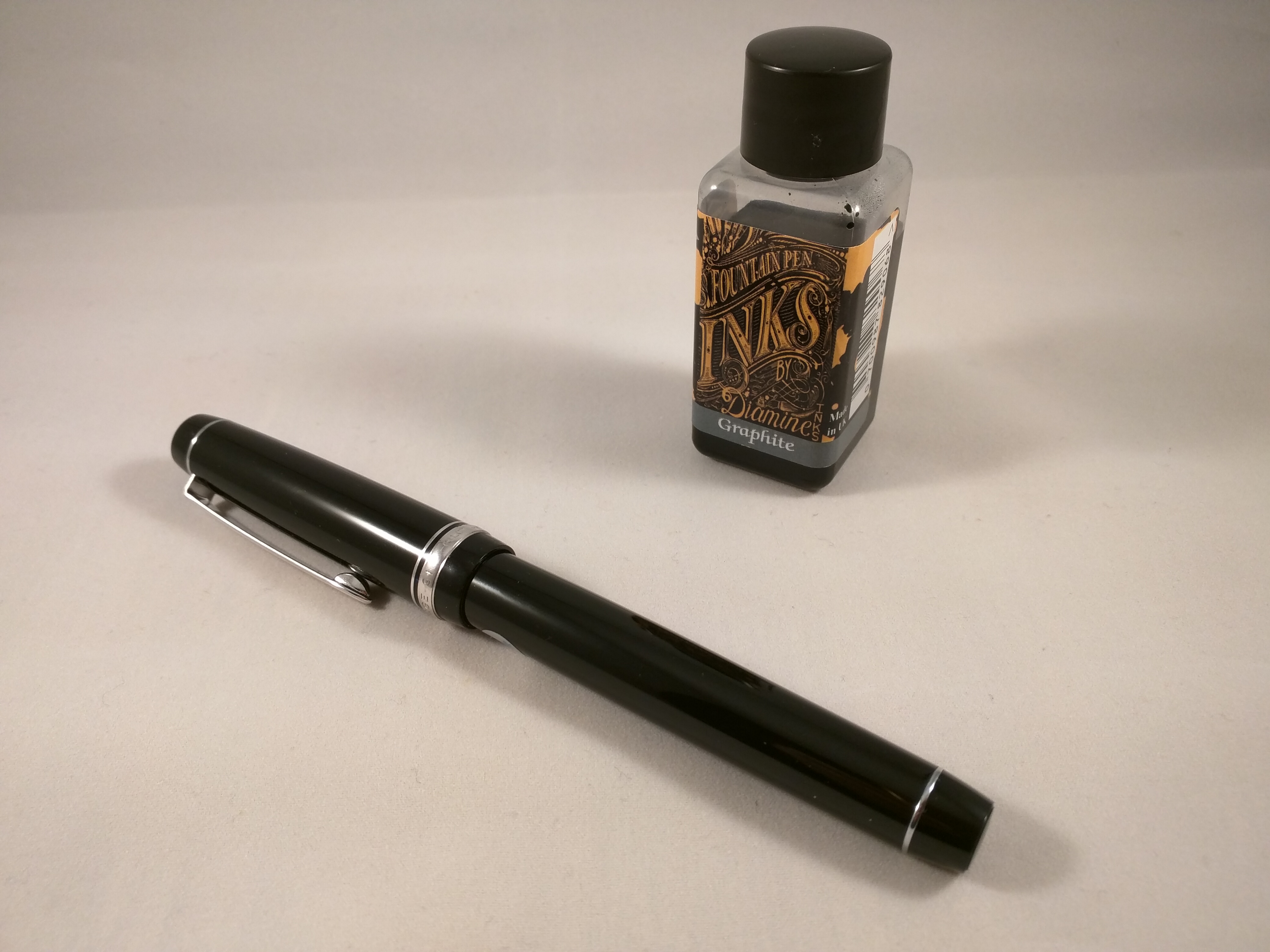
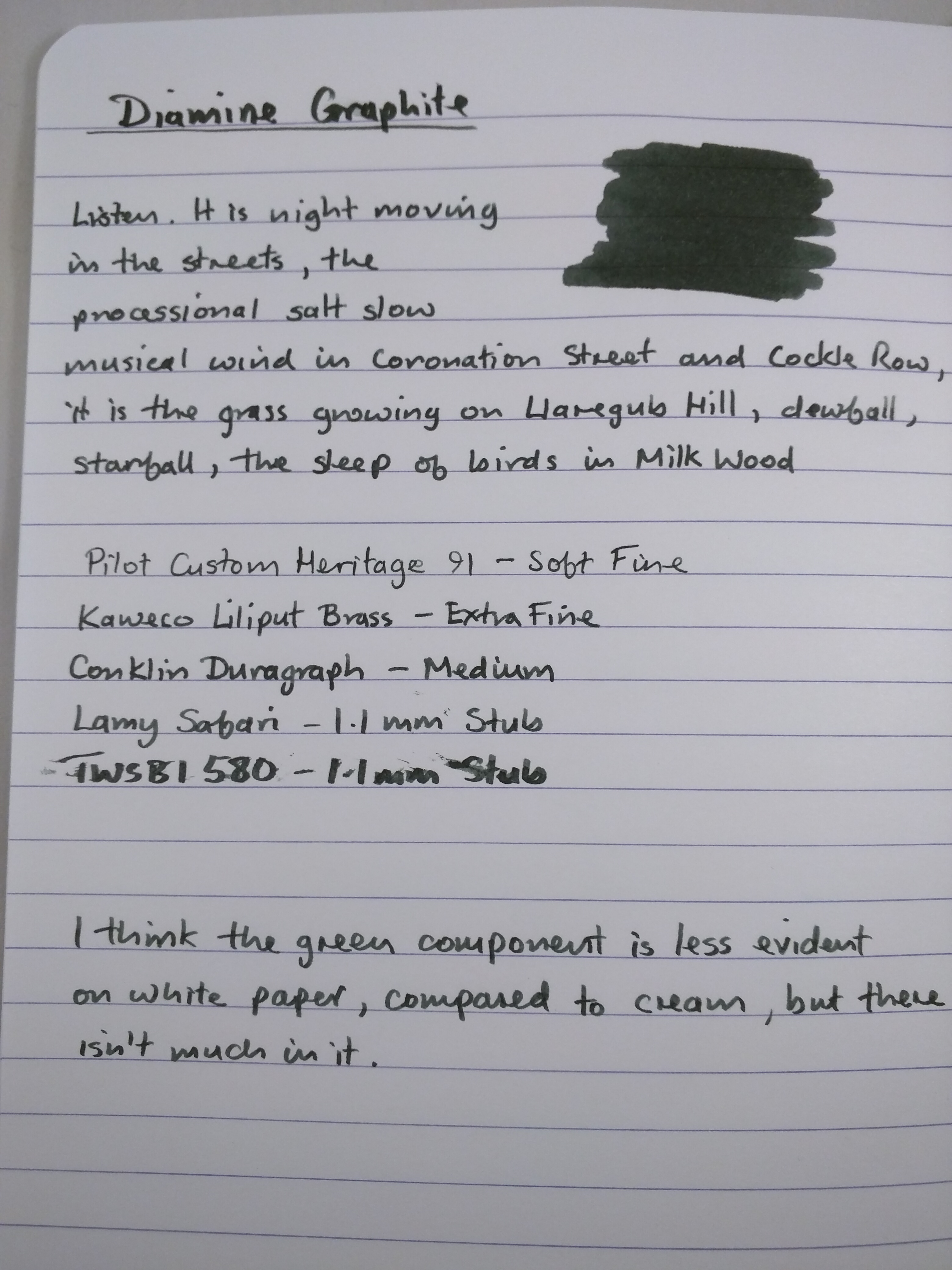
I may already own more ink that I could possibly use in my lifetime, but this hasn’t stopped me from buying more. Together with an in-house acrylic pen, I tried some of the new ‘home-made’ inks from the Birmingham Pen Company. I’ve been pleased with the results, aside from a minor gripe that one ink (Pittsburgh Bankers Ice Rink) is now a different shade of blue compared to the original. That’s a shame because I really liked the previous colour, but hats off to a small maker for having the courage to start up making their own inks.

My (long) haul from the Birmingham Pen Co.

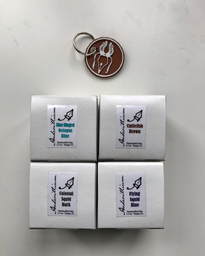
Anderillium Inks from Florida finally hit the UK through Hamilton Pens. I took the plunge and bought a few. They’re ridiculously well lubricated, which makes them hard to use in wet-writing pens, but this property has proved to be salvation for my Nakaya Decapod. This pen has never written how I would like it to, but the Anderillium inks counter the inherent dryness of the nib and made the pen useful to me.

An aquatic theme is probably appropriate for some of the wettest inks I’ve ever used…

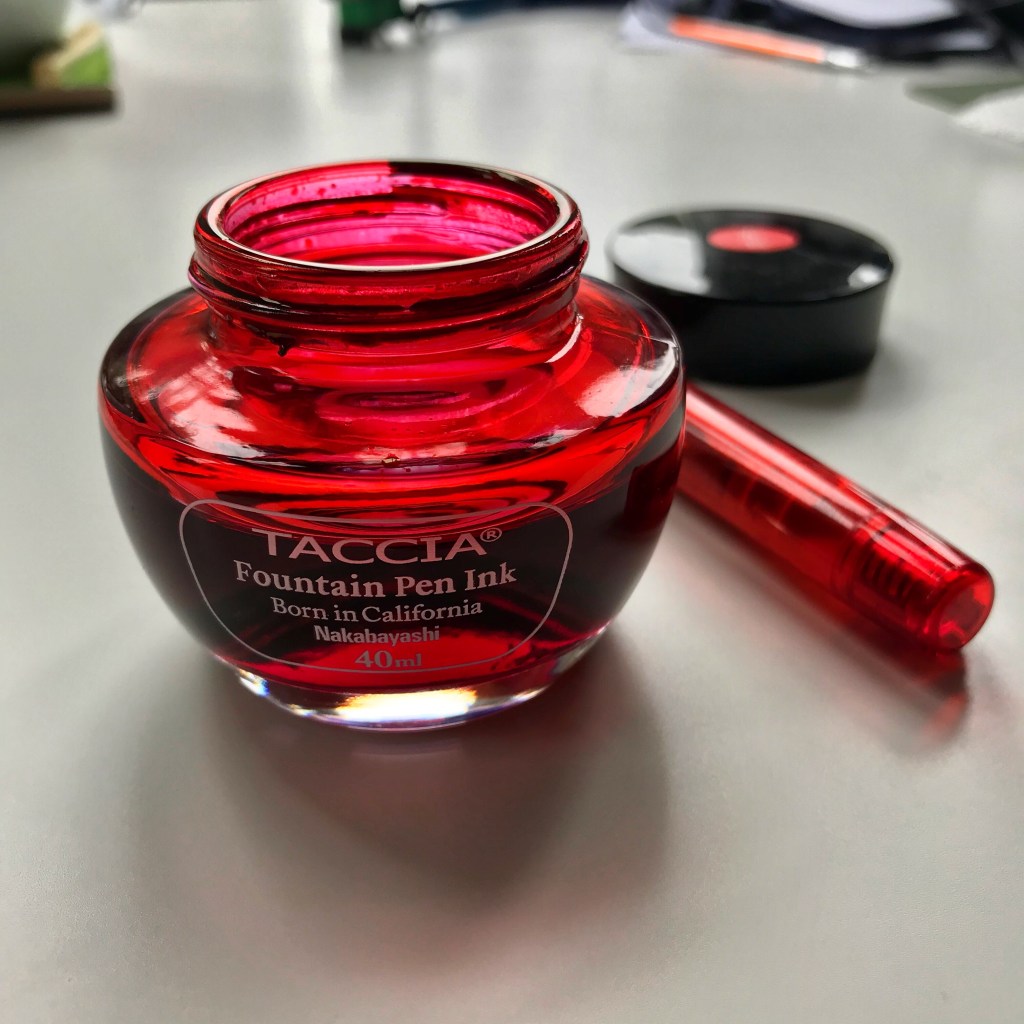
My main ink highlight for 2020 has come in the form of the Ukiyo-e series of inks from Taccia. The inks pay homage to the works of artists like Hokusai and Hiroshige. This is a form of art that I love, so I was always going to be tempted by these inks. Aside from the exquisite packaging, the inks are fantastic to write with. Many are quite subtle and subdued, but a few are more ‘showy’. Of these, Sabimidori is one of my favourites.

Taccia inks and probably the easiest game of spot the odd one out you’ll ever play!
Not one of the Ukiyo-e series, but Taccia Aka is a bonkers pinky-red with some gold sheen thrown in for good measure. Useless if you want subtle and stealthy, but handy if you need to make an impression!

[As an aside, if you want inspiration for what can be achieved in a lifetime, check out some of the work that Hokusai produced into his 80s. It is truly exquisite.]

What does 2021 have in store?

One realisation from this year has been the need to be more forward thinking about pen purchases. Rather than careering about, trying to buy every pen that appears in my Instagram feed, I’m going to try to actually having something that resembles a plan and a budget to go with it.

I’d like to investigate the world of small-scale makers a bit more, but finding one with a waiting list that isn’t as long as a geological epoch could be a challenge. It’s hard to imagine that I won’t be tempted by more Sailor Pro Gears. Bungubox now has an internationally-facing website in English which could be very dangerous!

One project I’m thinking of tackling is to expand the range of nib customisations that I own. The UK isn’t overly blessed with nibmeisters, so it probably means relying on FPNibs in Spain, but I’m keen to try a range of grinds and tweaks using the TWSBI Eco as a base. It may be less glamorous than a hatful of new pens, but it could be fun and interesting to see what a PO or WA nib will do to my handwriting.

Although I don’t have any specific plans, it’s hard to imagine that I won’t be buying more ink in 2021. The ‘what’ and ‘where from’ remains to be determined.

The field of notebooks could be interesting. I’m pretty well set on Tomoe River as my preferred platform, with the occasional deviation thrown in. However, I’ve yet to experience the new incarnation of this paper and, from reports elesewhere, it seems like I might have to give serious consideration to alternatives. Luckily, I have a reasonably large large stockpile of notebooks based on the ‘old’ 52gsm paper to work through so I can at least afford to take a more leisurely approach.

In terms of more local ambition, I’d like to get back to producing content for my blog. The major activity that has dominated my working life will come to an end in the spring of 2021. I’m hoping that a bit less pressure will give me a bit more time and headspace to actually turn ideas into content.

Since no plan survives contact with the enemy, it will be interesting to see what actually happens!

P-p-p-pick up a Prefounte? A look at one of Platinum’s budget fountain pens

I stumbled on the Platinum Prefounte as I was browsing Cult Pens’ website a couple of months ago. I’ve previously enjoyed the Plaisir from the more budget-friendly end of Platinum’s line-up and for under £10 (£8.99 to be precise) I thought I’d see how the Prefounte fared. In fact, I bought two – a fine in ‘Vermillion Orange‘ and a medium in ‘Night Sea‘.

In terms of presentation, the Prefounte comes in some fairly simple plastic and card packaging. It’s inoffesnive and appropriate for the price of the pen, but doesn’t really have a second use and mine went straight into the recycling once I’d unpacked the pen.

Prefounte packaging
The Prefounte comes in plain, simple packaging
Two of the Prefounte colour options – Vermillion Orange and Night Sea

Quick on the uptake as ever, I also realised that (with the exception of the very different Curidas), all of Platinum’s readily available steel-nibbed pens have names starting with a ‘P’ – even the PGB-3000A ‘Cool’. Cool name? Definitely. Well…maybe…

Anyway, back to the Prefounte. It’s a fairly slim and lightweight pen with a translucent cap and barrel, which makes it look more up-market than the Preppy and (arguably), not as smart as the Plaisir. Price-wise, between these two pens is exactly where the Prefounte sits – the Preppy is about half the price (around £4-5) and the Plaisir around 50% more expensive (around £13-15). As other reviewers have noted, whether there was a genuine gap in the line-up that needed filling is open to debate.

Of nibs and feeds

Keeping the Preppy and Plaisir in mind, all three pens share a common section, nib and feed, meaning that switching nibs is dead easy. I’ve always been intrigued by Platinum’s approach of incorporating the feed into the grip section. By making the section translucent as well, you can see the arrangement of fins within. This set-up makes the already small nib unit look more like it could be a replacement unit for a fibre-tip pen than a fountain pen, but in practice it all fits together nicely and works well.

Detail of Platinum's steel nib, feed and section
Platinum’s ubiquitous steel nib and feed/section

Staying on the subject of the nib, the business end of this pen is great. It may be small and plain to look at, but I think the simple approach works well here. The key question is ’how does it write?’ The answer to that is – ‘really well!’ I’ve had 5 of these nib units in various pens over the years and all have been excellent writers – very smooth with no scratchiness or hard starts. I did read some reports of problems with the Prefounte, but that doesn’t match my experience.

I’ve mentioned the translucent barrel and cap already, and I have to say I really like both the colours I picked. If neither of these appeal, you can also have Crimson, Dark Emerald or Graphite Blue.

The barrel is smoothly cylindrical, with a slight taper. The cap is a slip fit and snaps on and off crisply. The name ‘Prefounte’ is painted on just below the metal clip and the ‘opposite’ side of the cap tells you the nib width – 03F (or 05M) together with Platinum’s name and logo and the fact that the pen is made in Japan.

Being translucent means you can see the cartridge or converter in the barrel as well as the nib and feed in the section. You can also see the spring inner cap that makes up the ‘Slip and Seal’ mechanism. I like the fact that Platinum has extended this design right the way down its range of pens – even the Preppy has it. Platinum claim that you can leave a pen inked for a year and it won’t dry out. I haven’t fully tested this claim, but it certainly holds true for several months.

Filling options

The Prefounte comes supplied with a Platinum ink cartridge, because as with many Japanese pen brands, Platinum uses a proprietary fitting. This means you’re (mostly) restricted to using their own cartridges which in the UK come in a very limited selection of colours.

If you want to extend your choice of ink, you could clean and refill an empty Platinum cartridge, but that has ‘faff’ written all over it. Another alternative is to use a Platinum converter, but unless you have a spare one lying around the price of buying a new one (£6-9) can be almost as much as the cost of the pen itself! A more economical solution is to consider Platinum’s adapter for international cartridges at around £1.50. These do what the name suggests and open up a much wider set of options in terms of ink brands and colours.

It pays to be adaptable

One of my preferences is to use less expensive Platinum pens like the Prefounte with Platinum’s Carbon Black ink cartridges. Carbon Black is a fantastic waterproof, pigment ink which I love but don’t use a huge amount. A pen like the Prefounte is a great choice here. The basic writing experience is great and worst case, if it does get clogged up because of the ink particles, it’s not going to be too traumatic a loss. So far that hasn’t happened because the Slip and Seal cap is great at preventing the pen from drying out and the ball bearing that’s used to seal the cartridges gets punched out when you fit the cartridge and helps keep the ink in the cartridge agitated.

What/who is the Prefounte for?

This was essentially the theme of some of the reviews that I read. Was it a necessary addition to Platinum’s range of pens? Who is the target market? I did wonder whether the Prefounte is considered to be a school pen. It’s not marketed as such, but maybe that’s its purpose? Within Platinum’s range you already have the Preppy if keeping costs down is your only consideration, or if you have a little more cash available you could have the Plaisir. If you really don’t want a metal pen like the Plaisir, I guess the Prefounte offers something more aesthetically pleasing than the Preppy and made with nicer materials.

Platinum Preppy, Prefounte and Plaisir
Where does the Prefounte fit into Platinum’s line-up? Right there…

The Prefounte is just about smart enough to be used in a work context and you could probably lend it to a friend or colleague and not worry if it got lost or damaged as it’s cheap to replace .

You probably wouldn’t lend some of these pens to a friend or a colleague!

In isolation, I find it really hard to dislike the Prefounte. There’s nothing intrinsically wrong with it. It’s a nice enough looking pen, without being distinctive and it feels good in the hand. Platinum have got the writing experience with their steel nibs completely sorted, so that’s not an issue. It’s only when you start to think of it alongside other pens that you start to think about why you might buy it. There’s certainly lots of competition at this end of the market.

I bought mine as a bit of an experiment to see what they were like. If you were in the market for your first fountain pen, you could definitely do worse than pick the Prefounte. At least if your usage is going to be low/infrequent you can be comfortably certain that your pen won’t dry out when not in use.

While the usual recommendations for a first fountain pen are the Lamy Safari or Kaweco Perkeo, these will cost you quite a bit more (in relative terms). It’s arguable that you are getting better design and materials for your money and a better selection of inks that can be used with those pens, so there are other factors to consider here besides price.

At almost the same price as for the Prefounte, you could have the Kaco Retro. Based on my experience, deciding between these two is a much more marginal call. Price-wise there’s hardly anything in it. Both are fun designs and remarkably competent performers for such cheap pens. The Retro comes in some fun colours and has a converter as standard, but there’s only one nib size. The Prefounte colour choices may be slightly less fun, but I really like them, plus the Prefounte has interchangeable nibs and Slip and Seal. Here I’d say it really comes down to which one you prefer the look of. Neither has let me down and I’d recommend either.

Platinum Prefounte and Kaco Retro side-by-side
Prefounte or Retro? Your choice.

I’ve always enjoyed writing with Platinum’s budget steel-nibbed pens, and the Prefounte has lived up admirably to those expectations. Whether it has enough going for it in the face of competition is a more tricky question to answer.

Ink Review – Diamine Graphite

Diamine Graphite bottle and Pilot Custom Heritage 91

Diamine Graphite and Pilot Custom Heritage 91

Here goes with my first ever ink review…

I don’t know whether it has anything to do with the time of year or the weather, but here at Slightly Unnerved Towers darker, more muted ink colours seem to be the flavour of the month.  I’m gradually working through a bunch of these, but Diamine’s Graphite is one that’s caught my eye recently.

Diamine Graphite is a dark grey ink with an element of green to it.  It could have been called slate without raising too many eyebrows.  Either way it’s much darker than other grey inks I’ve tried to date and it lacks the blue tint that a lot of greys seem to have.

A bit of kitchen chromatography confirms that what you see is what you get and there’s nothing out of the ordinary or dramatic about it.

Diamine Graphite chromatogram

That could be seen as a negative if you like your inks filled with drama, but I don’t mind.  In its understated way, Graphite gets on with the job.  It’s subtle and straightforward enough to be used in a work context, but it also shades enough to provide some interest.

This ink is well lubricated and flows nicely.  I’ve used it in several pens and not yet had a bad experience.  Like most Diamine inks, it’s not waterproof, but for my purposes that not a problem.  Particularly with being a left-hander, I haven’t had any issues with drying times – a little over 20 seconds to fully dry on Tomoe River paper.

Here’s what it looks like on Tomoe River paper:

Tomoe River sample

Here’s what it looks like on Clairefontaine 1951 paper:

Diamine Graphite Clairefontaine 1951 paper

As with other Diamine inks, Graphite is pretty widely available in either 30ml or 80ml bottles, with the 80ml size being good value at around £6.00/$15.00 a bottle.  That said I really like the fact that you can buy the smaller bottles.  It’s great for inks that you might only use occasionally or still aren’t quite sure of.  Diamine have revamped the design of their labels, but not their bottles.  The best you can say about the 30ml bottles is that they’re functional.  They certainly won’t win any design awards, but at this price point it’s something most people should be able to live with.

Grey inks are not to everyone’s taste, but if you’re thinking of trying some out Diamine Graphite is well worth putting on the list.

Kaweco Liliput Converter – A Review

In the fountain pen world, Kaweco is probably best known for its Sport range of pens.  Renowned for their small, portable size when capped, but fully functional when posted.  True pocket pens.  Not content with this achievement, Kaweco went a step further and introduced the Liliput – a pen with smaller vital statistics, but arguably even more charm.

I own three of these diminutive delights and I’ll talk more about them in another post.  The purpose of this post is to introduce the first converter designed specifically for the Liliput.  Up until now, one notable constraint of the Liliput has been the fact that its size means that it can’t accommodate a converter and has to run on short international cartridges.

Pricing and sources

The good news is that the converter for the Liliput is cheap – around £2.50 in the UK ($3 in the US).  I got mine from Cult Pens, but Bureau Direct and Andy’s Pens in the UK also sell them.  In the US, you can get one from Jet Pens or Pen Chalet.

img_20170101_214919

Liliput converter with an international short cartridge for comparison

I think it’s fair to say that the converter won’t be winning many design awards.  It’s functional, but no great looker.  The adaptor end is made of polypropylene or a similar plastic.  I haven’t been able to figure out what the soft flexible material is that makes up the bulb, but it does what it is supposed to.  The two elements are joined by a metal collar, engraved with the Kaweco name.

To some extent it reminds me of a stripped-down old school Parker bulb filler, minus its metal frame.

img_20170101_215008

Converter vs cartridge – Brass vs Copper

In use

The key question is “does it work?”  I’m pleased to say that the answer is – ‘Yes’.  Mostly.

It’s not perfect in use, but let’s face it, the reason for buying this is to use bottled ink in a pen that was previously off-limits.  As such I suspect most people will live with the shortcomings.

img_20170101_215722

Ink on board

The small volume and softness of the bulb make it very difficult to fill completely by compressing the bulb.  The photo above shows the best result I managed to achieve.  I haven’t measured precisely how much ink I got into the pen, but with what’s in the feed I suspect it’s about what you would get from using a cartridge.

I don’t have a syringe/needle set-up, but if you do it may be an easier route to filling the converter.

For a first outing I inked my brass Liliput with some Diamine Twilight that I got as a Christmas present.

img_20170101_220606

Using the converter in anger

It’s hard to get too excited about an ink converter, but as someone who has used a Liliput for the last few years, it’s great to know that I can now use my favourite inks in this pen and no longer have to settle for the restrictions imposed by having to use cartridges.

Conclusion (Part 1)

This is the point where I’d be wrapping things up and recommending that, for the sum required to buy one of these, it’s a no-brainer to do so.  If you want a full size pen with a big ink capacity, look elsewhere.  If you’re a fan of the Liliput, it’s pretty much a must-have.  Coupled with the news that Kaweco are issuing a clip for the Liliput, things are on the up for this pen.

This review then became a little more rose-tinted.  Read on to find out more…

Conclusion (Part 2)

As I mentioned, for my first use of the new converter, I inked my Liliput with Diamine Twilight.  It was the first time I had used this ink and I have to report I like the colour and the way it behaves in getting from pen to page.

As I was taking photos for this review of the Liliput converter, I discovered that this ink and converter seem to have a very special relationship.  Around 24 hours after first inking the pen, I opened it up to find that the material that makes up the bulb had turned an interesting shade of pink!

img_20170103_062604

Pretty in pink

I emptied the pen and flushed it thoroughly with water to find that the pink colour seems to be a permanent fixture.  I contacted Cult Pens, (who I’d bought it from) and they haven’t had any other reports of this.  They kindly sent me a free replacement,though, and have passed my photos on to Kaweco to see if they have any thoughts on the subject.

img_20170103_211108

Still pink after washing

As this was the first time I had used Diamine’s Twilight, I didn’t have much to go on in terms of the ink’s properties.  Some quick and dirty chromatography identified a dye in this ink that looks a pretty close match to the colour of the converter.  It seems the two have ‘bonded’ in some way.

I’ve emailed Diamine to see if they’ll tell me what this dye is, but as yet, no response.

As far as I can tell, the bulb of the converter is as soft as it was before, so no obvious change in physical properties.  I haven’t had a chance to try washing it with anything other than water, but will try to get hold of some alcohol or acetone to see if that shifts it.

I’ll try the replacement that I was sent with some other inks to see if I get any similar reactions.  It would be nice to hear back from Diamine as to what the troublesome dye is, but I’m not holding my breath.

I have to say I’m enjoying the opportunity to turn detective, even if it is only in a small-time way.  It’s certainly a curiosity that I’d like to get to the bottom of!


What’s in the bag?

I thought I’d kick things off with a look at what accompanies me to work…

P1040108

Pens

My  ‘workhorse’ pens are a TWSBI Vac 700 and a Conklin Duragraph in Cracked Ice finish.  The Vac 700 has so far only been inked with Pilot Iroshizuku kon-peki, but it needs refilling so I’ve cleaned it and will see how it fares with a different ink.  The Duragraph has lived mainly on a diet of J. Herbin Perle Noir, but I’ve recently been trialing another Iroshizuku ink: ku-jaku.

Until recently I hadn’t contemplated the world of vintage pens, but an impulse buy from eBay left me the owner of a slightly dog-eared MontBlanc No. 24.  It’s a piston filler that I  think dates from the 1960s, but I know next to nothing about MontBlancs (never thought I could afford one).  So far I’ve been impressed.

The next pen is both vintage and brand new. Sounds odd, but it’s a 1940’s Eversharp Skyline that never made it out the shop that stocked it.  These pens seem well regarded and the nib supposedly has a bit of flex to it.  I haven’t used it much so far and will write up something more detailed in the near future.

Next up is my collection of Kaweco pens – 2 Liliputs and a Skyline Classic Sport.  The Liliputs are solid brass and copper and I’ve had them a while as you can tell from the patina.  I love these pens, the all metal construction gives these tiny pens some weight.  The Skyline is relatively new and I’m still trying to work it into my pen rotation.

Notebooks

My main journal/notebook is a Hobonichi Techo diary/planner.  I came across this gem a couple of years ago and have been hooked ever since.  At present I don’t use mine for much beyond a work diary and planner, but can’t see myself going back to a standard issue diary.  Its major selling point is the Tomoe River paper it’s made from – ultra thin and beautiful to write on.  Even with a leather cover, at a day to a page it’s still less than 2cm thick.

The two green notebooks are CIAK Appuntinos.  I’ve been experimenting with small to medium format notebooks and this pair caught my eye on the Journal Shop website.  Apart from the textured cover, it was the dot grid paper that took my interest.  I’ll write some more detailed thoughts about these books shortly.

Like many people, I was introduced to Midori through their Traveler’s notebooks.  They also produce a range of other notebooks, all on high quality, fountain pen-friendly paper.  I’m attempting to keep a journal and using this A5 MD Notebook to jot down my thoughts.  I went for grid paper rather than ruled.

Pencils

I’ll confess, I hardly use a pencil these days but I still carry a couple on the off chance I’ll need them.  I bought a Pentel Graphlet for this purpose and then acquired a Uni Kuru Toga M5 from Cult Pens as freebie on top of an order I placed.

Pencil case

My pens and pencils get transported in a Nomadic PN-01 pencil case. For a comparatively simple and straightforward design you can fit a lot in.  I’m still looking for the ideal pencil/pen case, but this does the job for now.