Ink Review – Diamine Pelham Blue

Oh no – it’s another blue ink!

One of the upsides to posting so sporadically is that it takes away some of the sense of needing to write about new products or little-known makers.   Pelham Blue is not a new ink and Diamine is definitely not a little-known maker.
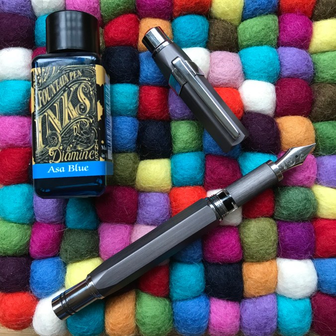
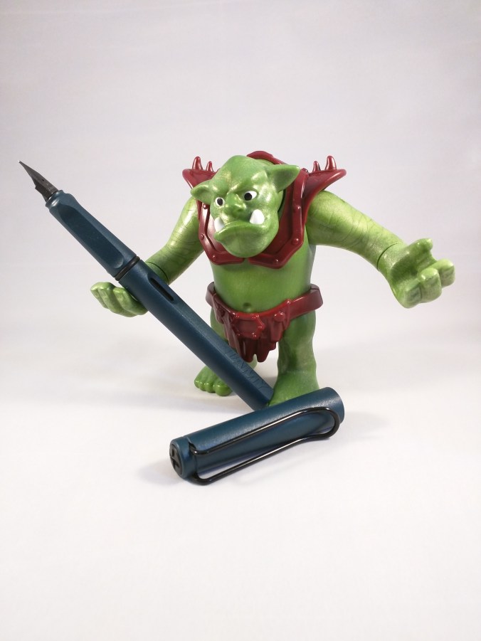
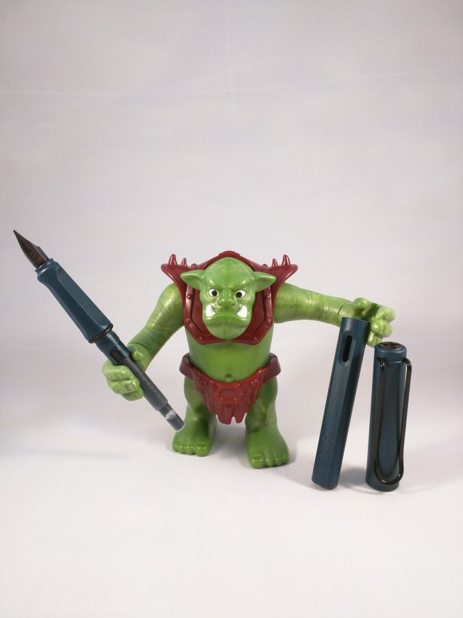
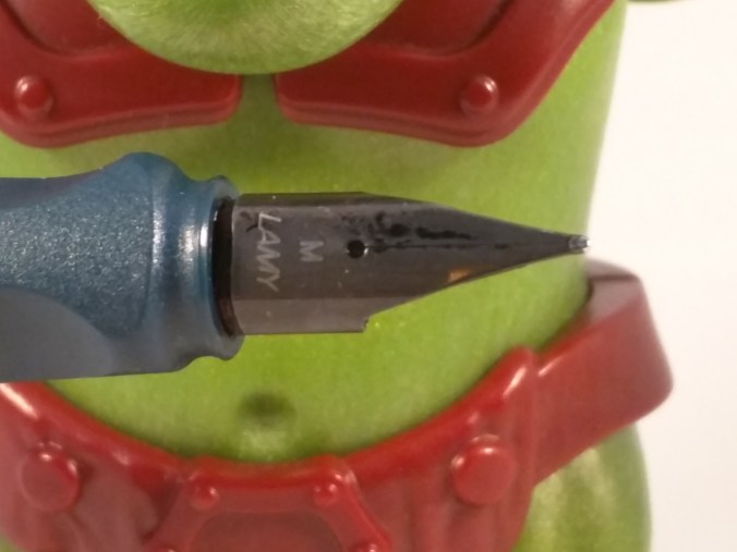
Gratuitous pen shot

Gratuitous pen shot

Pelham Blue is one of the Gibson Guitar series of inks.  I believe these were originally a Germany-only exclusive, but they were subsequently made generally available and have become a routine fixture in Diamine’s product line-up.  That’s good news because it means that Pelham Blue is widely available and fits into Diamine’s regular pricing structure.

On to the ink itself.  I’ve struggled to categorise it within the pantheon of blue inks.  Pelham Blue is a bit of a chameleon, looking slightly different according to which pen and paper you use.  I’ve seen ‘blue-black’ inks that are lighter than Pelham Blue.  What I can say is that it’s definitely not out there with azure and sapphire blues and it’s definitely not turquoise.  Before writing this post I read some other reviews and was struck by the difference in appearance between my use of Pelham Blue and the review on the Pen Addict.  That said I had a look at some examples of Gibson guitars that were finished in Pelham Blue and the photos of these were hugely variable too,

Coloring swatches

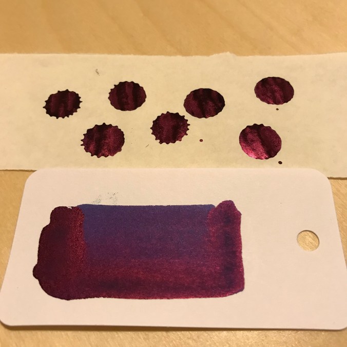
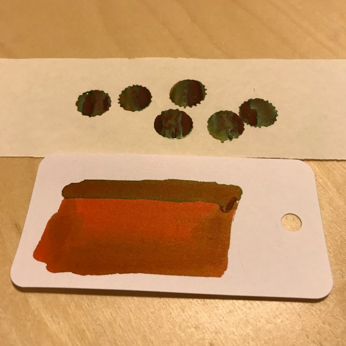
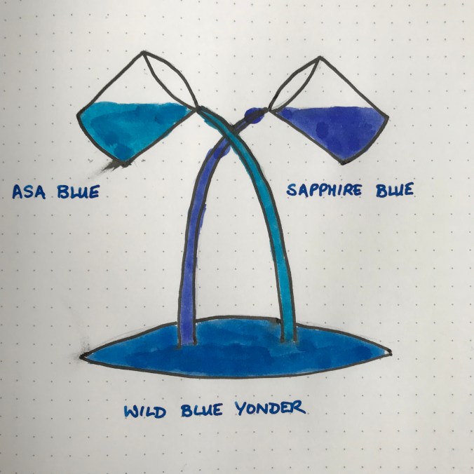
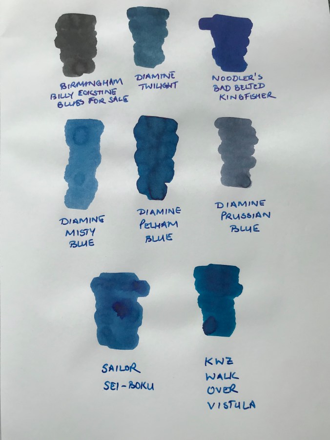
Some Col-o-ring swatches

If you swatch Pelham Blue, you could convince yourself that there some green in there, but that doesn’t really come through in normal use – i.e. writing.  Cult Pens, who I bought the ink from describe it as a deep, rich blue.  I think that sums it up quite nicely.

Comparison ink swatches

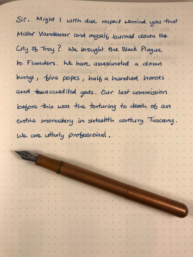
It’s definitely a blue of some description

I don’t see it as my mission in life to categorise and catalogue inks.  The key things for me are: ‘Do I like the colour?’, and ‘Does it suit my pens and the way I write?’

The answer to both of these is a resounding ‘Yes’.

The key things for me are...

Do I like the colour? Yes!

I really like this colour.  Pelham Blue manages to achieve the balance of being dark enough for serious things like work, but lively enough to be pleasant to use rather than utilitarian.

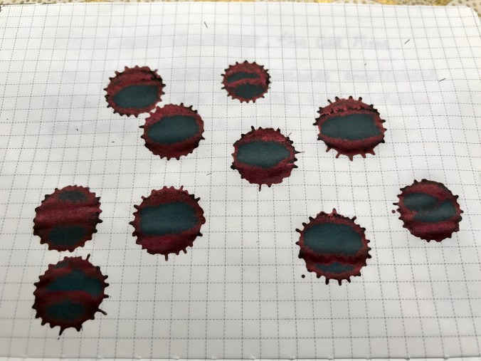
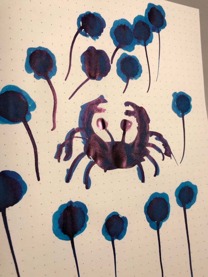
I tend to use Japanese paper in most situations, and this brings out some wonderful shading.  I didn’t think there was any sheen to be had, even on Tomoe Rive paper.  Then I tried some ink splats and these duly showed up some red sheen, but only where a considerable amount of ink had pooled.

Ink splats - sheen

There’s some sheen there if you really look for it

In my experience you won’t see any sheen in regular use, even on papers that normally deliver on that front.  But that’s OK, it’s not promoted as an ink that sheens, and the shading is more than adequate compensation.

Pelham Blue in various pens

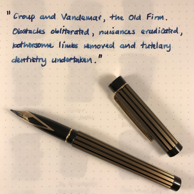
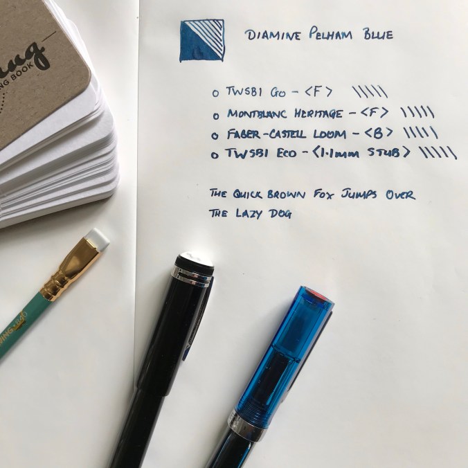
You have to love the consistency in nib widths

Pelham Blue works in pretty much any pen.  It’s free-flowing and what I would call a wet ink.  I like inks that are wet, so that probably endears it to me.  I’ve found it works well in  my Montblanc Heritage 1912 – to the extent that I can’t remember the last time I inked this pen with anything else.  As I was writing out this post, my Montblanc ran dry and I had absolutely no hesitation in just filling it up and carrying on.

One benefit of being a ‘regular’ Diamine ink is that Pelham Blue is relatively inexpensive.  I started with a 30ml bottle for £2.35 from Cult Pens, but got increasingly frustrated with trying to fill a piston filler from such a narrow bottle neck.  The only and obvious solution was trading up to an 80ml bottle instead (a massive £5.90).  I gave the 30ml to a friend and am quite prepared to believe that I will empty the 80ml bottle.  It may take me a while, but I can’t see me losing interest in this ink any time soon.

Depending on what you like, Diamine inks can be a bit hit and miss in terms of colour and properties but, as far as I’m concerned, they got it spot on with Pelham Blue.

Definitely not just another blue ink.

Sailor Shikiori Rikyucha Ink Review

Sailor Rikyucha ink doodle

In case you were in any doubt about which ink I’m talking about

Rikyucha (Green Tea Brown) is part of Sailor’s Shikiori (Four Seasons) range of inks.  Although it is a new ink to me, a bit of research suggests it was part of the Sailor line-up for a while, before disappearing to wherever discontinued inks go.  The translation of Rikyucha is a good one in terms of describing what is quite a complex ink.  It’s also a more palatable descriptor than some that might be applied to it.  Any resemblance between this ink and something that you might find lurking at the bottom of a pond is, of course, entirely coincidental…

Lookalikes

My interest in inks of this colour started with a couple of Diamine inks – Safari and Salamander.  While I’ve liked the colour of these inks, I’ve found them a little dry for my liking.  In a quest for something more to my liking I tried Robert Oster Bronze.  I love the colour of this ink, but again it’s a bit too dry for me.

Comparison swatches

Can you pick out the culprit from this lineup?

Close-up of ink swatches

The same swatches in closer detail

As you might expect from an ink made by Sailor, Rikyucha is a well-behaved, low maintenance ink.  That said, I suspect it’s the kind of colour that will polarise opinions.  I may well be biased, but it was appealing enough to make me buy a bottle.  As I’ve used it in anger I’ve grown increasingly fond of it.

As well as these basic properties, Rikyucha has one or two extra tricks up its sleeve.  The most on noticeable thing is that it looks dark green with a slight hint of blue while wet, but dries to a much browner shade.  I tried to capture this difference, but failed miserably so you’ll have to take my word for it.

Sailor Rikyucha writing sample

Some of my favourite literary villains and yet another chance to flaunt my awful handwriting

On top of the colour shift, there’s a cheeky bit of sheen thrown into the package.  Like a number of other Sailor inks I’ve used, it’s not the raison d’etre of this ink, but it’s a nice addition without dominating proceedings.  I used some ink splats to highlight this, but (on the right paper) broader, wetter nibs will also show this off.

Rikyucha ink splats and sheen

The obligatory ink splats to highlight the sheen

As befits an ink with these properties, its make up is a bit complicated and unexpected.  Some simple kitchen chromatography shows a range of colours.  I certainly wasn’t expecting the blue component…

Sailor Rikyucha chromatography

There’s more to Rikyucha than meets the eye

Economics

This is one of the first bottles of Sailor ink that I’ve bought in the new, smaller bottles that are replacing the old 50ml ones.  I like the design of the bottles and I’m generally a fan of smaller ink bottles.  I already have more ink than I’m likely to get through in my lifetime, so not having to add another 50ml to my list of guilty excess is to be welcomed.  What is not so welcome is the big shift in the unit cost of Sailor inks.  In the UK, a 50ml bottle of the old Sailor Jentle Four Seasons ink cost in the order of £16-20, which I thought was pretty good value for money for the quality of the ink.

The new 20ml bottles, however pretty they might be, weigh in at around £11 or £12, which shifts the cost from around 35p per ml to approximately 60p per ml.  Much as I love Sailor inks, this will certainly make me a little more selective about future purchases.

Sailor Shikiori Rikyucha box and bottle

Is it small or just very far away?


Conclusion

Overall I really like this ink.  I like the new packaging and bottles and I definitely like how Rikyucha behaves and how it looks on the page.  The colour shift as the ink dries and the sheen add to the interest, so if the colour of this ink appeals I’d recommend checking it out.  The only fly in the ointment is the pricing.  To be frank, the jump in price per ml seems excessive to me.  I get that smaller volumes will be relatively more expensive, but this is going a bit far.  That said, none of the other inks I’ve tried in this corner of the colour chart have worked nearly so well for me, so I’m prepared to live with the relatively high price.

Ink review – Krishna ink round up

Overview

Krishna inks are made in a place called Palakkad in Kerala, India and are the brainchild of a Dr Sreekumar.  Their trademark features are some interesting names and some vivid colours.  There is a reasonably large (and growing) line-up and they are becoming more widely available outside India.

Presentation-wise they come in 20ml glass bottles, which are perfectly functional but which won’t win any design awards.  Packaging is similarly, how shall I put this, simple.

Simple packaging

Prize-winning packaging? Not really

Given that many of the ones I’ve tried are a little (ahem) flamboyant and may not always be suitable for everyday use, the relatively small size makes them quite an attractive proposition.  It also makes it easy to justify buying multiple inks, which is how I’ve ended up with 7 of them so far.

Jungle Volcano, Anokhi and Sumukhi

Rumble in the jungle

Silent Night Sky, Moonview, Snake Boat, Pencil

Bad Moon Rising

My overriding impression of Krishna inks so far is that they flow well and major on sheen.  The latter feature is subject to some confirmation bias in that I mainly chose inks that looked like they would sheen.  If you do like some sheen with your inks, you’ll find plenty to interest you in this range.

I’ve tried these inks over a number of weeks and in a variety of pens, but I’m just going to give a brief summary of each one.  I may get round to writing up more detailed reviews at some point, but given how long it’s taken me to pull this together, hopefully there’s enough here to whet appetites.

Moonview

Krishna Moonview

Krishna Moonview

I’ll kick things off with Moonview as it’s perhaps the easiest one to relate to other inks.  It is a rich blue ink with a strong red/pink sheen.  When I say strong sheen, what I mean is that Moonview is another sheen monster in the same vein as Diamine Skull and Roses or Organics Studio Nitrogen Royal Blue.  It flows well and I’d say it’s better behaved than OS Nitrogen Royal Blue, but you might not feel the need to add it to your collection if you already have a number of inks of this nature.

Anokhi

Krishna Anokhi

I’m not normally a big fan of purple inks, but I’ve quite enjoyed dabbling with this one.  On top of the purple base colour, there’s a hefty dose of green sheen to accompany it.

Snake Boat

Krishna Snake Boat

Aside from the fantastic name, which raises all sorts of questions about its meaning, Snake Boat has a sort of muddy purple as a base colour, but with a green sheen.  Again, there’s a really strong component of sheen, but the resultant combination is intriguing.   Of the two, I’d probably choose this one over Anokhi because it’s not such an obvious purple and the overall result appeals to me much more.

Sumukhi

Krishna Sumukhi

Sumukhi is a bright pink ink with some green sheen to further spice it up.  I’ll come clean – I have no idea why I picked this ink.  It’s definitely not a colour I would ever consider using for normal writing purposes.  I have used it in ink doodles, though, and it’s proved to be quite good fun for that.

Pencil

Krishna Pencil

This is a seemingly random name for an ink, and based on the swatch it seems a bit of a misnomer.  You can see the logic when the ink is wet as there is a grey look to it, but when dry the colour is more of a washed-out purple.  I was drawn to this ink as it reminded me of Robert Oster Summer Storm, an ink that I love the colour of.  My problem with Summer Storm is that I find it dry, verging on arid, and difficult to get on with.  Pencil, on the other hand, has worked well with both fine and broad nibs, giving quite varied properties.

Silent Night Sky

Silent Night Sky is perhaps the most mundane of the Krishna inks that I’ve tried.  So much so that I forgot to photograph it.  To help conjure up a mental image, it’s quite a rich purple, but it’s also quite ‘safe’ compared to some of its stable-mates with only a little sheen.  (That helped, didn’t it?). To be frank I haven’t felt anything resembling a strong urge to do much with this ink.

Jungle Volcano

Krishna Jungle Volcano

Perhaps saving the best until last, Jungle Volcano is ink making at its brilliantly bonkers best.  I seem to recall it got its name as a result of a competition on Instagram, but it’s a name that suits.  It has attracted quite a lot of attention and I have yet to read a review by anyone who didn’t like it.  I love orange inks, but often find them a bit too ‘thin’ in practice.  It may explain why I like darker, more complex inks like Monteverde Fireopal and Diamine Ancient Copper.  Jungle Volcano is a similarly complex orange ink, further enhanced by some crazy green sheen.  Using it is proper fun and brings a smile to your face. I can’t imagine a situation where it would be suitable for work purposes, but it’s an ink you may well find yourself looking for excuses to use.

All fun and games?

Well it is until someone loses an eye (see the book of the same name by Christopher Brookmyre for that one).  While my overriding experience of using Krishna inks has been a positive one, it hasn’t entirely been plain sailing.  It was probably too much to expect that such richly coloured and highly-sheening inks would be trouble-free and I have had a couple of issues.  I inked a TWSBI Eco with Sumukhi and it was fine in use, but when I came to clean the pen I found the feed to be quite gunked up and some staining in the barrel.  They good news is that the staining isn’t permanent, the bad news is that it took about 4 days of soaking and flushing with water to shift this.  I inked another Eco with Snake Boat, and although it has been fascinating to look at the ink while it has sloshed about in the pen, I fully anticipate another pain in the proverbial to clean this out when the time comes.


Jungle Volcano was also a little problematic.  I didn’t have any noticeable staining issues, but there was some nib creep (not uncommon with orange inks) and a bit of gunking up of the feed.  Again it took a bit of soaking to shift this.

In the interests of balance, I’ve also cleaned Moonview and Anokhi out of other pens, and these were pretty well behaved and straightforward by comparison.

Availability and pricing

Krishna inks are reasonably widely available.  In the UK, Izods seems to be the only supplier.  Unfortunately, I found their website so frustrating to use that I went a bit further afield, namely Belgium (Sakura Fountain Pen Gallery and Germany (Fountainfeder).  In both instances, the process was smooth and quick with excellent customer service (a hand-written note and some chocolate always helps).  I paid around €8 a bottle, plus shipping, on both occasions.  In the US, you can buy from Vanness at around $8 a bottle.

Summary

Of the 7 Krishna inks I’ve dabbled with, only Silent Night Sky hasn’t really hit the mark.  I’ll probably struggle to get through Sumukhi, but that’s a matter of colour preference.  The remainder will continue to get use.  In terms of favourites, Jungle Volcano is great fun, Moonview is probably the most ‘practical’, while Snake Boat and Pencil are probably the most complex and interesting.

Unexpected Discoveries

Serene Serendipity

Alongside the hours of meticulous research, cross-referencing reviews, finding the best price and generally procrastinating over purchases, I like the occasional moments of serendipitous joy that come with spur-of-the-moment purchases.  Sometimes it’s completely out of the blue, but more often than not it’s the little extra you add to your shopping cart as part of a bigger order.  After all, what’s the harm?

So it was with some recent ink purchases from Fountainfeder in Germany.  My main objective was getting my hands on a couple of German-only inks from Diamine – Skull and Roses and November Rain.

The process from order to delivery was smooth and the wait wasn’t too long.  As well as the ink, I got a nice, hand-written note and some chocolate – always welcome.  Both Skull and Roses and November Rain look interesting in a “sheen-turned-up-to-11” kind of way. Even so, they weren’t the stars of the show.  That honour goes to the contents of an unassuming sample vial – Super 5 Atlantic

From swatches on the web, it looks to be somewhere on the teal spectrum, but as it turns out, the online photos rather undersell Super 5 Atlantic (unless you love teal, of course).

I’m rediscovering my love for the sea in all sorts of ways at the moment, including inks that reflect its myriad colours.  As a result, this ink has struck a chord with me, helped by the massive clue in the name.  Not the Super 5 bit – that sounds like a posh upgrade from the Fantastic 4 (imagine it said in a plummy English accent) – I meant the Atlantic part.

Super 5 Atlantic ink swab

Avast ye swab!

Swabbed, you get a beautiful blue/green/grey kind of colour, which indeed evokes the ocean.  Used in anger, it has plenty of shading to add interest.  On 52 gsm Tomoe River paper, there’s some cheeky sheen.  In fact, there’s wall-to-wall sheen.  It’s a silvery sort of sheen, so it manages to be both subtle and extravagant at the same time.  The sheen doesn’t dominate though and the true colour of the ink shines through.

Super 5 Atlantic writing sample

All at sea

Of course, there are risks and potential pitfalls with these impulse purchases.  Failure to do any meaningful research meant that I didn’t pick up on the fact that it’s a permanent ink.  If I’d known this I might have picked a different pen to my ghostly Franklin-Christoph 45.  The cap has a habit of collecting ink spots that are hard to shift so I’m being a bit wary and handling the pen gingerly until I’ve written it dry.

At around €16 for 30ml, Super 5 Atlantic is not a cheap ink.  It doesn’t seem to be available in the UK, so shipping costs from Europe add to the challenge.  It’s such a beautiful colour though, that I didn’t hesitate and I should have a bottle in a few days.  I can easily see this becoming one of my favourite inks – high praise from someone who has the attention span of a gnat when it comes to sticking with one ink.

Getting mixed up – into the Wild Blue Yonder

To begin at the beginning…

It started with something innocuous, as these things often do – a seemingly innocent purchase of a 30 ml bottle of Diamine ASA Blue.  At £2.35 it seemed rude not to.  But of course, that’s how they get you.  Added to the Mnemosyne 194 that I wanted, that almost got me to the £10 needed to qualify for free postage.  90p short, I needed something else…

…and that’s how I ended up with a bill for £45!

Enough about my lack of will power.  ASA Blue is great in its own right, carrying off  a passable impersonation of Pilot Iroshizuku Kon-peki at a fraction of the price.

TWSBI Precision and Diamine ASA Blue

Are you sitting comfortably?

While I was looking for write ups about this ink, I found an old thread on FPN where someone had mixed ASA Blue with Sapphire Blue in equal parts with interesting results.

So, I thought, how hard can it be and what’s the worst that can happen?  The answers are: ‘easy’ and ‘nothing untoward’.  No explosions, fires or gunky messes.  Instead, you get a really nice blue ink for your troubles.

Text from Under Milk Wood

Truly beginning at the beginning

Ink splats showing sheen

There’s sheen there if you look for it

What happens when you mix ASA Blue and Sapphire Blue

…something about a glass and a half?

Not an original idea and I can’t guarantee that I haven’t just made another ink from the Diamine range.  Either way, it was a bit of fun to try.  What I didn’t realise was that I was also demonstrating the pervasive and subliminal power of advertising.  It wasn’t until a couple of days after I’d done it that I realised why the image above looked kind of familiar.  Any resemblance to the logos and advertising imagery of a major UK chocolate manufacturer are entirely coincidental.  Honest.  No, really.

One thing that I do take issue with is the name.  The creator of this mix named it Asphire.  I see the logic and it gets a cheap laugh (or was that just me) but I can’t say I’m entirely impressed with the result.  I came up with was Wild Blue Yonder, but I’m open to suggestions.

Any thoughts?

Ink Review – Sailor Sei-boku

Sailor Sei-boku isn’t a new ink by any measure but seems to have gone relatively unnoticed in terms of reviews, certainly compared to its stable-mate Kiwa-guro.  Having been convinced enough to buy a bottle I thought I would share my impressions.

Sailor Sei-boku bottle and box

Sei-boku in Sailor’s ‘traditional’ bottle

As with other Sailor inks, you get a squat 50ml bottle in a nice cardboard box.  (Sailor are in the process of changing the design of their bottles, so you may find you get a different form factor.)  Unlike the Jentle Four Seasons inks that I’m more familiar, the box design is much bolder and in your face.  It’s also rather shiny, which makes photographing it a bit of a challenge.  You also get that little reservoir in the top of the bottle that’s meant to make filling your pen easier as the level in the bottle drops.  I used to think this was a neat idea, but I’m not so sure these days and tend to use a syringe to fill my pens instead. You can remove the insert, but that seems a recipe for very inky fingers.

Sei-boku is a pigment ink, meaning that its colour comes predominantly from particles suspended in the ink rather than dissolved dyes.  This brings the benefit of being fairly waterproof and the perilous warning that you should be careful lest poor pen hygiene result in blocked feeds, clogged nibs and, if you’re really slap-dash, possibly the end of the universe.  (Note: I may have made one of these up.)

I suspect that this is more of a backside-covering disclaimer because I can’t say that I have experienced any particular (geddit?) problems with Sei-boku.  You can see the settled particles when you pick up the bottle, so there’s a need to give the bottle a bit of a shake to get the particles back into suspension before you ink your pen.  If you’ve used one of the many shimmering inks that are available, then you’ll be familiar with this ritual.  I take a similar approach with pens and invert them a few times before writing with them.  This probably won’t do much for what’s already in the feed, but I figure every little helps in evening out the distribution of the particles.  I maybe wouldn’t  leave a pen inked for months without using it, but I don’t think it’s quite as bad as the warnings suggest.

That’s enough of the perils and practicalities of pigment ink, what’s it like?  I find Sei-boku remarkably blue for a “blue-black” ink, but I also find it a really pleasant and quite distinct colour.  I’ll happily admit to being biased towards blue inks, but it continually amazes me how many different and distinct blue inks there are.

Writing sample, Kaweco Perkeo, medium nib, Sailor Sei-boku, Tomoe River

Telling your Croups from your Vandemars through the medium of Tomoe River

Mr Vandemar, Platinum 3776, Sailor Sei-boku

Mr Vandemar’s lovely smile

Sailor Sei-boku, Tomoe River, Kaweco Lilliputian, fine nib

Might I with due respect remind you…

As with the other Sailor inks I’ve used, Sei-boku is well lubricated and flows extremely well.  It may be a feature of the suspended pigment particles, but the colour is not super-saturated, meaning that the ink shades beautifully.  It’ll come as no surprise that the shading is most visible with a broad nib.

Writing sample with broad nib

Croup and Vandemar get the broad nib treatment

Another feature in common with other inks that I’ve tried is a cheeky bit of sheen.  I have to say that this was a bit of a surprise, albeit a very welcome one.  I had thought that Sei-boku was going to be a very grown-up ink and therefore a little dull and worthy, so all in all it’s been a pleasant discovery.

Sei-boku ink splats

Sei-boku ink splats on Tomoe River

Sailor Sei-boku sheen

Some cheeky sheen

In terms of colour, none of my other inks quite match Sei-boku.  I had originally thought Iroshizuku Tsuki-yo was a close match, but from looking at the swabs, Tsuki-yo has too much of a turquoise hue to it.  After I’d finished the swabs, I remembered I had a sample of Iroshizuku Shin-kai and wondered whether that might be a match…it isn’t.

Comparison ink swabs

Nothing compares…

A bit of simple paper chromatography reveals blues of varying shades.  There’s an interesting pattern of dark blue or black dots.  My guess is these are clumps of the pigment particles, but I have no way to be sure.

Sailor Sei-boku chromatography

Chromatography can yield some interesting results

I don’t normally worry about testing waterproof-ness in my inks, and I haven’t done any systematic testing of Sei-boku, either.  I did wet a fingertip and run it over a couple of lines of writing and the ink held fast.

So there we have it, I got past the dire(-ish) warnings and found an ink that I really like.  It’s considerably more expensive than other Sailor inks, being double the price of standard Jentle ink (including blue-black) and about a third more expensive than the Jentle Four Seasons inks.  Maybe the pricing has put people off trying Sei-boku (hence the small number of reviews), but I’m certainly glad I gave it a try.  Pricing makes this a premium ink, but I haven’t tried an ink quite like it and don’t begrudge the cost.  When you compare the price of Sei-Boku to Pilot Iroshizuku inks and newcomers like Colorverse, I don’t think the price is too outrageous.  I bought my bottle from The Writing Desk for £21.60, but you can get it from a variety of sources (including Cult Pens and Andy’s Pens) at a similar price.  Pricing in the US is roughly $ for £ from vendors like Vanness and Jet Pens.  Wonder Pens in Toronto also have Sei-boku for CA$33.


Ink review – KWZ Walk Over Vistula

The back story of KWZ inks is pretty well known.  They’re made in Poland by a husband and wife team and include a range of iron gall inks alongside their “normal” inks.  In late 2017, to mark Polish Independence Day, KWZ added three suitably-themed inks to their standard line-up.  I bought all three earlier this year, but have so far mainly used Walk Over Vistula.

9B7C7FB1-C22B-44C7-A06C-6C5F8F193A63

In search of enlightenment

852C4405-6EB1-4733-873E-B6271D59A049

Ink drops seemed a bit dull, but I have no idea what prompted this combination as an alternative

A brief internet search tells me that the Vistula is Poland’s longest river which flows through Krakow and Warsaw.  I have no idea what colour the waters of the Vistula are, but Walk Over Vistula is a turquoise-blue ink.  I’m reluctant to call it teal, because I don’t think it has enough green in it.  This is quite a crowded field with plenty of competition to be found (see swatches later).  As it turns out, it’s also a colour I like.  Of the 11 inks I swabbed for comparison, I own full-sized bottles of 7 of them!

For some reason, the camera on my iPad had some issues with colour accuracy resulting in the ink looking like it is more blue than turquoise.  I tried persuading it of the error of its  ways, but it wasn’t having any of it.  You’ll have to take my word for it about the true nature of the colour.  Sorry about that.

The ink comes packaged in the same way as other KWZ inks.  You get 60ml of ink in a glass bottle, shipped in a fetchingly minimal box.  Handily, the top of the box has a small colour swatch on it.  If you store your inks inks in a box like me, it makes it easy to pick out the ink you want.  The bonus with the “independence” inks is that you get a postcard that showcases the ink colour.

B96D916B-0C27-430C-BC32-CDA9942FF865

So what’s it like?

Likes and dislikes about ink are very subjective, but I’m definitely in the “like” camp for Walk Over Vistula.  Aside from the rich colour, you get an ink that is pretty well saturated and which flows well.  In my fine-nibbled Lamy 2000, this equated to a wet line with not a lot of shading.  For comparison I also inked up a Lamy Safari with a stub nib.  As well as getting the benefit of a wider line, the relatively stingy ink flow is a good way of holding back more “enthusiastic” inks, helping to show off colour and shading.

DEDC3538-05BD-4A42-98B3-1B7758F14DBC

0146AB42-B644-4992-9E65-89646142E177

Both samples were written in a Taroko Breeze notebook which features white 68gsm Tomoe River.

What the writing samples don’t show is the sheen that comes with this ink.  As someone who enjoys a bit of sheen, I was very slow on the uptake in spotting the sheen on this ink.       You can’t avoid it on Tomoe River paper.  I haven’t tried any Rhodia, but the sheen was also evident on the paper in my TWSBI notebook.

ACE60EAE-080A-48FF-A65B-752538A8C24E

Something tells me that drawing crustaceans is not my strong point

In terms of looky-likeys, one of my first thoughts was Pilot Iroshizuku Ku-jaku.  Looking at the swatches, maybe Blackstone Barrier Reef Blue and various of the Robert Oster inks are nearer to the mark.  I think my reluctance to badge this as a teal ink is borne out by comparison with Sailor Jentle Yama dori.

F9F109AB-5E55-47BC-9E90-44538628A736

Note to self, make sure the page is flat to avoid fuzzy bits

A bit of kitchen chromatography doesn’t reveal any great surprises

991497C6-53F5-4130-B1D0-CB7305D06E9F

I haven’t tested Walk Over Vistula for waterproof-ness, but I’m pretty confident it’s not.  This isn’t a deal-breaker for me as I don’t tend to need waterproof inks.  Similarly, it’s not the quickest drying, but not outrageously slow either.

Despite there being a number of similar alternatives to this colour, I’m enjoying using it. Two pens in my current rotation are inked with it.  I’m more than happy to recommend this ink in its own right, but when you take into account the fact that you get 60ml at the price of KWZ’s standard ink range.

I got my bottle from Bureau Direct for £12.95, but you can also get it from The Hamilton Pen Company.  In the US, you can get Walk Over Vistula from Vanness.

Enjoy.


Ink review – Sailor Jentle Oku-yama

Oku-yama, Vac700 and Clairefontaine notebook

One of those times when pen, ink and notebook come together brilliantly

Sailor Jentle Oku-yama is part of the Four Seasons range of inks.  I believe that it was originally introduced as a limited edition ink, but is now a fixture in the range.  Oku-yama apparently translates as “remote mountain” or “deep mountain”, but that’s not much help in trying to figure out what colour it actually is.  Reading other reviews suggests maroon, pomegranate or cranberry.  Garnet is another possible descriptor.  Take your pick.

Despite all the rave reviews, my first instinct was that this is not the sort of ink colour that I go for.  Blues, greys and the occasional green are much more my normal hunting ground.  I decided to buy a sample to see how I got on, and as you can see from the first photo, I liked it enough to buy a whole bottle.  However you choose to describe it, this ink is striking and a really interesting colour.

I bought my bottle for £16.20 from the nice people at The Writing Desk, but it’s fairly  widely available in the UK.  In the US, Jet Pens will sell you a bottle for $14.25, Anderson Pens for $18.  Wonderpens in Canada also have it listed at Can$24.75.  This is definitely not a budget ink, but it’s still way cheaper than inks like Caran d’Ache, Graf von Faber Castell and Pilot Iroshizuku.

As with other Four Seasons inks, Oku-yama comes in a round and fairly squat 50ml bottle.  The bottle contains an insert that is meant to make filling your pen easier.  With the bottle capped, turn it upside down to fill this internal reservoir.  Turn the bottle the right way up, uncap it and fill your pen.  With larger nibbed pens, filling may be tricky depending on how far you need to insert the pen.  Some people seem to find this insert infuriating to use, but so far I haven’t found it too much of a chore.

What’s it like?

Oku-yama is pretty well saturated, although it does get a bit darker with multiple passes when swabbing it.  As I’ve already said, inks of this colour are off my normal radar, so I don’t have a huge back catalogue to compare it with.  Some internet research throws up names like Diamine Syrah, Montblanc Bordeaux and Pilot Iroshizuku Yama-budo as being close.  The only inks I have that come remotely close are from a mixed pack of Diamine cartridges.

As you can see, Diamine Claret is nothing like it.  Oxblood is not dissimilar but Oku-yama has more of a red tint to it.

IMG_20170526_220202

Oku-yama alongside Diamine Claret and Oxblood on Tomoe River paper

A bit of kitchen chromatography throws up an interesting mix of colours as you might expect for an ink like this.

IMG_20170526_220222

Oku-yama in action

I’ve tried this ink out in a Sheaffer Legacy Heritage (medium), a Noodler’s Ahab Flex (fine medium), a TWSBI Vac700 (fine and broad) and a Lamy Safari (1.1mm stub).  As I found with the Vac700, it’s a great ink for a demonstrator pen – the sort of colour you’d want to see and not hide away.

In terms of papers, I’ve used Oku-yama on Tomoe River, Clairefontaine, Life Noble, Rhodia and TWSBI paper.  One observation is that I think it looks better on cream-coloured papers compared to the white of Rhodia and standard-issue Clairefontaine.

It’s most definitely not waterproof, but it doesn’t make itself out to be so.  Dry times are reasonable – a little over 20 seconds on Clairefontaine paper with a broad nib in my Vac700.  Expect it to be longer on something like Tomoe River and allow for quicker drying times with a finer nib/dryer pen.  My non-scientific assessment is that I’ve used it quite extensively for journaling in an A5 notebook and not had any issues with the ink not being dry when it’s time to turn the page.

I’d describe Oku-yama as a “wet” ink, so although it performed well on these papers it won’t come as a surprise to learn that there was some show-through.  There was no bleed-through at all.  In fact the only real surprise was some feathering on Life Noble paper with the Sheaffer.  It’s the first time I’ve experienced feathering on this paper, but the Sheaffer bears more than a passing resemblance to a fire hose in terms of the amount of ink it puts down, so I can forgive that.

IMG_20170526_220506

Feathering on Life Noble paper

Aside from the gorgeous colour, Oku-yama has a reputation for two things – shading and sheen.  I found that it will shade without any need for encouragement.  Even with a relatively dry-writing pen like the Safari, I couldn’t have stopped this ink from shading if I’d wanted to.  Similarly, I found that Oku-yama shaded on all the papers I tried it on.IMG_20170526_220257

IMG_20170526_220452


Oku-yama on Clairefontaine (top) and Life Noble (bottom) paper

The Sheen, What About The Sheen?

As with a number of other Sailor inks, Oku-yama will produce sheen.  In this case it’s a green/gold sheen.  It will come as absolutely no surprise that the easiest paper to see sheen on is Tomoe River.

IMG_20170520_173402

Oku-yama ink splat on Tomoe River paper

It’s there, even with normal writing – you really don’t have to try very hard at all.  My photos don’t show it very well, so you’ll have to take my word for it.

IMG_20170526_215919

Sheen on Tomoe River paper

I also managed to get some sheen on Life Noble and TWSBI papers, but there’s clearly something in the surface finish of Rhodia and Clairefontaine papers that kills it off.

Summary

At the outset, I didn’t know what to expect from Sailor’s Oku-yama or what I would make of it.  In the end I kind of fell for it.  It’s not really a colour for work use, but it’s both cheery and complex and a joy to write with in most other situations.  I’ve used it quite a bit for journal keeping and I haven’t found it to be overpowering when used page after page.

As a measure of how much I like it, I’ve written the Sheaffer dry and am probably down to a fifth of a tank in the Vac700, which has a huge ink capacity.  I’ll certainly refill the Vac700 with it when it runs dry.

This one’s a keeper!

The Hedgehog of Wisdom – using Midori Flash Cards to index inks

IMG_20170507_222334

“The fox knows many things, but the hedgehog knows one big thing.”  (Archilochus)

…hedgehogs aren’t simpletons; they have a piercing insight that allows them to see through complexity and discern underlying patterns. Hedgehogs see what is essential, and ignore the rest.”  (Jim Collins)

At the start of 2017 I resolved to expand the range of inks in my possession and I’m happy to say it’s a resolution I’ve managed to keep to, buying both bottles and samples to test different makes and colours.  This creates its own problems: i) where to keep the ink; and ii) how to keep track of what I’ve got.  I haven’t really solved the first one, but I’ve made a start on the second.  Enter the Hedgehog…

Like many people, when I first discovered the Midori Traveler’s Notebook I also stumbled on the vast array of stationery items that Midori also produces.  They all seemed like a good idea at the time I bought them, but have mostly sat around my desk looking for a purpose in life.  And so it was with a set of flash cards in the shape of a hedgehog.  Nice enough to look at, but what on earth was I going to do with them?

IMG_20170507_222436

The Hedgehog of Wisdom

Cataloguing inks

With the number of inks I owned growing fast, I realised I needed to do something to keep a handle on what I had.  My first attempt to catalogue my inks was with a Clairefontaine Age Bag notebook.  Great idea I thought.  Lots of high quality pure-white pages.  What’s not to like?  Well, a couple of things actually…

Sure the paper is good, but I really, really hate the way this book is put together.  To say it’s not a lay-flat binding is an understatement.  Call me squeamish, but I can’t quite bring myself to inflict the level of physical violence on a poor, defenceless book that is necessary to make it stay open at the page I’m interested in.  Also, and presumably to save cost, the faux aged card covers are stuck on top of the spine tape, rather than integral to the binding.

The flaw in the plan with notebooks

There also some practical problems on the horizon.  However you group inks and categorise them, if you use a book you are almost guaranteed to want to compare two inks that are on different pages.  Short of tearing out pages, you’re going to struggle to make all the side-by-side comparisons you’ll want.  Also, unless you’re brilliant at predicting how many inks of each colour you’re going to end up with, allowing enough space for each in (say) the blue section is going to be tricky.

IMG_20170507_222541

You can get a lot on a page in a notebook, but the format is not very flexible

Here’s where the Hedgehog comes in.  It’s a stack of 80 flash cards, held together by a metal ring.  The ring can be opened to add, remove, move cards, but you can just add a swatch for each new ink without worrying about any particular sequence.

I’ve taken to numbering each swatch and keeping a list of which ink the number corresponds to.  I also try to “double up” on half of the swatch (i.e. two passes of the cotton bud) as a means of getting an idea about saturation and also to help spot things like sheen.

IMG_20170507_223055

Until I put this together, I’d never noticed the sheen that comes with Diamine Teal (if you apply enough of it!)

I like to compare how one ink looks against another.  It helps me figure out what to make of a new ink, if I can look at it alongside one that I already know.  The real utility of the Hedgehog is the ability to pull out several colours and compare them…

IMG_20170507_223004

A set of flash cards will cost you around £3/$3.  As well as hedgehogs you can have ducks, cats, dogs, bears, strawberries (you get the picture).  I got mine from the Journal Shop, but Jet Pens and the Tokyo Pen Shop also sell them.  I haven’t managed to figure what weight the paper is, but it’s plenty heavy enough and there’s been no hint of feathering, show-through or bleed-through.

Hedgehogs are truly wise creatures.

Bangwagonesque – Lamy Safari Petrol…

…or a foray into the world of the limited/special edition.  I’ll happily admit to being a cynic (or an advanced realist as I like to think of it) when it comes to this kind of thing.  Rather than rush to fill a gaping void in my life, I tend to file limited editions under ‘marketing ploy’ and move on.  So what’s changed?

Lamy Safari Petrol

Lamy Safari Special Edition (you’ll have to source your own troll)

If you were hoping for news of a Damascene conversion, the reality is far more mundane.  I was given a gift voucher for a local stationery shop.  So far, so good.  Unfortunately, said shop has a limited range of pens that I like (and can afford).  The selection of inks on offer is even more limited.  As a result, the arrival of the new Safari seemed to solve my problem.   I could spend the voucher on a known quantity, besides which another Safari here or there doesn’t really count.  (At least that’s what I’ve told myself.)  So, for a cash cost of about £2.50, I left the shop with a new Safari and a matching pack of 5 T10 cartridges.

Lamy Safari Petrol - cap off

“Oops.  I thought it was a screw cap – it just came off in my hand!  Honest.”

What’s it like?  Well, first and foremost it’s a Lamy Safari.  Much has been written in praise of this pen, and it (almost) always makes it on to the list of pens recommended to someone starting out in the world of fountain pens.  There’s not really much more to add.  That said, although I own four of these pens already, I don’t use them that often.  Their tendency towards being dry writers usually leaves me reaching for other pens in preference.

Lamy Safari Petrol disassembled

This could make a handy spear…

One of the novelties for me here is that this is the first Safari I’ve owned in a matte, textured finish rather than the conventional gloss, polished finish.  It’s nice enough , but in this particular colour I think it cheapens the feel (and the look) of the pen.  Maybe it’s hard to produce this in a gloss finish, but I think I’d like it more.  All the other fittings, including the nib, are finished in black – any other finish would look out of place with this colour.

Cap detail

Cap detail

Black nib close-up

PVD-coated nib in black


Two Lamy Safaris

Side by side with a ‘conventional’ Safari

Troll plus Safari

Look into my eyes…deep into my eyes…

The other novelty is in the ink.  Despite the number of Safaris I own, I’ve never tried one with Lamy’s own inks.  I bought a pack of T10 cartridges in the matching colour and so far I’ve been impressed.  The medium-nibbed pen that I went for has written smoothly so far, with no skipping or hard starts.  I haven’t really had the sense of the pen being a dry writer, so maybe I should try combining my other Safaris with Lamy inks to see how they get on.  I’ve noticed a bit of nib creep (visible in the close-ups of the nib), but have no idea whether this is common to all Lamy inks or is specific to the Petrol ink.

The ink is available in bottles, but good luck in finding it.  Bottles of the Petrol ink seem to have sold out everywhere in the UK, mostly on pre-orders from what I can tell.  Various sellers are indicating that there may be further stock arriving in May, so if you haven’t got hold of a bottle yet, you may get another shot at it.

What’s the ink like?

As I mentioned, it flows well and puts down a good line.  I’ve tried it on Life and Rhodia paper and it’s been perfectly happy on both with no sign of feathering.  To be fair, you wouldn’t really expect anything different with these papers.

Writing sample

My awful handwriting on Rhodia paper

In terms of colour, it’s a good match for the pen.  The nearest ink I own to it is Noodler’s Squeteague, but that has a stronger green/teal component to it.  By comparison, the Lamy ink has more of a blue/grey/black component.

Petrol vs Squeteague

Lamy Petrol ink side by side with Noodler’s Squeteague

In conclusion

I like the colour of this pen, the textured finish less so.  The black fittings finish it off well. If you’re in the market for a Lamy Safari, and the colour appeals, then you won’t go too far wrong.  The real revelation for me has been the combination of pen and ink.  Rather than being dry and a bit scratchy as I was expecting, this combination worked really, really well.

Maybe there was something of a Damascene conversion after all…

(I’d also like to thank Trevor the Troll for his work as my glamorous (and unpaid) assistant.  I think you’ll agree that he put in a sterling performance under trying circumstances.)