Doing the resurrection shuffle – or how to breathe new life into pens (and maybe this blog too)

(I considered putting what follows at the end of this post. That way anyone who only wants to read about pens doesn’t have to read it. In the end I decided to leave it where it is because the act of writing it has helped me a little towards processing some of what has been going on for the last year or so. Nothing major or dramatic, but realisation that MY normality has been disrupted, that some of the consequences of that disruption are still being felt and I need to acknowledge this in order to help myself get back to ‘normal’, or whatever passes for normal these days.)

I’ve never been the most prolific or regular of posters, but to anyone who has stopped by my blog it will have been apparent that not much has changed in a while. I haven’t been anywhere, I simply haven’t felt like writing.

Of course, the past 16 or 17 months haven’t been ‘normal’ for any of us, but I found getting through all that the pandemic brought (lockdowns, enforced home-working, home-schooling, home-schooling while home-working, social isolation etc.) quite tough. I don’t want to start making comparisons because everyone’s experiences have been different, and in many ways I have a lot to be thankful for. You could argue that things began to improve a few months ago. I had my Covid vaccinations, a major project that had dominated my work life for the past two and a half years came to an end and my kids were back in school on a regular basis.

Instead of a sense of relief and freedom, I felt empty. Empty and tired. Where did my interest in pens fit in? Could/would stationery save me? Turns out – not really. The ability to indulge in some retail therapy seemed to help at the time and I managed to acquire some nice pens and some interesting inks, but my pen use declined and I certainly didn’t feel any desire to write pen/stationery reviews.

One of my pen purchases (Bungubox Fujiyama Blue) and some Dinosaur Jr lyrics that sum up how me and stationery have been getting along

So why (re-)start now?

I had begun to assemble some thoughts for this post anyway, but I stumbled across Brad Dowdy’s guest appearance on the Nib Section podcast from back in April of this year. We all know that Brad is an all-round good guy, but to hear him espouse the Pen Addict philosophy and his support for others in the pen community so eloquently made me think ‘maybe I can do this’. Indeed, ‘maybe I SHOULD do this.’ (That episode is well worth a listen BTW.)

If you’re still reading, thanks for sticking with me. The idea for the pen part of this post has been around longer than the decision to write it and to give it some context. As I mulled it over, I couldn’t help noticing the irony of piggybacking a piece about my challenges of whether to keep the blog going on to a post about bringing afflicted pens back from the dead. Has anyone seen Lazarus recently?

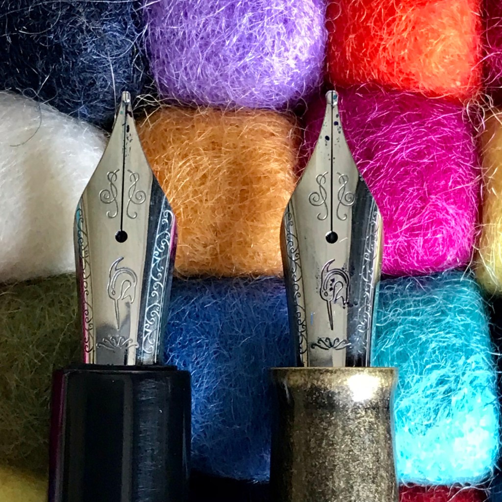
I’m pleased to say that the majority of the pens that I have owned have written straight out of the box. I’ve had examples where nibs have been unusable or have written but have been dull and lifeless, but luckily these have been relatively few. As my knowledge and confidence have grown I’ve been able to recognise sub-par performance, and, on cheaper pens I’ve even had the courage to tweak nibs to try to get them working better. In this case, the resolution was realising that the way to fix a rubbish pen experience was a nib transplant, rather than persevering with the original.

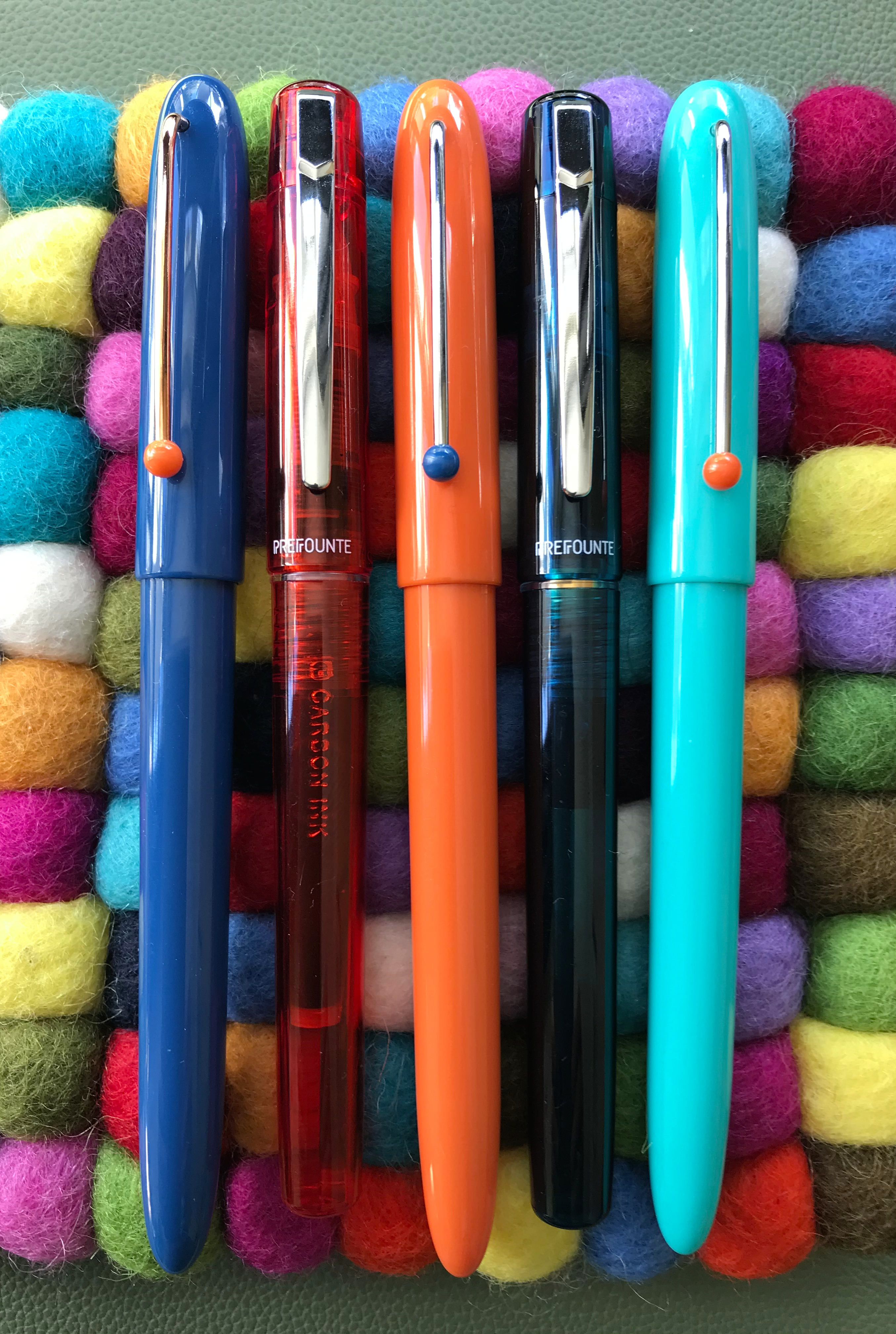
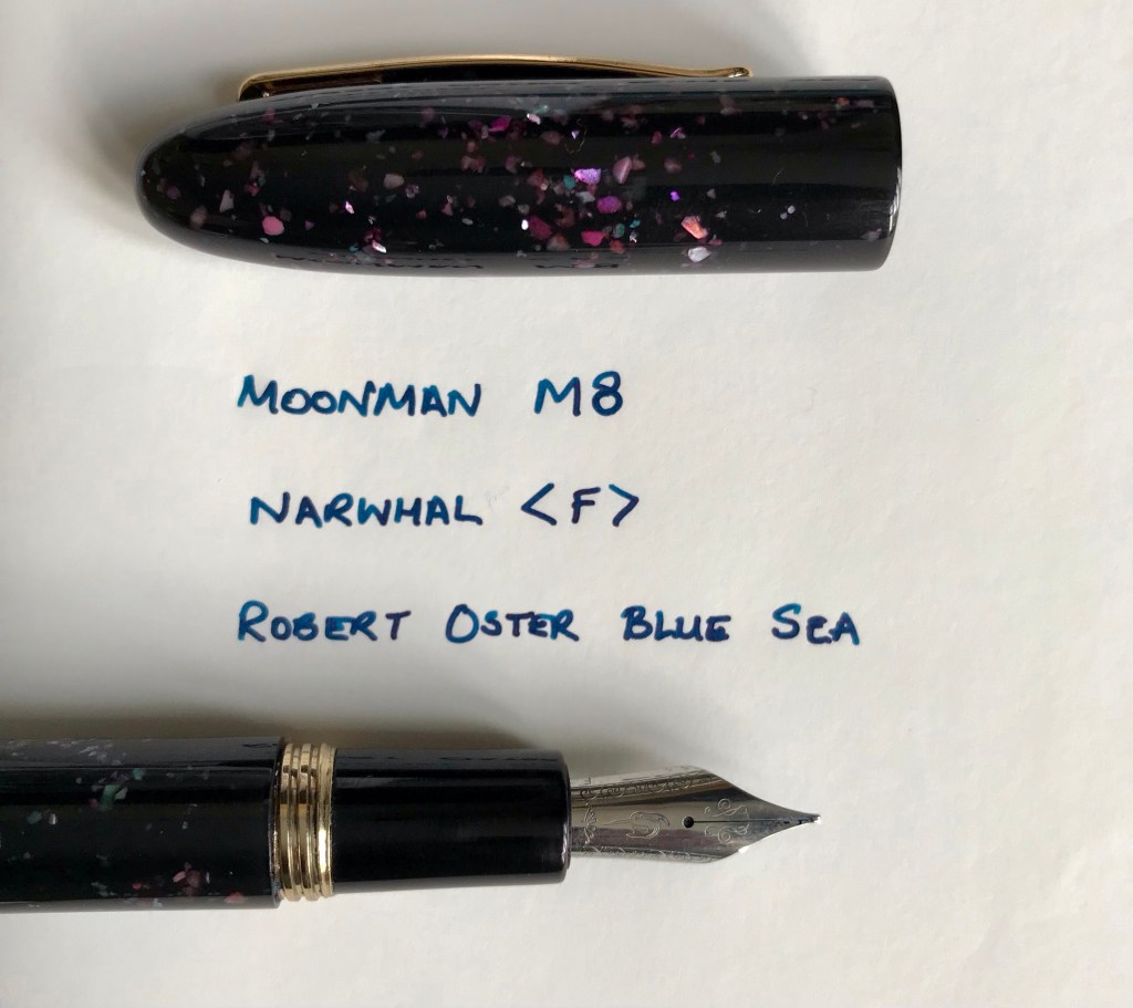
This is most evident on two Moonman pens that I bought last year – the M8 and T1. I liked the M8 because of the sparkly inclusions in the resin that could be mistaken for cut-price raden (in a dimly-lit room) and the T1 looked like the intriguing by-product of leaving a TWSBI Eco and Kaweco Sport together in a desk drawer for a while.

Both pens cost less than £30. Not exactly major cash, but enough for you to expect a half-decent writing experience. Which was precisely what I didn’t get. One wrote, but was dull and lifeless, while the other was scratchy as hell and hard-started like it was going out of fashion. Rather than engage with a non-UK vendor on a major online retail platform that shares a name with a large South American river, I decided to see if I could improve things by myself. After all, how hard could it be and what was the worst that could happen?

One of the reasons that people like pens like the T1 is the ability to switch in all kinds of nibs. The M8 and T1 take a size 6 nib, but use a different housing to Bock or JoWo so I tried keeping the feed and housing, but switching nibs. That got me something of an improvement until the M8 rebelled by the housing self-destructing. So far, not so good…

Meanwhile, another of my pen purchases of the last year or so was a Narwhal Schuylkill (the Porpita Navy). Among other plaudits, Narwhal have been praised for the quality of their nibs and the fact that they are made in-house. I can’t verify the in-house part, but my experience backs up the quality angle.

Edit Post

SavedPreview(opens in a new tab)Add titleDoing the resurrection shuffle – or how to breathe new life into pens (and maybe this blog too)

(I considered putting what follows at the end of this post. That way anyone who only wants to read about pens doesn’t have to read it. In the end I decided to leave it where it is because the act of writing it has helped me a little towards processing some of what has been going on for the last year or so. Nothing major or dramatic, but realisation that MY normality has been disrupted, that some of the consequences of that disruption are still being felt and I need to acknowledge this in order to help myself get back to ‘normal’, or whatever passes for normal these days.)

I’ve never been the most prolific or regular of posters, but to anyone who has stopped by my blog it will have been apparent that not much has changed in a while. I haven’t been anywhere, I simply haven’t felt like writing.

Of course, the past 16 or 17 months haven’t been ‘normal’ for any of us, but I found getting through all that the pandemic brought (lockdowns, enforced home-working, home-schooling, home-schooling while home-working, social isolation etc.) quite tough. I don’t want to start making comparisons because everyone’s experiences have been different, and in many ways I have a lot to be thankful for. You could argue that things began to improve a few months ago. I had my Covid vaccinations, a major project that had dominated my work life for the past two and a half years came to an end and my kids were back in school on a regular basis.

Instead of a sense of relief and freedom, I felt empty. Empty and tired. Where did my interest in pens fit in? Could/would stationery help turn things around? Turns out – not really. The ability to indulge in some retail therapy seemed to help at the time and I managed to acquire some nice pens and some interesting inks, but my pen use declined and I certainly didn’t feel any desire to write pen/stationery reviews.

This image has an empty alt attribute; its file name is img_1941.jpg
The Narwhal Schuylkill – hard to spell, even harder to pronounce. Despite that, it’s an excellent pen with a lot to recommend it.
Narwhal nib unit

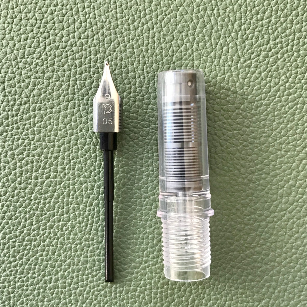
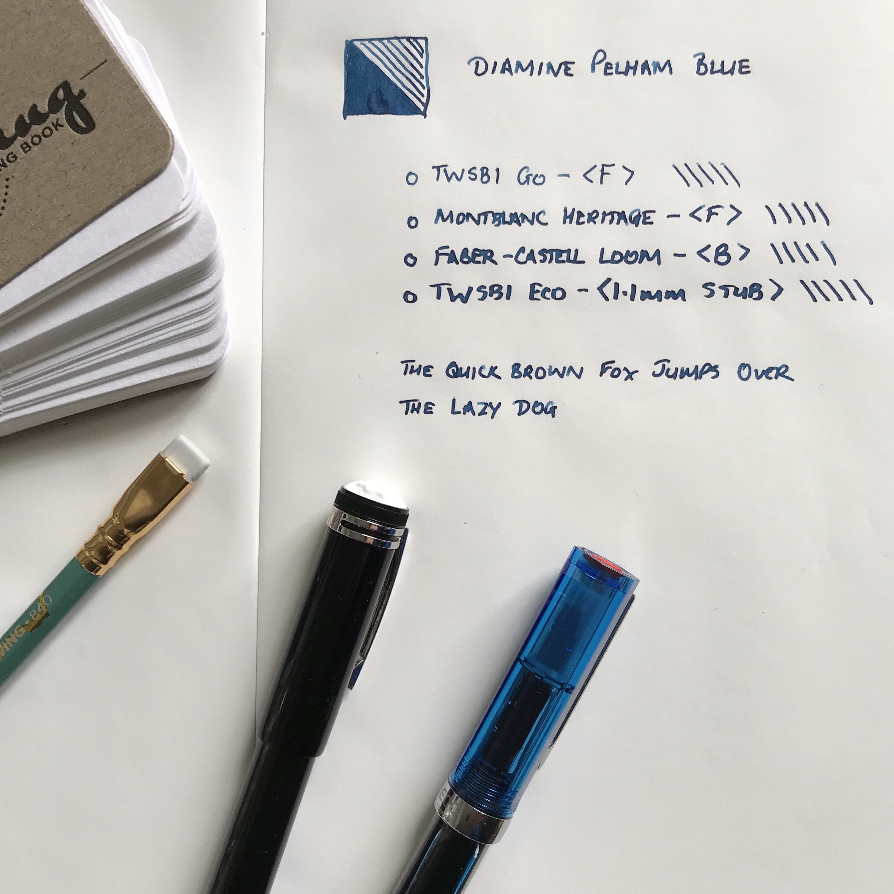
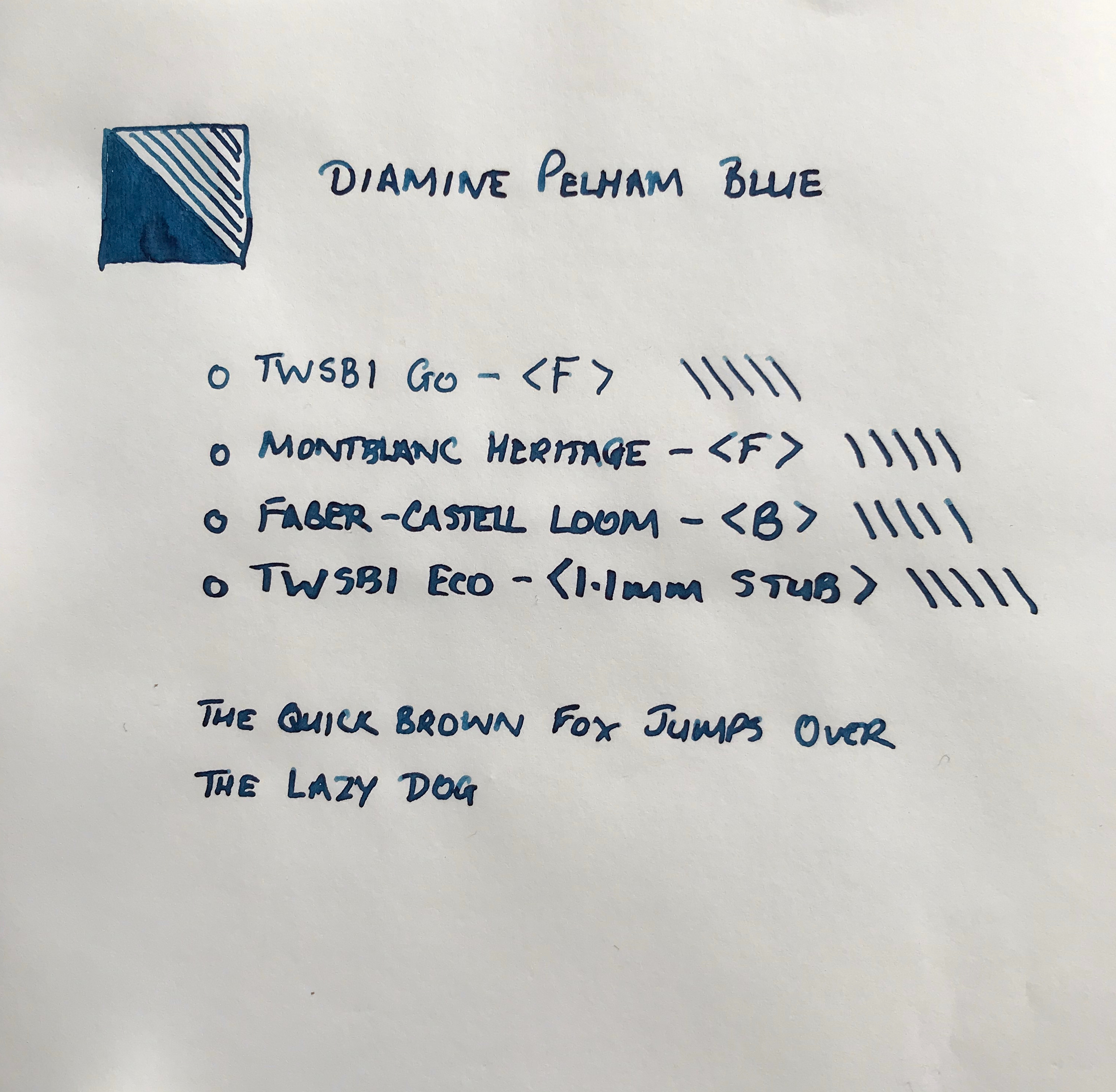
When I was cleaning my Narwhal I was struck by how similar the nib unit looked to the Moonman one. A small experiment later and I was able to confirm that the Narwhal nib unit fitted the Moonman. I duly ordered two Narwhal nib units from Hamilton Pens and now both Moonmans (Moonmen?) are a) functional and b) nice to write with.

Sparkly
The offspring of a Kaweco and a TWSBI?
Aside from being functional, the Narwhal imprint adds some interest. Bet you can’t tell which nib is ‘fine’ and which one is ‘medium’

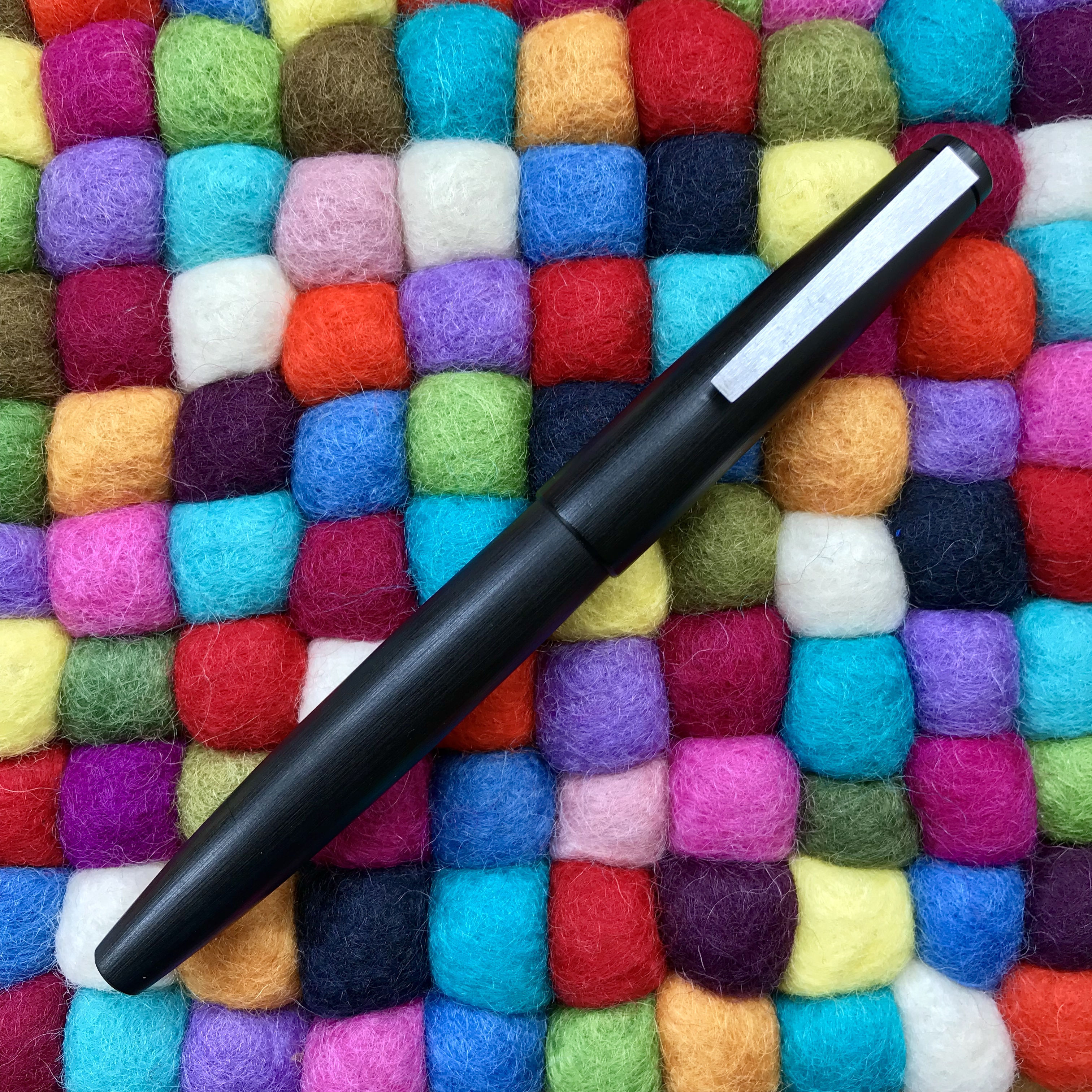
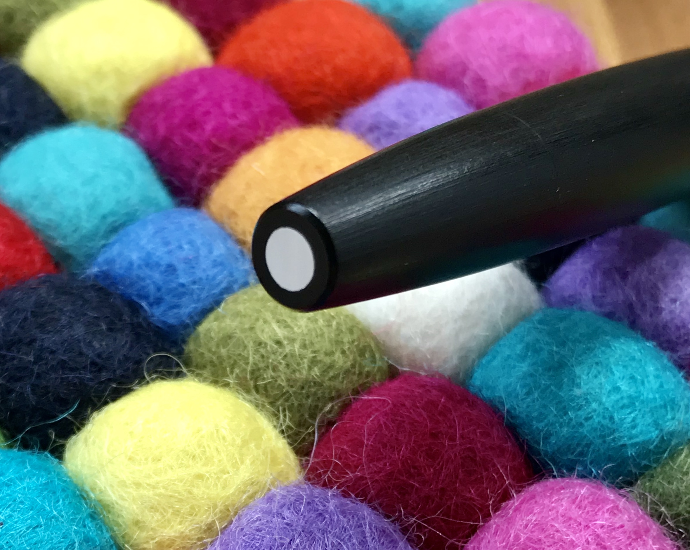
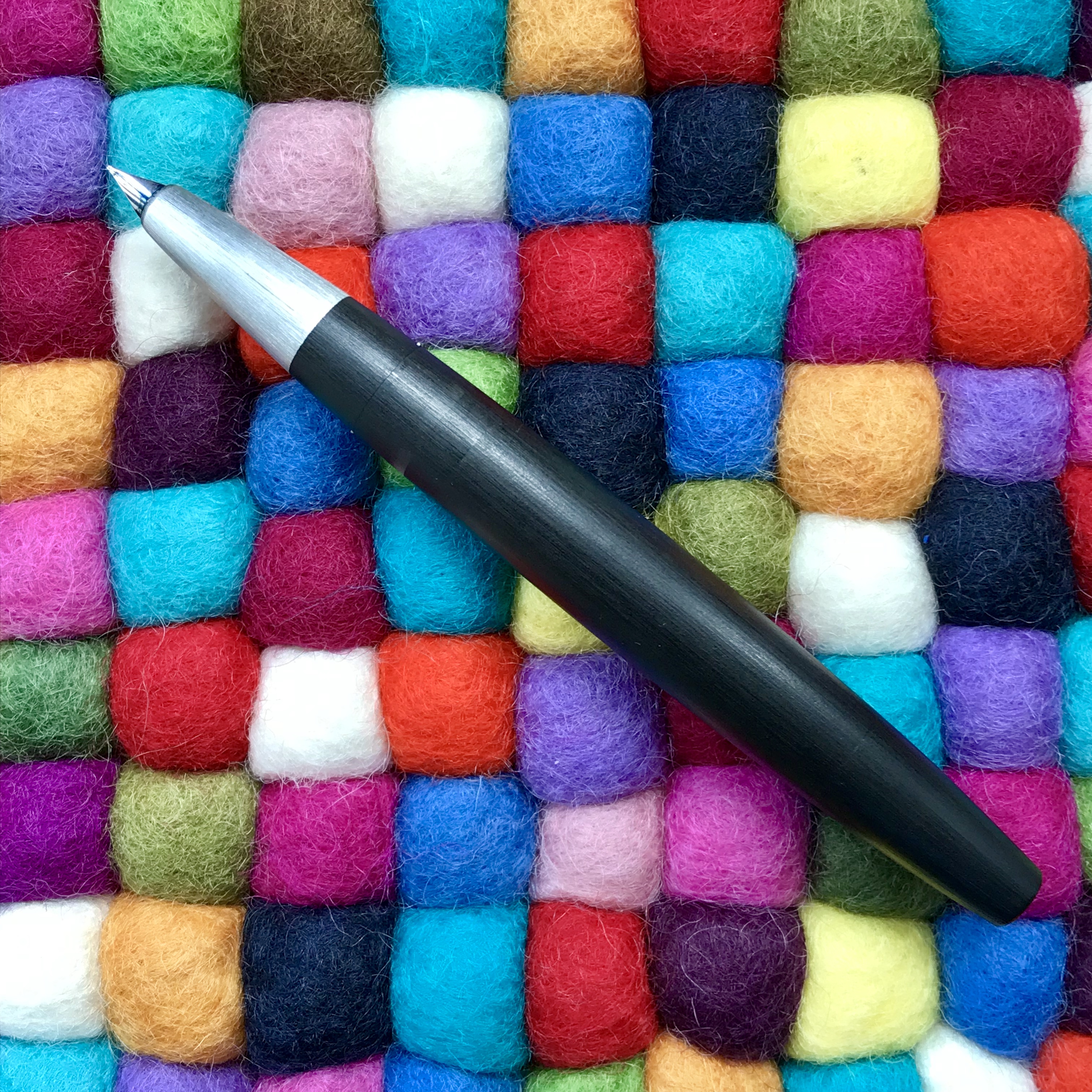
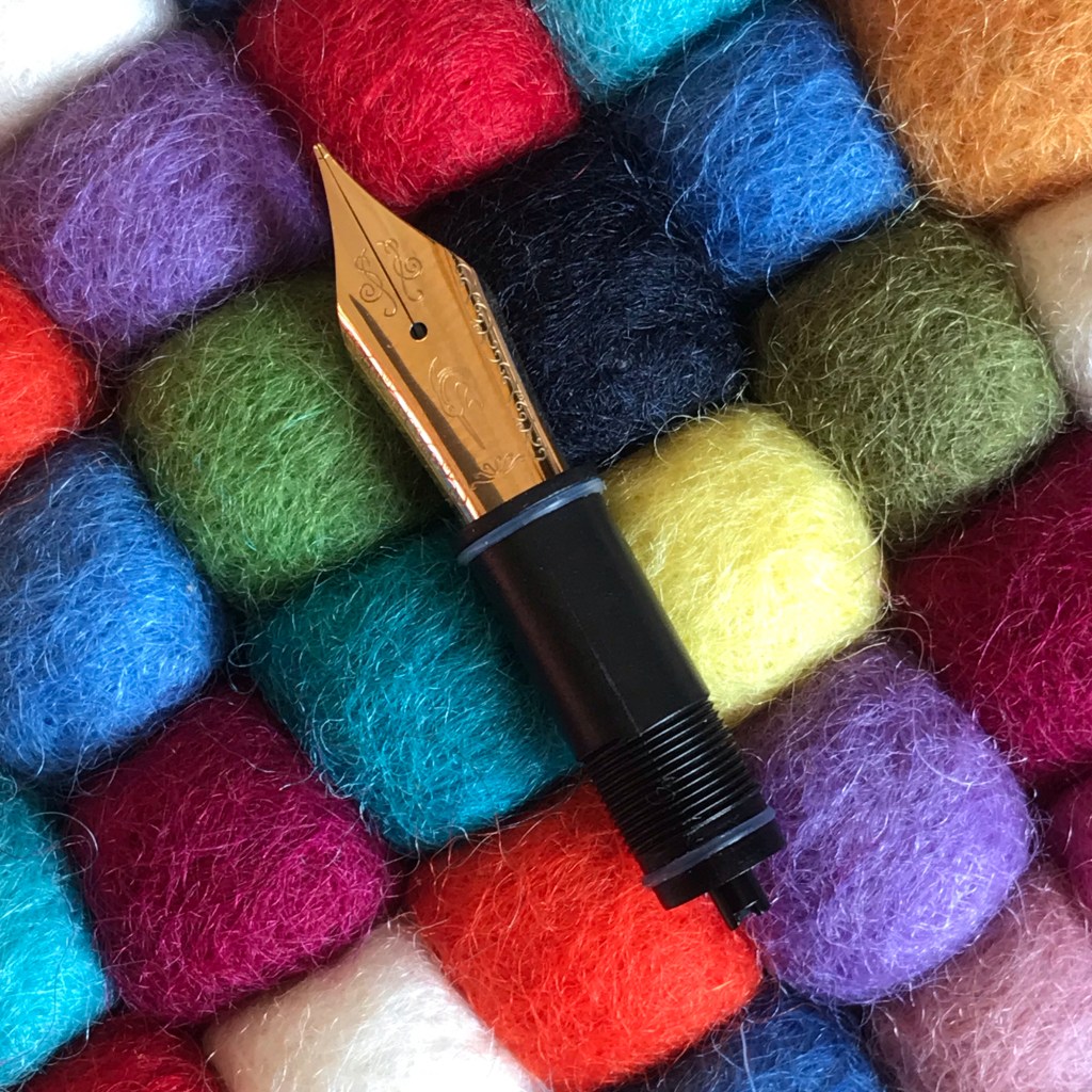
My other nib swap story concerns the Kaweco Dia2. I’m a sucker for art deco styling and always liked the look of the Dia2, but I was deterred by the relatively small size of the nib. It’s the same unit (Bock 060) that you find on the Kaweco Sport and Liliput pens. Several years ago I was swayed by positive reviews into buying a Dia2, but after a promising start my use tailed off. I couldn’t reconcile the presence of the diminutive nib in this context and the pen languished for a couple of years.

How the Kaweco Dia2 is meant to look
If the nib isn’t far away, it must be very small
The Kaweco Dia2 with a ‘sensible’ nib
Not quite serious nibbage, but definitely a step in the right direction

By chance I happened across a couple of references to the Dia2 taking a larger nib. Still a size 5, but one more in proportion to the overall size of the pen. As it turns out, a Bock 076 nib unit has the same size housing and feed as the Bock 060 that comes as standard and so can be swapped. This information didn’t exactly seem top secret, but I’m not sure it’s that widely known either. Either way, I gave Beaufort Inks £10.50 plus shipping and they sent me the nib. While it won’t fundamentally change the way the Dia2 writes, at least the nib no longer looks malnourished and ever so slightly silly. You can also have some fun switching in a stub or even a titanium nib if you want.

Everything has its place, and the place for a Bock 060 nib is not in a Kaweco Dia2…

Of course, all of this nib switcheroo came with a price tag and not a trivial one relative to the selling price of the pens. There may have been other ways to resolve my Moonman troubles, but to be honest I’m so impressed with Narwhal nibs that I’m glad I made the switch. With the Dia2, I feel a little more of this sits at Kaweco’s door. I don’t see the small nib as a ‘feature’. It has always looked out of place to me and as it turns out there was an alternative available. It smacks more of laziness and cutting corners. After all the retail price of both nib units is the same (I can’t believe that the wholesale price is much different either), so cost of manufacture must be similar. The larger nib fits inside the cap without any issues as well, so Kaweco could install the larger nib without any need for re-design or re-tooling. Why they don’t is anyone’s guess, but at least there is an aftermarket route to a greater sense of proportion.

Thanks for reading this far. I can’t claim it’s the best piece of writing ever, but at least I got back on the horse.

P.S. Now more than ever, please find a little time to be kind both to yourself and to others.

Branching out – of sorts

Anyone who follows me on Instagram (@slightly_unnerved) will know that I have a bit of a thing for the Sailor Pro Gear. In 2020, the number of Pro Gears I own went from a modest three to a more showy eight. These were all limited/special editions of one sort or another. More (or less) interestingly, four out of these five came with medium nibs.

Spot the pattern – (L-R) Pro Gear Earth (Broad), Apres Ski (Medium), Blue Lagoon (Medium), Tequila Sunrise (Medium), Angel’s Delight (Medium), Kure Azur (Medium), Bungubox Omotesando Blue (Fine Medium), Bungubox Sanctuary Blue (Medium)

This didn’t bother me in the slightest as I happen to really like Sailor’s 21K medium nib. It’s a package that just works for me. Hand-finished, in practice, each of the Sailor medium nibs I own is sufficiently different (line width, flow, feedback) that they don’t all blur into one. Combine this with the range of colours I have and it never feels like I don’t have choice.

Besides the pens that I bought, one other Pro Gear I had made up my mind to buy was the Ocean. It too was a limited edition, but limited in the thousands and widely available at regular Sailor prices.

Familiarity did a good job of breeding contempt and I was quite happy to sit and ponder this particular purchase. Unfortunately, I waited too long and by the time I was ready to make the purchase, no-one in the UK had any left. It was sold out with no prospect of a re-stock.

Aaaarrrrgggghhhhh!

As I veered between reconciliation with the situation and the (not entirely rational) notion of ordering one from the US, Anthony from UK Fountain Pens put one up for sale. On the face of it, this solved my problem – the model I wanted, from a UK seller and with the bonus of not having to pay the premium of a brand new pen. I’ve never met Anthony, but if you’ve ever read his blog (and you should) it’s clear that he cherishes and cares for his pens. As such I had no concerns about the condition of the pen I would be buying.

Exhibit A – Sailor Pro Gear Ocean

There was one quite big issue that I needed to address. This pen would come with an extra-fine nib! Japanese fountain pen nibs generally run thinner than their European counterparts. Given that I’d be reluctant to buy a European pen with an extra-fine nib, the prospect of a Japanese extra-fine was quite daunting (well for me anyway).

That extra-fine nib. The extra bonus was a dual-tone nib. I was expecting all rhodium…

Here was my dilemma. If I passed on this, when would I get a chance to buy another Pro Gear Ocean at a sensible price? If I bought it, what if it was effectively useless? In practice, the decision didn’t take long to arrive at. Funds were duly dispatched and a few days later the pen arrived.

Does size matter? L: extra-fine, R: medium
Getting it down on paper

Was it the right decision? Definitely. Inked up with Sailor Yonaga, it writes brilliantly. The flow is good and the nib is not at all scratchy. It has a little of the pencil-like feedback that Sailor nibs are renowned for, but that’s it. All in all a fantastic pen.

Much of this pen was a known quantity, but sometimes it’s good to push your boundaries a bit and try something that differs from the norm.

Next stop a music nib?

2020 – A year in pens

It might seem a bit off to be writing a round up of 2020 when I haven’t posted very much on my blog. Lack of output doesn’t equate to lack of acquisition, and 2020 has proved to be a year of surprisingly large investment in pens and stationery.

Covid and me

It’s hard to write a round-up of the year just gone without mentioning the C-word. For whatever may have seemed like hardship, I was in fact extremely fortunate as neither I, nor any of my immediate family contracted Covid. Having a partner who works in a hospital meant it was never far away and the challenges faced by healthcare workers all over the world were very real to us, but what went on in hospital stayed there.

My work was minimally affected and I was able to carry on working from home. Like many people I very quickly discovered how to use Zoom and other platforms. Where things got interesting was in trying to balance working with looking after young kids. We’re still talking to one another 😁, but it was tough going at times.

Although it’s easy to form the impression that the various lockdowns and restrictions gave people loads of time to find creative outlets, what I mostly got was tiredness and not much time or inclination for doing a great deal. About the only thing that kept me sane was getting out of the house for some exercise.

Having some time to draw breath over Christmas has at least given me a chance to sit down and write something, even if it reads like a list of who I threw money at over the last 12 months!

Here’s hoping that 2021 brings some new creative opportunities and the time to do something about them!

And now the fun part…

After all that, it’s time I got on with what went on in my little world of stationery.

Plus ca change

Despite being confined to barracks (in work terms) for the foreseeable future, I’ve stuck with tradition and will be using the Hobonichi Techo as a paper diary again in 2021. I seem to flip-flop between buying direct from Japan and more locally from UK distributors. This year, despite the razzamatazz of the launch in Japan, I took the UK route and purchased from The Journal Shop, along with some A5 Tomoe River notebooks that I’m looking forward to trying.

As far as paper was concerned, Tomoe River paper remained king in 2020. Notebooks from Hobonichi and Flyght of Fantasy Studio.

Learning the art of patience

One of the casualties of the pandemic was international shipping. Having read horror stories of the convoluted routes that some peoples’ purchases took, I’ve been relatively lucky. That said, I had to wait 4 months for one of my Sailors between pre-order and delivery. At least the pen made it safely and (so far) nothing has gone astray.

Jumping in with both feet

I’ve been an admirer of the Sailor Pro Gear for quite some time. In particular, I like the look of the various special editions that seem to surface with ever-increasing frequency. Missing out on one such edition (Bungubox’s Fujiyama Blue) sparked a reactionary splurge that saw me buy the next two Bungubox editions, along with three pens from the Cocktail series.

My two Bungubox editions – Sanctuary Blue (L) and Omotesando Blue (R)
I really pushed the boat out with these pens – the one on the rights has a fine-medium nib instead of my habitual medium.

On top of the 2020 edition (Kure Azur), Sailor re-released the previous 9 cocktail pens as part of a 10-part set. This retailed with an eye-watering price tag, but despite this I did consider this option. Luckily plenty of retailers seem to have been able to offer individual pens, and so I was able to secure the Blue Lagoon and Apres Ski, along with the Kure Azur to join my Tequila Sunrise and Angel’s Delight.

Anyone for cocktails? (L-R: Apres Ski, Blue Lagoon, Kure Azur – all medium nibs)
3 Sailor nibs and they’re all medium!
The gratuitous shot of all my Pro Gears together. (L-R: Earth, Apres Ski, Blue Lagoon, Tequila Sunrise, Angel’s Delight, Kure Azur, Bungubox Omotesando Blue, Bungubox Sanctuary Blue)

Stilos with style

2020 saw me look more closely at Italian pens. In Spring, I bought my first Leonardo (a Momento Zero) and was an early adopter of the Maiora Impronte. The Leonardo has become a firm favourite. Despite its beautiful resin exterior, the Maiora has proved a far less engaging pen. It’s not a bad pen, but it’s not really for me.

The Italian section (L – Leonardo Momento Zero, R – Maiora Impronte). Almost identical in price, but the Leonardo feels a much higher quality pen.

As the end of 2020 approached, the second batch of a collaboration between Leonardo and Jonathan Brooks / Carolina Pen Company was announced. (I missed the first one – are you detecting a common theme here?). Aside from the Leonardo element, I figured this was going to be my best chance to own a pen in the legendary Primary Manipulation acrylic so I jumped at the chance when it came up. I’m happy to say that the result was worth it.

Little Leo, meet big Leo…

Other pens of note

I eventually took the plunge and bought a Platinum Curidas. I’d been put off buying a Pilot Vanishing Point due to concerns about the position of the clip. Taking advantage of a discount from Cult Pens, I managed to bag the Curidas for a good price. To my surprise (and delight) the various protrusions didn’t interfere with my grip and the Curidas is now a regular in my rotation.

Diplomat Aero, Platinum Curidas, TWSBI Eco Cement Grey
Diplomat Aero, Platinum Curidas and one of two TWSBI Ecos I bought in 2020

Late to the party (again), I finally bought a Diplomat Aero. I had assumed that I would end up buying the orange version of this pen, but when the ‘factory’ finish appeared, I was tempted enough to buy it. I don’t own many metal pens, but the Aero is comfortable to hold and the nib is a joy to write with . Coupled with the ‘raw’ aluminium finish, this is one of those pens that I just want to write with.

Getting inked up

I may already own more ink that I could possibly use in my lifetime, but this hasn’t stopped me from buying more. Together with an in-house acrylic pen, I tried some of the new ‘home-made’ inks from the Birmingham Pen Company. I’ve been pleased with the results, aside from a minor gripe that one ink (Pittsburgh Bankers Ice Rink) is now a different shade of blue compared to the original. That’s a shame because I really liked the previous colour, but hats off to a small maker for having the courage to start up making their own inks.

My (long) haul from the Birmingham Pen Co.

Anderillium Inks from Florida finally hit the UK through Hamilton Pens. I took the plunge and bought a few. They’re ridiculously well lubricated, which makes them hard to use in wet-writing pens, but this property has proved to be salvation for my Nakaya Decapod. This pen has never written how I would like it to, but the Anderillium inks counter the inherent dryness of the nib and made the pen useful to me.

An aquatic theme is probably appropriate for some of the wettest inks I’ve ever used…

My main ink highlight for 2020 has come in the form of the Ukiyo-e series of inks from Taccia. The inks pay homage to the works of artists like Hokusai and Hiroshige. This is a form of art that I love, so I was always going to be tempted by these inks. Aside from the exquisite packaging, the inks are fantastic to write with. Many are quite subtle and subdued, but a few are more ‘showy’. Of these, Sabimidori is one of my favourites.

Taccia inks and probably the easiest game of spot the odd one out you’ll ever play!
Not one of the Ukiyo-e series, but Taccia Aka is a bonkers pinky-red with some gold sheen thrown in for good measure. Useless if you want subtle and stealthy, but handy if you need to make an impression!

[As an aside, if you want inspiration for what can be achieved in a lifetime, check out some of the work that Hokusai produced into his 80s. It is truly exquisite.]

What does 2021 have in store?

One realisation from this year has been the need to be more forward thinking about pen purchases. Rather than careering about, trying to buy every pen that appears in my Instagram feed, I’m going to try to actually having something that resembles a plan and a budget to go with it.

I’d like to investigate the world of small-scale makers a bit more, but finding one with a waiting list that isn’t as long as a geological epoch could be a challenge. It’s hard to imagine that I won’t be tempted by more Sailor Pro Gears. Bungubox now has an internationally-facing website in English which could be very dangerous!

One project I’m thinking of tackling is to expand the range of nib customisations that I own. The UK isn’t overly blessed with nibmeisters, so it probably means relying on FPNibs in Spain, but I’m keen to try a range of grinds and tweaks using the TWSBI Eco as a base. It may be less glamorous than a hatful of new pens, but it could be fun and interesting to see what a PO or WA nib will do to my handwriting.

Although I don’t have any specific plans, it’s hard to imagine that I won’t be buying more ink in 2021. The ‘what’ and ‘where from’ remains to be determined.

The field of notebooks could be interesting. I’m pretty well set on Tomoe River as my preferred platform, with the occasional deviation thrown in. However, I’ve yet to experience the new incarnation of this paper and, from reports elesewhere, it seems like I might have to give serious consideration to alternatives. Luckily, I have a reasonably large large stockpile of notebooks based on the ‘old’ 52gsm paper to work through so I can at least afford to take a more leisurely approach.

In terms of more local ambition, I’d like to get back to producing content for my blog. The major activity that has dominated my working life will come to an end in the spring of 2021. I’m hoping that a bit less pressure will give me a bit more time and headspace to actually turn ideas into content.

Since no plan survives contact with the enemy, it will be interesting to see what actually happens!

P-p-p-pick up a Prefounte? A look at one of Platinum’s budget fountain pens

I stumbled on the Platinum Prefounte as I was browsing Cult Pens’ website a couple of months ago. I’ve previously enjoyed the Plaisir from the more budget-friendly end of Platinum’s line-up and for under £10 (£8.99 to be precise) I thought I’d see how the Prefounte fared. In fact, I bought two – a fine in ‘Vermillion Orange‘ and a medium in ‘Night Sea‘.

In terms of presentation, the Prefounte comes in some fairly simple plastic and card packaging. It’s inoffesnive and appropriate for the price of the pen, but doesn’t really have a second use and mine went straight into the recycling once I’d unpacked the pen.

Prefounte packaging
The Prefounte comes in plain, simple packaging
Two of the Prefounte colour options – Vermillion Orange and Night Sea

Quick on the uptake as ever, I also realised that (with the exception of the very different Curidas), all of Platinum’s readily available steel-nibbed pens have names starting with a ‘P’ – even the PGB-3000A ‘Cool’. Cool name? Definitely. Well…maybe…

Anyway, back to the Prefounte. It’s a fairly slim and lightweight pen with a translucent cap and barrel, which makes it look more up-market than the Preppy and (arguably), not as smart as the Plaisir. Price-wise, between these two pens is exactly where the Prefounte sits – the Preppy is about half the price (around £4-5) and the Plaisir around 50% more expensive (around £13-15). As other reviewers have noted, whether there was a genuine gap in the line-up that needed filling is open to debate.

Of nibs and feeds

Keeping the Preppy and Plaisir in mind, all three pens share a common section, nib and feed, meaning that switching nibs is dead easy. I’ve always been intrigued by Platinum’s approach of incorporating the feed into the grip section. By making the section translucent as well, you can see the arrangement of fins within. This set-up makes the already small nib unit look more like it could be a replacement unit for a fibre-tip pen than a fountain pen, but in practice it all fits together nicely and works well.

Detail of Platinum's steel nib, feed and section
Platinum’s ubiquitous steel nib and feed/section

Staying on the subject of the nib, the business end of this pen is great. It may be small and plain to look at, but I think the simple approach works well here. The key question is ’how does it write?’ The answer to that is – ‘really well!’ I’ve had 5 of these nib units in various pens over the years and all have been excellent writers – very smooth with no scratchiness or hard starts. I did read some reports of problems with the Prefounte, but that doesn’t match my experience.

I’ve mentioned the translucent barrel and cap already, and I have to say I really like both the colours I picked. If neither of these appeal, you can also have Crimson, Dark Emerald or Graphite Blue.

The barrel is smoothly cylindrical, with a slight taper. The cap is a slip fit and snaps on and off crisply. The name ‘Prefounte’ is painted on just below the metal clip and the ‘opposite’ side of the cap tells you the nib width – 03F (or 05M) together with Platinum’s name and logo and the fact that the pen is made in Japan.

Being translucent means you can see the cartridge or converter in the barrel as well as the nib and feed in the section. You can also see the spring inner cap that makes up the ‘Slip and Seal’ mechanism. I like the fact that Platinum has extended this design right the way down its range of pens – even the Preppy has it. Platinum claim that you can leave a pen inked for a year and it won’t dry out. I haven’t fully tested this claim, but it certainly holds true for several months.

Filling options

The Prefounte comes supplied with a Platinum ink cartridge, because as with many Japanese pen brands, Platinum uses a proprietary fitting. This means you’re (mostly) restricted to using their own cartridges which in the UK come in a very limited selection of colours.

If you want to extend your choice of ink, you could clean and refill an empty Platinum cartridge, but that has ‘faff’ written all over it. Another alternative is to use a Platinum converter, but unless you have a spare one lying around the price of buying a new one (£6-9) can be almost as much as the cost of the pen itself! A more economical solution is to consider Platinum’s adapter for international cartridges at around £1.50. These do what the name suggests and open up a much wider set of options in terms of ink brands and colours.

It pays to be adaptable

One of my preferences is to use less expensive Platinum pens like the Prefounte with Platinum’s Carbon Black ink cartridges. Carbon Black is a fantastic waterproof, pigment ink which I love but don’t use a huge amount. A pen like the Prefounte is a great choice here. The basic writing experience is great and worst case, if it does get clogged up because of the ink particles, it’s not going to be too traumatic a loss. So far that hasn’t happened because the Slip and Seal cap is great at preventing the pen from drying out and the ball bearing that’s used to seal the cartridges gets punched out when you fit the cartridge and helps keep the ink in the cartridge agitated.

What/who is the Prefounte for?

This was essentially the theme of some of the reviews that I read. Was it a necessary addition to Platinum’s range of pens? Who is the target market? I did wonder whether the Prefounte is considered to be a school pen. It’s not marketed as such, but maybe that’s its purpose? Within Platinum’s range you already have the Preppy if keeping costs down is your only consideration, or if you have a little more cash available you could have the Plaisir. If you really don’t want a metal pen like the Plaisir, I guess the Prefounte offers something more aesthetically pleasing than the Preppy and made with nicer materials.

Platinum Preppy, Prefounte and Plaisir
Where does the Prefounte fit into Platinum’s line-up? Right there…

The Prefounte is just about smart enough to be used in a work context and you could probably lend it to a friend or colleague and not worry if it got lost or damaged as it’s cheap to replace .

You probably wouldn’t lend some of these pens to a friend or a colleague!

In isolation, I find it really hard to dislike the Prefounte. There’s nothing intrinsically wrong with it. It’s a nice enough looking pen, without being distinctive and it feels good in the hand. Platinum have got the writing experience with their steel nibs completely sorted, so that’s not an issue. It’s only when you start to think of it alongside other pens that you start to think about why you might buy it. There’s certainly lots of competition at this end of the market.

I bought mine as a bit of an experiment to see what they were like. If you were in the market for your first fountain pen, you could definitely do worse than pick the Prefounte. At least if your usage is going to be low/infrequent you can be comfortably certain that your pen won’t dry out when not in use.

While the usual recommendations for a first fountain pen are the Lamy Safari or Kaweco Perkeo, these will cost you quite a bit more (in relative terms). It’s arguable that you are getting better design and materials for your money and a better selection of inks that can be used with those pens, so there are other factors to consider here besides price.

At almost the same price as for the Prefounte, you could have the Kaco Retro. Based on my experience, deciding between these two is a much more marginal call. Price-wise there’s hardly anything in it. Both are fun designs and remarkably competent performers for such cheap pens. The Retro comes in some fun colours and has a converter as standard, but there’s only one nib size. The Prefounte colour choices may be slightly less fun, but I really like them, plus the Prefounte has interchangeable nibs and Slip and Seal. Here I’d say it really comes down to which one you prefer the look of. Neither has let me down and I’d recommend either.

Platinum Prefounte and Kaco Retro side-by-side
Prefounte or Retro? Your choice.

I’ve always enjoyed writing with Platinum’s budget steel-nibbed pens, and the Prefounte has lived up admirably to those expectations. Whether it has enough going for it in the face of competition is a more tricky question to answer.

Ink Review – Diamine Pelham Blue

Oh no – it’s another blue ink!

One of the upsides to posting so sporadically is that it takes away some of the sense of needing to write about new products or little-known makers.   Pelham Blue is not a new ink and Diamine is definitely not a little-known maker.

Gratuitous pen shot

Gratuitous pen shot

Pelham Blue is one of the Gibson Guitar series of inks.  I believe these were originally a Germany-only exclusive, but they were subsequently made generally available and have become a routine fixture in Diamine’s product line-up.  That’s good news because it means that Pelham Blue is widely available and fits into Diamine’s regular pricing structure.

On to the ink itself.  I’ve struggled to categorise it within the pantheon of blue inks.  Pelham Blue is a bit of a chameleon, looking slightly different according to which pen and paper you use.  I’ve seen ‘blue-black’ inks that are lighter than Pelham Blue.  What I can say is that it’s definitely not out there with azure and sapphire blues and it’s definitely not turquoise.  Before writing this post I read some other reviews and was struck by the difference in appearance between my use of Pelham Blue and the review on the Pen Addict.  That said I had a look at some examples of Gibson guitars that were finished in Pelham Blue and the photos of these were hugely variable too,

Coloring swatches

Some Col-o-ring swatches

If you swatch Pelham Blue, you could convince yourself that there some green in there, but that doesn’t really come through in normal use – i.e. writing.  Cult Pens, who I bought the ink from describe it as a deep, rich blue.  I think that sums it up quite nicely.

Comparison ink swatches

It’s definitely a blue of some description

I don’t see it as my mission in life to categorise and catalogue inks.  The key things for me are: ‘Do I like the colour?’, and ‘Does it suit my pens and the way I write?’

The answer to both of these is a resounding ‘Yes’.

The key things for me are...

Do I like the colour? Yes!

I really like this colour.  Pelham Blue manages to achieve the balance of being dark enough for serious things like work, but lively enough to be pleasant to use rather than utilitarian.

I tend to use Japanese paper in most situations, and this brings out some wonderful shading.  I didn’t think there was any sheen to be had, even on Tomoe Rive paper.  Then I tried some ink splats and these duly showed up some red sheen, but only where a considerable amount of ink had pooled.

Ink splats - sheen

There’s some sheen there if you really look for it

In my experience you won’t see any sheen in regular use, even on papers that normally deliver on that front.  But that’s OK, it’s not promoted as an ink that sheens, and the shading is more than adequate compensation.

Pelham Blue in various pens

You have to love the consistency in nib widths

Pelham Blue works in pretty much any pen.  It’s free-flowing and what I would call a wet ink.  I like inks that are wet, so that probably endears it to me.  I’ve found it works well in  my Montblanc Heritage 1912 – to the extent that I can’t remember the last time I inked this pen with anything else.  As I was writing out this post, my Montblanc ran dry and I had absolutely no hesitation in just filling it up and carrying on.

One benefit of being a ‘regular’ Diamine ink is that Pelham Blue is relatively inexpensive.  I started with a 30ml bottle for £2.35 from Cult Pens, but got increasingly frustrated with trying to fill a piston filler from such a narrow bottle neck.  The only and obvious solution was trading up to an 80ml bottle instead (a massive £5.90).  I gave the 30ml to a friend and am quite prepared to believe that I will empty the 80ml bottle.  It may take me a while, but I can’t see me losing interest in this ink any time soon.

Depending on what you like, Diamine inks can be a bit hit and miss in terms of colour and properties but, as far as I’m concerned, they got it spot on with Pelham Blue.

Definitely not just another blue ink.

Pebble Stationery Co. A5 Chiyogami Notebook review

If you have more than a passing interest in fountain pens, chances are that you will have at least heard of Tomoe River paper.  You may have tried it.  You may love it or you may wonder what all the fuss is about.  I’m firmly in the “love it” camp and have been on a bit of a Tomoe River kick in the past few months.

One of my last notebook reviews was of the Endless Recorder – a hardback A5 notebook based on 68gsm Tomoe River (TR) paper.  In that review, I wished that the growth in people making Tomoe RIver notebooks would extend from 68gsm, where all the action seemed to be, down to the thinner 52gsm version (which I much prefer).

My theory is that the 52gsm TR is so prone to creasing and damage from handling that notebook makers have shied away from it.  Recent experience suggests that might be changing.  It would be nice to think that someone saw my plea and took pity on me, but in all likelihood, it’s just coincidence.  Either way, over the past few months, the opportunity has come my way to acquire some hardback A5 notebooks based on 52gsm TR paper.

Chronologically, the first of these to come my way came with a chunk of air miles and something of a guilt trip about the accompanying carbon footprint.

The books in question came from Pebble Stationery.  I first came across this company when I bought one of their 52gsm TR pocket notebooks from Nero’s Notes.  Since then, Pebble have extended their regular range to include a soft cover A5 book, which is quite widely available.  What caught my eye was a post in Pebble’s Instagram feed of some A5 hardback books, covered with decorative Chiyogami paper (another favourite of mine).

Pebble Stationery Chiyogami Notebook cover details

Can you judge a book by its cover?

Missing out first time round taught me that these handmade books come up as small batches and don’t hang around for long when they do.  I presume this is why they don’t appear for sale through their regular distributors.  As a result, I ended up ordering direct from Pebble which, of course, meant ordering from Australia.

If you’ve ever bought a notebook containing TR paper, you’ll know they’re not the cheapest.  Assessing the value for money of these books is not easy, but to me they’re worth the expense.  The Pebble Chiyogami books weigh in at AUS$28 (about £14 at current exchange rates) for 200 pages in A5 size.  The downside is their location – I had  two of them shipped from Australia and the shipping cost almost as much as a single notebook!

In terms of structure and features, the Pebble Chiyogami books are pretty straightforward and minimalist, but I don’t mean that in any negative sense.  The paper is sewn in small signatures and traditionally bound.  From my experience (n=2), the end papers are chosen to compliment the cover papers – white for the geometric pattern on one and black for the dragonfly design on the other.  Page corners are left square. In terms of extras, you get a ribbon page marker, but no back cover pocket or index pages.

Detail of the notebook binding

Simple, beautiful binding

Chiyogami notebook detail

Square corners are the order of the day

The books are bound by hand, and the website description warns of possible imperfections and creases.  The books I bought were both executed to a very high standard, with no noticeable flaws.  I’ve finished one of them and didn’t find a dud page anywhere.  The binding is very tight, which means that some gentle persuasion was needed at first to get the book to open flat.  After that, I had no issue whatsoever and the book held together without any signs of structural issues.  The Chiyogami paper that I’ve handled has never felt like it was robust enough to survive for long as the cover on a notebook, and I think the covers of the Pebble notebooks are coated with something to make them more durable.  It changes the feel slightly, but is no bother and worth it in terms of making the covers more durable.

What’s inside?

You can have any page layout option you want, as long as what you want is blank.  This is not uncommon with handmade TR notebooks and not something I’d penalise Pebble for. I’m learning to embrace the blank page and use a guide sheet to stop my crappy lefty handwriting nosediving as I work across the page.  With hindsight, it might have been nice to have a guide sheet included with the book, but I just used one from another book so it’s hardly a major issue.

Getting down to use, I could say there’s nothing much to report.  The properties of 52gsm TR paper are described extensively and it is my absolute favourite paper to write on.  It’s unfeasibly thin, but will take pretty much any ink from any nib in any fountain pen with no feathering or bleed through.  If you want to show off shading and sheen in your inks, then this is the paper to do it with.  Both my Pebble books came with off-white/cream paper, but that’s fine as I prefer it to pure white.  The base colour of the paper does affect how some inks look (compared to pure white paper), but you can have great fun figuring out which inks work best!

Showing off ink sheen on Tomoe River paper

There might be a hint of sheen here!

Heretics Detractors will point out the ghosting (show through) and long dry times.  The first is simply a function of the thinness of the paper, and you’ll have to decide whether you can live with that or not.  I have 2 words for the second – BLOTTING PAPER!  In practice, I find I only need to use blotting paper when I’m about to turn a page, so it’s more backup than absolute necessity.

Summary

I know I’m biased, but these Pebble Chiyogami notebooks are beautiful to look at and skilfully made (by hand) to show off some wonderful Japanese papers.  If none of these elements are your thing, you’ll probably find richer pickings elsewhere.  If you like 52gsm Tomoe River paper, these books are a great platform to showcase its properties.  Sure they’re not cheap, but I think the pricing is reasonable and if you want to know what an expensive TR paper notebook looks like, check out Musubi!

One thing I did like about the Pebble notebooks was the page count.  Pebble have avoided the tendency of some 52gsm TR books to counter the thinness of the paper by having a huge page count.  200 pages makes for a manageably slim book that’s easy to write in and transport.

I think high page counts can create practical and psychological problems.  Physically, a notebook that is too thick can be uncomfortable to write in, especially as you get towards the bottom of the page.  Everyone’s tolerances are different, but something resembling a telephone directory will be a challenge.  Psychologically, a book with a high page count can seem a bit daunting to start and can become a marathon chore to complete.

My journaling has become a bit sporadic of late and I found the Pebble notebook to be just about right in this respect – easy to handle, long-lasting enough to justify its price tag but not so long that I came to resent using it.

Do I recommend these books – yes, absolutely!

Will I buy more of these?  Honestly, I’m not sure.  I have loved owning and using these books, but the relative cost associated with having to ship them half way round the world is a bit of an issue for me.  If these books were available through a local distributor such as Nero’s, I’d have no qualms in buying them regularly.  This point comes into starker relief following my discovery of Flyght of Fantasy Studio notebooks at the Bristol pen show earlier this year.  Based in Scotland, they hand make notebooks using 52 and 68gsm TR paper and cover the books in some amazing Japanese and Japanese-inspired fabrics.  OK, these have a higher page count (and proportionately higher price tag) than the Pebble notebooks but, in other respects, I’ve may well have found a way to feed my addiction to eye-catching TR paper notebooks from more local sources.


Fountain Pen Review – Kaco Retro

Kaco is a pen brand that I’m not at all familiar with.  I bought my Retro from Cult Pens as a top-up to an order I was placing.  The Kaco Retro is a cheap Chinese fountain pen.  It’s also very retro in style terms (who’d have thought it?).  Pens of this sort can be a bit hit and miss in terms of quality and whether (or not) they work.  The last one of these I tried was the Moonman M2.  That turned out to be a good buy (and my most read post).  Is the Kaco Retro good enough to recommend as a beginner’s pen?  Does it offer enough to be of interest to a pen aficionado?  Read on to find out what I made of it…

What’s in the box?

For it’s £10 price tag, you get a surprising amount.  Of course there’s the pen and also a couple of anonymous short international cartridges.  So far, so predictable.  What makes the proposition more interesting is the inclusion of a converter.  These aren’t usually included with pens from major manufacturers that cost several times more, so to see one here is a definite bonus.

Contents of Kaco Retro box

I’m not in the box (anymore)

On to the pen itself…

Materials

The Retro is made from some kind of ABS-type plastic, which apparently means that it’s an opaque thermoplastic and an amorphous polymer.  Well that’s good to know.  The really good news is that there’s absolutely no danger of the term ‘precious resin’ being used in the marketing blurb.  It makes for a lightweight pen and one that feels like it was made to a price point – which, of course, it is.

The material and overall weight don’t necessarily inspire a sense that the Kaco Retro will survive long enough to become a family heirloom, but it’s tough enough for the here and now and my guess is that it will be fun while it lasts.

The pen I bought is described as ‘green’, but I’d say that turquoise would be a better description.  That said, the lid of the box says KacoGreen and the ‘KG’ is etched into the cap, so who am I to argue with that?

Form and function

The shape of the Kaco Retro is that of a rather familiar slim cigar.  It also has a hooded nib.  Of course, any resemblance between the Retro and a Parker 51 is entirely coincidental.  To be fair, rather than going all out and ripping off the Parker design in its entirety, Kaco have added one or two touches that are presumably enough to fend off a lawsuit for infringement of design rights.

Photo of capped Kaco Retro

Now which pen do you remind me of?

The hooded nib

Nibz in the hood?

The barrel and the cap are each made in single pieces, so there are no finials and no adornments at either end.  There are small indentations at each end that look like manufacturing artefacts, but these have been tidied up well enough that I have no complaints about them.

Cap detail

That’s one end of it

The section is essentially the same diameter as the barrel, so there is no step-down between the two.  Also, being a slip cap pen there are no threads to get in the way.  This smooth profile, coupled with the materials it’s made from, might make the Kaco Retro a slippery customer, but I’ve experienced no problems holding on to it while I write.  It’s also worth noting that top of the section which screws into the barrel is clear and doubles as an ink window.  I’m not sure how much use this will be, but it breaks up the otherwise uniform colour of the pen.

5A9C4E2A-FA24-4E15-81C5-0B614A9CF743

Size comparison #1 (L-R: Kaweco Perkeo, Kaco Retro, TWSBI Eco)

8790A985-9143-4D84-AD32-C11042AB564E

Size comparison #2

The clip

Normally I don’t worry much about clips on fountain pens.  Their main benefit to me is as a roll-stop to prevent pens sky diving from my desk.  Despite this, I felt it was worth highlighting the clip on the Retro.

From a design point of view, I think the clip works really well.  The simple form suits the pen.  One end vanishes inside the cap with no obvious means of attachment, the other end sports a plastic ball in a colour that contrasts the rest of the pen.  On the green (turquoise) Retro that I have, the ball is orange.  If you buy a blue Retro, you also get an orange ball.  Buy an orange pen and the ball is blue – and so on.

Clip detail

Clippety doo-dah

Where the clip is less successful is in terms of its utility.  I’d go as far as to say that as a clip and all that’s implied by that term, it’s a complete failure.  It’s extremely rigid.  It looks and feels like a nail.  The clip is so rigid, in fact, that it’s hard to lift it to clip the pen to anything.  I wrote the notes for this review in a Paperchase notebook with 100gsm paper and I couldn’t clip the pen to a single sheet of this.  My suspicion is that any attempt to persuade the clip to live up to its name would not end well.  Consequently I haven’t forced the issue.

The nib

The Kaco Retro comes with an extra fine nib.  That’s it.  You don’t get a choice of other widths.  In practice, I’d put the width as being nearer to what I would call a fine and it suits me well enough.  If you like your nibs on the broad side of things, you’ll probably be disappointed.

Handwriting sample comparing nib widths

Extra fine or fine? My money’s on fine!

At the price the Retro comes in at, the most you can hope for is that the nib will write well enough and do so without too much hassle.  It may have been luck, but mine has proved to be an excellent writer.  To be on the safe side, I inked my Retro with Pure Pens’ Celtic Sea.  This was partly to (vaguely) match the colour of the pen, but mainly because it’s a free-flowing ink and I wanted to avoid a writing experience that was dry and scratchy.

The Retro writes well on a range of papers, putting down a smooth and wet line of ink.  I’ve experienced no skipping or hard starts.  To be honest the pen hasn’t lain unused for long, but I’ve had no indications of the nib drying out or being reluctant to start.  This is probably also helped by an insert inside the cap. This incorporates a clutch ring to hold the cap on and a plastic liner that looks like it’s there to help stop the nib from drying out.

In conclusion

I tend to shy away from the ‘best pen for…’ type of recommendation, but I’ve been very pleasantly surprised and impressed by the Kaco Retro.  I find it visually appealing.  It also comes with the added bonus of functioning really well as a fountain pen.  Sure, it’s not made from the highest quality materials, but neither does it pretend to be more than it is, and it does only cost £10.

If you like the design and colour scheme, the Kaco Retro is a great place to start with fountain pens.  The fact that you get a converter thrown in is a huge bonus. Being able to buy from a reputable pen retailer like Cult Pens means that if you do have any issues (like a dud nib), you have some customer support to engage with.  All of that said, this pen has something to offer even if you already own a heap of fountain pens and want something a bit different to add to your collection.

I got mine from Cult Pens for £9.99.  Prices on eBay and Amazon look to be broadly similar.  I couldn’t immediately spot a mainstream US retailer that carries them.  If anyone knows of one, let me know and I’ll update this post.  If money is no object, you can buy what appears to be exactly the same pen from Choosing Keeping for £18.00.  Although, if you feel the need to spend the sort of money that Choosing Keeping are charging, I’d suggest sticking with Cult Pens and buying two of them.  The orange one is next on my list…

Notebook Review – Nero’s Notes Basics

I have an interesting relationship with pocket-sized notebooks.  I like the idea and I seem to buy a lot of them, but using them has proved more of a problem.  That’s partly down to the way I use notebooks in everyday life, but it’s also down to an irrational fear of ‘spoiling’ them by writing in them.  The result is a hoard of pocket notebooks, some of which are exquisite in their design and execution.

It’s not a straightforward case of White Page Anxiety, there’s also awe and respect for the (often) handmade nature of books like those from Back Pocket and Dapper Notes.  I know that the people behind these companies intended their notebooks to be used, but I have yet to convince myself that this is entirely OK.

Back Pocket and Field Notes editions

When notebooks look this good, why spoil them?

To try to disrupt this mindset, I’ve decided to force myself to use pocket notebooks more. To help prevent backsliding on my part, I went all in and signed up for the Nero’s Notes pocket notebook subscription.  This means a bunch of pocket notebooks turn up at my door every 3 months and can only be interrupted by active intervention on my part.

Given the difficulties I seem to have using notebooks that feature amazing artwork on their covers, Nero’s came to my rescue – albeit unintentionally.  My first shipment included a set of 3 Nero’s ‘Basics’ notebooks and set of 3 ‘1857’ notebooks (Stuart Lennon who owns Nero’s, is also one of the hosts/presenters of the excellent 1857 podcast).

Structure and Format

The term ‘Basic’ can sometimes be synonymous with cheap and nasty, but not so with these notebooks.  As the information on the inner and outer faces of the cover tells you, these notebooks are handmade in the UK using 240gsm card stock for the covers and 70gsm dot grid paper for the 36 page interior.  The books are saddle-sewn (i.e. stapled), which is pretty common for notebooks of this size.  Corners are rounded, which is a nice touch.

Front cover of Nero’s Notes Basics notebook

Keeping it simple up front…

The outside of the covers is suitably simple – the front cover sports the Nero’s logo and the word ‘Basics’, while the rear cover has the company name, the notebook’s dimensions and a legend telling you that the notebook is handmade in England.  The inside front cover allows you to record some basic information about the contents, while the inside rear cover provides some space to record your details and details of the materials used to make the notebooks.

Nero’s Notes Basics inside front cover detail

Worth making a note of

Nero’s Notes Basics inside rear cover detail

I love the idea that someone might expect a reward for returning the sort of drivel I write in my notebooks

In Use

The term ‘Basics’ distinguishes this notebook from another in the Nero’s line-up – the ‘Ink Friendly’.  The clue is in the name, with the latter being heavier weight, coated and meant to be more fountain pen-friendly.  To be honest, I haven’t found much of a problem using fountain pens with the Basics notebook.  On the face of it, the Basics notebooks are cheaper, but the page count is lower.  When this is factored in, prices are pretty similar between the 2 sets of notebooks.

Testing the ink friendliness of the Basics paper

Testing the ink-friendliness of the Basics paper

Show-through

Show-through but no major bleed-through

The paper performed pretty well, all things considered.  Based on previous experience with notebooks like Field Notes, I didn’t have particularly high expectations, but there was nothing really to complain about at all with the Nero’s notebooks.  All the fountain pens I tried performed just fine, although I didn’t use any particularly broad nibs.  The only obvious sign of feathering in my (non-exhaustive) test came with a thick OHTO Graphic Liner.

There was a fair amount of show-through, with a Sharpie being the worst offender (no real surprise there).  The Sharpie was also the only pen that gave a hint of bleed-through.  Again, not entirely surprising.

Conclusion

Nero’s themselves describe these books as simple, practical and super-stylish.  The first 2 are undoubtedly true.  The third is a little more subjective, but I must admit I like the plain and uncluttered look.  It reminds me slightly of an old school exercise book.

I’ve been pleasantly surprised by how the Basics notebooks have performed.  At £9 for a set of 3, they’re pretty reasonable value for money.  They’ve definitely helped me get started on using pocket notebooks, and I even left the house once with one stashed in my pocket!  That provoked another crisis about which pen to take with me, but that’s a whole other can of worms best left unopened for now.


Notebook Review – Endless Recorder

Front cover shot Endless Recorder

The front end(less)

At first second glance, the Endless Recorder looks like many other A5 hardcover notebooks, with faux leather covers in a range of relatively muted colours.  (The first glance highlights a cream coloured drawstring bag that holds the book.)  What (hopefully) sets the Recorder apart from the also-rans is that they’re put together around Tomoe River paper.  This paper has something between cult and legendary status in the fountain pen world but, even with some recent entrants to the market, there are still relatively few makes of Tomoe River-based notebooks out there (check out GLP Creations and Taroko Designs for some alternative offerings).

Endless notebook storage bag

Are notebook bags your bag?

It’s hard these days to be truly innovative when it comes to design and construction of notebooks, and the Recorder follows a pretty well tried and tested design.  The faux leather hard cover I mentioned earlier comes embossed with the company logo on the front and “ENDLESS” on the back.  It’s all done quite subtly and without ostentation.  This leads quite nicely to the end papers, which feature an open dot layout with a blank space to fill in with the details of your choice,  There is also a repeat of the Endless logo, which adds a touch of class.

Endless Notebook rear cover

The back end(less)

Endless Recorder end papers

Subtle, stylish end papers

Perhaps it won’t set the world alight, but it makes the Recorder smart and subtle enough for use in a work setting, but the design accents are well executed and should satisfy the stationery aficionado.

The business end of the book is made up of small, thread-bound signatures, which help the book to open flat without the need to resort to coercion or physical violence.  Page corners are rounded (as are the corners of the cover).  There is a pocket inside the back cover.  It seems to be de rigeur for this type of notebook, but I can’t recall the last time I actually used one in a notebook.  The pocket is worth exploring when you get your Recorder, because there’s a small goody in there (I won’t give the game away) along with some promotional material.

Details of the binding

In case you lose your thread

There is no index and pages aren’t numbered, but I don’t find it that much of a chore to make my own index and number pages as I go.

Tomoe River 68gsm paper

Round corners, no page numbers

The ribbon and elastic closure come in a pleasantly contrasting turquoise colour.  I bought two Recorders, one in dark blue and one in red, and the ribbon and elastic are the same colour in both books.

The paper itself

There’s not much more to say about Tomoe River paper that hasn’t already been said.  In the case of the Endless Recorder, you get the thicker 68gsm paper, rather than the 52gsm you’ll find in things like the Hobonichi Techo or Seven Seas notebooks.  It takes pretty much any ink you care to throw at it from any width of nib, without feathering or bleed-through.  The coating means that dry times are not particularly quick, and I tend to have a piece of blotting paper to hand when I’m writing my journal.  It will also come as no surprise that there is some show-through, but this is just something you have to embrace if you’re going to write on Tomoe River paper.  It’s certainly less noticeable with the 68gsm than with the 52gsm paper.

Currently inked on Tomoe River paper

I’ll take any ink you can throw at me…

The paper in the Recorder is off-white.  I bought mine from Pen Venture in Romania, which gave me the choice of either blank or with a dot grid layout.  I bought dot gridded ones.  I used to think that dot grids were the best layout since whatever the last best layout was.  Over time, I’m less convinced of this, particularly when I’m using it for journaling.  I can see the merits in some applications, but I’m starting to come back to ruled or even blank for journaling. If you buy the blank notebook, you get a guide sheet included.  If I buy any more Recorders I might well try the blank version.


If you buy direct from Endless Works you get a choice of 4 layouts – blank, ruled, grid and dot.

I paid around €24 for each book from Pen Venture, rather than the £18 that Endless Works charge if you buy direct.  My reasoning was that buying from mainland Europe would be cheaper and less hassle than buying from the US.  It may have been less hassle, but my only option was some DHL priority service which added substantially to my bill.  Maybe I’ll buy direct from the US next time.

Practicalities of ownership

I’ve finished one of the two books I bought and didn’t experience any major issues.  I found that there was a little bit of lift on one corner of the cover material cover where it’s gathered and folded over.  My Endless Recorder didn’t travel further than between my desk and the living room sofa, but if you were to take it further afield maybe this points to it being a bit less durable than desired.  The ribbon page marker has also ended up looking a little fluffy and ragged.  This doesn’t bother me too much, but if you like a book that remains pristine looking through thick and thin, you might want to think more carefully.

Beyond that I had no issues with the Endless Recorder.  The book opened flat and the binding has never shown any indication of falling apart.  I mentioned the absence of page numbers or an index.  In practice, most notebooks I’ve ever bought haven’t had page numbers or an index and I haven’t felt like there has been a hole in my life as a consequence.

The Tomoe River paper does its job as you might expect.  I experienced no problems beyond the show-through, which I was expecting.

It’s not a criticism of Endless, but I wish someone would take this approach to notebooks, but with the 52gsm Tomoe River instead.  Whether it’s a cost thing or the sheer hassle of dealing with a paper that creases when you look at it, I don’t know, but I can’t believe there wouldn’t be a demand for it.

I’d certainly buy some.

Update

Since I published this post, Endless Works got in touch to let me know that they’ve recently updated the Recorder so that it now has an index and numbered pages.  There is also a block of perforated pages that allow you to remove them easily, if needed.  I’m happy to set the record straight. 😀

The Lamy 2000 – a long-term companion

I noted the other day that Bauhaus is 100 years old.  Not the pale-faced, pointy-cheekboned goth outfit fronted by Pete Murphy, but the German art and design movement founded by Walter Gropius.

This got me thinking about a pen that has become one of my long-term companions on my particular bus ride – the Lamy 2000.  This is a fountain pen that has often been seen as embodying  the Bauhaus aesthetic, even if technically it missed that particular bus by 30-odd years.  It was also pretty much my first ‘posh’ fountain pen, by which I mean it cost over £100, had a gold nib and filled using a piston mechanism.  This was all unknown territory for me at the time, but the 2000 exuded class and almost everything I read said it was great pen and a classic design that any self-respecting penthusiast should have in their collection.

So it was that I gave Cult Pens what seemed (at the time) like a lot of money and they sent me a pen.  I chose a fine nib and seem to recall that this was the first time that I’d really given consideration to picking a nib size other than medium.  Due to a fortunate combination of personal preference (I think it looks way better) and price, I picked the black Makrolon finish instead of the alternative of brushed steel.

Capped Lamy 2000

The Lamy 2000 in all its sleek, simple beauty

Pens achieve cult status for all kinds of reasons; some more justified than others.  In the case of the Lamy 2000 (first introduced in 1966), I think this is deserved.  Capped, its lines are simple and appealing, with flat ends and a brushed metal clip on which you’ll find the only bit of Lamy branding, subtly etched near where the clip attaches to the cap.

Lamy 2000 clip detail

In case you forget who made the pen…

The only other accent you’ll find is a brushed metal disc at the tip of the barrel.

Piston cap detail

Piston cap inlay

It’s a slip cap, so a slight pull is all that is needed to uncap the pen and get writing.  Removing the cap really reveals what all the fuss is about.  There are no steps between elements or weird changes of angle, just a simple and continuous curve from where the nib emerges from the section to the end of the barrel.

The sleek lines of the Lamy 2000

Follow the lines…

Perhaps the only thing that jars ever so slightly is a pair of tabs that protrude a fraction of a millimetre from either side of the section a little below the ink window.

Lamy 2000 cap clutch tab

If the cap fits… One of the two cap clutch tabs

I was never really sure what these were for, but in doing some background research I discover they are part of a clutch ring for the cap.  In that sense they do their job perfectly well and don’t intrude on the writing experience.  My thumb sits right on top of one of them when I hold the pen and I can’t say I’ve ever really noticed it, let alone felt any discomfort even for long writing sessions.

This also marks the point where the section attaches to the barrel.  The design of this (and the piston cap) is such that you can barely see the join where the two elements meet.  The cleverness of the piston cap end of things was highlighted in a recent post by Anthony over at UK Fountain Pens.

That blind piston cap

Can you spot the join?

I can certainly remember looking at my newly acquired Lamy 2000 and wondering how I was meant to fill it.  As it was my first piston filler, I duly read the instructions, but remained stumped as to where the cap that I was meant to unscrew actually was.  Of course now it seems so easy (it always is when you know how), but what impresses me is that even after several years of use and numerous fills, everything has remained tight and these transitions still appear seamless.  A tribute to the design, the materials and the manufacturing.

As a counter to all that black Makrolon, there is a short brushed metal section which leads the eye down to a small, partially hooded 14K rhodium-plated gold nib.  The only departure from curved lines comes with the underside of the section, which angles up more sharply towards the underside of the feed.  Cunningly, this conceals the breather hole – another good piece of design.

9C381685-DAC5-450A-A7E4-EBF3B89D2909

The 14K nib in all its glory.  Where’s the breather hole?

1475665F-C5A3-4A17-8AE8-7D1CBEB30437

There it is!

2DD95FC0-0C4F-425C-9335-B03CA8F519F7

That slight change of angle…

It may have been good fortune, but the nib on mine has written flawlessly since I got it.  I have read that some people had bad experiences with theirs, but I have absolutely no complaints with mine and I’m not the greatest lover of Lamy nibs.  It’s not the thinnest ‘fine’ I’ve ever owned, but it suits my writing just – well – fine.  Mine copes with pretty much whatever ink I throw at it, but it is a very wet writer, so can be a good choice for use with drier inks.

I have to say it, I really love my Lamy 2000.  It looks fantastic, writes well and seldom goes uninked for any length of time.  It’s also pleasing that Lamy haven’t tried to do anything silly with this pen.  The design wears its age well and has evolved by remaining essentially unchanged over the 53 years of its life so far.

The Lamy 2000 is smart enough to use in any setting and, although not cheap, I’ve never felt uncomfortable taking it with me to work.  Sure it’s not as glamorous as some other pens, but it does its job with quiet efficiency and (I like to think) pride in being able to do its job well.  Definitely a pen where all the plaudits are entirely justified.  If you don’t own one already, I’d recommend giving some serious thought to rectifying that oversight.

If you want to know more about the Lamy 2000, when I was doing some researchI came across this amazingly thorough piece on FPN  It covers pretty much every aspect of the pen from its design origins through to how to strip it down.  Whatever you think of the pen it is well worth a read.