Too many pens?

IMG_20160721_091242-2

Ever wondered if there is a ‘right’ number of pens to own ?  Is it all down to personal taste, or are there some mathematical rules that determine the correct number?

If your enthusiasm for pens, and fountain pens in particular, is anything like mine your relationship with them is simple. Right?  Something like –

See pen;

Like pen;

BUY PEN*

(* – unless it’s really expensive and then you might have to do some saving up first)

Turns out that it might not be so simple and there might be such a thing as ‘too many pens’.

Now for some maths…

The principle is quite easy really: the correct number of pens you should own (x) is one more than the number you currently own (n)

In other words:

x = n + 1

For reasons that should be obvious, the smallest number of fountain pens you should own is 3.  If you don’t currently own 3 or more fountain pens, I suggest you take a break from reading this and do some shopping until you do…

…Welcome back!

n ≥ 3

So far, so straightforward.  However, it turns out that there is a maximum number of fountain pens that you should not exceed (y).

Mathematically speaking:

y = s – 1

Now things start to get tricky when the value of x tends to y.  This is potentially dangerous because s is defined as the number of fountain pens that would result in separation from your spouse or partner (or something equally calamitous).  Only you can know the value of s for your particular circumstances, but clearly exceeding s-1 is something to avoid at all costs.

Don’t say I didn’t warn you!

Footnotes/credits

  1. Much as I’d like to claim this idea as being all mine, inspiration for this post came from Rule #12 of the Velominati.  If you have an interest in the sport of cycling, you will most likely already be familiar with the  Velominati.  If not, among the many excellent things they do in the world of cycling, the Velominati serve as custodians and arbiters of the Rules.

    Some Rules could apply to the world of pens, but I think it’s fair to say that many of them do not.  After all, do you need guidance on the length and colour of your socks (Rules #27 and #28) or what kind of coffee you should drink (Rule #56)?  (If you do, are you reading the right blog?)

    Rule #12 describes the mathematics of bike ownership and I thought it applied just as well to fountain pen ownership, without much need for translation.  The one thing I take as encouragement is that pens are a lot smaller and less obvious than bikes…

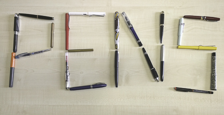
  2. I don’t know what my value of s is, but I hope I’m still some way off.  When I thought about the photo at the top of this post, I calculated the number of pens I would need to spell ‘PENS’ as being 21.  Fine I thought, I’ll start with fountain pens and make up the numbers with whatever else is at hand.

    Scarily, as you can see in the photo, only one pen isn’t a fountain pen.  Eek!

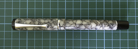
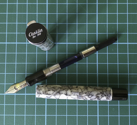
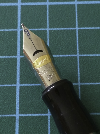
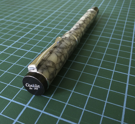
  3. If you’re curious, the pens in the photo are as follows: Baoer 79, Conklin All American, Conklin Duragraph, Eversharp Skyline, Kaweco Sport, Kaweco Liliput (x2), Lamy 2000, Lamy Safari (x4), Mentmore Supreme, MontBlanc 24, Noodler’s Ahab, Parker 51, Pilot Kakuno, Platinum Preppy, Schneider iD, TWSBI Vac700.  The joker in the pack is an OHTO Fineliner.


Fountain pen review – Conklin Duragraph

I received this pen as a Christmas present and I’ll admit it, we got off to an awkward start.  However,  with perseverance we’ve since become the best of friends.

I’ll also admit that Conklin was not a brand of pen that I had heard of until I stumbled across the Duragraph on the Cult Pens website. A quick bit of research (i.e. Google) revealed that the name goes back to the late 19th/early 20th century and was a successful and innovative pen company.  However, by the 1930s it had begun to decline and by the late 1940s/early 1950s had ceased to exist.  The name was revived in 2000 and a range of pens issued, intended to reflect the heritage of the original brand.  The original Duragraph was issued in 1924, smack bang in the middle of the Art Deco movement.  The re-issued  Duragraph certainly echoes those times in terms of styling.

On to the pen itself…

IMG_20160701_121736-2

Although I received it as a present, the Duragraph will set you back around £45 in the UK and around the same price in $ in the USA.  The Duragraph comes housed in a substantial, dark blue box, which sits inside a cardboard sleeve.  Other reviews have noted the similarity of the box to a coffin.  Luckily mine didn’t have a satin lining that some seem to, so the resemblance stopped at the outside.  The pen comes supplied with 2 short international cartridges and a converter.  I went straight for the converter and inked the Duragraph with Diamine’s 150th anniversary Silver Fox (more on that later).

IMG_20160701_122336-2

IMG_20160701_122218-2

The box is large and (sort of) coffin-like

IMG_20160701_121942-2

Based on Goulet Pens’ Nib Nook (this is such a brilliant resource for getting a feel for what a particular pen/nib will give you), I went for a medium nib.  The nib itself is a two-tone affair, mainly steel with a gold-coloured oval bearing the Conklin name.  The breather hole is a fetching crescent shape.  Overall, the nib is striking without being too ostentatious.

IMG_20160701_122116-2

The two-tone nib

Capped the pen is 140mm long, 125mm uncapped and 175mm posted.  It is 13mm wide and weighs 24g.  I went for the ‘cracked ice’ finish, which goes well with the black end caps, chromed bands and chromed clip.  The end of the cap bears the Conklin name in white and the wider chrome band around the cap is also engraved ‘Conklin’ and ‘Duragraph’.  The name Duragraph is bracketed by an engraved crescent design.

IMG_20160701_121707-2

Overall, I like the design of the pen and think the finish is a nice balance of boldness and subtlety.  Rather then reminding me of anything to do with ice, the finish conjures up terrazzo – a polished, concrete-like material engineered to look like marble.  It may seem weird, but for me that helps with the Art Deco connection as terrazzo was used for flooring in a lot of buildings in the 1920s and 30s.

IMG_20160701_121559-2

If I had sat down to write this review the first time I used this pen, then I would not be recommending it.  Inked with Diamine’s Silver Fox, it was not a pleasure to write with.  The nib scratched and squeaked its way across the paper and struggled to lay down a decent line.  I had read other reviews that suggested quality control was far from brilliant and it was pot luck whether you got a good nib or otherwise.  My initial thoughts were that I had a dud and that this was a pen that was destined for the back of my desk drawer (a kind of naughty step for pens).

Luckily I persevered and switch inks to J Herbin’s Perle Noire.  With this juicy, rich black ink on board, the Duragraph was transformed from a sulky scribbler into a well-behaved writer, delivering a decent and consistent line on the paper.  I have since inked it with Pilot’s Iroshizuku ‘shin kai’ and it performs equally well with this quality ink.

IMG_20160701_133727-3

Not even this pen can help my spidery handwriting!

This is quite a large pen but, being predominantly made of resin, it’s not outrageously heavy.  It sits well in the hand (well mine anyway) without the need to post the cap.  This is just as well, because I didn’t like the way the cap posted.  It was a snug fit on the end cap, too snug as it left a gap.  As a result it didn’t actually feel that secure.  Adding the cap also shifted the weight too far back on the pen for my liking and comfort.

Putting this small niggle aside, I have to say I have been impressed with the Duragraph.  £45 isn’t dirt cheap for a fountain pen, but I think you get a lot of pen for your money, both in terms of real estate and performance.  I’m glad I chose it and it still gets regular use.

I am definitely not unnerved by this pen.

As an aside, I have since tried the Diamine Silver Fox in two other pens – a Lamy Safari and a Sheaffer Legacy.  Both of them struggled, even the Sheaffer, which normally lays down a very wet line.  As a result, I’ve sent this ink to the naughty step instead of the Conklin…