Branching out – of sorts

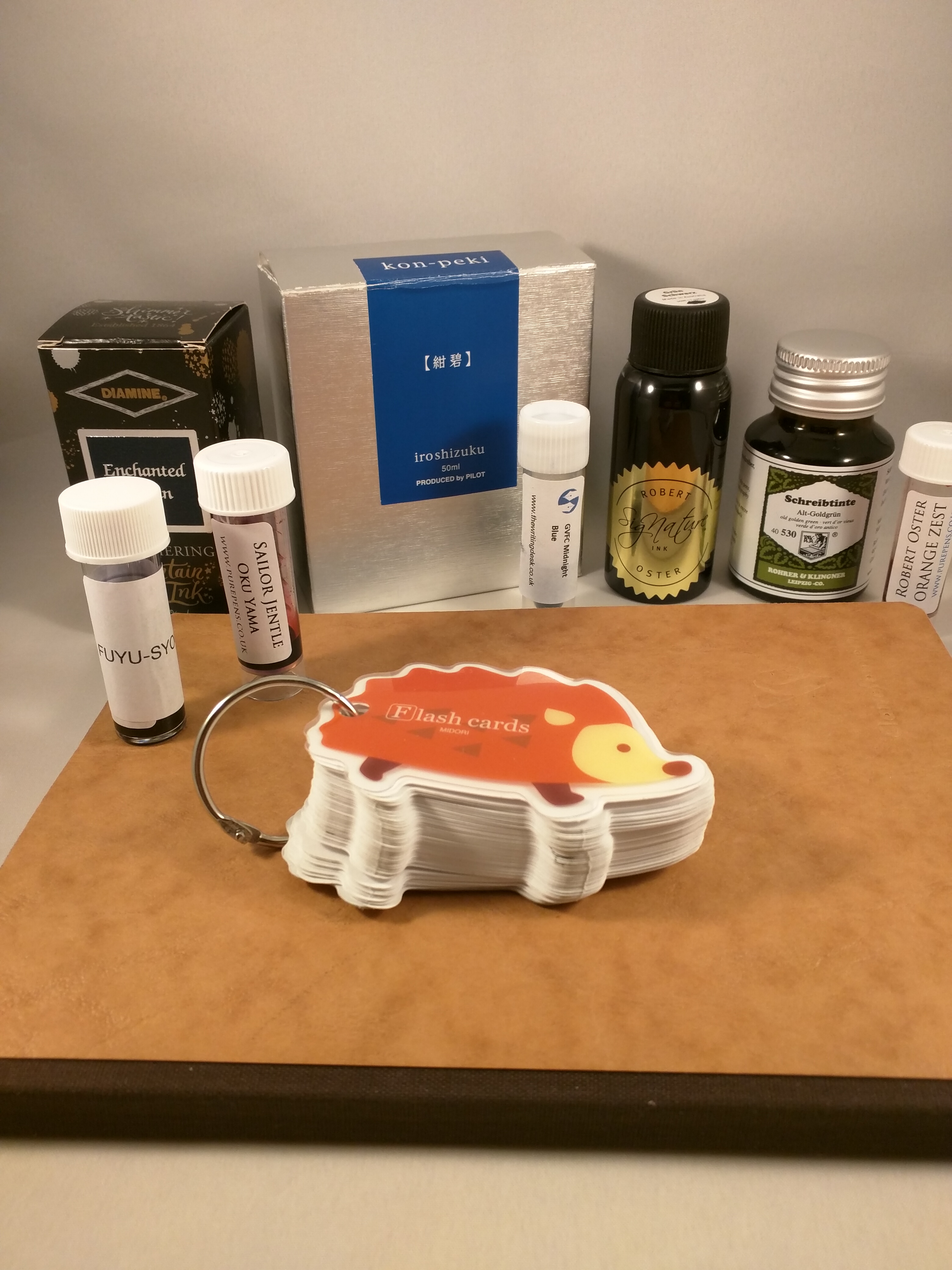
Anyone who follows me on Instagram (@slightly_unnerved) will know that I have a bit of a thing for the Sailor Pro Gear. In 2020, the number of Pro Gears I own went from a modest three to a more showy eight. These were all limited/special editions of one sort or another. More (or less) interestingly, four out of these five came with medium nibs.

Spot the pattern – (L-R) Pro Gear Earth (Broad), Apres Ski (Medium), Blue Lagoon (Medium), Tequila Sunrise (Medium), Angel’s Delight (Medium), Kure Azur (Medium), Bungubox Omotesando Blue (Fine Medium), Bungubox Sanctuary Blue (Medium)

This didn’t bother me in the slightest as I happen to really like Sailor’s 21K medium nib. It’s a package that just works for me. Hand-finished, in practice, each of the Sailor medium nibs I own is sufficiently different (line width, flow, feedback) that they don’t all blur into one. Combine this with the range of colours I have and it never feels like I don’t have choice.

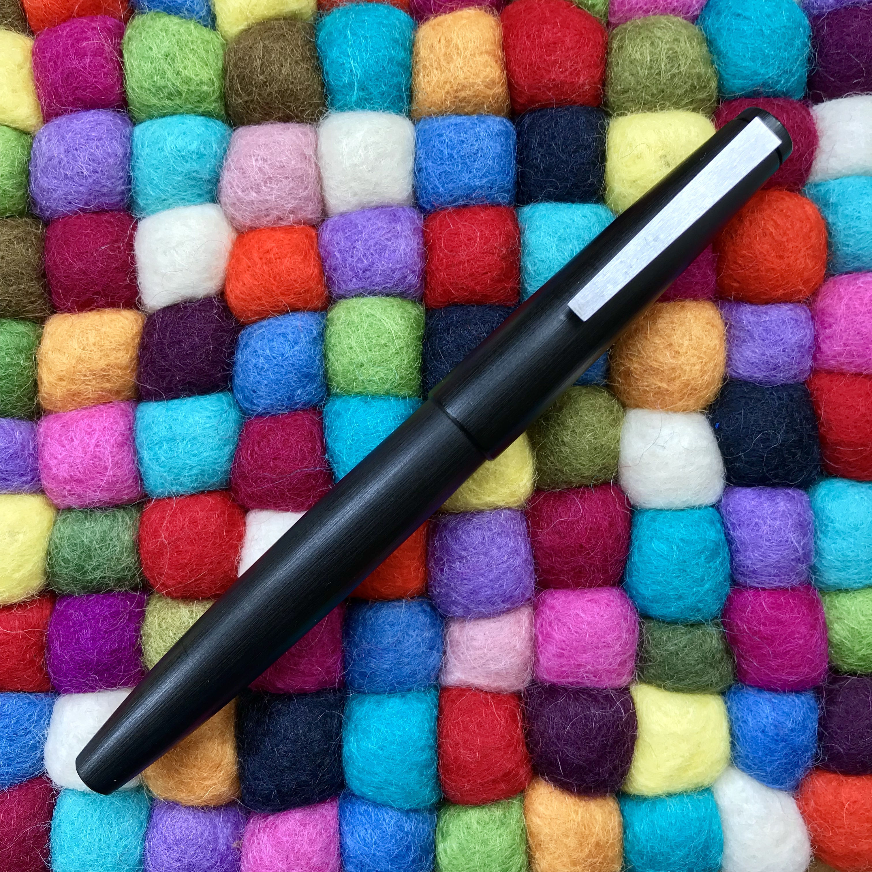
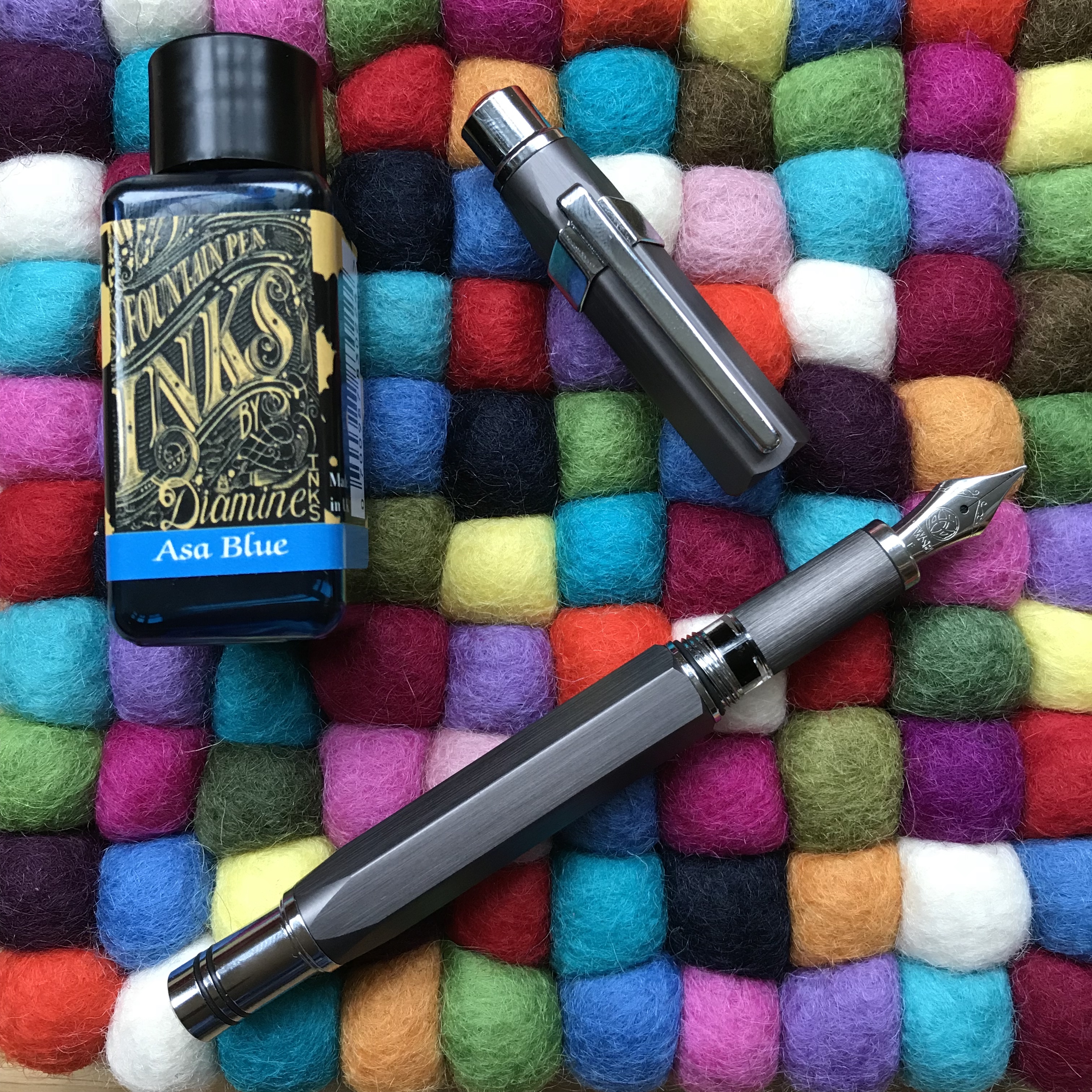
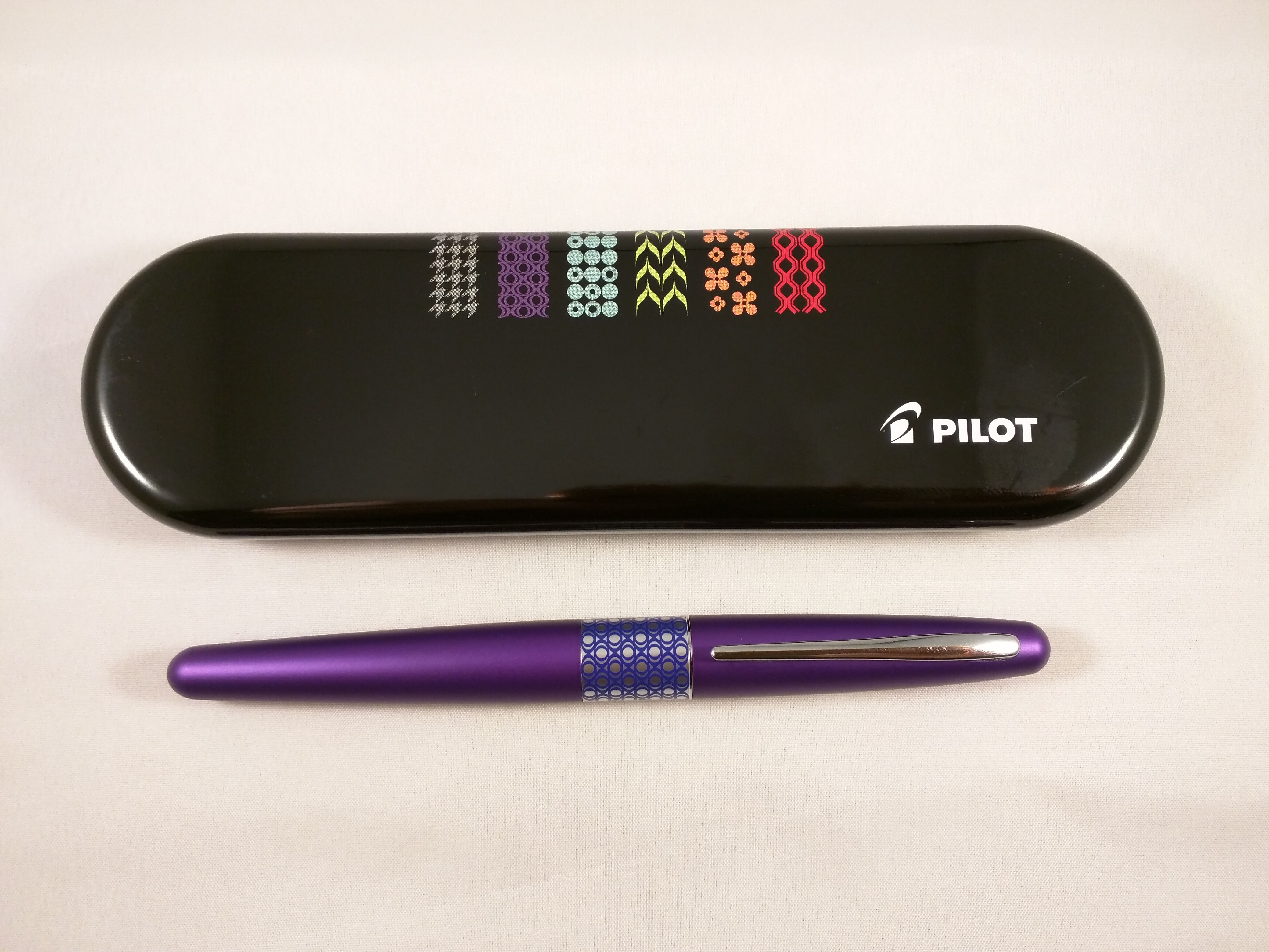
Besides the pens that I bought, one other Pro Gear I had made up my mind to buy was the Ocean. It too was a limited edition, but limited in the thousands and widely available at regular Sailor prices.

Familiarity did a good job of breeding contempt and I was quite happy to sit and ponder this particular purchase. Unfortunately, I waited too long and by the time I was ready to make the purchase, no-one in the UK had any left. It was sold out with no prospect of a re-stock.

Aaaarrrrgggghhhhh!

As I veered between reconciliation with the situation and the (not entirely rational) notion of ordering one from the US, Anthony from UK Fountain Pens put one up for sale. On the face of it, this solved my problem – the model I wanted, from a UK seller and with the bonus of not having to pay the premium of a brand new pen. I’ve never met Anthony, but if you’ve ever read his blog (and you should) it’s clear that he cherishes and cares for his pens. As such I had no concerns about the condition of the pen I would be buying.

Exhibit A – Sailor Pro Gear Ocean

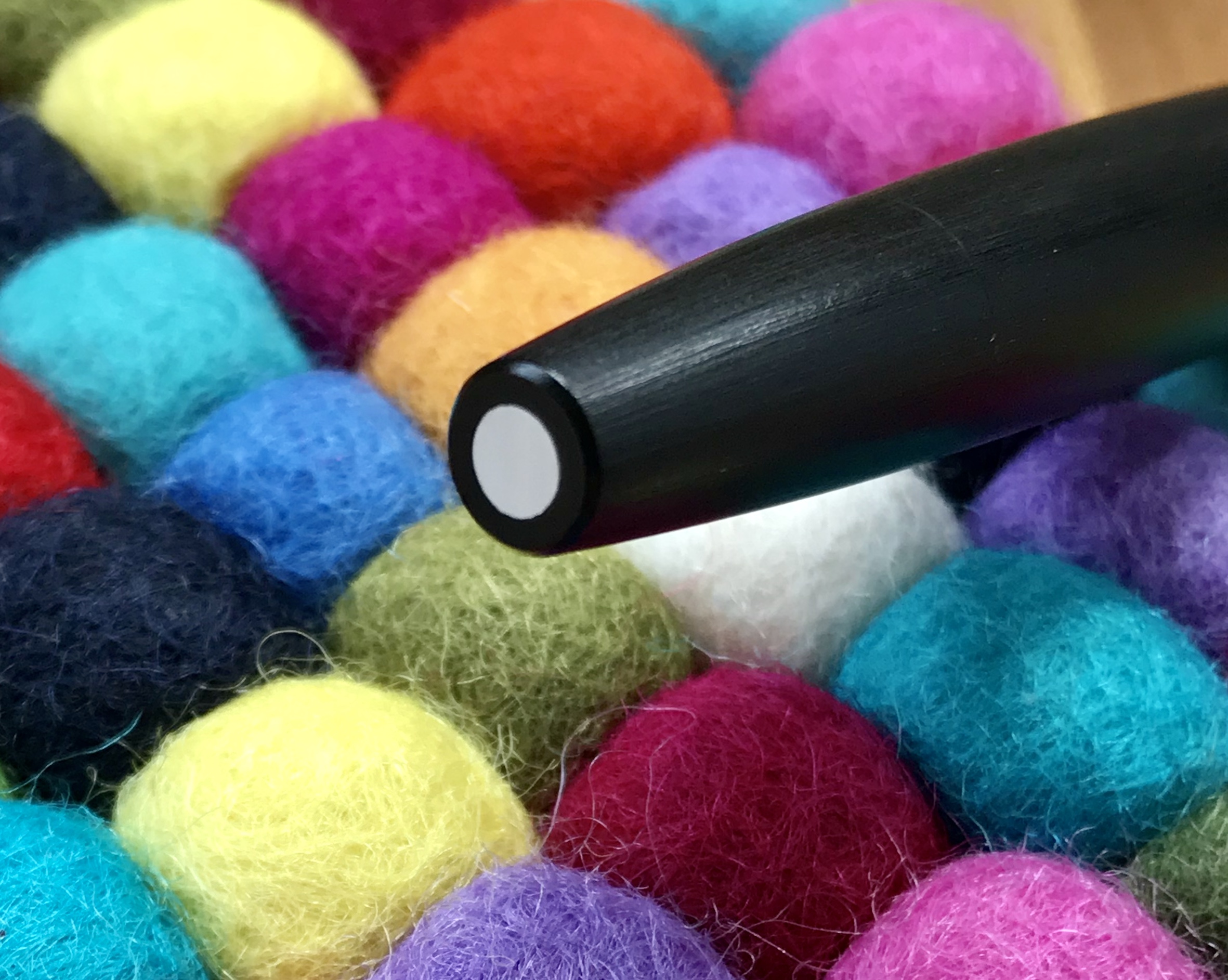
There was one quite big issue that I needed to address. This pen would come with an extra-fine nib! Japanese fountain pen nibs generally run thinner than their European counterparts. Given that I’d be reluctant to buy a European pen with an extra-fine nib, the prospect of a Japanese extra-fine was quite daunting (well for me anyway).

That extra-fine nib. The extra bonus was a dual-tone nib. I was expecting all rhodium…

Here was my dilemma. If I passed on this, when would I get a chance to buy another Pro Gear Ocean at a sensible price? If I bought it, what if it was effectively useless? In practice, the decision didn’t take long to arrive at. Funds were duly dispatched and a few days later the pen arrived.

Does size matter? L: extra-fine, R: medium
Getting it down on paper

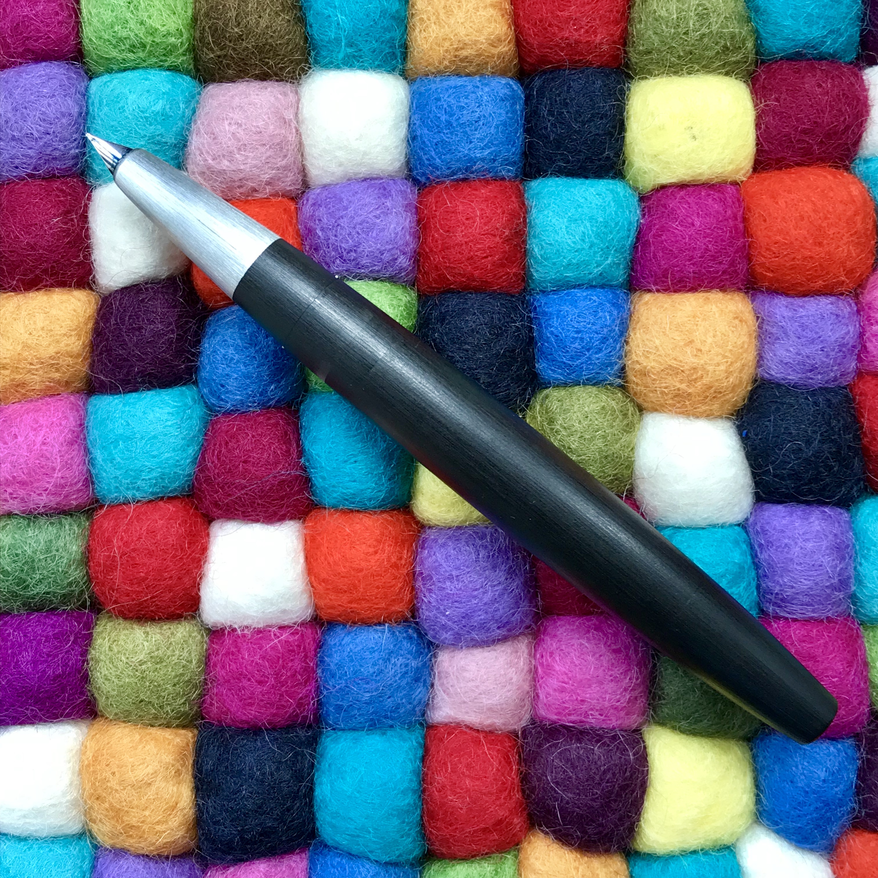
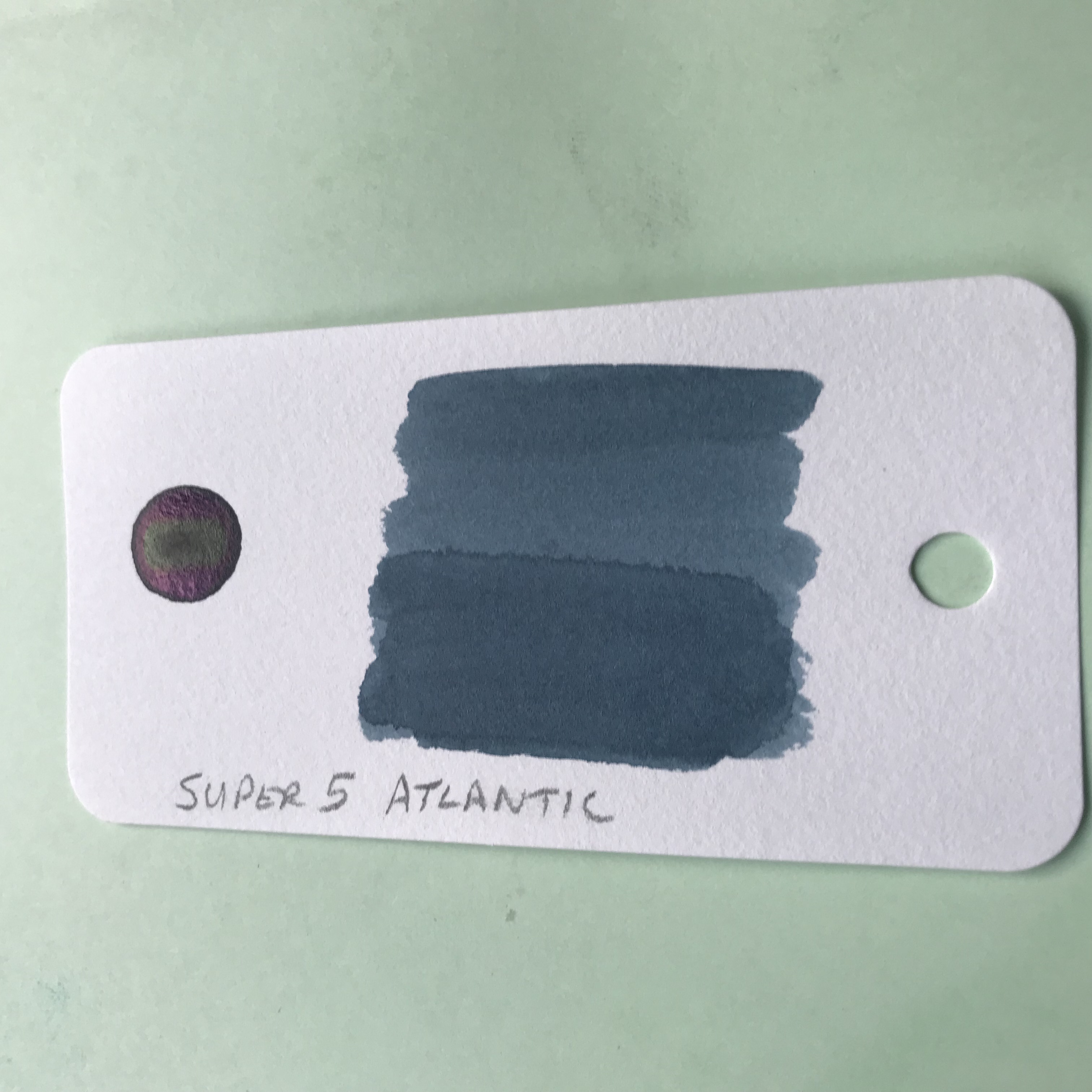
Was it the right decision? Definitely. Inked up with Sailor Yonaga, it writes brilliantly. The flow is good and the nib is not at all scratchy. It has a little of the pencil-like feedback that Sailor nibs are renowned for, but that’s it. All in all a fantastic pen.

Much of this pen was a known quantity, but sometimes it’s good to push your boundaries a bit and try something that differs from the norm.

Next stop a music nib?

The Lamy 2000 – a long-term companion

I noted the other day that Bauhaus is 100 years old.  Not the pale-faced, pointy-cheekboned goth outfit fronted by Pete Murphy, but the German art and design movement founded by Walter Gropius.

This got me thinking about a pen that has become one of my long-term companions on my particular bus ride – the Lamy 2000.  This is a fountain pen that has often been seen as embodying  the Bauhaus aesthetic, even if technically it missed that particular bus by 30-odd years.  It was also pretty much my first ‘posh’ fountain pen, by which I mean it cost over £100, had a gold nib and filled using a piston mechanism.  This was all unknown territory for me at the time, but the 2000 exuded class and almost everything I read said it was great pen and a classic design that any self-respecting penthusiast should have in their collection.

So it was that I gave Cult Pens what seemed (at the time) like a lot of money and they sent me a pen.  I chose a fine nib and seem to recall that this was the first time that I’d really given consideration to picking a nib size other than medium.  Due to a fortunate combination of personal preference (I think it looks way better) and price, I picked the black Makrolon finish instead of the alternative of brushed steel.

Capped Lamy 2000

The Lamy 2000 in all its sleek, simple beauty

Pens achieve cult status for all kinds of reasons; some more justified than others.  In the case of the Lamy 2000 (first introduced in 1966), I think this is deserved.  Capped, its lines are simple and appealing, with flat ends and a brushed metal clip on which you’ll find the only bit of Lamy branding, subtly etched near where the clip attaches to the cap.

Lamy 2000 clip detail

In case you forget who made the pen…

The only other accent you’ll find is a brushed metal disc at the tip of the barrel.

Piston cap detail

Piston cap inlay

It’s a slip cap, so a slight pull is all that is needed to uncap the pen and get writing.  Removing the cap really reveals what all the fuss is about.  There are no steps between elements or weird changes of angle, just a simple and continuous curve from where the nib emerges from the section to the end of the barrel.

The sleek lines of the Lamy 2000

Follow the lines…

Perhaps the only thing that jars ever so slightly is a pair of tabs that protrude a fraction of a millimetre from either side of the section a little below the ink window.

Lamy 2000 cap clutch tab

If the cap fits… One of the two cap clutch tabs

I was never really sure what these were for, but in doing some background research I discover they are part of a clutch ring for the cap.  In that sense they do their job perfectly well and don’t intrude on the writing experience.  My thumb sits right on top of one of them when I hold the pen and I can’t say I’ve ever really noticed it, let alone felt any discomfort even for long writing sessions.

This also marks the point where the section attaches to the barrel.  The design of this (and the piston cap) is such that you can barely see the join where the two elements meet.  The cleverness of the piston cap end of things was highlighted in a recent post by Anthony over at UK Fountain Pens.

That blind piston cap

Can you spot the join?

I can certainly remember looking at my newly acquired Lamy 2000 and wondering how I was meant to fill it.  As it was my first piston filler, I duly read the instructions, but remained stumped as to where the cap that I was meant to unscrew actually was.  Of course now it seems so easy (it always is when you know how), but what impresses me is that even after several years of use and numerous fills, everything has remained tight and these transitions still appear seamless.  A tribute to the design, the materials and the manufacturing.

As a counter to all that black Makrolon, there is a short brushed metal section which leads the eye down to a small, partially hooded 14K rhodium-plated gold nib.  The only departure from curved lines comes with the underside of the section, which angles up more sharply towards the underside of the feed.  Cunningly, this conceals the breather hole – another good piece of design.

9C381685-DAC5-450A-A7E4-EBF3B89D2909

The 14K nib in all its glory.  Where’s the breather hole?

1475665F-C5A3-4A17-8AE8-7D1CBEB30437

There it is!

2DD95FC0-0C4F-425C-9335-B03CA8F519F7

That slight change of angle…

It may have been good fortune, but the nib on mine has written flawlessly since I got it.  I have read that some people had bad experiences with theirs, but I have absolutely no complaints with mine and I’m not the greatest lover of Lamy nibs.  It’s not the thinnest ‘fine’ I’ve ever owned, but it suits my writing just – well – fine.  Mine copes with pretty much whatever ink I throw at it, but it is a very wet writer, so can be a good choice for use with drier inks.

I have to say it, I really love my Lamy 2000.  It looks fantastic, writes well and seldom goes uninked for any length of time.  It’s also pleasing that Lamy haven’t tried to do anything silly with this pen.  The design wears its age well and has evolved by remaining essentially unchanged over the 53 years of its life so far.

The Lamy 2000 is smart enough to use in any setting and, although not cheap, I’ve never felt uncomfortable taking it with me to work.  Sure it’s not as glamorous as some other pens, but it does its job with quiet efficiency and (I like to think) pride in being able to do its job well.  Definitely a pen where all the plaudits are entirely justified.  If you don’t own one already, I’d recommend giving some serious thought to rectifying that oversight.

If you want to know more about the Lamy 2000, when I was doing some researchI came across this amazingly thorough piece on FPN  It covers pretty much every aspect of the pen from its design origins through to how to strip it down.  Whatever you think of the pen it is well worth a read.

Learning to stay on the bus

When I started my blog, I was in part looking for a creative outlet that could serve as a substitute for photography.  Sure I’ve liked and used fountain pens for years, but it never occurred to me that I would start collecting them in earnest, or writing about them, or (here was the big surprise) finding that other people might actually want to read what I had to say about them.

Black and white photo of a Hosta flower

Hosta flower

I’ve never really taken to digital photography beyond the acceptance that these days it’s a convenient way to take photographs.  And while I still can’t be persuaded to spend hours in front of a computer tweaking images, I never had that problem standing for hours in a cramped, darkened space under a red safelight making prints in a darkroom.  Maybe it was the smell of the chemicals, but I’d like to think it was the childlike wonder of watching an image gradually materialising on the paper as it rocked gently in the tray of developer and thinking “I did that”.  Of course, it applied equally when things went wrong, but I’m pleased to say that this sense of magic has never gone away.

Black and white photo of a waterfall

Waterfall (Cwmorthin, North Wales)

I can’t pretend to be a very good photographer but I need to be able to believe I still am one.  Unfortunately, the time needed for taking and making photographs has not been compatible with work and family commitments in recent years.  I’m hopeful that one day this will change, and that when it does it will actually still be possible to buy film and photographic paper and get back to something that I really love.  In the meantime, my darkroom is mothballed and my beloved Sinar Norma and Mamiya RB67 are more like ornaments in the corner of a room than tools of the trade.  All the gear – no idea when I’m going to get to put it to good use…

Black and white long exposure seascape

Seascape

What does any of this have to do with buses?

On the face of it, not a lot.

I’ve never been to Helsinki and I’ve certainly never seen its bus station, but I’m more familiar with it than any other Scandinavian transportation hub as a result of a lecture given by Amo Rafael Minkkinen a number of years ago.  He was talking about the creative process, the development of one’s own style as a photographer and how it could be compared to taking a journey from Helsinki’s central bus station. You can read a transcript about the Helsinki Bus Station Theory here.  (It’s worth taking the time, I think.)

Old Helsinki main bus terminal

Google tells me this is the old Helsinki bus station… (Courtesy of JIP at English Wikipedia [CC BY-SA 3.0])

In a nutshell, he argued that you will spend years making photographs that look like the work of others, but eventually (and here’s where the bus analogy punchline arrives) your personal route will start to diverge from these others as the journey progresses and your own style will start to become distinct from those around you.  The trick is to stay on the bus and see the journey through.  Going back to the bus station and starting again on another route to see if that offers a better option will just waste precious time and end up leaving you no further forward than before – just on a different route.

This resonated with me at the time, being inspired by the work of photographers like John Davies, Fay Godwin, John Blakemore, Igor Svibilsky and many others while I tried to work out what sort of photographs I wanted to make.  However, I’ve recently found myself reflecting on it in the context of writing my blog and how the focus of my interest in pens, paper and ink has changed with time, practice and seeing what interests other people.

Do I stick with what I’m doing?

Should I follow what I see going on elsewhere?

Sure, at times I’ve followed the same routes as other people, even jumping on the occasional bandwagon.  What I think I’ve learnt along the way is that you should trust your own judgement, follow what interests you and learn from your experiences as you go.  I’ve also learnt that my list of favourite pens (owned or aspirational) or inks and, to a lesser extent, paper now looks nothing like it did a couple of years ago.  Also, I’m fairly confident that my list will almost certainly never entirely match anyone else’s. At first glance there might be similarities, but look at the detail and you’ll start to see the differences.  That’s one of the wonders of this hobby and the wonderfully diverse group of people out there who practice it.

So, whatever your creative endeavour, whether it be one that you do in private or share publicly, you’ll get where you’re going eventually.  Stick with it and try to enjoy the ride.

As Minkkinen himself said – “Stay on the bus.  Stay on the f*cking bus!”

A Helsinki bus

A Helsinki bus. Consider staying on it… (Courtesy of AleWi [CC0])

Unexpected Discoveries

Serene Serendipity

Alongside the hours of meticulous research, cross-referencing reviews, finding the best price and generally procrastinating over purchases, I like the occasional moments of serendipitous joy that come with spur-of-the-moment purchases.  Sometimes it’s completely out of the blue, but more often than not it’s the little extra you add to your shopping cart as part of a bigger order.  After all, what’s the harm?

So it was with some recent ink purchases from Fountainfeder in Germany.  My main objective was getting my hands on a couple of German-only inks from Diamine – Skull and Roses and November Rain.

The process from order to delivery was smooth and the wait wasn’t too long.  As well as the ink, I got a nice, hand-written note and some chocolate – always welcome.  Both Skull and Roses and November Rain look interesting in a “sheen-turned-up-to-11” kind of way. Even so, they weren’t the stars of the show.  That honour goes to the contents of an unassuming sample vial – Super 5 Atlantic

From swatches on the web, it looks to be somewhere on the teal spectrum, but as it turns out, the online photos rather undersell Super 5 Atlantic (unless you love teal, of course).

I’m rediscovering my love for the sea in all sorts of ways at the moment, including inks that reflect its myriad colours.  As a result, this ink has struck a chord with me, helped by the massive clue in the name.  Not the Super 5 bit – that sounds like a posh upgrade from the Fantastic 4 (imagine it said in a plummy English accent) – I meant the Atlantic part.

Super 5 Atlantic ink swab

Avast ye swab!

Swabbed, you get a beautiful blue/green/grey kind of colour, which indeed evokes the ocean.  Used in anger, it has plenty of shading to add interest.  On 52 gsm Tomoe River paper, there’s some cheeky sheen.  In fact, there’s wall-to-wall sheen.  It’s a silvery sort of sheen, so it manages to be both subtle and extravagant at the same time.  The sheen doesn’t dominate though and the true colour of the ink shines through.

Super 5 Atlantic writing sample

All at sea

Of course, there are risks and potential pitfalls with these impulse purchases.  Failure to do any meaningful research meant that I didn’t pick up on the fact that it’s a permanent ink.  If I’d known this I might have picked a different pen to my ghostly Franklin-Christoph 45.  The cap has a habit of collecting ink spots that are hard to shift so I’m being a bit wary and handling the pen gingerly until I’ve written it dry.

At around €16 for 30ml, Super 5 Atlantic is not a cheap ink.  It doesn’t seem to be available in the UK, so shipping costs from Europe add to the challenge.  It’s such a beautiful colour though, that I didn’t hesitate and I should have a bottle in a few days.  I can easily see this becoming one of my favourite inks – high praise from someone who has the attention span of a gnat when it comes to sticking with one ink.

Getting mixed up – into the Wild Blue Yonder

To begin at the beginning…

It started with something innocuous, as these things often do – a seemingly innocent purchase of a 30 ml bottle of Diamine ASA Blue.  At £2.35 it seemed rude not to.  But of course, that’s how they get you.  Added to the Mnemosyne 194 that I wanted, that almost got me to the £10 needed to qualify for free postage.  90p short, I needed something else…

…and that’s how I ended up with a bill for £45!

Enough about my lack of will power.  ASA Blue is great in its own right, carrying off  a passable impersonation of Pilot Iroshizuku Kon-peki at a fraction of the price.

TWSBI Precision and Diamine ASA Blue

Are you sitting comfortably?

While I was looking for write ups about this ink, I found an old thread on FPN where someone had mixed ASA Blue with Sapphire Blue in equal parts with interesting results.

So, I thought, how hard can it be and what’s the worst that can happen?  The answers are: ‘easy’ and ‘nothing untoward’.  No explosions, fires or gunky messes.  Instead, you get a really nice blue ink for your troubles.

Text from Under Milk Wood

Truly beginning at the beginning

Ink splats showing sheen

There’s sheen there if you look for it

What happens when you mix ASA Blue and Sapphire Blue

…something about a glass and a half?

Not an original idea and I can’t guarantee that I haven’t just made another ink from the Diamine range.  Either way, it was a bit of fun to try.  What I didn’t realise was that I was also demonstrating the pervasive and subliminal power of advertising.  It wasn’t until a couple of days after I’d done it that I realised why the image above looked kind of familiar.  Any resemblance to the logos and advertising imagery of a major UK chocolate manufacturer are entirely coincidental.  Honest.  No, really.

One thing that I do take issue with is the name.  The creator of this mix named it Asphire.  I see the logic and it gets a cheap laugh (or was that just me) but I can’t say I’m entirely impressed with the result.  I came up with was Wild Blue Yonder, but I’m open to suggestions.

Any thoughts?

My First Pen Show

On Sunday 4th February I attended the first pen show on the UK calendar at the Doubletree Hilton on the outskirts of Bristol.  It was also my first pen show, but the coincidence was mainly one of geography as this one is nearest to home.  Despite having read reports of last year’s London pen show and various US pen shows, I wasn’t entirely sure what to expect out here in the provinces.  Luckily I didn’t have to brave things by myself as I managed to persuade my friend, Phil, to tag along.  For us newbies, safety in numbers seemed like a good idea.

We managed to arrive not long after things got going so we had a good chance to scout out the stands before the crowds arrived.  There was mainly a mixture of retailers and dealers, the Writing Equipment Society, plus renowned UK pen maker Adrian Twiss.  I probably should have thought more about what I’d need to write up my trip and taken more note of who else was there, but I’ll plead a novice lack of forethought and feeling like the kid who has been handed the keys to the sweet shop.


IMG_20180204_113605

Pens at a pen show, who’d have thought it?

Despite there being plenty of pens to drool over, I managed to be restrained and not buy any.  I did let the nice people from Pocket Notebooks (in the process of becoming Nero’s Notes) persuade me to buy a Nock Brasstown in the latest fetching shade of orange.  I also took a punt on a Life Schopfer notebook.  The team were really engaging and we spent a bit of time comparing notes on Japanese stationery and the quest for the perfect notebook.  I haven’t previously bought much from these guys, but I will certainly be sending more of my money their way in future.

83923551-4D16-4B3A-8104-00C359B761E2

Brass(town) in pocket

My overall impression was that everyone was friendly and happy to talk pens, but as Phil put it “there’s not a lot of cash changing hands”.  There certainly seemed to be lots of conversations between dealers, but not a lot of buying or selling going on.  Maybe this is how pen shows work, with punters poring over pens without much intention of buying.  Alternatively, maybe dealers get a little too attached to the pens they acquire and are not entirely unhappy if no-one buys their precious stock.  We managed several laps of the room, partly in the hope that if we went round enough times, prices might miraculously come down.  Sadly they stood resolutely firm.

31BDB537-D2D9-485D-B7A3-1D9932323C11

Life’s what you make it

Among the retailers there were a variety of offers to be had, although not all of them worked out to be as generous as they first seemed.  Given that most people can easily check internet prices from their phones, some of the “offers” did seem a bit cheeky.

Although I didn’t go so far as to buy a pen, I did manage to answer a few questions that I’ve been pondering about possible future purchases.

Pilot Vanishing Point – thanks, but no thanks

Despite its clever design and a nib that everyone raves about, the Pilot Vanishing Point is not for me.  The positioning of its clip and my grip are just not compatible.  Now I know this I can (sadly) move on.

Sailor Professional Gear – yes please

I’ve been pondering whether to add Sailor to my list and the chance to handle a few confirmed that this would be a good thing.  The Professional Gear wins out over the 1911, and although I normally prefer rhodium to gold trim, I was rather taken with the limited edition Earth with its gold finishing.  Want one!

Pelikans – to join the flock or not?

My other big unknown was about Pelikan pens.  It seems that you’re not allowed to be serious about fountain pens without owning one (or more).  I’ve been curious about the M400 White Tortoise for a while, but hadn’t seen one for real.  I did find a used one at the show, but it was £300!  Considering you can still buy them new for under £200 I thought this was a tad excessive.

My main learning point was that when it comes to Pelikans, size matters.  You can find plenty of opinion out there that the M40X is a bit on the small side, and I find myself agreeing with that sentiment.  The M60X and M80X are a bit more like it, though.

The M600 falls by the wayside once aesthetics are taken into account as I’m not a huge fan of Pelikan’s stock colours or the current limited edition White Transparent.  The M80X ranges – now we’re getting somewhere.  I could be seriously tempted by the Stresemann and/or the Ocean Swirl.  Both look orders of magnitude better in the flesh than they do in photos.  Somehow they manage to be both more striking and more subtle at the same time.  I did see one M800 Brown Tortoise.  Now that is truly a beautiful pen.  Sadly, well out of my price range any time soon.

Is that it?

I enjoyed my trip to Bristol and I suspect this won’t be my last pen show.  At the same time I don’t think I’m going to be rushing round the UK ticking off the rest of them.  One thing is clear.  If I’m serious about buying a pen, then I know I’ll need to go with a much bigger budget.  Time to get saving…


Must try harder

C63F3B8C-0EC9-4C22-8611-3869C32EC8DD

Says it all, really

Reading all the highlights and round-up posts from the blogs I follow has highlighted how meagre my output for the last year has been.  In my head I reviewed lots of the things that I forked over my hard-earned cash for, but something got lost in translation and for a variety of reasons only a few made it onto the digital page.

In reflecting on this, I’ve come to realise a couple of things.  Blogs are a little like gardens (no, seriously) in that they are a reflection of you and need to be tended and nurtured.  If you don’t put the time into maintenance and planning, then you don’t get good results.  That said, doing it for the sake of doing it can also be counter-productive.  It needs both head and heart, and maybe I’ve been lacking a little of both.

I’m not much of a fan of resolutions – mainly because I’m terrible at keeping them, but I know that I need to do a bit of nurturing to get things where I’d like them to be.

It’s not all doom and gloom…

There are some positives.  I didn’t have to buy all the pens I acquired last year – I won a set of 3 Lamy Aion pens from the lovely people at The Writing Desk.  All I had to do was to indulge my habit and buy something from them – in this case a TWSBI Diamond Mini limited edition in gold.  First impressions of the Aion fountain pen are good.  If nothing else, it proves that buying more pens has got to be a good thing (doesn’t it?).

FDE3C57D-6E68-48BC-899F-7D23939EC9E7

Aion, Lion, Zion

We all have weaknesses and it seems TWSBIs are mine.  The Diamond Mini was one of 5 TWSBI pens I bought last year.  My growing family of TWSBIs now stands at 7 – a Vac700 (currently a little poorly, but fixable), the gold Diamond Mini, an Eco, an Eco-T and three Diamond 580ALs (Lava, Turquoise and Rose).

108C56F6-1262-4FB4-9FB2-BC9286F0A6D3

We are family

It was an interesting year ink-wise.  I followed the sheen bandwagon, graduating from the likes of Sailor, through Robert Oster to Blackstone and on to the Organics Studio sheen monsters Walden Pond Blue and Nitrogen Royal Blue.  It was fun while it lasted, but perhaps you can have too much of a good thing.  If the sheen obscures the base colour of the ink, maybe things have gone a little too far…

AD68B0D6-C4B6-447C-BD87-AFC27E8DD460

Shiny

On the notebook front, I’m increasingly convinced that the Far East is where it’s at.  Aside from continuing with the Hobonichi Techo – I’m on my third one (second direct from Japan) – I’ve been exploring the Life range of notebooks.  As well as the Noble range, which is relatively well known, I’ve been impressed by the Tsubame (Swallow), Kappan and Renover books.  Mnemosyne books have become my book of choice for work and I still have a real fondness for Midori’s MD books.  My affection for Tomoe River paper remains undiminished, but it’s getting harder to come by in the UK at a sensible price, and there is still a (relative) dearth of books that use this paper.

5B7D0E4F-7E1D-482A-B08E-4F420BC75A68

Big in Japan

KWZ’s Polish special edition inks have hit the UK, so time to hammer the bank account (again).

Targets for this year?  Maybe I’ll finally commit to buying a Pelikan.  Then again, I’ve procrastinated for a year already and still haven’t done anything about it.  Birmingham Pen Company’s inks get good write ups, so maybe it’s time to give them a try.  Colorverse inks seem to be the latest Instagram hit, maybe I’ll see what all the fuss is about.

Here’s to 2018. Let’s hope my grades improve…

Season’s Greetings

I’d like to thank everyone who follows or reads my blog. I hope you’ve enjoyed some of what I’ve had to say over the past year.  I wish you and your loved ones all the very best at this festive time of year.

38873922-C22E-449F-956D-E1AAC7CD1E29

If you’re interested in the technicalities, the paper is Tomoe River, inks are KWZ Honey, Private Reserve Avacado, Diamine Firefly, Diamine Enchanted Ocean.

The Hedgehog of Wisdom – using Midori Flash Cards to index inks

IMG_20170507_222334

“The fox knows many things, but the hedgehog knows one big thing.”  (Archilochus)

…hedgehogs aren’t simpletons; they have a piercing insight that allows them to see through complexity and discern underlying patterns. Hedgehogs see what is essential, and ignore the rest.”  (Jim Collins)

At the start of 2017 I resolved to expand the range of inks in my possession and I’m happy to say it’s a resolution I’ve managed to keep to, buying both bottles and samples to test different makes and colours.  This creates its own problems: i) where to keep the ink; and ii) how to keep track of what I’ve got.  I haven’t really solved the first one, but I’ve made a start on the second.  Enter the Hedgehog…

Like many people, when I first discovered the Midori Traveler’s Notebook I also stumbled on the vast array of stationery items that Midori also produces.  They all seemed like a good idea at the time I bought them, but have mostly sat around my desk looking for a purpose in life.  And so it was with a set of flash cards in the shape of a hedgehog.  Nice enough to look at, but what on earth was I going to do with them?

IMG_20170507_222436

The Hedgehog of Wisdom

Cataloguing inks

With the number of inks I owned growing fast, I realised I needed to do something to keep a handle on what I had.  My first attempt to catalogue my inks was with a Clairefontaine Age Bag notebook.  Great idea I thought.  Lots of high quality pure-white pages.  What’s not to like?  Well, a couple of things actually…

Sure the paper is good, but I really, really hate the way this book is put together.  To say it’s not a lay-flat binding is an understatement.  Call me squeamish, but I can’t quite bring myself to inflict the level of physical violence on a poor, defenceless book that is necessary to make it stay open at the page I’m interested in.  Also, and presumably to save cost, the faux aged card covers are stuck on top of the spine tape, rather than integral to the binding.

The flaw in the plan with notebooks

There also some practical problems on the horizon.  However you group inks and categorise them, if you use a book you are almost guaranteed to want to compare two inks that are on different pages.  Short of tearing out pages, you’re going to struggle to make all the side-by-side comparisons you’ll want.  Also, unless you’re brilliant at predicting how many inks of each colour you’re going to end up with, allowing enough space for each in (say) the blue section is going to be tricky.

IMG_20170507_222541

You can get a lot on a page in a notebook, but the format is not very flexible

Here’s where the Hedgehog comes in.  It’s a stack of 80 flash cards, held together by a metal ring.  The ring can be opened to add, remove, move cards, but you can just add a swatch for each new ink without worrying about any particular sequence.

I’ve taken to numbering each swatch and keeping a list of which ink the number corresponds to.  I also try to “double up” on half of the swatch (i.e. two passes of the cotton bud) as a means of getting an idea about saturation and also to help spot things like sheen.

IMG_20170507_223055

Until I put this together, I’d never noticed the sheen that comes with Diamine Teal (if you apply enough of it!)

I like to compare how one ink looks against another.  It helps me figure out what to make of a new ink, if I can look at it alongside one that I already know.  The real utility of the Hedgehog is the ability to pull out several colours and compare them…

IMG_20170507_223004

A set of flash cards will cost you around £3/$3.  As well as hedgehogs you can have ducks, cats, dogs, bears, strawberries (you get the picture).  I got mine from the Journal Shop, but Jet Pens and the Tokyo Pen Shop also sell them.  I haven’t managed to figure what weight the paper is, but it’s plenty heavy enough and there’s been no hint of feathering, show-through or bleed-through.

Hedgehogs are truly wise creatures.

Out with the old…

As 2017 gets under way, I thought I would take a moment to look back at how 2016 ended and also to look forward to 2017

What Santa brought me

The festive period at Slightly Unnerved Towers saw me the happy recipient of  several pen-related gifts.

The Pilot MR/Metropolitan is an inexpensive, but very highly rated pen which has so far been missing from my collection.  In the sparkly spirit of Christmas I chose the suitably unsubtle Retro Pop in Ellipse Violet.  I don’t yet have a converter for it, so it’s currently running on a cartridge.  Early scribblings seem very promising.

img_20170103_063012

Pilot MR Retro Pop

I’m not really a fan of calligraphy, but I was intrigued by J Herbin’s glass dip pens.  They are certainly striking and I thought might be useful as a way of trying out new inks.

img_20170103_063108

img_20170103_063122

This is the joker in the pack – a ballpoint pen!  Ballpoints are probably my least favourite kind of pen, but I like the minimalist style of this Tombow Zoom.  I knew it was a slim pen, but I was still taken aback when I opened the box.  It’s positively skeletal, but writes surprisingly well.

img_20170103_063242

Tombow Zoom 707

New pens can look a bit lonely without some ink to keep them company.  Luckily Santa had that covered as well with some goodies from the Diamine stable.  First up is one of their shimmering inks – Enchanted Ocean.  I’m not sure when or where I’ll use this ink, but I was intrigued by the concept and it’s substantially cheaper than the J Herbin alternatives.  I have one of those crazy Sailor Fudé pens with the 55° angled nib and I might team the two up and see what happens.  After all, what’s the worst that can happen?

img_20170103_062823

Diamine shimmering ink

At a more down to earth level, I also received three bottles of Diamine ink – Graphite, Twilight and Prussian Blue.  Diamine have revamped the desing of their labels and I think I like them.  The swabs look interesting but so far the only one I’ve tried in anger is Twilight.  First impressions are good so far…

img_20170103_062744

Diamine inks with the new label design

Looking ahead

That was how 2016 ended, what about 2017?

My pen buying has been rather scattergun to date.  If I see something I like, I tend to go ahead and buy it.  This has netted me some great pens, but the focus has been at the more budget end of the market.  Nothing wrong with that in itself, but I have designs on some more expensive pens and need to stop blowing my budget and save up.

Pens that I have my eye on include:

  • Platinum #3776 – although this more or less hits 3 figures in GB£, it still has a reputation for being good value for money in terms of nib quality.  I’d like to find out first hand…
  • Pilot Custom Heritage 912 – I bought a Custom Heritage 91 with a soft fine nib from Japan last year (it’s not available in the UK) and was impressed.  The 912 is intriguing because of the selection of nibs available.  I had originally thought about the PO nib, but from what I understand this is even finer than the soft fine, so is probably a step too far for me (although I do love the shape of it).  I might be tempted by the Waverly nib instead. This has an upward curve reminiscent of Sheaffer nibs, and although being more or less a medium nib, this is Pilot’s version of ‘medium’, so nearer to a western ‘fine’.  This will have to be another order from Japan.
  • A Pelikan of some description.  Such a venerable and respected pen manufacturer, but one I know little about.  Do I buy vintage?  Do I buy new?  I need to think a bit more about this one but it’s definitely on the list, just rather fuzzy.
  • Pilot Vanishing Point – a pen that no-one seems to have a bad word to say about, but one I haven’t quite got my head around.  This is one that I think I’ll need to try in a real shop in order to figure out whether the design works for me or not.
  • Sailor – a bit like Pelikan, this is more a feeling that I should own one at some point, rather than desire to have a specific model.  That said, the Professional Gear range looks good and might the right place to start for me.
  • Sheaffer – I have a bit of a hankering for a vintage Sheaffer of some description.  The design of some of the nibs is really appealing, but I need to do some research first as there is a huge back catalogue to choose from.

Most of these will have to be long term projects as a result of cost, but it’s nice to have something to aspire to.  One brand I don’t feel particularly drawn towards is Montblanc.  I don’t know where my prejudice comes from, but somehow it doesn’t feel like a pen for me (even though I own a dog-eared Montblanc 24).  Maybe one day I’ll see the light, but for now I have plenty of other things to focus on.

Inks

My thoughts on inks are less well-defined than those on pens.  I suspect my Diamine collection will continue to expand.  After all, the pricing of their 30ml bottles makes them hard to resist.

Among my favoured brands I’d like bottles of Iroshizuku Shin-kai and Fuyu Syogun.  I’ve tried samples of both and really like them.  They are premium inks at premium prices, but I have enough of these already to have confidence that they will be worth the investment.

More of a resolution than a plan – I should expand my inky horizons and try some other brands.  Sailor and Graf von Faber Castell are among those that look interesting.  Some other brands are hard to come by in the UK, so maybe I should look further afield.  Also I wish more UK retailers would sell samples or expand the ranges that they offer as samples.  If you’re going to commit £30 to a bottle of ink, you generally want to have an idea that you like the colour and know how it will perform with the pens and papers that you use.

Notebooks and paper

I have a whole shelf filled with unused notebooks – everything from Field Notes, through Clairefontaine and Leuchtturm to Fabriano, Mnemosyne, Nuuna, Life and Nanami Seven Seas.  Maybe I should stop being so reverential and actually get on and use some of these…

I plan to continue tinkering with making my own notebooks.  Each time I make one I see ways to improve the design and also my technique.

Just one or two things to keep me busy in 2017…