The Hedgehog of Wisdom – using Midori Flash Cards to index inks

IMG_20170507_222334

“The fox knows many things, but the hedgehog knows one big thing.”  (Archilochus)

…hedgehogs aren’t simpletons; they have a piercing insight that allows them to see through complexity and discern underlying patterns. Hedgehogs see what is essential, and ignore the rest.”  (Jim Collins)

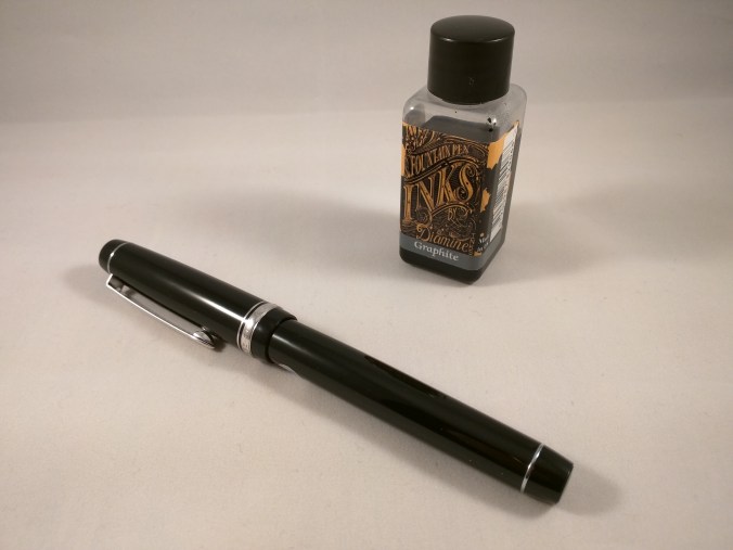
At the start of 2017 I resolved to expand the range of inks in my possession and I’m happy to say it’s a resolution I’ve managed to keep to, buying both bottles and samples to test different makes and colours.  This creates its own problems: i) where to keep the ink; and ii) how to keep track of what I’ve got.  I haven’t really solved the first one, but I’ve made a start on the second.  Enter the Hedgehog…

Like many people, when I first discovered the Midori Traveler’s Notebook I also stumbled on the vast array of stationery items that Midori also produces.  They all seemed like a good idea at the time I bought them, but have mostly sat around my desk looking for a purpose in life.  And so it was with a set of flash cards in the shape of a hedgehog.  Nice enough to look at, but what on earth was I going to do with them?

IMG_20170507_222436

The Hedgehog of Wisdom

Cataloguing inks

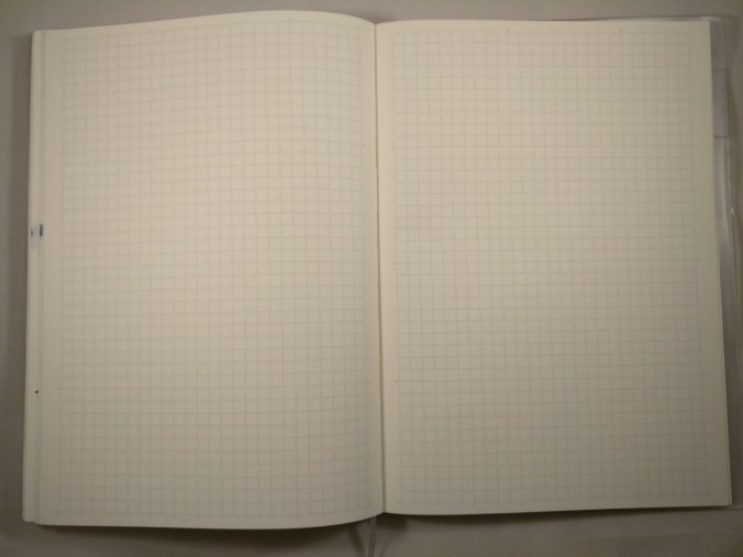
With the number of inks I owned growing fast, I realised I needed to do something to keep a handle on what I had.  My first attempt to catalogue my inks was with a Clairefontaine Age Bag notebook.  Great idea I thought.  Lots of high quality pure-white pages.  What’s not to like?  Well, a couple of things actually…

Sure the paper is good, but I really, really hate the way this book is put together.  To say it’s not a lay-flat binding is an understatement.  Call me squeamish, but I can’t quite bring myself to inflict the level of physical violence on a poor, defenceless book that is necessary to make it stay open at the page I’m interested in.  Also, and presumably to save cost, the faux aged card covers are stuck on top of the spine tape, rather than integral to the binding.

The flaw in the plan with notebooks

There also some practical problems on the horizon.  However you group inks and categorise them, if you use a book you are almost guaranteed to want to compare two inks that are on different pages.  Short of tearing out pages, you’re going to struggle to make all the side-by-side comparisons you’ll want.  Also, unless you’re brilliant at predicting how many inks of each colour you’re going to end up with, allowing enough space for each in (say) the blue section is going to be tricky.

IMG_20170507_222541

You can get a lot on a page in a notebook, but the format is not very flexible

Here’s where the Hedgehog comes in.  It’s a stack of 80 flash cards, held together by a metal ring.  The ring can be opened to add, remove, move cards, but you can just add a swatch for each new ink without worrying about any particular sequence.

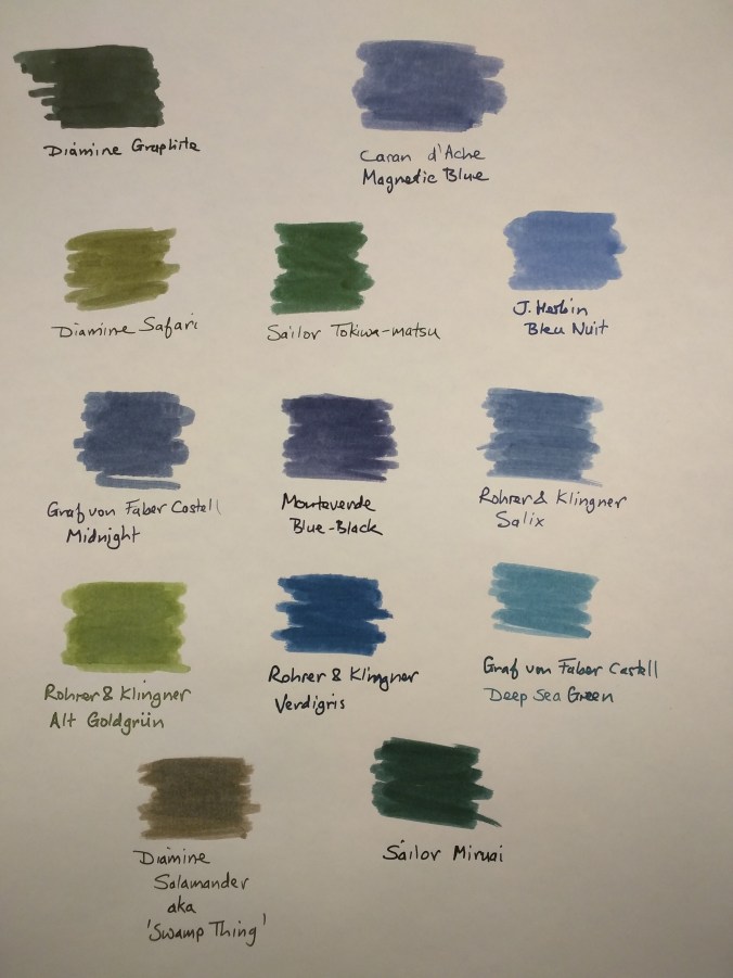
I’ve taken to numbering each swatch and keeping a list of which ink the number corresponds to.  I also try to “double up” on half of the swatch (i.e. two passes of the cotton bud) as a means of getting an idea about saturation and also to help spot things like sheen.

IMG_20170507_223055

Until I put this together, I’d never noticed the sheen that comes with Diamine Teal (if you apply enough of it!)

I like to compare how one ink looks against another.  It helps me figure out what to make of a new ink, if I can look at it alongside one that I already know.  The real utility of the Hedgehog is the ability to pull out several colours and compare them…

IMG_20170507_223004

A set of flash cards will cost you around £3/$3.  As well as hedgehogs you can have ducks, cats, dogs, bears, strawberries (you get the picture).  I got mine from the Journal Shop, but Jet Pens and the Tokyo Pen Shop also sell them.  I haven’t managed to figure what weight the paper is, but it’s plenty heavy enough and there’s been no hint of feathering, show-through or bleed-through.

Hedgehogs are truly wise creatures.

Bangwagonesque – Lamy Safari Petrol…

…or a foray into the world of the limited/special edition.  I’ll happily admit to being a cynic (or an advanced realist as I like to think of it) when it comes to this kind of thing.  Rather than rush to fill a gaping void in my life, I tend to file limited editions under ‘marketing ploy’ and move on.  So what’s changed?

Lamy Safari Petrol

Lamy Safari Special Edition (you’ll have to source your own troll)

If you were hoping for news of a Damascene conversion, the reality is far more mundane.  I was given a gift voucher for a local stationery shop.  So far, so good.  Unfortunately, said shop has a limited range of pens that I like (and can afford).  The selection of inks on offer is even more limited.  As a result, the arrival of the new Safari seemed to solve my problem.   I could spend the voucher on a known quantity, besides which another Safari here or there doesn’t really count.  (At least that’s what I’ve told myself.)  So, for a cash cost of about £2.50, I left the shop with a new Safari and a matching pack of 5 T10 cartridges.

Lamy Safari Petrol - cap off

“Oops.  I thought it was a screw cap – it just came off in my hand!  Honest.”

What’s it like?  Well, first and foremost it’s a Lamy Safari.  Much has been written in praise of this pen, and it (almost) always makes it on to the list of pens recommended to someone starting out in the world of fountain pens.  There’s not really much more to add.  That said, although I own four of these pens already, I don’t use them that often.  Their tendency towards being dry writers usually leaves me reaching for other pens in preference.

Lamy Safari Petrol disassembled

This could make a handy spear…

One of the novelties for me here is that this is the first Safari I’ve owned in a matte, textured finish rather than the conventional gloss, polished finish.  It’s nice enough , but in this particular colour I think it cheapens the feel (and the look) of the pen.  Maybe it’s hard to produce this in a gloss finish, but I think I’d like it more.  All the other fittings, including the nib, are finished in black – any other finish would look out of place with this colour.

Cap detail

Cap detail

Black nib close-up

PVD-coated nib in black


Two Lamy Safaris

Side by side with a ‘conventional’ Safari

Troll plus Safari

Look into my eyes…deep into my eyes…

The other novelty is in the ink.  Despite the number of Safaris I own, I’ve never tried one with Lamy’s own inks.  I bought a pack of T10 cartridges in the matching colour and so far I’ve been impressed.  The medium-nibbed pen that I went for has written smoothly so far, with no skipping or hard starts.  I haven’t really had the sense of the pen being a dry writer, so maybe I should try combining my other Safaris with Lamy inks to see how they get on.  I’ve noticed a bit of nib creep (visible in the close-ups of the nib), but have no idea whether this is common to all Lamy inks or is specific to the Petrol ink.

The ink is available in bottles, but good luck in finding it.  Bottles of the Petrol ink seem to have sold out everywhere in the UK, mostly on pre-orders from what I can tell.  Various sellers are indicating that there may be further stock arriving in May, so if you haven’t got hold of a bottle yet, you may get another shot at it.

What’s the ink like?

As I mentioned, it flows well and puts down a good line.  I’ve tried it on Life and Rhodia paper and it’s been perfectly happy on both with no sign of feathering.  To be fair, you wouldn’t really expect anything different with these papers.

Writing sample

My awful handwriting on Rhodia paper

In terms of colour, it’s a good match for the pen.  The nearest ink I own to it is Noodler’s Squeteague, but that has a stronger green/teal component to it.  By comparison, the Lamy ink has more of a blue/grey/black component.

Petrol vs Squeteague

Lamy Petrol ink side by side with Noodler’s Squeteague

In conclusion

I like the colour of this pen, the textured finish less so.  The black fittings finish it off well. If you’re in the market for a Lamy Safari, and the colour appeals, then you won’t go too far wrong.  The real revelation for me has been the combination of pen and ink.  Rather than being dry and a bit scratchy as I was expecting, this combination worked really, really well.

Maybe there was something of a Damascene conversion after all…

(I’d also like to thank Trevor the Troll for his work as my glamorous (and unpaid) assistant.  I think you’ll agree that he put in a sterling performance under trying circumstances.)


Midori MD A5 Notebook Review

For many people, when you mention Midori, they think of the very popular Traveler’s Notebook.  Compared to such a high profile range, the MD notebooks are less well known, which is a shame because they really are great notebooks.  I’ve been using one as a journal of sorts for a few months now and think they deserve a great deal more recognition.

The A5 notebooks can be had plain, rules or with a grid pattern.  They’re fairly widely available with similar £/$ prices.  I bought mine from the Journal Shop for £12.95.

In my (so far) limited experience of Japanese stationery, packaging has tended to be simple but exquisite.  The story is no different for the MD.  The simple but beautiful cream card cover is wrapped in a sheet of glassine paper with a wraparound paper sleeve.  The cover is vulnerable to marking easiliy, so this is pretty much a necessity in packaging terms.

Midori MD notebook packaging front view

A plain version of the MD, fresh out of its wrapper


Midori MD notebook packaging rear view

Once you get into using the notebook, the cover is embossed with the MD symbol.  This simple design touch adds to the overall sense of class you get from using these notebooks.

Embossed Midori MD logo

Construction

The MD has sewn binding made up of a large number of small signatures, giving a usable page count of 176.  The main result is that the book opens flat without the need to inflict physical violence on it.  As a left-hander, I’ve really come to appreciate the importance of this property in a notebook.  The quality of the stitching is excellent.  The binding is a little unusual in that mull has been used on the spine instead of regular binding tape.  It’s very neatly finished and further adds to the sense of class that goes with these notebooks.

Such a light-coloured cover is vulnerable to marking, but an inexpensive clear plastic cover is available from most of the stockists who sell the notebooks.

Midori MD notebook binding (#2)

Inside you get gorgeous cream paper with a light blue 5mm grid pattern.  If you like your paper to be a crisp white, this may not appeal to you.  I tend to prefer off-white paper, so this works just fine for me.  Unlike some gridded notebooks, the grid blends nicely with the paper stock meaning it does its job unobtrusively – allowing you to get on with the business of writing.  I couldn’t find any definitive information on the weight of the paper, but I’d hazard a guess at 80gsm.

Midori MD grid detail

What’s it like to use?

Here’s a sample written with a fine nibbed Lamy 2000, inked with J. Herbin Perle Noire…

Midori MD handwriting sample

Trying a range of nib sizes and inks didn’t phase the MD paper in the slightest.  There was no sign of any feathering or bleed-through, even with some very wet pen/ink combinations.  This does mean that drying times are not always the quickest, but I’d say it’s no worse for the MD paper compared to other quality papers.  I even tried a Tombow ABT brush pen and the paper behaved itself impeccably.

The paper does have a bit of tooth to it.  This meant getting feedback with some of the drier pen/ink combinations I tried, but it was never enough to be a problem.  I found that some of these were harder work to write with than others, so you might have a bit of trial and error figuring out which ones work well for you and which ones less so if you write a lot in one sitting.

It won’t come as a surprise that the cream paper base affects the appearance of some inks.  Darker inks fared pretty well, but some lighter inks like Rohrer and Klingner Alt Goldgrun lost a bit of their punch compared to when used on lighter papers.

These are minor niggles, though, and in my opinion are outweighed by the performance and quality of these notebooks.

Midori MD various pen samples

There is some show-through, but I haven’t found it at all intrusive when writing on the reverse of a page.

Midori MD show-through

Wrap-up

In conclusion, these are fantastic quality notebooks which I’ve come to love over the past couple of months of use.  Any negatives are pretty small and vastly outweighed by the positives of design, execution and function.  The paper is exquisite and takes pretty much any ink you might choose to throw at it.  If you haven’t tried one and are looking for a new notebook to try, I thoroughly recommend them.


Snake eyes

If you suffer from ophidiophobia you might want to look away now.  Here’s what arrived in the post today…

Jinhao 'snake' fountain pen

Snakes on a pen!

I saw this on Amazon and couldn’t resist.  It’s so outrageous that it’s passed all the way through bad taste and emerged the other side with a certain swagger.  It’s a beast of a pen (in more ways than one), weighing in at around 85g.  Half of that is down to the cap alone!

Jinhao 'snake' fountain pen showing nib

Did I mention there are snakes?

The pen itself is quite slim – I guess to allow for the added (ahem) “decoration”.  Perhaps surprisingly it sits quite nicely and comfortably in the hand.  You can post the cap, but the only reason I can think you would want to is if you wanted a mini-staff so you could pretend to be an ancient Egyptian high priest or something.  In the real world posting the cap ruins the balance of the pen.

Jinaho 'snake' fountain pen cap details

I’ve got my eye on you…

Overall quality and finish seem pretty reasonable.  A quick test with some Diamine Twilight suggests the nib is on the fine side, but out of the box it seems a reasonable writer.

I’m looking forward to trying it out properly…

Ink Review – Diamine Graphite

Diamine Graphite bottle and Pilot Custom Heritage 91

Diamine Graphite and Pilot Custom Heritage 91

Here goes with my first ever ink review…

I don’t know whether it has anything to do with the time of year or the weather, but here at Slightly Unnerved Towers darker, more muted ink colours seem to be the flavour of the month.  I’m gradually working through a bunch of these, but Diamine’s Graphite is one that’s caught my eye recently.

Diamine Graphite is a dark grey ink with an element of green to it.  It could have been called slate without raising too many eyebrows.  Either way it’s much darker than other grey inks I’ve tried to date and it lacks the blue tint that a lot of greys seem to have.

A bit of kitchen chromatography confirms that what you see is what you get and there’s nothing out of the ordinary or dramatic about it.

Diamine Graphite chromatogram

That could be seen as a negative if you like your inks filled with drama, but I don’t mind.  In its understated way, Graphite gets on with the job.  It’s subtle and straightforward enough to be used in a work context, but it also shades enough to provide some interest.

This ink is well lubricated and flows nicely.  I’ve used it in several pens and not yet had a bad experience.  Like most Diamine inks, it’s not waterproof, but for my purposes that not a problem.  Particularly with being a left-hander, I haven’t had any issues with drying times – a little over 20 seconds to fully dry on Tomoe River paper.

Here’s what it looks like on Tomoe River paper:

Tomoe River sample

Here’s what it looks like on Clairefontaine 1951 paper:

Diamine Graphite Clairefontaine 1951 paper

As with other Diamine inks, Graphite is pretty widely available in either 30ml or 80ml bottles, with the 80ml size being good value at around £6.00/$15.00 a bottle.  That said I really like the fact that you can buy the smaller bottles.  It’s great for inks that you might only use occasionally or still aren’t quite sure of.  Diamine have revamped the design of their labels, but not their bottles.  The best you can say about the 30ml bottles is that they’re functional.  They certainly won’t win any design awards, but at this price point it’s something most people should be able to live with.

Grey inks are not to everyone’s taste, but if you’re thinking of trying some out Diamine Graphite is well worth putting on the list.

Baker’s Dozen

I mentioned in a previous post about the need to expand my inky horizons in 2017 and I haven’t let the grass grow under my feet.  After moaning about poor availability of samples in the UK, it turns out that the Writing Desk offer a pretty good range and 12 new inks duly arrived in the mail this week.

As it’s Friday the 13th, I felt I had to add one more (Diamine Graphite) for the purposes of mildly dramatic effect.  And here they are…

13 ink swatches

Baker’s dozen

Caran d’Ache, Graf von Faber Castell, Monteverde, Rohrer and Klingner and Sailor are all new ink brands to me, so I feel like I’m upholding my new year’s resolution.

Swatches were applied with a cotton bud onto Tomoe River paper, and the names written with my J Herbin glass dip pen.

The Rohrer and Klingner and Sailor inks look really interesting.  In colour terms I particularly like the R&K Alt Goldgrün and Verdigris.  I’ve started using Diamine Graphite a bit, and that looks to be another very interesting ink.

I also bought a Clairefontaine notebook to use as a catalogue  and aide memoire for my inks.  Hopefully it will make writing ink reviews a bit easier too.  As well as the usual swatches and pen tests, I plan to do some simple paper chromatography.  After the issue with my Kaweco Liliput converter and Diamine Twilight, I’ve become quite interested in the dye and pigment combinations used to make the various colours.

I think I’ll be trying more samples this year. The challenge will be affording the full bottles if I decide I like lots of them!  Ho hum.

Kaweco Liliput Converter – A Review

In the fountain pen world, Kaweco is probably best known for its Sport range of pens.  Renowned for their small, portable size when capped, but fully functional when posted.  True pocket pens.  Not content with this achievement, Kaweco went a step further and introduced the Liliput – a pen with smaller vital statistics, but arguably even more charm.

I own three of these diminutive delights and I’ll talk more about them in another post.  The purpose of this post is to introduce the first converter designed specifically for the Liliput.  Up until now, one notable constraint of the Liliput has been the fact that its size means that it can’t accommodate a converter and has to run on short international cartridges.

Pricing and sources

The good news is that the converter for the Liliput is cheap – around £2.50 in the UK ($3 in the US).  I got mine from Cult Pens, but Bureau Direct and Andy’s Pens in the UK also sell them.  In the US, you can get one from Jet Pens or Pen Chalet.

img_20170101_214919

Liliput converter with an international short cartridge for comparison

I think it’s fair to say that the converter won’t be winning many design awards.  It’s functional, but no great looker.  The adaptor end is made of polypropylene or a similar plastic.  I haven’t been able to figure out what the soft flexible material is that makes up the bulb, but it does what it is supposed to.  The two elements are joined by a metal collar, engraved with the Kaweco name.

To some extent it reminds me of a stripped-down old school Parker bulb filler, minus its metal frame.

img_20170101_215008

Converter vs cartridge – Brass vs Copper

In use

The key question is “does it work?”  I’m pleased to say that the answer is – ‘Yes’.  Mostly.

It’s not perfect in use, but let’s face it, the reason for buying this is to use bottled ink in a pen that was previously off-limits.  As such I suspect most people will live with the shortcomings.

img_20170101_215722

Ink on board

The small volume and softness of the bulb make it very difficult to fill completely by compressing the bulb.  The photo above shows the best result I managed to achieve.  I haven’t measured precisely how much ink I got into the pen, but with what’s in the feed I suspect it’s about what you would get from using a cartridge.

I don’t have a syringe/needle set-up, but if you do it may be an easier route to filling the converter.

For a first outing I inked my brass Liliput with some Diamine Twilight that I got as a Christmas present.

img_20170101_220606

Using the converter in anger

It’s hard to get too excited about an ink converter, but as someone who has used a Liliput for the last few years, it’s great to know that I can now use my favourite inks in this pen and no longer have to settle for the restrictions imposed by having to use cartridges.

Conclusion (Part 1)

This is the point where I’d be wrapping things up and recommending that, for the sum required to buy one of these, it’s a no-brainer to do so.  If you want a full size pen with a big ink capacity, look elsewhere.  If you’re a fan of the Liliput, it’s pretty much a must-have.  Coupled with the news that Kaweco are issuing a clip for the Liliput, things are on the up for this pen.

This review then became a little more rose-tinted.  Read on to find out more…

Conclusion (Part 2)

As I mentioned, for my first use of the new converter, I inked my Liliput with Diamine Twilight.  It was the first time I had used this ink and I have to report I like the colour and the way it behaves in getting from pen to page.

As I was taking photos for this review of the Liliput converter, I discovered that this ink and converter seem to have a very special relationship.  Around 24 hours after first inking the pen, I opened it up to find that the material that makes up the bulb had turned an interesting shade of pink!

img_20170103_062604

Pretty in pink

I emptied the pen and flushed it thoroughly with water to find that the pink colour seems to be a permanent fixture.  I contacted Cult Pens, (who I’d bought it from) and they haven’t had any other reports of this.  They kindly sent me a free replacement,though, and have passed my photos on to Kaweco to see if they have any thoughts on the subject.

img_20170103_211108

Still pink after washing

As this was the first time I had used Diamine’s Twilight, I didn’t have much to go on in terms of the ink’s properties.  Some quick and dirty chromatography identified a dye in this ink that looks a pretty close match to the colour of the converter.  It seems the two have ‘bonded’ in some way.

I’ve emailed Diamine to see if they’ll tell me what this dye is, but as yet, no response.

As far as I can tell, the bulb of the converter is as soft as it was before, so no obvious change in physical properties.  I haven’t had a chance to try washing it with anything other than water, but will try to get hold of some alcohol or acetone to see if that shifts it.

I’ll try the replacement that I was sent with some other inks to see if I get any similar reactions.  It would be nice to hear back from Diamine as to what the troublesome dye is, but I’m not holding my breath.

I have to say I’m enjoying the opportunity to turn detective, even if it is only in a small-time way.  It’s certainly a curiosity that I’d like to get to the bottom of!


Out with the old…

As 2017 gets under way, I thought I would take a moment to look back at how 2016 ended and also to look forward to 2017

What Santa brought me

The festive period at Slightly Unnerved Towers saw me the happy recipient of  several pen-related gifts.

The Pilot MR/Metropolitan is an inexpensive, but very highly rated pen which has so far been missing from my collection.  In the sparkly spirit of Christmas I chose the suitably unsubtle Retro Pop in Ellipse Violet.  I don’t yet have a converter for it, so it’s currently running on a cartridge.  Early scribblings seem very promising.

img_20170103_063012

Pilot MR Retro Pop

I’m not really a fan of calligraphy, but I was intrigued by J Herbin’s glass dip pens.  They are certainly striking and I thought might be useful as a way of trying out new inks.

img_20170103_063108

img_20170103_063122

This is the joker in the pack – a ballpoint pen!  Ballpoints are probably my least favourite kind of pen, but I like the minimalist style of this Tombow Zoom.  I knew it was a slim pen, but I was still taken aback when I opened the box.  It’s positively skeletal, but writes surprisingly well.

img_20170103_063242

Tombow Zoom 707

New pens can look a bit lonely without some ink to keep them company.  Luckily Santa had that covered as well with some goodies from the Diamine stable.  First up is one of their shimmering inks – Enchanted Ocean.  I’m not sure when or where I’ll use this ink, but I was intrigued by the concept and it’s substantially cheaper than the J Herbin alternatives.  I have one of those crazy Sailor Fudé pens with the 55° angled nib and I might team the two up and see what happens.  After all, what’s the worst that can happen?

img_20170103_062823

Diamine shimmering ink

At a more down to earth level, I also received three bottles of Diamine ink – Graphite, Twilight and Prussian Blue.  Diamine have revamped the desing of their labels and I think I like them.  The swabs look interesting but so far the only one I’ve tried in anger is Twilight.  First impressions are good so far…

img_20170103_062744

Diamine inks with the new label design

Looking ahead

That was how 2016 ended, what about 2017?

My pen buying has been rather scattergun to date.  If I see something I like, I tend to go ahead and buy it.  This has netted me some great pens, but the focus has been at the more budget end of the market.  Nothing wrong with that in itself, but I have designs on some more expensive pens and need to stop blowing my budget and save up.

Pens that I have my eye on include:

  • Platinum #3776 – although this more or less hits 3 figures in GB£, it still has a reputation for being good value for money in terms of nib quality.  I’d like to find out first hand…
  • Pilot Custom Heritage 912 – I bought a Custom Heritage 91 with a soft fine nib from Japan last year (it’s not available in the UK) and was impressed.  The 912 is intriguing because of the selection of nibs available.  I had originally thought about the PO nib, but from what I understand this is even finer than the soft fine, so is probably a step too far for me (although I do love the shape of it).  I might be tempted by the Waverly nib instead. This has an upward curve reminiscent of Sheaffer nibs, and although being more or less a medium nib, this is Pilot’s version of ‘medium’, so nearer to a western ‘fine’.  This will have to be another order from Japan.
  • A Pelikan of some description.  Such a venerable and respected pen manufacturer, but one I know little about.  Do I buy vintage?  Do I buy new?  I need to think a bit more about this one but it’s definitely on the list, just rather fuzzy.
  • Pilot Vanishing Point – a pen that no-one seems to have a bad word to say about, but one I haven’t quite got my head around.  This is one that I think I’ll need to try in a real shop in order to figure out whether the design works for me or not.
  • Sailor – a bit like Pelikan, this is more a feeling that I should own one at some point, rather than desire to have a specific model.  That said, the Professional Gear range looks good and might the right place to start for me.
  • Sheaffer – I have a bit of a hankering for a vintage Sheaffer of some description.  The design of some of the nibs is really appealing, but I need to do some research first as there is a huge back catalogue to choose from.

Most of these will have to be long term projects as a result of cost, but it’s nice to have something to aspire to.  One brand I don’t feel particularly drawn towards is Montblanc.  I don’t know where my prejudice comes from, but somehow it doesn’t feel like a pen for me (even though I own a dog-eared Montblanc 24).  Maybe one day I’ll see the light, but for now I have plenty of other things to focus on.

Inks

My thoughts on inks are less well-defined than those on pens.  I suspect my Diamine collection will continue to expand.  After all, the pricing of their 30ml bottles makes them hard to resist.

Among my favoured brands I’d like bottles of Iroshizuku Shin-kai and Fuyu Syogun.  I’ve tried samples of both and really like them.  They are premium inks at premium prices, but I have enough of these already to have confidence that they will be worth the investment.

More of a resolution than a plan – I should expand my inky horizons and try some other brands.  Sailor and Graf von Faber Castell are among those that look interesting.  Some other brands are hard to come by in the UK, so maybe I should look further afield.  Also I wish more UK retailers would sell samples or expand the ranges that they offer as samples.  If you’re going to commit £30 to a bottle of ink, you generally want to have an idea that you like the colour and know how it will perform with the pens and papers that you use.

Notebooks and paper

I have a whole shelf filled with unused notebooks – everything from Field Notes, through Clairefontaine and Leuchtturm to Fabriano, Mnemosyne, Nuuna, Life and Nanami Seven Seas.  Maybe I should stop being so reverential and actually get on and use some of these…

I plan to continue tinkering with making my own notebooks.  Each time I make one I see ways to improve the design and also my technique.

Just one or two things to keep me busy in 2017…

Platinum Plaisir – fountain pen review

There’s always a risk when a company gives a product a name that implies a certain quality of experience.  So it is with Platinum’s Plaisir.  Is owning one a pleasure or a pain?  Read on to find out…

Platinum Plaisir Nova Orange

I’ve previously reviewed Platinum’s Preppy – an ultra-cheap, highly usable cartridge pen that has a decent nib (particularly when you factor in the price).

At over three times the price of the Preppy, the Plaisir is the Preppy’s more grown-up, sophisticated cousin.  You get the same transparent plastic grip and nib/feed combo that comes with the Preppy.  (The grip is smoked on the Nova Orange, but clear on the other colour options.)  Where your extra money goes is on an aluminium cap and barrel and the introduction of Platinum’s ‘slip and seal’ cap mechanism which prevents ink from clogging even if the pen sits unused for up to a year.  Having only had the pen a month or two, I’ll have to take Platinum’s word for that.  Still, it’s nice to see this feature down at this price level.

Platinum Preppy and Plaisir

Plaisir and Preppy for comparison

The Plaisir comes in a fairly wide range of colours, including ‘Frosty Blue’ and ‘Gunmetal’ alongside the more usual red and black.  Medium and fine are the most commonly available nibs.  I hung on until the Nova Orange version (I like orange) became available from Cult Pens and, having previously tried a medium, opted this time for a fine nib.

Stats for Plaisir are as follows:

Weight = 14.5g

Length = 142.5 mm

Diameter (max) = 15 mm

The Plaisir cost me £9.45 from Cult Pens (UK).  The US retail price is $22, although Goulet Pens seem to be offering it at a discounted price of around $18.

Plaisir, Kaweco Sport and Lamy Safari for comparison

Real world comparison – Lamy Safari, Kaweco Sport, Platinum Plaisir

As with the Preppy, the only option out of the box is to use Platinum’s proprietary cartridges.  For an extra £1.50 ($5 in the US) you can buy a small plastic adaptor which enables you to use the more readily available short international cartridges.  As I showed with the Preppy, you can also add in Kaweco’s mini piston converter on top to enable you to use bottled ink.  I took the opportunity to try Diamine’s ‘Elegance’ collection – a box of 20 cartridges (Claret, Teal, Midnight, Oxblood and Saddle Brown).

Playing it safe, the first colour I tried was Midnight.  This turns out to be a perfectly reasonable dark blue.

Writing sample

In use the Plaisir puts down a fine, but suitably wet line.  Of the fine-nibbed pens I own, this is one of the finest – maybe matched by my TWSBI Diamond 580.  The fine nibs on my Lamy 2000 and Kaweco Sport don’t really come close in comparison.

So what do I make of the Plaisir overall?  Well, I really like it.

The nib is great.  It’s no less plain than the nib on a Lamy Safari and at this price point you wouldn’t expect a lot to have been spent on making it look more glamorous.  Despite its simple design, it puts down a good line and behaves itself well.  It’s not at all scatchy and I appreciate the good ink flow.  Drier pens can make writing with a fine nib a bit of a chore, but not so here.  The nib and feed can be removed simply by pulling, so you could switch to another nib size quite easily (the Preppy would make a cheap donor).  The grip is most definitely utilitarian rather than a design classic, but it gets the job done.

img_20161105_215248

Nib detail

The aluminium finish makes it feel a lot more up-market than the all-plastic Preppy.  The Plaisir feels quite slender and light weight in the hand, and although I prefer my pens to be a little chunkier and with a bit more heft, it hasn’t stopped me using this pen on a regular basis.  I don’t normally post pens when I write, but found myself doing so with the Plaisir to get the balance right for me.

Detail of cap band

The embossed, engraved chrome band at the base of the cap takes the opposite approach to the nib in terms of finish.  It’s a little too fancy for my taste and it could be argued that it cheapens the look of the pen a little.  In my opinion, something simpler would have added more class.  That said, I’m being a bit harsh here and I have to keep reminding myself that this is a pen costing less than £10!

That’s what it really comes down to.  Platinum have done a fantastic job producing such a well-made, well-performing pen at this price point.  I haven’t had the opportunity to try one of Platinum’s higher end pens yet, but the Plaisir certainly helps underpin the company’s reputation for producing pens with quality nibs that are good value for money.

So far, owning one has been a pleasure.

Curious Orange – some inks for Autumn

After a bit of an Indian Summer, it really feels like Autumn has arrived in the UK now – a bit chilly in the mornings, but with plenty of bright sunshine.  The leaves are turning colour and we’ve been busy looking for conkers.

All of this prompted me to do something with a bunch of orange inks I’ve been accumulating over the summer.  I think there is a tendency to treat orange as something of a novelty colour when it comes to inks.  Most of my writing goes on at work, and while that may limit uses for orange as a colour, I do find it handy when reviewing/annotating documents as well as mind-mapping type stuff.

Taking into account the time of year, I thought about some ways of trying to demonstrate the range of colours I had.  Even with my (extremely) limited drawing abilities I figured I could just about make a pumpkin recognisable and use each segment to highlight a different ink.  Some of the vividness of colour has been lost along the way, but hopefully you can see how they compare.

img_20161011_214501_90

Oranges are not the only fruit

Diamine’s Orange is probably the most vivid of the inks I tried – it reminds me of the kind of orange-esque  drinks that were around when I was a child.  They’re probably banned by international treaty now, but at the time no-one seemed to worry about the additives they contained.

Not surprisingly, Pumpkin is very pumpkin-like, having a redder tone than the Orange.  The two Sunsets (Diamine and Iroshizuku) are quite closely matched and Blaze Orange is quite aptly named – you almost feel you could warm your hands over it.  Deep Dark Orange is made for Cult Pens by Diamine and for me is reminiscent of a good, spicy marmalade – a welcome addition to a slice of toast at this time of year (with a nice mug of tea, of course).

Ancient Copper is a bit of an imposter, but I needed another ink to fill the final segment and this was the nearest to another shade of orange than anything else I had.

J. Herbin’s Vert Olive was the only green ink I had, so it had to suffice for the pumpkin’s stalk.  I clearly need to investigate green inks further!

Technical

  • Paper – Tomoe River (68gsm)
  • Outlines – Sepia Mangaka Flexible pen
  • Text – Black Mangaka Flexible pen

The Tomoe River once again did what it does so well – taking a lot of ink (applied with a cotton bud) and showing no sign of any bleed-through.

All of think inks were purchased from Cult Pens, apart from the Yu-yake, which was bought as a sample from eBay.