Ho, ho, ho…(bonichi)

Don’t worry, this post has nothing to do with Christmas.  It’s way too early in the year to be thinking of such things!  It is, however, the time of year when the 2017 Hobonichi Techo is unleashed on the world.

Hobonichi Techo 2017 box


I’ve used one as a work diary and planner for the last 2 years and decided to repeat the experience for 2017.  The big difference for me this year was that I ordered mine direct from Hobonichi in Japan, instead of from a UK stockist.  Supplies to the UK tend to be limited, so it can be a challenge to get hold of one if you’re not quick off the mark.

The Techo itself looks much the same as previous incarnations – A6 format (the only option in English) with a smart, understated black card cover.  Buying from Japan meant I could choose from a range of outer covers not available in the UK.  It also meant that I could buy some notebooks to accompany the Techo, as well as receiving some free goodies.

One of the goodies is straightforward (4 colour pen) and one is, ahem, unusual.  By unusual I mean a small melamine plate made to look like a slice of toast with some butter melting into it.  No, I don’t know why either, but it certainly catches your attention!


Hobonichi Techo

2017 Hobonichi Techo


Hobonichi Techo cover

Slightly less subtle than my old brown leather cover


Inside view of cover


Hobonichi notebook

Hobonichi pocket notebooks featuring Tomoe River paper (yum!)


Multicolour pen and plate

Hobonichi goodies!

Out of the Grey: A homemade Tomoe River notebook

IMG_20160829_072339

Why do this in the first place?

Put simply, I love Tomoe River paper.  Ever since I got my hands on my first Hobonichi Techo, I’ve admired this thin, but ever so fountain pen-friendly paper.  Although there seem to be a growing number of notebooks made using Tomoe River, these are generally not easy to come by in the UK.  I recently took the plunge and ordered a couple of Nanami Paper’s Seven Seas notebooks – all the way from California.  These are fairly expensive notebooks in their own right.  Add in the cost of shipping from the US and these become a luxury rather than an everyday notebook.

There aren’t too many options for buying Tomoe River as loose sheets in the UK, but I managed to find a UK seller on eBay offering 300 sheets of Tomoe River paper for just under £30.  So far, so good.  After all, how hard can it be to make a notebook using ridiculously thin paper that creases easily?

Format

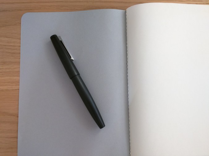
I made an A5 book, simply because I bought A4 paper and this meant the least amount of work in terms of folding and cutting.  A5 also happens to be my format of choice, so it wasn’t such a hard decision.  I also settled on a single signature exercise book, rather than a more complicated journal-type notebook.  I’ve been experimenting with this type of book as inserts for my Start Bay Navigator.

I can never figure out how notebook makers count their pages. What I do know is that I used 24 sheets of A4, folded down, giving a total of 96 pages of A5 in the finished book.

Finish

IMG_20160829_072430

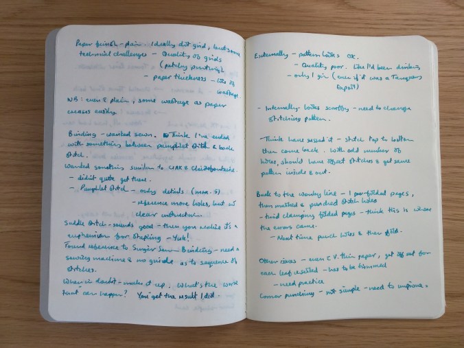
The book contains plain paper, more out of necessity than choice.  I tend to prefer dot grids, but the printable dot grids I’ve found on the web so far have been downright patchy in terms of the density of the dots.  I’ve put together my own, but since Tomoe River paper doesn’t fare very well in your average printer this is somewhat moot.  The seller that I got this paper from has now started selling 68gsm Tomoe River and I intend to see whether this will work any better in a printer.

Cover and Binding

In keeping with the exercise book theme, I went for a simple grey card cover (hence the title of the post and a bit of musical nostalgia – a 1986 album by the The Dream Syndicate).

I wanted a sewn binding, similar to the CIAK Appuntino I reviewed recently. From what I can find out, this is known as a Singer Sewn Binding (Made on a Singer sewing machine?), but I didn’t manage to find a handy diagram of the stitching pattern.  Instead, I ended up more or less using backstitch.  This gave the right appearance on the outside, but looks a bit messy on the inside.

IMG_20160829_072430


IMG_20160829_072512

After consultation with an embroidery and patchwork expert (my mum), I think the answer is to use a simple running stitch down the spine and then back up again.  With an odd number of holes, this should give the same pattern inside and out, offset by one hole.

IMG_20160829_072606

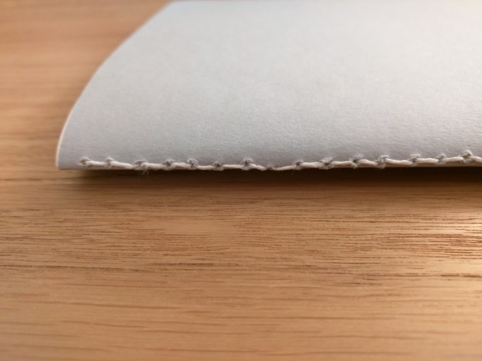
As you can see from the photos, the binding could have been straighter.  I was drinking a gin and tonic as I made the notebook (Tanqueray Export if you must know), but that wasn’t the cause (honest!).  I folded and clamped the pages before I marked out and punched the holes, so when I came to stitch the block of paper things weren’t as well aligned as I might have hoped.  Next time out I’ll clamp the block and punch the binding holes before I fold the paper and cover.

Finishing

One of the consequences of stacking this many sheets of paper is that those in the middle of the book stick out further than those nearest the cover.  To get a neat looking notebook, this means having to trim the edges.  I used a steel rule and a craft knife and to be frank it got a little messy.  Definitely something I need to practice at.

I used a 10mm corner punch to round the corners, and again I need a bit more practice to make these as neat as possible.

In use?

Overall, I’m quite pleased with the outcome.  Sure, there are things that I need to improve and a few things that I will do differently next time, but from nothing to a finished book in a couple of hours didn’t seem too shabby.

IMG_20160829_072527

In use, the paper performs as you might expect.  Tolerant of lots of pens and inks.  Drying times are long and you get show-through, but that’s something I’m happy to live with.  The sample of writing I’ve shown was written with a medium-nibbed Sheaffer Legacy (not the Lamy 2000 in the photos), inked with Pilot Iroshizuku ku-jaku – a combination that puts down a pretty wet line.  Even so, it was pretty well behaved, coping with my handwriting and showing off the shading you get with this ink.

What next?

I’ll certainly try this again, looking to improve in the areas I’ve highlighted.  I also plan to try a multi-signature book at some point.  As well as a more complicated binding, this will mean a more elaborate cover, end papers (I have some gorgeous Chiyogami paper that I’m itching to use) etc.  It should be fun!  After all, what’s the worst that can happen?

Frankenpen – A Platinum-Kaweco hybrid

(Disclaimer: The title of this post may be more dramatic than the content, but I couldn’t resist using it.)

IMG_20160816_090157-2

Platinum Preppy – medium nib in blue

Platinum’s Preppy is a very popular pen.  What’s not to like?  For around £3 in the UK ($3-4 in the US) you get a simple, straightforward cartridge pen with a really decent quality steel nib.  Okay, it probably won’t last long enough to become a family heirloom, but it’s robust enough to be a good first fountain pen that writes well and puts more expensive pens to shame.  You get a choice of nibs from medium to extra fine.  Unlike its low-cost rival, the Pilot V series, you also get a pen that you can re-use.  Straight up, you can use Platinum’s own cartridges that come in a range of colours.  Spend a little money on an adaptor and you can use any short international cartridge, opening up the choice of inks to include the likes of Diamine and J Herbin.  (Both provide a good range of colours in cartridges, but their bottled ink ranges are bigger.)

IMG_20160816_090354-2

Nib, section and international adaptor

Cartridges aren’t the most economical way to buy ink and some inks are only available in bottles.  The solution is obvious, buy a converter!  Platinum handily make a couple of converters, but read the small print and you find they work with ‘most’ Platinum pens.  Unfortunately ‘most’ doesn’t include the Preppy, or its more up-market stablemate the Plaisir (which uses the same section and nib assembly).

That’s OK though, because I bought an international adaptor.  I’ll just plug in an international converter and I’ll be good to go, right?  Not really.  The space taken up by the adaptor, plus the relatively short barrel mean that most converters simply won’t fit.

Step forward Kaweco’s Mini Piston Converter.  This pint-sized converter was developed for use in Kaweco Sport pens.  Handily it also fits the remaining space in the barrel of the Preppy.

IMG_20160816_090650-2

Nib, section, adaptor and converter

It’s not the biggest converter in the world, but it does mean you can use bottled inks in the Preppy.  Admittedly, by the time you’ve added in the adaptor and converter you’ve trebled your initial costs.  That brings you up to around £9 (US$12) – which is still cheaper than a Lamy Safari (which needs its own converter if you want to use bottled ink).  If you’re prepared to spend a bit more money  (around £16/$20 all in) you could go through the same exercise with the higher spec and more robust Platinum Plaisir.  I prefer the Platinum nib to the equivalent Lamy, which I find too dry.  When I can get my hands on an orange Plaisir (yum), I plan to repeat the exercise.  The only other thing I would change is to go for fine nib instead of the medium I chose here.

What’s the worst that can happen?


Notebook Review – CIAK Appuntino

As with many of my purchases, I came across these notebooks by accident.  CIAK is not a brand I was familiar with and after a bit more digging there seems to be a vanishingly small amount of information out there on the Appuntino range (even on the company’s own website).  I bought medium and large sized notebooks. This is a review of the medium.

The books come in packs of two and a pair of the medium notebooks will set you back £8.95 (around US$12) from The Journal Shop.  I chose Lime and Green for my pair and the colour combination is very pleasant indeed.

Vital Statistics

CIAK’s definition of medium is 12cm x 17cm, making the books around 3cm bigger than a Field Notes book in both directions.  This could restrict their use as genuine pocket notebooks, but mine fit quite nicely in the same pocket of my work bag as my Hobonichi.

IMG_20160725_123622

Textured cover, dot grid paper

What drew me to the books is that they contain dot grid paper (I’m a big fan) – 64 pages in all.  I couldn’t find any particular information about the paper in in terms of weight etc., although in my estimate it is lower than 80gsm.  If anyone can tell me more about the paper, I’d be happy to hear it and update this post accordingly.

In action

Before I go into more detail on the paper, the covers are worth a comment.  The textured outer is soft, with a slightly battered feel to it – far more tactile than a simple card covering.  It is laminated to a card inner in a complimentary colour.  Rather than being stapled, the books are stitched in contrasting thread which is visible along the spine.

IMG_20160725_123602

Because of the way the books are bound, they don’t lie flat when opened but are much more compliant once they’ve been broken in.  Something further on that binding: I’ve just passed half way in one book and noticed as I type this that one of the knots tying the binding thread has pulled apart.  I don’t know if this is a one-off or a common problem, but may be a factor if you are particularly hard on your notebooks.

Now to the important bit, how does the paper perform?  In terms of look and feel, it works for me.  The paper is a cream/ivory colour, printed with a 5mm dot grid pattern and with rounded corners.  The paper is a little softer than Rhodia dot grid paper and much softer than Field Notes paper.

IMG_20160725_123706

Dot grid paper (look hard and you’ll see the pulled thread at the top)

I’ve mainly used fountain pens in these books and I think it’s fair to say that the results haven’t been brilliant.  I’ve tried a variety of pen and ink combinations, but the overall trend was towards feathering and show through.

I’ve been considering trialing bullet journaling, and thought I’d use the Appuntino to jot down some notes to  help me visualise  how bullet journaling might work for me.  As you can see in the photograph Noodler’s Squeteague and Bad Belted Kingfisher, along with Pelikan Topaz didn’t fare too well. The pens I used with these inks (MontBlanc, Conklin and Baoer) tend to put down quite a wet line and that certainly didn’t help to limit feathering.

IMG_20160725_123722

Trying to make sense of bullet journaling – simple!


IMG_20160725_123759

IMG_20160725_123743

Considering I find the nib to be on the fine side of medium, my Noodler’s Ahab pen also produced a fair amount of feathering with Diamine Damson ink.  The least amount of problem came from a Copic Multiliner!  You can see from the next photograph just how much show-through there is.

IMG_20160725_123815

Show-through on the Appuntino

I did some comparison tests with a Field Notes Pitch Black book and got (I think) fairly similar results in terms of feathering.  There was less show-through, but I put this down to Field Notes paper being thicker.


IMG_20160726_141233

Field Notes Pitch Black for comparison

IMG_20160726_141251

Tricky Ahab

In conclusion

After all that, you might think I’d be steering readers away from these notebooks.  Sorry to disappoint, but I’m not going to.  I really like these notebooks, despite their flaws.  It’s hard to express in words, but there is something about these little books that makes me want to take them out and use them.  It’s a tactile thing and that trumps the shortcomings, or as I choose to view them – idiosyncrasies.


Too many pens?

IMG_20160721_091242-2

Ever wondered if there is a ‘right’ number of pens to own ?  Is it all down to personal taste, or are there some mathematical rules that determine the correct number?

If your enthusiasm for pens, and fountain pens in particular, is anything like mine your relationship with them is simple. Right?  Something like –

See pen;

Like pen;

BUY PEN*

(* – unless it’s really expensive and then you might have to do some saving up first)

Turns out that it might not be so simple and there might be such a thing as ‘too many pens’.

Now for some maths…

The principle is quite easy really: the correct number of pens you should own (x) is one more than the number you currently own (n)

In other words:

x = n + 1

For reasons that should be obvious, the smallest number of fountain pens you should own is 3.  If you don’t currently own 3 or more fountain pens, I suggest you take a break from reading this and do some shopping until you do…

…Welcome back!

n ≥ 3

So far, so straightforward.  However, it turns out that there is a maximum number of fountain pens that you should not exceed (y).

Mathematically speaking:

y = s – 1

Now things start to get tricky when the value of x tends to y.  This is potentially dangerous because s is defined as the number of fountain pens that would result in separation from your spouse or partner (or something equally calamitous).  Only you can know the value of s for your particular circumstances, but clearly exceeding s-1 is something to avoid at all costs.

Don’t say I didn’t warn you!

Footnotes/credits

  1. Much as I’d like to claim this idea as being all mine, inspiration for this post came from Rule #12 of the Velominati.  If you have an interest in the sport of cycling, you will most likely already be familiar with the  Velominati.  If not, among the many excellent things they do in the world of cycling, the Velominati serve as custodians and arbiters of the Rules.

    Some Rules could apply to the world of pens, but I think it’s fair to say that many of them do not.  After all, do you need guidance on the length and colour of your socks (Rules #27 and #28) or what kind of coffee you should drink (Rule #56)?  (If you do, are you reading the right blog?)

    Rule #12 describes the mathematics of bike ownership and I thought it applied just as well to fountain pen ownership, without much need for translation.  The one thing I take as encouragement is that pens are a lot smaller and less obvious than bikes…

  2. I don’t know what my value of s is, but I hope I’m still some way off.  When I thought about the photo at the top of this post, I calculated the number of pens I would need to spell ‘PENS’ as being 21.  Fine I thought, I’ll start with fountain pens and make up the numbers with whatever else is at hand.

    Scarily, as you can see in the photo, only one pen isn’t a fountain pen.  Eek!

  3. If you’re curious, the pens in the photo are as follows: Baoer 79, Conklin All American, Conklin Duragraph, Eversharp Skyline, Kaweco Sport, Kaweco Liliput (x2), Lamy 2000, Lamy Safari (x4), Mentmore Supreme, MontBlanc 24, Noodler’s Ahab, Parker 51, Pilot Kakuno, Platinum Preppy, Schneider iD, TWSBI Vac700.  The joker in the pack is an OHTO Fineliner.


Fountain pen review – Conklin Duragraph

I received this pen as a Christmas present and I’ll admit it, we got off to an awkward start.  However,  with perseverance we’ve since become the best of friends.

I’ll also admit that Conklin was not a brand of pen that I had heard of until I stumbled across the Duragraph on the Cult Pens website. A quick bit of research (i.e. Google) revealed that the name goes back to the late 19th/early 20th century and was a successful and innovative pen company.  However, by the 1930s it had begun to decline and by the late 1940s/early 1950s had ceased to exist.  The name was revived in 2000 and a range of pens issued, intended to reflect the heritage of the original brand.  The original Duragraph was issued in 1924, smack bang in the middle of the Art Deco movement.  The re-issued  Duragraph certainly echoes those times in terms of styling.

On to the pen itself…

IMG_20160701_121736-2

Although I received it as a present, the Duragraph will set you back around £45 in the UK and around the same price in $ in the USA.  The Duragraph comes housed in a substantial, dark blue box, which sits inside a cardboard sleeve.  Other reviews have noted the similarity of the box to a coffin.  Luckily mine didn’t have a satin lining that some seem to, so the resemblance stopped at the outside.  The pen comes supplied with 2 short international cartridges and a converter.  I went straight for the converter and inked the Duragraph with Diamine’s 150th anniversary Silver Fox (more on that later).

IMG_20160701_122336-2

IMG_20160701_122218-2

The box is large and (sort of) coffin-like

IMG_20160701_121942-2

Based on Goulet Pens’ Nib Nook (this is such a brilliant resource for getting a feel for what a particular pen/nib will give you), I went for a medium nib.  The nib itself is a two-tone affair, mainly steel with a gold-coloured oval bearing the Conklin name.  The breather hole is a fetching crescent shape.  Overall, the nib is striking without being too ostentatious.

IMG_20160701_122116-2

The two-tone nib

Capped the pen is 140mm long, 125mm uncapped and 175mm posted.  It is 13mm wide and weighs 24g.  I went for the ‘cracked ice’ finish, which goes well with the black end caps, chromed bands and chromed clip.  The end of the cap bears the Conklin name in white and the wider chrome band around the cap is also engraved ‘Conklin’ and ‘Duragraph’.  The name Duragraph is bracketed by an engraved crescent design.

IMG_20160701_121707-2

Overall, I like the design of the pen and think the finish is a nice balance of boldness and subtlety.  Rather then reminding me of anything to do with ice, the finish conjures up terrazzo – a polished, concrete-like material engineered to look like marble.  It may seem weird, but for me that helps with the Art Deco connection as terrazzo was used for flooring in a lot of buildings in the 1920s and 30s.

IMG_20160701_121559-2

If I had sat down to write this review the first time I used this pen, then I would not be recommending it.  Inked with Diamine’s Silver Fox, it was not a pleasure to write with.  The nib scratched and squeaked its way across the paper and struggled to lay down a decent line.  I had read other reviews that suggested quality control was far from brilliant and it was pot luck whether you got a good nib or otherwise.  My initial thoughts were that I had a dud and that this was a pen that was destined for the back of my desk drawer (a kind of naughty step for pens).

Luckily I persevered and switch inks to J Herbin’s Perle Noire.  With this juicy, rich black ink on board, the Duragraph was transformed from a sulky scribbler into a well-behaved writer, delivering a decent and consistent line on the paper.  I have since inked it with Pilot’s Iroshizuku ‘shin kai’ and it performs equally well with this quality ink.

IMG_20160701_133727-3

Not even this pen can help my spidery handwriting!

This is quite a large pen but, being predominantly made of resin, it’s not outrageously heavy.  It sits well in the hand (well mine anyway) without the need to post the cap.  This is just as well, because I didn’t like the way the cap posted.  It was a snug fit on the end cap, too snug as it left a gap.  As a result it didn’t actually feel that secure.  Adding the cap also shifted the weight too far back on the pen for my liking and comfort.

Putting this small niggle aside, I have to say I have been impressed with the Duragraph.  £45 isn’t dirt cheap for a fountain pen, but I think you get a lot of pen for your money, both in terms of real estate and performance.  I’m glad I chose it and it still gets regular use.

I am definitely not unnerved by this pen.

As an aside, I have since tried the Diamine Silver Fox in two other pens – a Lamy Safari and a Sheaffer Legacy.  Both of them struggled, even the Sheaffer, which normally lays down a very wet line.  As a result, I’ve sent this ink to the naughty step instead of the Conklin…


What’s in the bag?

I thought I’d kick things off with a look at what accompanies me to work…

P1040108

Pens

My  ‘workhorse’ pens are a TWSBI Vac 700 and a Conklin Duragraph in Cracked Ice finish.  The Vac 700 has so far only been inked with Pilot Iroshizuku kon-peki, but it needs refilling so I’ve cleaned it and will see how it fares with a different ink.  The Duragraph has lived mainly on a diet of J. Herbin Perle Noir, but I’ve recently been trialing another Iroshizuku ink: ku-jaku.

Until recently I hadn’t contemplated the world of vintage pens, but an impulse buy from eBay left me the owner of a slightly dog-eared MontBlanc No. 24.  It’s a piston filler that I  think dates from the 1960s, but I know next to nothing about MontBlancs (never thought I could afford one).  So far I’ve been impressed.

The next pen is both vintage and brand new. Sounds odd, but it’s a 1940’s Eversharp Skyline that never made it out the shop that stocked it.  These pens seem well regarded and the nib supposedly has a bit of flex to it.  I haven’t used it much so far and will write up something more detailed in the near future.

Next up is my collection of Kaweco pens – 2 Liliputs and a Skyline Classic Sport.  The Liliputs are solid brass and copper and I’ve had them a while as you can tell from the patina.  I love these pens, the all metal construction gives these tiny pens some weight.  The Skyline is relatively new and I’m still trying to work it into my pen rotation.

Notebooks

My main journal/notebook is a Hobonichi Techo diary/planner.  I came across this gem a couple of years ago and have been hooked ever since.  At present I don’t use mine for much beyond a work diary and planner, but can’t see myself going back to a standard issue diary.  Its major selling point is the Tomoe River paper it’s made from – ultra thin and beautiful to write on.  Even with a leather cover, at a day to a page it’s still less than 2cm thick.

The two green notebooks are CIAK Appuntinos.  I’ve been experimenting with small to medium format notebooks and this pair caught my eye on the Journal Shop website.  Apart from the textured cover, it was the dot grid paper that took my interest.  I’ll write some more detailed thoughts about these books shortly.

Like many people, I was introduced to Midori through their Traveler’s notebooks.  They also produce a range of other notebooks, all on high quality, fountain pen-friendly paper.  I’m attempting to keep a journal and using this A5 MD Notebook to jot down my thoughts.  I went for grid paper rather than ruled.

Pencils

I’ll confess, I hardly use a pencil these days but I still carry a couple on the off chance I’ll need them.  I bought a Pentel Graphlet for this purpose and then acquired a Uni Kuru Toga M5 from Cult Pens as freebie on top of an order I placed.

Pencil case

My pens and pencils get transported in a Nomadic PN-01 pencil case. For a comparatively simple and straightforward design you can fit a lot in.  I’m still looking for the ideal pencil/pen case, but this does the job for now.