Branching out – of sorts

Anyone who follows me on Instagram (@slightly_unnerved) will know that I have a bit of a thing for the Sailor Pro Gear. In 2020, the number of Pro Gears I own went from a modest three to a more showy eight. These were all limited/special editions of one sort or another. More (or less) interestingly, four out of these five came with medium nibs.

Spot the pattern – (L-R) Pro Gear Earth (Broad), Apres Ski (Medium), Blue Lagoon (Medium), Tequila Sunrise (Medium), Angel’s Delight (Medium), Kure Azur (Medium), Bungubox Omotesando Blue (Fine Medium), Bungubox Sanctuary Blue (Medium)

This didn’t bother me in the slightest as I happen to really like Sailor’s 21K medium nib. It’s a package that just works for me. Hand-finished, in practice, each of the Sailor medium nibs I own is sufficiently different (line width, flow, feedback) that they don’t all blur into one. Combine this with the range of colours I have and it never feels like I don’t have choice.

Besides the pens that I bought, one other Pro Gear I had made up my mind to buy was the Ocean. It too was a limited edition, but limited in the thousands and widely available at regular Sailor prices.

Familiarity did a good job of breeding contempt and I was quite happy to sit and ponder this particular purchase. Unfortunately, I waited too long and by the time I was ready to make the purchase, no-one in the UK had any left. It was sold out with no prospect of a re-stock.

Aaaarrrrgggghhhhh!

As I veered between reconciliation with the situation and the (not entirely rational) notion of ordering one from the US, Anthony from UK Fountain Pens put one up for sale. On the face of it, this solved my problem – the model I wanted, from a UK seller and with the bonus of not having to pay the premium of a brand new pen. I’ve never met Anthony, but if you’ve ever read his blog (and you should) it’s clear that he cherishes and cares for his pens. As such I had no concerns about the condition of the pen I would be buying.

Exhibit A – Sailor Pro Gear Ocean

There was one quite big issue that I needed to address. This pen would come with an extra-fine nib! Japanese fountain pen nibs generally run thinner than their European counterparts. Given that I’d be reluctant to buy a European pen with an extra-fine nib, the prospect of a Japanese extra-fine was quite daunting (well for me anyway).

That extra-fine nib. The extra bonus was a dual-tone nib. I was expecting all rhodium…

Here was my dilemma. If I passed on this, when would I get a chance to buy another Pro Gear Ocean at a sensible price? If I bought it, what if it was effectively useless? In practice, the decision didn’t take long to arrive at. Funds were duly dispatched and a few days later the pen arrived.

Does size matter? L: extra-fine, R: medium
Getting it down on paper

Was it the right decision? Definitely. Inked up with Sailor Yonaga, it writes brilliantly. The flow is good and the nib is not at all scratchy. It has a little of the pencil-like feedback that Sailor nibs are renowned for, but that’s it. All in all a fantastic pen.

Much of this pen was a known quantity, but sometimes it’s good to push your boundaries a bit and try something that differs from the norm.

Next stop a music nib?

Pebble Stationery Co. A5 Chiyogami Notebook review

If you have more than a passing interest in fountain pens, chances are that you will have at least heard of Tomoe River paper.  You may have tried it.  You may love it or you may wonder what all the fuss is about.  I’m firmly in the “love it” camp and have been on a bit of a Tomoe River kick in the past few months.

One of my last notebook reviews was of the Endless Recorder – a hardback A5 notebook based on 68gsm Tomoe River (TR) paper.  In that review, I wished that the growth in people making Tomoe RIver notebooks would extend from 68gsm, where all the action seemed to be, down to the thinner 52gsm version (which I much prefer).

My theory is that the 52gsm TR is so prone to creasing and damage from handling that notebook makers have shied away from it.  Recent experience suggests that might be changing.  It would be nice to think that someone saw my plea and took pity on me, but in all likelihood, it’s just coincidence.  Either way, over the past few months, the opportunity has come my way to acquire some hardback A5 notebooks based on 52gsm TR paper.

Chronologically, the first of these to come my way came with a chunk of air miles and something of a guilt trip about the accompanying carbon footprint.

The books in question came from Pebble Stationery.  I first came across this company when I bought one of their 52gsm TR pocket notebooks from Nero’s Notes.  Since then, Pebble have extended their regular range to include a soft cover A5 book, which is quite widely available.  What caught my eye was a post in Pebble’s Instagram feed of some A5 hardback books, covered with decorative Chiyogami paper (another favourite of mine).

Pebble Stationery Chiyogami Notebook cover details

Can you judge a book by its cover?

Missing out first time round taught me that these handmade books come up as small batches and don’t hang around for long when they do.  I presume this is why they don’t appear for sale through their regular distributors.  As a result, I ended up ordering direct from Pebble which, of course, meant ordering from Australia.

If you’ve ever bought a notebook containing TR paper, you’ll know they’re not the cheapest.  Assessing the value for money of these books is not easy, but to me they’re worth the expense.  The Pebble Chiyogami books weigh in at AUS$28 (about £14 at current exchange rates) for 200 pages in A5 size.  The downside is their location – I had  two of them shipped from Australia and the shipping cost almost as much as a single notebook!

In terms of structure and features, the Pebble Chiyogami books are pretty straightforward and minimalist, but I don’t mean that in any negative sense.  The paper is sewn in small signatures and traditionally bound.  From my experience (n=2), the end papers are chosen to compliment the cover papers – white for the geometric pattern on one and black for the dragonfly design on the other.  Page corners are left square. In terms of extras, you get a ribbon page marker, but no back cover pocket or index pages.

Detail of the notebook binding

Simple, beautiful binding

Chiyogami notebook detail

Square corners are the order of the day

The books are bound by hand, and the website description warns of possible imperfections and creases.  The books I bought were both executed to a very high standard, with no noticeable flaws.  I’ve finished one of them and didn’t find a dud page anywhere.  The binding is very tight, which means that some gentle persuasion was needed at first to get the book to open flat.  After that, I had no issue whatsoever and the book held together without any signs of structural issues.  The Chiyogami paper that I’ve handled has never felt like it was robust enough to survive for long as the cover on a notebook, and I think the covers of the Pebble notebooks are coated with something to make them more durable.  It changes the feel slightly, but is no bother and worth it in terms of making the covers more durable.

What’s inside?

You can have any page layout option you want, as long as what you want is blank.  This is not uncommon with handmade TR notebooks and not something I’d penalise Pebble for. I’m learning to embrace the blank page and use a guide sheet to stop my crappy lefty handwriting nosediving as I work across the page.  With hindsight, it might have been nice to have a guide sheet included with the book, but I just used one from another book so it’s hardly a major issue.

Getting down to use, I could say there’s nothing much to report.  The properties of 52gsm TR paper are described extensively and it is my absolute favourite paper to write on.  It’s unfeasibly thin, but will take pretty much any ink from any nib in any fountain pen with no feathering or bleed through.  If you want to show off shading and sheen in your inks, then this is the paper to do it with.  Both my Pebble books came with off-white/cream paper, but that’s fine as I prefer it to pure white.  The base colour of the paper does affect how some inks look (compared to pure white paper), but you can have great fun figuring out which inks work best!

Showing off ink sheen on Tomoe River paper

There might be a hint of sheen here!

Heretics Detractors will point out the ghosting (show through) and long dry times.  The first is simply a function of the thinness of the paper, and you’ll have to decide whether you can live with that or not.  I have 2 words for the second – BLOTTING PAPER!  In practice, I find I only need to use blotting paper when I’m about to turn a page, so it’s more backup than absolute necessity.

Summary

I know I’m biased, but these Pebble Chiyogami notebooks are beautiful to look at and skilfully made (by hand) to show off some wonderful Japanese papers.  If none of these elements are your thing, you’ll probably find richer pickings elsewhere.  If you like 52gsm Tomoe River paper, these books are a great platform to showcase its properties.  Sure they’re not cheap, but I think the pricing is reasonable and if you want to know what an expensive TR paper notebook looks like, check out Musubi!

One thing I did like about the Pebble notebooks was the page count.  Pebble have avoided the tendency of some 52gsm TR books to counter the thinness of the paper by having a huge page count.  200 pages makes for a manageably slim book that’s easy to write in and transport.

I think high page counts can create practical and psychological problems.  Physically, a notebook that is too thick can be uncomfortable to write in, especially as you get towards the bottom of the page.  Everyone’s tolerances are different, but something resembling a telephone directory will be a challenge.  Psychologically, a book with a high page count can seem a bit daunting to start and can become a marathon chore to complete.

My journaling has become a bit sporadic of late and I found the Pebble notebook to be just about right in this respect – easy to handle, long-lasting enough to justify its price tag but not so long that I came to resent using it.

Do I recommend these books – yes, absolutely!

Will I buy more of these?  Honestly, I’m not sure.  I have loved owning and using these books, but the relative cost associated with having to ship them half way round the world is a bit of an issue for me.  If these books were available through a local distributor such as Nero’s, I’d have no qualms in buying them regularly.  This point comes into starker relief following my discovery of Flyght of Fantasy Studio notebooks at the Bristol pen show earlier this year.  Based in Scotland, they hand make notebooks using 52 and 68gsm TR paper and cover the books in some amazing Japanese and Japanese-inspired fabrics.  OK, these have a higher page count (and proportionately higher price tag) than the Pebble notebooks but, in other respects, I’ve may well have found a way to feed my addiction to eye-catching TR paper notebooks from more local sources.


Notebook Review – Endless Recorder

Front cover shot Endless Recorder

The front end(less)

At first second glance, the Endless Recorder looks like many other A5 hardcover notebooks, with faux leather covers in a range of relatively muted colours.  (The first glance highlights a cream coloured drawstring bag that holds the book.)  What (hopefully) sets the Recorder apart from the also-rans is that they’re put together around Tomoe River paper.  This paper has something between cult and legendary status in the fountain pen world but, even with some recent entrants to the market, there are still relatively few makes of Tomoe River-based notebooks out there (check out GLP Creations and Taroko Designs for some alternative offerings).

Endless notebook storage bag

Are notebook bags your bag?

It’s hard these days to be truly innovative when it comes to design and construction of notebooks, and the Recorder follows a pretty well tried and tested design.  The faux leather hard cover I mentioned earlier comes embossed with the company logo on the front and “ENDLESS” on the back.  It’s all done quite subtly and without ostentation.  This leads quite nicely to the end papers, which feature an open dot layout with a blank space to fill in with the details of your choice,  There is also a repeat of the Endless logo, which adds a touch of class.

Endless Notebook rear cover

The back end(less)

Endless Recorder end papers

Subtle, stylish end papers

Perhaps it won’t set the world alight, but it makes the Recorder smart and subtle enough for use in a work setting, but the design accents are well executed and should satisfy the stationery aficionado.

The business end of the book is made up of small, thread-bound signatures, which help the book to open flat without the need to resort to coercion or physical violence.  Page corners are rounded (as are the corners of the cover).  There is a pocket inside the back cover.  It seems to be de rigeur for this type of notebook, but I can’t recall the last time I actually used one in a notebook.  The pocket is worth exploring when you get your Recorder, because there’s a small goody in there (I won’t give the game away) along with some promotional material.

Details of the binding

In case you lose your thread

There is no index and pages aren’t numbered, but I don’t find it that much of a chore to make my own index and number pages as I go.

Tomoe River 68gsm paper

Round corners, no page numbers

The ribbon and elastic closure come in a pleasantly contrasting turquoise colour.  I bought two Recorders, one in dark blue and one in red, and the ribbon and elastic are the same colour in both books.

The paper itself

There’s not much more to say about Tomoe River paper that hasn’t already been said.  In the case of the Endless Recorder, you get the thicker 68gsm paper, rather than the 52gsm you’ll find in things like the Hobonichi Techo or Seven Seas notebooks.  It takes pretty much any ink you care to throw at it from any width of nib, without feathering or bleed-through.  The coating means that dry times are not particularly quick, and I tend to have a piece of blotting paper to hand when I’m writing my journal.  It will also come as no surprise that there is some show-through, but this is just something you have to embrace if you’re going to write on Tomoe River paper.  It’s certainly less noticeable with the 68gsm than with the 52gsm paper.

Currently inked on Tomoe River paper

I’ll take any ink you can throw at me…

The paper in the Recorder is off-white.  I bought mine from Pen Venture in Romania, which gave me the choice of either blank or with a dot grid layout.  I bought dot gridded ones.  I used to think that dot grids were the best layout since whatever the last best layout was.  Over time, I’m less convinced of this, particularly when I’m using it for journaling.  I can see the merits in some applications, but I’m starting to come back to ruled or even blank for journaling. If you buy the blank notebook, you get a guide sheet included.  If I buy any more Recorders I might well try the blank version.


If you buy direct from Endless Works you get a choice of 4 layouts – blank, ruled, grid and dot.

I paid around €24 for each book from Pen Venture, rather than the £18 that Endless Works charge if you buy direct.  My reasoning was that buying from mainland Europe would be cheaper and less hassle than buying from the US.  It may have been less hassle, but my only option was some DHL priority service which added substantially to my bill.  Maybe I’ll buy direct from the US next time.

Practicalities of ownership

I’ve finished one of the two books I bought and didn’t experience any major issues.  I found that there was a little bit of lift on one corner of the cover material cover where it’s gathered and folded over.  My Endless Recorder didn’t travel further than between my desk and the living room sofa, but if you were to take it further afield maybe this points to it being a bit less durable than desired.  The ribbon page marker has also ended up looking a little fluffy and ragged.  This doesn’t bother me too much, but if you like a book that remains pristine looking through thick and thin, you might want to think more carefully.

Beyond that I had no issues with the Endless Recorder.  The book opened flat and the binding has never shown any indication of falling apart.  I mentioned the absence of page numbers or an index.  In practice, most notebooks I’ve ever bought haven’t had page numbers or an index and I haven’t felt like there has been a hole in my life as a consequence.

The Tomoe River paper does its job as you might expect.  I experienced no problems beyond the show-through, which I was expecting.

It’s not a criticism of Endless, but I wish someone would take this approach to notebooks, but with the 52gsm Tomoe River instead.  Whether it’s a cost thing or the sheer hassle of dealing with a paper that creases when you look at it, I don’t know, but I can’t believe there wouldn’t be a demand for it.

I’d certainly buy some.

Update

Since I published this post, Endless Works got in touch to let me know that they’ve recently updated the Recorder so that it now has an index and numbered pages.  There is also a block of perforated pages that allow you to remove them easily, if needed.  I’m happy to set the record straight. 😀

Ink review – Krishna ink round up

Overview

Krishna inks are made in a place called Palakkad in Kerala, India and are the brainchild of a Dr Sreekumar.  Their trademark features are some interesting names and some vivid colours.  There is a reasonably large (and growing) line-up and they are becoming more widely available outside India.

Presentation-wise they come in 20ml glass bottles, which are perfectly functional but which won’t win any design awards.  Packaging is similarly, how shall I put this, simple.

Simple packaging

Prize-winning packaging? Not really

Given that many of the ones I’ve tried are a little (ahem) flamboyant and may not always be suitable for everyday use, the relatively small size makes them quite an attractive proposition.  It also makes it easy to justify buying multiple inks, which is how I’ve ended up with 7 of them so far.

Jungle Volcano, Anokhi and Sumukhi

Rumble in the jungle

Silent Night Sky, Moonview, Snake Boat, Pencil

Bad Moon Rising

My overriding impression of Krishna inks so far is that they flow well and major on sheen.  The latter feature is subject to some confirmation bias in that I mainly chose inks that looked like they would sheen.  If you do like some sheen with your inks, you’ll find plenty to interest you in this range.

I’ve tried these inks over a number of weeks and in a variety of pens, but I’m just going to give a brief summary of each one.  I may get round to writing up more detailed reviews at some point, but given how long it’s taken me to pull this together, hopefully there’s enough here to whet appetites.

Moonview

Krishna Moonview

Krishna Moonview

I’ll kick things off with Moonview as it’s perhaps the easiest one to relate to other inks.  It is a rich blue ink with a strong red/pink sheen.  When I say strong sheen, what I mean is that Moonview is another sheen monster in the same vein as Diamine Skull and Roses or Organics Studio Nitrogen Royal Blue.  It flows well and I’d say it’s better behaved than OS Nitrogen Royal Blue, but you might not feel the need to add it to your collection if you already have a number of inks of this nature.

Anokhi

Krishna Anokhi

I’m not normally a big fan of purple inks, but I’ve quite enjoyed dabbling with this one.  On top of the purple base colour, there’s a hefty dose of green sheen to accompany it.

Snake Boat

Krishna Snake Boat

Aside from the fantastic name, which raises all sorts of questions about its meaning, Snake Boat has a sort of muddy purple as a base colour, but with a green sheen.  Again, there’s a really strong component of sheen, but the resultant combination is intriguing.   Of the two, I’d probably choose this one over Anokhi because it’s not such an obvious purple and the overall result appeals to me much more.

Sumukhi

Krishna Sumukhi

Sumukhi is a bright pink ink with some green sheen to further spice it up.  I’ll come clean – I have no idea why I picked this ink.  It’s definitely not a colour I would ever consider using for normal writing purposes.  I have used it in ink doodles, though, and it’s proved to be quite good fun for that.

Pencil

Krishna Pencil

This is a seemingly random name for an ink, and based on the swatch it seems a bit of a misnomer.  You can see the logic when the ink is wet as there is a grey look to it, but when dry the colour is more of a washed-out purple.  I was drawn to this ink as it reminded me of Robert Oster Summer Storm, an ink that I love the colour of.  My problem with Summer Storm is that I find it dry, verging on arid, and difficult to get on with.  Pencil, on the other hand, has worked well with both fine and broad nibs, giving quite varied properties.

Silent Night Sky

Silent Night Sky is perhaps the most mundane of the Krishna inks that I’ve tried.  So much so that I forgot to photograph it.  To help conjure up a mental image, it’s quite a rich purple, but it’s also quite ‘safe’ compared to some of its stable-mates with only a little sheen.  (That helped, didn’t it?). To be frank I haven’t felt anything resembling a strong urge to do much with this ink.

Jungle Volcano

Krishna Jungle Volcano

Perhaps saving the best until last, Jungle Volcano is ink making at its brilliantly bonkers best.  I seem to recall it got its name as a result of a competition on Instagram, but it’s a name that suits.  It has attracted quite a lot of attention and I have yet to read a review by anyone who didn’t like it.  I love orange inks, but often find them a bit too ‘thin’ in practice.  It may explain why I like darker, more complex inks like Monteverde Fireopal and Diamine Ancient Copper.  Jungle Volcano is a similarly complex orange ink, further enhanced by some crazy green sheen.  Using it is proper fun and brings a smile to your face. I can’t imagine a situation where it would be suitable for work purposes, but it’s an ink you may well find yourself looking for excuses to use.

All fun and games?

Well it is until someone loses an eye (see the book of the same name by Christopher Brookmyre for that one).  While my overriding experience of using Krishna inks has been a positive one, it hasn’t entirely been plain sailing.  It was probably too much to expect that such richly coloured and highly-sheening inks would be trouble-free and I have had a couple of issues.  I inked a TWSBI Eco with Sumukhi and it was fine in use, but when I came to clean the pen I found the feed to be quite gunked up and some staining in the barrel.  They good news is that the staining isn’t permanent, the bad news is that it took about 4 days of soaking and flushing with water to shift this.  I inked another Eco with Snake Boat, and although it has been fascinating to look at the ink while it has sloshed about in the pen, I fully anticipate another pain in the proverbial to clean this out when the time comes.


Jungle Volcano was also a little problematic.  I didn’t have any noticeable staining issues, but there was some nib creep (not uncommon with orange inks) and a bit of gunking up of the feed.  Again it took a bit of soaking to shift this.

In the interests of balance, I’ve also cleaned Moonview and Anokhi out of other pens, and these were pretty well behaved and straightforward by comparison.

Availability and pricing

Krishna inks are reasonably widely available.  In the UK, Izods seems to be the only supplier.  Unfortunately, I found their website so frustrating to use that I went a bit further afield, namely Belgium (Sakura Fountain Pen Gallery and Germany (Fountainfeder).  In both instances, the process was smooth and quick with excellent customer service (a hand-written note and some chocolate always helps).  I paid around €8 a bottle, plus shipping, on both occasions.  In the US, you can buy from Vanness at around $8 a bottle.

Summary

Of the 7 Krishna inks I’ve dabbled with, only Silent Night Sky hasn’t really hit the mark.  I’ll probably struggle to get through Sumukhi, but that’s a matter of colour preference.  The remainder will continue to get use.  In terms of favourites, Jungle Volcano is great fun, Moonview is probably the most ‘practical’, while Snake Boat and Pencil are probably the most complex and interesting.

Unexpected Discoveries

Serene Serendipity

Alongside the hours of meticulous research, cross-referencing reviews, finding the best price and generally procrastinating over purchases, I like the occasional moments of serendipitous joy that come with spur-of-the-moment purchases.  Sometimes it’s completely out of the blue, but more often than not it’s the little extra you add to your shopping cart as part of a bigger order.  After all, what’s the harm?

So it was with some recent ink purchases from Fountainfeder in Germany.  My main objective was getting my hands on a couple of German-only inks from Diamine – Skull and Roses and November Rain.

The process from order to delivery was smooth and the wait wasn’t too long.  As well as the ink, I got a nice, hand-written note and some chocolate – always welcome.  Both Skull and Roses and November Rain look interesting in a “sheen-turned-up-to-11” kind of way. Even so, they weren’t the stars of the show.  That honour goes to the contents of an unassuming sample vial – Super 5 Atlantic

From swatches on the web, it looks to be somewhere on the teal spectrum, but as it turns out, the online photos rather undersell Super 5 Atlantic (unless you love teal, of course).

I’m rediscovering my love for the sea in all sorts of ways at the moment, including inks that reflect its myriad colours.  As a result, this ink has struck a chord with me, helped by the massive clue in the name.  Not the Super 5 bit – that sounds like a posh upgrade from the Fantastic 4 (imagine it said in a plummy English accent) – I meant the Atlantic part.

Super 5 Atlantic ink swab

Avast ye swab!

Swabbed, you get a beautiful blue/green/grey kind of colour, which indeed evokes the ocean.  Used in anger, it has plenty of shading to add interest.  On 52 gsm Tomoe River paper, there’s some cheeky sheen.  In fact, there’s wall-to-wall sheen.  It’s a silvery sort of sheen, so it manages to be both subtle and extravagant at the same time.  The sheen doesn’t dominate though and the true colour of the ink shines through.

Super 5 Atlantic writing sample

All at sea

Of course, there are risks and potential pitfalls with these impulse purchases.  Failure to do any meaningful research meant that I didn’t pick up on the fact that it’s a permanent ink.  If I’d known this I might have picked a different pen to my ghostly Franklin-Christoph 45.  The cap has a habit of collecting ink spots that are hard to shift so I’m being a bit wary and handling the pen gingerly until I’ve written it dry.

At around €16 for 30ml, Super 5 Atlantic is not a cheap ink.  It doesn’t seem to be available in the UK, so shipping costs from Europe add to the challenge.  It’s such a beautiful colour though, that I didn’t hesitate and I should have a bottle in a few days.  I can easily see this becoming one of my favourite inks – high praise from someone who has the attention span of a gnat when it comes to sticking with one ink.

Getting mixed up – into the Wild Blue Yonder

To begin at the beginning…

It started with something innocuous, as these things often do – a seemingly innocent purchase of a 30 ml bottle of Diamine ASA Blue.  At £2.35 it seemed rude not to.  But of course, that’s how they get you.  Added to the Mnemosyne 194 that I wanted, that almost got me to the £10 needed to qualify for free postage.  90p short, I needed something else…

…and that’s how I ended up with a bill for £45!

Enough about my lack of will power.  ASA Blue is great in its own right, carrying off  a passable impersonation of Pilot Iroshizuku Kon-peki at a fraction of the price.

TWSBI Precision and Diamine ASA Blue

Are you sitting comfortably?

While I was looking for write ups about this ink, I found an old thread on FPN where someone had mixed ASA Blue with Sapphire Blue in equal parts with interesting results.

So, I thought, how hard can it be and what’s the worst that can happen?  The answers are: ‘easy’ and ‘nothing untoward’.  No explosions, fires or gunky messes.  Instead, you get a really nice blue ink for your troubles.

Text from Under Milk Wood

Truly beginning at the beginning

Ink splats showing sheen

There’s sheen there if you look for it

What happens when you mix ASA Blue and Sapphire Blue

…something about a glass and a half?

Not an original idea and I can’t guarantee that I haven’t just made another ink from the Diamine range.  Either way, it was a bit of fun to try.  What I didn’t realise was that I was also demonstrating the pervasive and subliminal power of advertising.  It wasn’t until a couple of days after I’d done it that I realised why the image above looked kind of familiar.  Any resemblance to the logos and advertising imagery of a major UK chocolate manufacturer are entirely coincidental.  Honest.  No, really.

One thing that I do take issue with is the name.  The creator of this mix named it Asphire.  I see the logic and it gets a cheap laugh (or was that just me) but I can’t say I’m entirely impressed with the result.  I came up with was Wild Blue Yonder, but I’m open to suggestions.

Any thoughts?

Fountain pen review – Moonman M2

Moonman M2, Diamine Firefly

If you believed, they put a man on the moon

The Moonman M2 eyedropper fountain pen has been attracting quite a bit of interest recently, so I thought I’d join the bandwagon and find out what the fuss was about.  In trying to write this post, it has has turned into a bit of a hybrid of a review and an account of my first encounter with the world of eyedropper pens.  Please read on to find out how I got on with it.

My Chinese pen history

Chinese fountain pens are cheap and  widely available.  I own a number of them.  Aside from the amazingly bonkers Snake pen, made by Jinhao, most of mine are copies or derivatives of western pens.  Despite being fuelled by naive optimism, none of them have had much merit beyond being cheap to buy.  To give one example I brought a Baoer copy of a Starwalker.  The nib is reasonable enough, but sadly it’s more Mont Clonk than Mont Blanc, requiring a prodigious amount of plumber’s PTFE tape to make the section and barrel fit together.  Of the other Chinese pens that I own, all of them have needed a tweak or two to make work well.  At the prices you pay for these pens, you’re not going to get much in the way of quality control, but the flip side is that it’s a real lottery as to whether you get a good ‘un or a dud.

Thankfully that might be starting to change.  Frank Underwater has done some great work to highlight and introduce a new wave of Chinese pens that seem to be challenging stereotypes and injecting design and quality along the way.  The Moonman M2 is one such of these…

Eyedroppers

In case you didn’t already know it, an eyedropper is a pen that has no filling mechansim.  The barrel itself holds the ink, giving you a much higher ink capacity than a pen that fills by a piston or converter.  Ever since I came across the concept, I’ve been slightly unnerved about trying one.  Most seem to be conversions of standard fountain pens and depend on how well you can seal the joint between the section and barrel.  In the same vein, I’ve never understood why you’d want to do this with a pen where you can’t see the ink.  Fine if your pen is transparent or translucent, but otherwise, why bother?  Surely part of the point is to be able to see your ink of choice sloshing about (and know when it’s about to run dry)?

Is it a demonstrator?

Is it a demonstrator if there’s no filling mechanism to ‘demonstrate’?

I’m also very fickle and like to switch inks around on a regular basis.  Having  a huge ink capacity is not necessarily a bonus – it just means I have to write a lot more before I can change ink.

The ‘open-plan’ approach also means that while you can vastly increase ink capacity, failure of the seal means a lot of spilt ink!  Thankfully there seem to be more pens coming out that are intended to be eyedroppers from the outset.  As a result these come equiped for the purpose.  The Moonman M2 falls into this category, being made of transparent acrylic and set up to be an eyedropper from the outset.

On to the pen itself.

Presentation

In keeping with the clean and simple design of the pen, it comes with a perfectly presentable cardboard sleeve which sports the Moonman logo.  It contains a case made of similar plastic to the one that you get with a TWSBI Eco.  The box contains a striking red foam insert into which are cut slots for the pen and a glass eyedropper.  The pen fits snugly, meaning it can be a bit of a struggle to extract, but that’s no big deal.  If you’re anything like me, that’s the last time the pen will see the box anyway.

CE33C681-DA18-471E-8D0B-13738D69BA7B

moonman M2 in box

I was too keen to try the pen out and forgot the unboxing shot until after I’d filled the pen.  I hope you like red.

Size and shape

The Moonman M2 is basically a classic, pointy-ended torpedo shape.  Absence of a clip enhances the clean lines.  I’d call it medium-sized in terms of length and diameter, coming in at around 14cm long when capped and 13mm in diameter, with a screw cap (no clip).  Being made of plastic, it’s not too heavy.  My not-very-accurate kitchen scales tell me that it weighs in at 14 grammes.  To put it in a more real-world context, it’s similar in proportion to a Lamy 2000, just a lot pointier.

The nib is a fairly standard looking gold-esque #5, stamped with the immortal words “Iridium Point Germany”.  It’s probably meant to inspire confidence that you’re getting a certain level of quality, but it always makes me think someone is trying too hard to make the point.

Look and feel

I really like the clean, sleek looks of the M2.  Coupled with the way the acrylic has been milled, it looks very smart.  In place of finials and end caps you get tapered, polished acrylic, which catches the light nicely.

Moonman M2 catching the light

Catching some rays with Diamine Firefly

The other thing of note in the appearance of the Moonman M2 is a bright red anodised ring which bears the company’s name.  This won’t be to everyone’s taste, and some will argue that it interferes with the overall clean look of the pen.  I quite like it and certainly don’t find it offensive.  This marks the step-down from the barrel to the section.  Because of the overall proportions of the pen, this is quite moderate and the threads for the cap are also fairly unobtrusive.  I’ve had no issues of discomfort when holding the M2.

EFDF6FF8-E198-476C-A58F-294913E505FE

It’s a Moonman, in case you were wondering

Filling

Not surprisingly, filling this pen is pretty straightforward.  Put some ink in the barrel and that’s about it.  The key thing to remember is that everything needs to be done ‘upside down’ to avoid messy accidents and spills.  Keep things ‘nib up’ until the whole thing is assembled.  I haven’t tried the glass pipette (eyedropper) that came with the pen, preferring to use a syringe.  I’ve no reason to doubt that the eyedropper works, but I prefer the control you get with a syringe.

You can get a good 2.5ml of ink into this pen without any trouble, although there’s probably a little bit more headroom to be had.  The top of the section protrudes into the barrel when you assemble the pen, so if you’re over-enthusiastic with the filling you may find yourself re-acquainting yourself with the principles of Archimedes and with ink everywhere!  I’ve erred on the side of caution and managed to avoid that so far.

It’s probably the right point to talk about Leak Prevention System.  OK, there isn’t a system as such, but the Moonman M2 does come with two silicone O-rings installed to keep the ink where it’s meant to be.  One is around the top of the section, where it screws into the barrel and the other at the top of the nib unit.

The second O-ring is very fine, so you will need to keep a particularly close eye on it if you remove it for any reason.  I took it off mine and put it on a piece of kitchen paper (white, textured background – brilliant thinking).  I then spent several minutes trying to work out where I’d put it!

nib and section

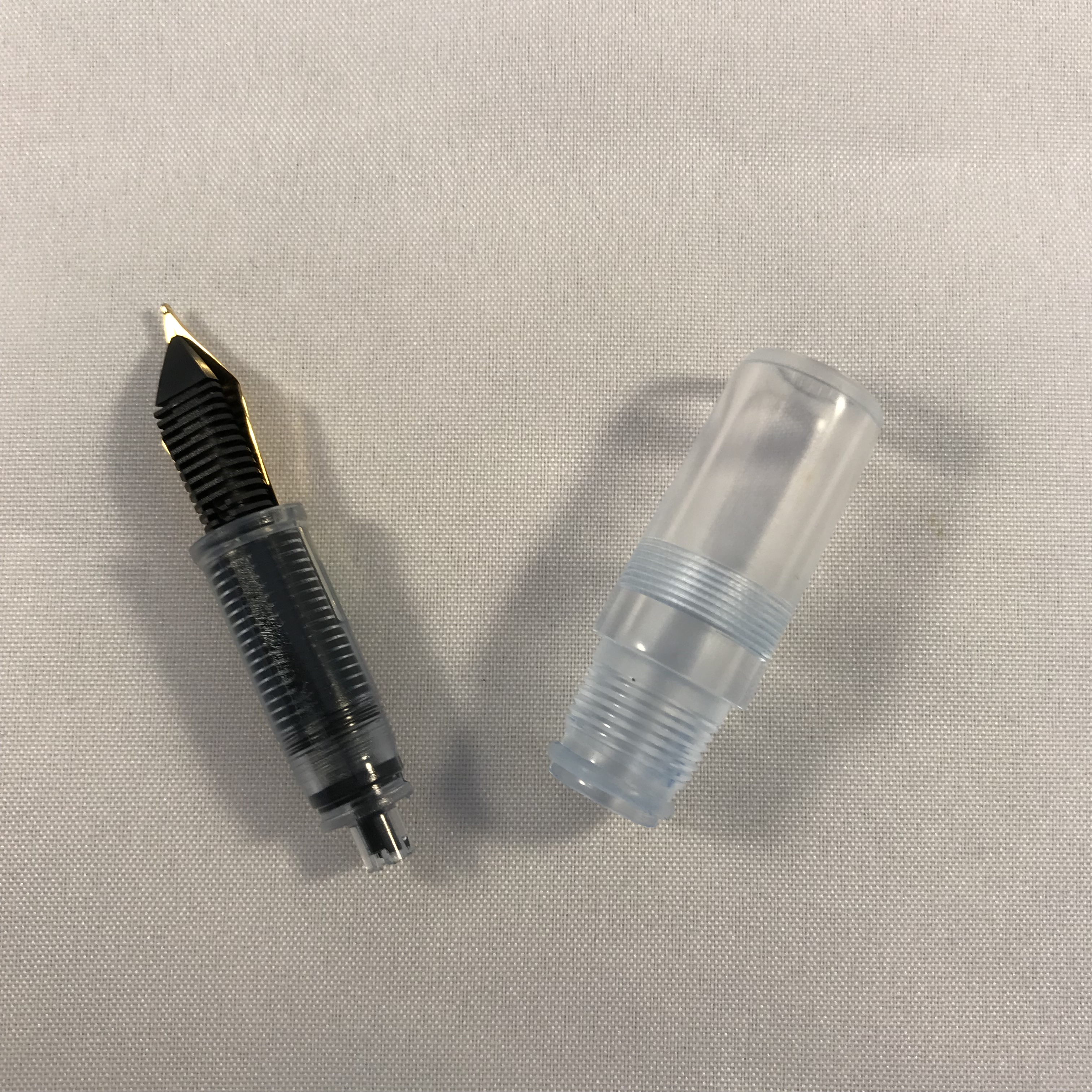
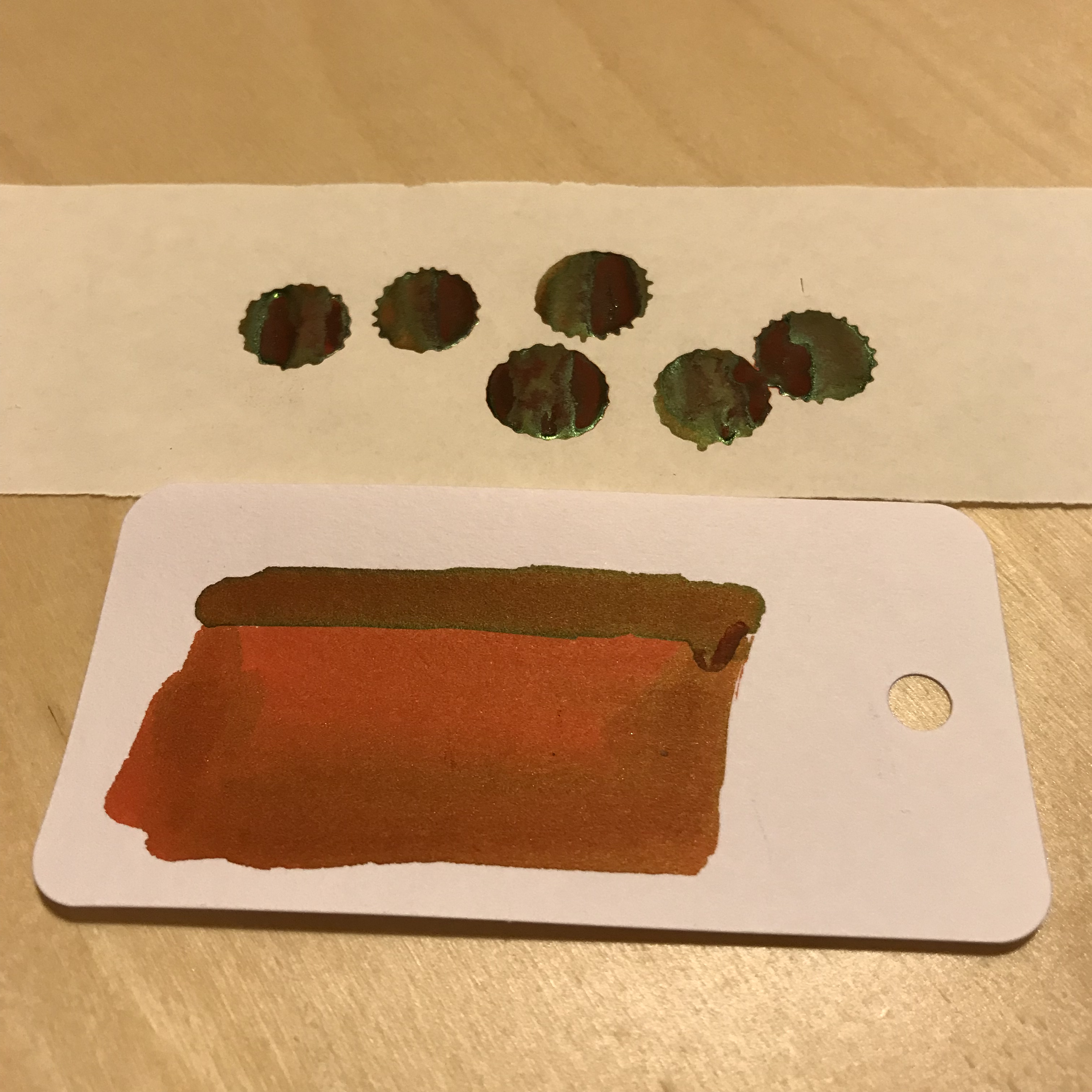
Spot the O-rings. (If I had remembered to draw in some arrows, they’d be easier to see!)

In use

I wasn’t certain whether the O-rings would be enough to seal the pen, so my first fill of the M2 was with water.  I left the pen nib-down overnight and was pleased to find that there was no hint of any leakage.  Buoyed up by this, I took the plunge and inked the M2 with Sailor Jentle Yama-dori.  It didn’t take much more than a couple of inversions and gravity to prime the feed and start the pen writing.

The Moonman M2 is available with two choices of nib size – 0.38 or 0.5mm.  These sizes equate roughly to extra fine or fine.  Given how much nib sizes vary in reality, I love the aspiration that nibs can be produced to this level of precision.

I chose the 0.5mm option and it’s a pretty solid fine.  It’s not the smoothest nib I’ve ever used, but I wouldn’t say mine was scratchy either.  I might try smoothing it out a little at some point, but for now I’m happy enough the way it is.  I’ve had no issues at all with skipping or hard starts, so all good there.  Opinion seems to be generally favourable  about the quality of the nibs on the M2, and my experience backs that up.

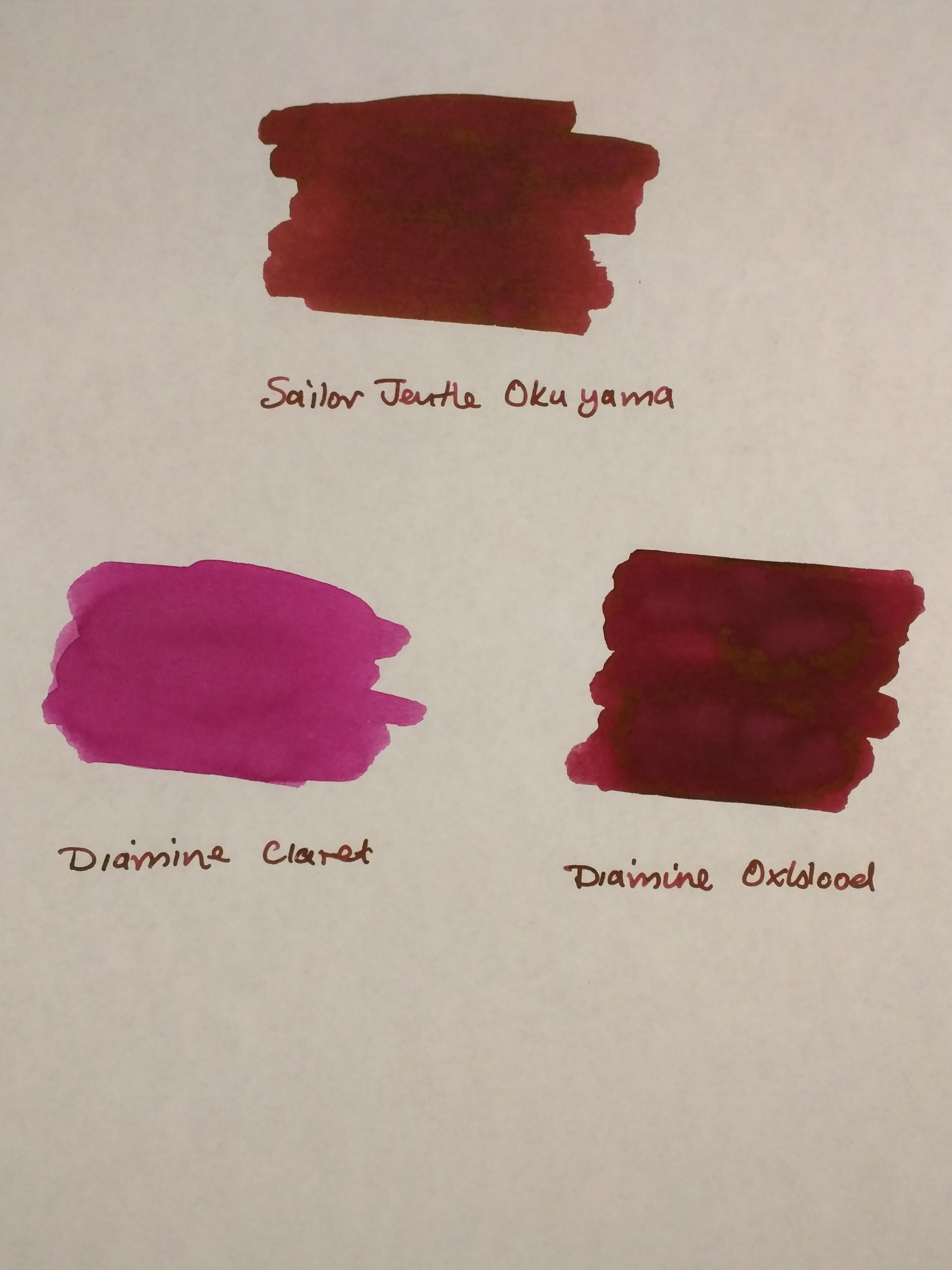
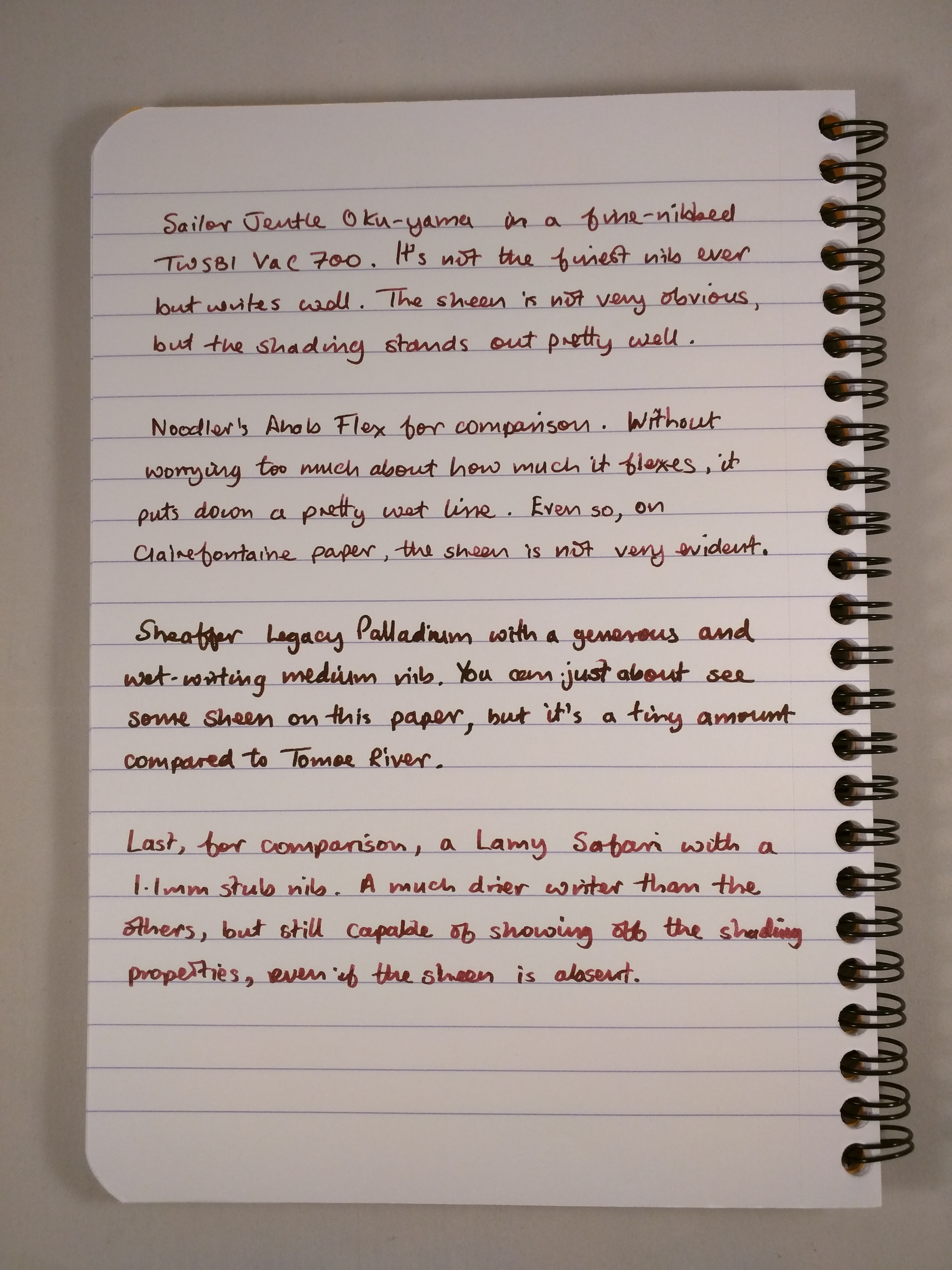
I’ve written a fair number of pages now on Tomoe River, Clairefontaine and TWSBI paper and the M2 has performed pretty well on all of them.

EFF114CE-292A-42A5-BAEA-00920DE6D3B9

Testing the Moonman M2 – Sailor Jentle Yama-dori on Tomoe River

Cleaning

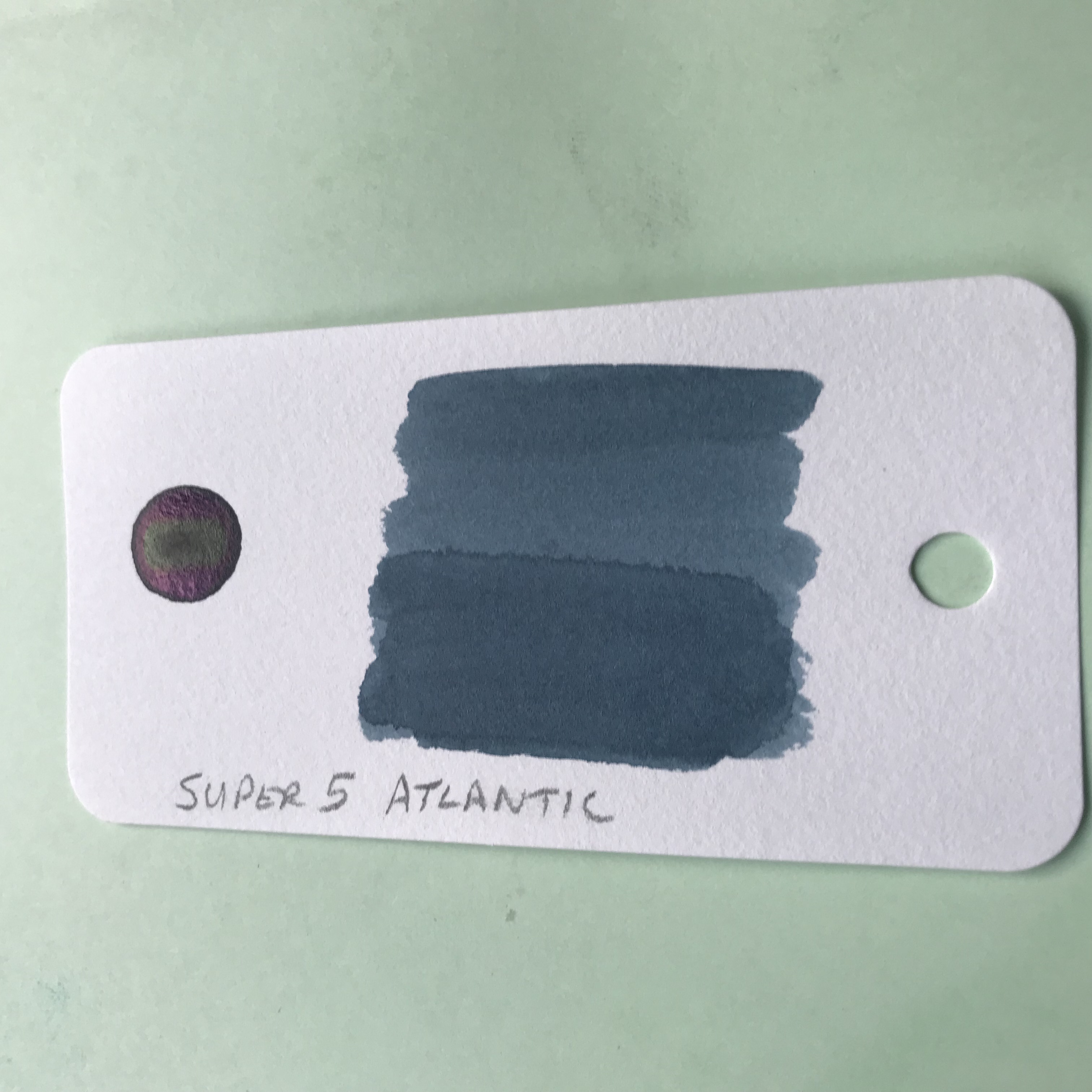
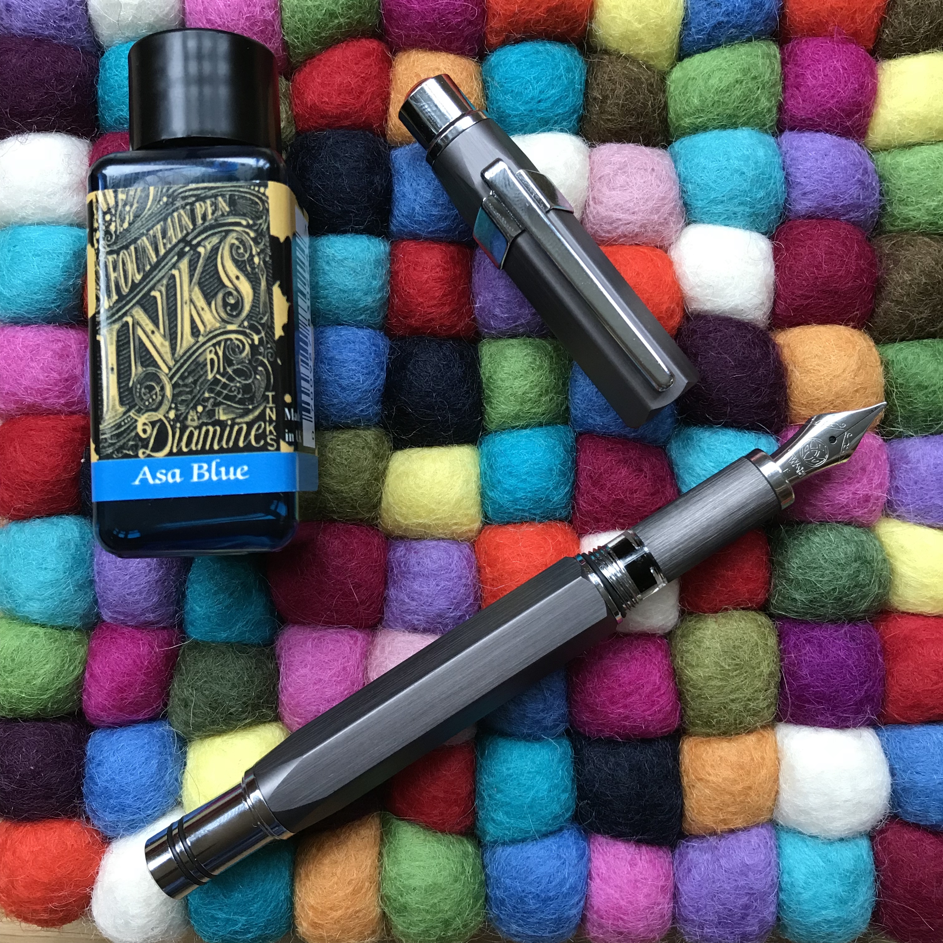
One potential concern about a pen like this is whether it will be easy to clean and how likely it is to stain.  So far, no problems.  I cleaned out the Yama-dori I first inked the M2 with and the barrel cleaned up with no issues at all.  The nib and feed took a bit more work, but came out with a clean bill of health.  A bulb syringe is a helpful tool for this.  Ditto the section, although the O-ring on this could have a tendency to trap ink, so might need particular attention.  I’ve since filled the M2 with Diamine Firefly and again the pen cleaned up after this without issue.  I’ve currently got it inked with Diamine ASA Blue and all looks good so far.

Price and availability

The M2 cost me £12.98 on eBay including shipping from China.  The US price is just shy of $16, so pretty comparable.  There are some being re-sold from the UK, but at around twice the price I paid.  Delivery took just over a week, which was more than acceptable.

Overall impressions

The Moonman M2 is a great pen in its own right, and wipes the floor with all the other Chinese pens I’ve tried.  Factor in the price and it’s an absolute bargain.  I love the design, materials and the quality of the finish.  As a first choice for an eyedropper I certainly could have done a lot worse.  I don’t really need a pen that can hold this much ink, but I’ve enjoyed being distracted by the sight of ink sloshing around in it.  The way the acrylic refracts/reflects light, really adds to the overall effect.  As a bonus, it’s certainly helped overcome my concerns about using eyedroppers.  All I have to do now is remember to handle it differently to all my other pens!
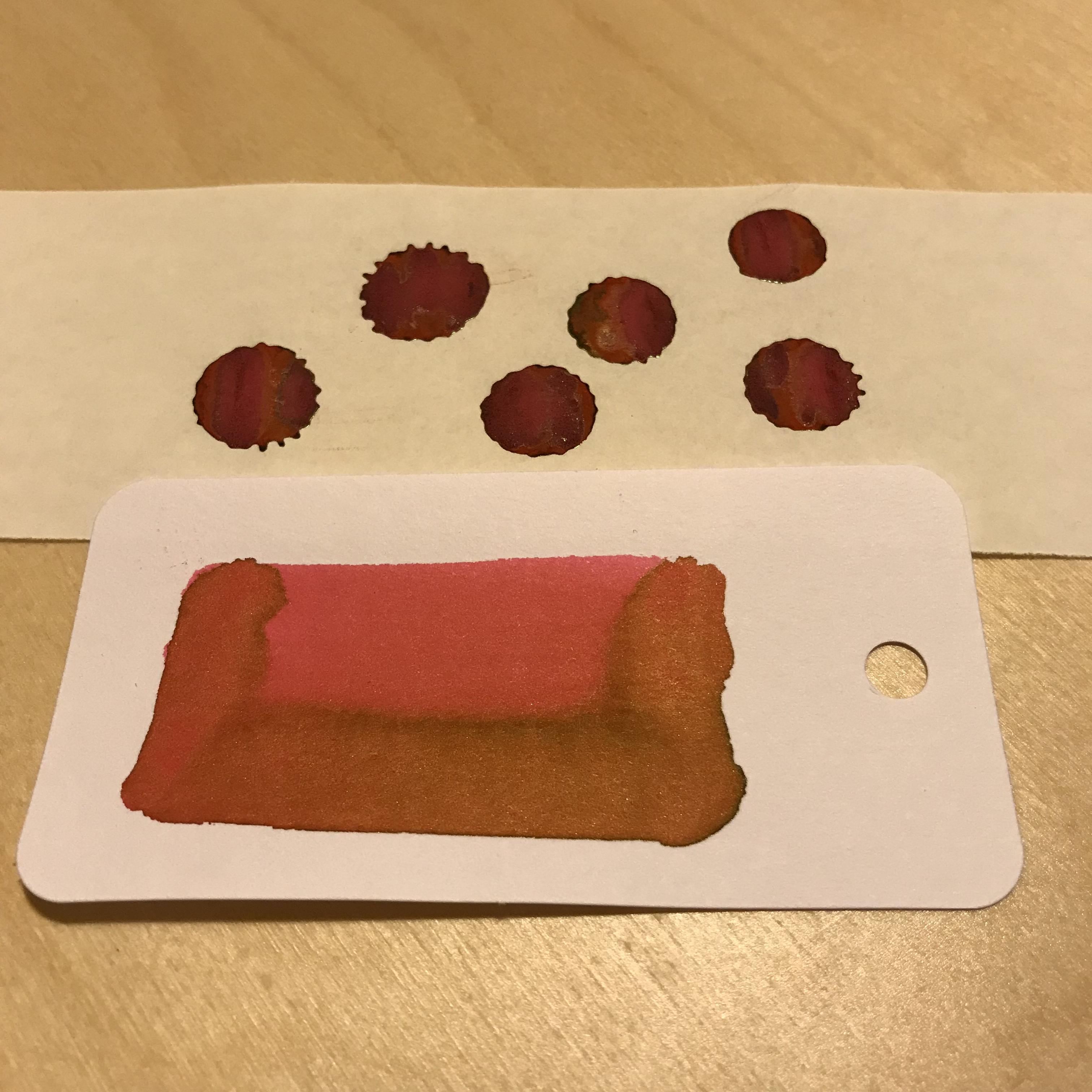
Gratuitous ink shot

Gratuitous ink shot


Ink review – KWZ Walk Over Vistula

The back story of KWZ inks is pretty well known.  They’re made in Poland by a husband and wife team and include a range of iron gall inks alongside their “normal” inks.  In late 2017, to mark Polish Independence Day, KWZ added three suitably-themed inks to their standard line-up.  I bought all three earlier this year, but have so far mainly used Walk Over Vistula.

9B7C7FB1-C22B-44C7-A06C-6C5F8F193A63

In search of enlightenment

852C4405-6EB1-4733-873E-B6271D59A049

Ink drops seemed a bit dull, but I have no idea what prompted this combination as an alternative

A brief internet search tells me that the Vistula is Poland’s longest river which flows through Krakow and Warsaw.  I have no idea what colour the waters of the Vistula are, but Walk Over Vistula is a turquoise-blue ink.  I’m reluctant to call it teal, because I don’t think it has enough green in it.  This is quite a crowded field with plenty of competition to be found (see swatches later).  As it turns out, it’s also a colour I like.  Of the 11 inks I swabbed for comparison, I own full-sized bottles of 7 of them!

For some reason, the camera on my iPad had some issues with colour accuracy resulting in the ink looking like it is more blue than turquoise.  I tried persuading it of the error of its  ways, but it wasn’t having any of it.  You’ll have to take my word for it about the true nature of the colour.  Sorry about that.

The ink comes packaged in the same way as other KWZ inks.  You get 60ml of ink in a glass bottle, shipped in a fetchingly minimal box.  Handily, the top of the box has a small colour swatch on it.  If you store your inks inks in a box like me, it makes it easy to pick out the ink you want.  The bonus with the “independence” inks is that you get a postcard that showcases the ink colour.

B96D916B-0C27-430C-BC32-CDA9942FF865

So what’s it like?

Likes and dislikes about ink are very subjective, but I’m definitely in the “like” camp for Walk Over Vistula.  Aside from the rich colour, you get an ink that is pretty well saturated and which flows well.  In my fine-nibbled Lamy 2000, this equated to a wet line with not a lot of shading.  For comparison I also inked up a Lamy Safari with a stub nib.  As well as getting the benefit of a wider line, the relatively stingy ink flow is a good way of holding back more “enthusiastic” inks, helping to show off colour and shading.

DEDC3538-05BD-4A42-98B3-1B7758F14DBC

0146AB42-B644-4992-9E65-89646142E177

Both samples were written in a Taroko Breeze notebook which features white 68gsm Tomoe River.

What the writing samples don’t show is the sheen that comes with this ink.  As someone who enjoys a bit of sheen, I was very slow on the uptake in spotting the sheen on this ink.       You can’t avoid it on Tomoe River paper.  I haven’t tried any Rhodia, but the sheen was also evident on the paper in my TWSBI notebook.

ACE60EAE-080A-48FF-A65B-752538A8C24E

Something tells me that drawing crustaceans is not my strong point

In terms of looky-likeys, one of my first thoughts was Pilot Iroshizuku Ku-jaku.  Looking at the swatches, maybe Blackstone Barrier Reef Blue and various of the Robert Oster inks are nearer to the mark.  I think my reluctance to badge this as a teal ink is borne out by comparison with Sailor Jentle Yama dori.

F9F109AB-5E55-47BC-9E90-44538628A736

Note to self, make sure the page is flat to avoid fuzzy bits

A bit of kitchen chromatography doesn’t reveal any great surprises

991497C6-53F5-4130-B1D0-CB7305D06E9F

I haven’t tested Walk Over Vistula for waterproof-ness, but I’m pretty confident it’s not.  This isn’t a deal-breaker for me as I don’t tend to need waterproof inks.  Similarly, it’s not the quickest drying, but not outrageously slow either.

Despite there being a number of similar alternatives to this colour, I’m enjoying using it. Two pens in my current rotation are inked with it.  I’m more than happy to recommend this ink in its own right, but when you take into account the fact that you get 60ml at the price of KWZ’s standard ink range.

I got my bottle from Bureau Direct for £12.95, but you can also get it from The Hamilton Pen Company.  In the US, you can get Walk Over Vistula from Vanness.

Enjoy.


Season’s Greetings

I’d like to thank everyone who follows or reads my blog. I hope you’ve enjoyed some of what I’ve had to say over the past year.  I wish you and your loved ones all the very best at this festive time of year.

38873922-C22E-449F-956D-E1AAC7CD1E29

If you’re interested in the technicalities, the paper is Tomoe River, inks are KWZ Honey, Private Reserve Avacado, Diamine Firefly, Diamine Enchanted Ocean.

Ink review – Sailor Jentle Oku-yama

Oku-yama, Vac700 and Clairefontaine notebook

One of those times when pen, ink and notebook come together brilliantly

Sailor Jentle Oku-yama is part of the Four Seasons range of inks.  I believe that it was originally introduced as a limited edition ink, but is now a fixture in the range.  Oku-yama apparently translates as “remote mountain” or “deep mountain”, but that’s not much help in trying to figure out what colour it actually is.  Reading other reviews suggests maroon, pomegranate or cranberry.  Garnet is another possible descriptor.  Take your pick.

Despite all the rave reviews, my first instinct was that this is not the sort of ink colour that I go for.  Blues, greys and the occasional green are much more my normal hunting ground.  I decided to buy a sample to see how I got on, and as you can see from the first photo, I liked it enough to buy a whole bottle.  However you choose to describe it, this ink is striking and a really interesting colour.

I bought my bottle for £16.20 from the nice people at The Writing Desk, but it’s fairly  widely available in the UK.  In the US, Jet Pens will sell you a bottle for $14.25, Anderson Pens for $18.  Wonderpens in Canada also have it listed at Can$24.75.  This is definitely not a budget ink, but it’s still way cheaper than inks like Caran d’Ache, Graf von Faber Castell and Pilot Iroshizuku.

As with other Four Seasons inks, Oku-yama comes in a round and fairly squat 50ml bottle.  The bottle contains an insert that is meant to make filling your pen easier.  With the bottle capped, turn it upside down to fill this internal reservoir.  Turn the bottle the right way up, uncap it and fill your pen.  With larger nibbed pens, filling may be tricky depending on how far you need to insert the pen.  Some people seem to find this insert infuriating to use, but so far I haven’t found it too much of a chore.

What’s it like?

Oku-yama is pretty well saturated, although it does get a bit darker with multiple passes when swabbing it.  As I’ve already said, inks of this colour are off my normal radar, so I don’t have a huge back catalogue to compare it with.  Some internet research throws up names like Diamine Syrah, Montblanc Bordeaux and Pilot Iroshizuku Yama-budo as being close.  The only inks I have that come remotely close are from a mixed pack of Diamine cartridges.

As you can see, Diamine Claret is nothing like it.  Oxblood is not dissimilar but Oku-yama has more of a red tint to it.

IMG_20170526_220202

Oku-yama alongside Diamine Claret and Oxblood on Tomoe River paper

A bit of kitchen chromatography throws up an interesting mix of colours as you might expect for an ink like this.

IMG_20170526_220222

Oku-yama in action

I’ve tried this ink out in a Sheaffer Legacy Heritage (medium), a Noodler’s Ahab Flex (fine medium), a TWSBI Vac700 (fine and broad) and a Lamy Safari (1.1mm stub).  As I found with the Vac700, it’s a great ink for a demonstrator pen – the sort of colour you’d want to see and not hide away.

In terms of papers, I’ve used Oku-yama on Tomoe River, Clairefontaine, Life Noble, Rhodia and TWSBI paper.  One observation is that I think it looks better on cream-coloured papers compared to the white of Rhodia and standard-issue Clairefontaine.

It’s most definitely not waterproof, but it doesn’t make itself out to be so.  Dry times are reasonable – a little over 20 seconds on Clairefontaine paper with a broad nib in my Vac700.  Expect it to be longer on something like Tomoe River and allow for quicker drying times with a finer nib/dryer pen.  My non-scientific assessment is that I’ve used it quite extensively for journaling in an A5 notebook and not had any issues with the ink not being dry when it’s time to turn the page.

I’d describe Oku-yama as a “wet” ink, so although it performed well on these papers it won’t come as a surprise to learn that there was some show-through.  There was no bleed-through at all.  In fact the only real surprise was some feathering on Life Noble paper with the Sheaffer.  It’s the first time I’ve experienced feathering on this paper, but the Sheaffer bears more than a passing resemblance to a fire hose in terms of the amount of ink it puts down, so I can forgive that.

IMG_20170526_220506

Feathering on Life Noble paper

Aside from the gorgeous colour, Oku-yama has a reputation for two things – shading and sheen.  I found that it will shade without any need for encouragement.  Even with a relatively dry-writing pen like the Safari, I couldn’t have stopped this ink from shading if I’d wanted to.  Similarly, I found that Oku-yama shaded on all the papers I tried it on.IMG_20170526_220257

IMG_20170526_220452


Oku-yama on Clairefontaine (top) and Life Noble (bottom) paper

The Sheen, What About The Sheen?

As with a number of other Sailor inks, Oku-yama will produce sheen.  In this case it’s a green/gold sheen.  It will come as absolutely no surprise that the easiest paper to see sheen on is Tomoe River.

IMG_20170520_173402

Oku-yama ink splat on Tomoe River paper

It’s there, even with normal writing – you really don’t have to try very hard at all.  My photos don’t show it very well, so you’ll have to take my word for it.

IMG_20170526_215919

Sheen on Tomoe River paper

I also managed to get some sheen on Life Noble and TWSBI papers, but there’s clearly something in the surface finish of Rhodia and Clairefontaine papers that kills it off.

Summary

At the outset, I didn’t know what to expect from Sailor’s Oku-yama or what I would make of it.  In the end I kind of fell for it.  It’s not really a colour for work use, but it’s both cheery and complex and a joy to write with in most other situations.  I’ve used it quite a bit for journal keeping and I haven’t found it to be overpowering when used page after page.

As a measure of how much I like it, I’ve written the Sheaffer dry and am probably down to a fifth of a tank in the Vac700, which has a huge ink capacity.  I’ll certainly refill the Vac700 with it when it runs dry.

This one’s a keeper!