Unexpected Discoveries

Serene Serendipity

Alongside the hours of meticulous research, cross-referencing reviews, finding the best price and generally procrastinating over purchases, I like the occasional moments of serendipitous joy that come with spur-of-the-moment purchases.  Sometimes it’s completely out of the blue, but more often than not it’s the little extra you add to your shopping cart as part of a bigger order.  After all, what’s the harm?

So it was with some recent ink purchases from Fountainfeder in Germany.  My main objective was getting my hands on a couple of German-only inks from Diamine – Skull and Roses and November Rain.

The process from order to delivery was smooth and the wait wasn’t too long.  As well as the ink, I got a nice, hand-written note and some chocolate – always welcome.  Both Skull and Roses and November Rain look interesting in a “sheen-turned-up-to-11” kind of way. Even so, they weren’t the stars of the show.  That honour goes to the contents of an unassuming sample vial – Super 5 Atlantic

From swatches on the web, it looks to be somewhere on the teal spectrum, but as it turns out, the online photos rather undersell Super 5 Atlantic (unless you love teal, of course).

I’m rediscovering my love for the sea in all sorts of ways at the moment, including inks that reflect its myriad colours.  As a result, this ink has struck a chord with me, helped by the massive clue in the name.  Not the Super 5 bit – that sounds like a posh upgrade from the Fantastic 4 (imagine it said in a plummy English accent) – I meant the Atlantic part.

Super 5 Atlantic ink swab

Avast ye swab!

Swabbed, you get a beautiful blue/green/grey kind of colour, which indeed evokes the ocean.  Used in anger, it has plenty of shading to add interest.  On 52 gsm Tomoe River paper, there’s some cheeky sheen.  In fact, there’s wall-to-wall sheen.  It’s a silvery sort of sheen, so it manages to be both subtle and extravagant at the same time.  The sheen doesn’t dominate though and the true colour of the ink shines through.

Super 5 Atlantic writing sample

All at sea

Of course, there are risks and potential pitfalls with these impulse purchases.  Failure to do any meaningful research meant that I didn’t pick up on the fact that it’s a permanent ink.  If I’d known this I might have picked a different pen to my ghostly Franklin-Christoph 45.  The cap has a habit of collecting ink spots that are hard to shift so I’m being a bit wary and handling the pen gingerly until I’ve written it dry.

At around €16 for 30ml, Super 5 Atlantic is not a cheap ink.  It doesn’t seem to be available in the UK, so shipping costs from Europe add to the challenge.  It’s such a beautiful colour though, that I didn’t hesitate and I should have a bottle in a few days.  I can easily see this becoming one of my favourite inks – high praise from someone who has the attention span of a gnat when it comes to sticking with one ink.

Getting mixed up – into the Wild Blue Yonder

To begin at the beginning…

It started with something innocuous, as these things often do – a seemingly innocent purchase of a 30 ml bottle of Diamine ASA Blue.  At £2.35 it seemed rude not to.  But of course, that’s how they get you.  Added to the Mnemosyne 194 that I wanted, that almost got me to the £10 needed to qualify for free postage.  90p short, I needed something else…

…and that’s how I ended up with a bill for £45!

Enough about my lack of will power.  ASA Blue is great in its own right, carrying off  a passable impersonation of Pilot Iroshizuku Kon-peki at a fraction of the price.

TWSBI Precision and Diamine ASA Blue

Are you sitting comfortably?

While I was looking for write ups about this ink, I found an old thread on FPN where someone had mixed ASA Blue with Sapphire Blue in equal parts with interesting results.

So, I thought, how hard can it be and what’s the worst that can happen?  The answers are: ‘easy’ and ‘nothing untoward’.  No explosions, fires or gunky messes.  Instead, you get a really nice blue ink for your troubles.

Text from Under Milk Wood

Truly beginning at the beginning

Ink splats showing sheen

There’s sheen there if you look for it

What happens when you mix ASA Blue and Sapphire Blue

…something about a glass and a half?

Not an original idea and I can’t guarantee that I haven’t just made another ink from the Diamine range.  Either way, it was a bit of fun to try.  What I didn’t realise was that I was also demonstrating the pervasive and subliminal power of advertising.  It wasn’t until a couple of days after I’d done it that I realised why the image above looked kind of familiar.  Any resemblance to the logos and advertising imagery of a major UK chocolate manufacturer are entirely coincidental.  Honest.  No, really.

One thing that I do take issue with is the name.  The creator of this mix named it Asphire.  I see the logic and it gets a cheap laugh (or was that just me) but I can’t say I’m entirely impressed with the result.  I came up with was Wild Blue Yonder, but I’m open to suggestions.

Any thoughts?

Ink Review – Sailor Sei-boku

Sailor Sei-boku isn’t a new ink by any measure but seems to have gone relatively unnoticed in terms of reviews, certainly compared to its stable-mate Kiwa-guro.  Having been convinced enough to buy a bottle I thought I would share my impressions.

Sailor Sei-boku bottle and box

Sei-boku in Sailor’s ‘traditional’ bottle

As with other Sailor inks, you get a squat 50ml bottle in a nice cardboard box.  (Sailor are in the process of changing the design of their bottles, so you may find you get a different form factor.)  Unlike the Jentle Four Seasons inks that I’m more familiar, the box design is much bolder and in your face.  It’s also rather shiny, which makes photographing it a bit of a challenge.  You also get that little reservoir in the top of the bottle that’s meant to make filling your pen easier as the level in the bottle drops.  I used to think this was a neat idea, but I’m not so sure these days and tend to use a syringe to fill my pens instead. You can remove the insert, but that seems a recipe for very inky fingers.

Sei-boku is a pigment ink, meaning that its colour comes predominantly from particles suspended in the ink rather than dissolved dyes.  This brings the benefit of being fairly waterproof and the perilous warning that you should be careful lest poor pen hygiene result in blocked feeds, clogged nibs and, if you’re really slap-dash, possibly the end of the universe.  (Note: I may have made one of these up.)

I suspect that this is more of a backside-covering disclaimer because I can’t say that I have experienced any particular (geddit?) problems with Sei-boku.  You can see the settled particles when you pick up the bottle, so there’s a need to give the bottle a bit of a shake to get the particles back into suspension before you ink your pen.  If you’ve used one of the many shimmering inks that are available, then you’ll be familiar with this ritual.  I take a similar approach with pens and invert them a few times before writing with them.  This probably won’t do much for what’s already in the feed, but I figure every little helps in evening out the distribution of the particles.  I maybe wouldn’t  leave a pen inked for months without using it, but I don’t think it’s quite as bad as the warnings suggest.

That’s enough of the perils and practicalities of pigment ink, what’s it like?  I find Sei-boku remarkably blue for a “blue-black” ink, but I also find it a really pleasant and quite distinct colour.  I’ll happily admit to being biased towards blue inks, but it continually amazes me how many different and distinct blue inks there are.

Writing sample, Kaweco Perkeo, medium nib, Sailor Sei-boku, Tomoe River

Telling your Croups from your Vandemars through the medium of Tomoe River

Mr Vandemar, Platinum 3776, Sailor Sei-boku

Mr Vandemar’s lovely smile

Sailor Sei-boku, Tomoe River, Kaweco Lilliputian, fine nib

Might I with due respect remind you…

As with the other Sailor inks I’ve used, Sei-boku is well lubricated and flows extremely well.  It may be a feature of the suspended pigment particles, but the colour is not super-saturated, meaning that the ink shades beautifully.  It’ll come as no surprise that the shading is most visible with a broad nib.

Writing sample with broad nib

Croup and Vandemar get the broad nib treatment

Another feature in common with other inks that I’ve tried is a cheeky bit of sheen.  I have to say that this was a bit of a surprise, albeit a very welcome one.  I had thought that Sei-boku was going to be a very grown-up ink and therefore a little dull and worthy, so all in all it’s been a pleasant discovery.

Sei-boku ink splats

Sei-boku ink splats on Tomoe River

Sailor Sei-boku sheen

Some cheeky sheen

In terms of colour, none of my other inks quite match Sei-boku.  I had originally thought Iroshizuku Tsuki-yo was a close match, but from looking at the swabs, Tsuki-yo has too much of a turquoise hue to it.  After I’d finished the swabs, I remembered I had a sample of Iroshizuku Shin-kai and wondered whether that might be a match…it isn’t.

Comparison ink swabs

Nothing compares…

A bit of simple paper chromatography reveals blues of varying shades.  There’s an interesting pattern of dark blue or black dots.  My guess is these are clumps of the pigment particles, but I have no way to be sure.

Sailor Sei-boku chromatography

Chromatography can yield some interesting results

I don’t normally worry about testing waterproof-ness in my inks, and I haven’t done any systematic testing of Sei-boku, either.  I did wet a fingertip and run it over a couple of lines of writing and the ink held fast.

So there we have it, I got past the dire(-ish) warnings and found an ink that I really like.  It’s considerably more expensive than other Sailor inks, being double the price of standard Jentle ink (including blue-black) and about a third more expensive than the Jentle Four Seasons inks.  Maybe the pricing has put people off trying Sei-boku (hence the small number of reviews), but I’m certainly glad I gave it a try.  Pricing makes this a premium ink, but I haven’t tried an ink quite like it and don’t begrudge the cost.  When you compare the price of Sei-Boku to Pilot Iroshizuku inks and newcomers like Colorverse, I don’t think the price is too outrageous.  I bought my bottle from The Writing Desk for £21.60, but you can get it from a variety of sources (including Cult Pens and Andy’s Pens) at a similar price.  Pricing in the US is roughly $ for £ from vendors like Vanness and Jet Pens.  Wonder Pens in Toronto also have Sei-boku for CA$33.


Ink review – KWZ Walk Over Vistula

The back story of KWZ inks is pretty well known.  They’re made in Poland by a husband and wife team and include a range of iron gall inks alongside their “normal” inks.  In late 2017, to mark Polish Independence Day, KWZ added three suitably-themed inks to their standard line-up.  I bought all three earlier this year, but have so far mainly used Walk Over Vistula.

9B7C7FB1-C22B-44C7-A06C-6C5F8F193A63

In search of enlightenment

852C4405-6EB1-4733-873E-B6271D59A049

Ink drops seemed a bit dull, but I have no idea what prompted this combination as an alternative

A brief internet search tells me that the Vistula is Poland’s longest river which flows through Krakow and Warsaw.  I have no idea what colour the waters of the Vistula are, but Walk Over Vistula is a turquoise-blue ink.  I’m reluctant to call it teal, because I don’t think it has enough green in it.  This is quite a crowded field with plenty of competition to be found (see swatches later).  As it turns out, it’s also a colour I like.  Of the 11 inks I swabbed for comparison, I own full-sized bottles of 7 of them!

For some reason, the camera on my iPad had some issues with colour accuracy resulting in the ink looking like it is more blue than turquoise.  I tried persuading it of the error of its  ways, but it wasn’t having any of it.  You’ll have to take my word for it about the true nature of the colour.  Sorry about that.

The ink comes packaged in the same way as other KWZ inks.  You get 60ml of ink in a glass bottle, shipped in a fetchingly minimal box.  Handily, the top of the box has a small colour swatch on it.  If you store your inks inks in a box like me, it makes it easy to pick out the ink you want.  The bonus with the “independence” inks is that you get a postcard that showcases the ink colour.

B96D916B-0C27-430C-BC32-CDA9942FF865

So what’s it like?

Likes and dislikes about ink are very subjective, but I’m definitely in the “like” camp for Walk Over Vistula.  Aside from the rich colour, you get an ink that is pretty well saturated and which flows well.  In my fine-nibbled Lamy 2000, this equated to a wet line with not a lot of shading.  For comparison I also inked up a Lamy Safari with a stub nib.  As well as getting the benefit of a wider line, the relatively stingy ink flow is a good way of holding back more “enthusiastic” inks, helping to show off colour and shading.

DEDC3538-05BD-4A42-98B3-1B7758F14DBC

0146AB42-B644-4992-9E65-89646142E177

Both samples were written in a Taroko Breeze notebook which features white 68gsm Tomoe River.

What the writing samples don’t show is the sheen that comes with this ink.  As someone who enjoys a bit of sheen, I was very slow on the uptake in spotting the sheen on this ink.       You can’t avoid it on Tomoe River paper.  I haven’t tried any Rhodia, but the sheen was also evident on the paper in my TWSBI notebook.

ACE60EAE-080A-48FF-A65B-752538A8C24E

Something tells me that drawing crustaceans is not my strong point

In terms of looky-likeys, one of my first thoughts was Pilot Iroshizuku Ku-jaku.  Looking at the swatches, maybe Blackstone Barrier Reef Blue and various of the Robert Oster inks are nearer to the mark.  I think my reluctance to badge this as a teal ink is borne out by comparison with Sailor Jentle Yama dori.

F9F109AB-5E55-47BC-9E90-44538628A736

Note to self, make sure the page is flat to avoid fuzzy bits

A bit of kitchen chromatography doesn’t reveal any great surprises

991497C6-53F5-4130-B1D0-CB7305D06E9F

I haven’t tested Walk Over Vistula for waterproof-ness, but I’m pretty confident it’s not.  This isn’t a deal-breaker for me as I don’t tend to need waterproof inks.  Similarly, it’s not the quickest drying, but not outrageously slow either.

Despite there being a number of similar alternatives to this colour, I’m enjoying using it. Two pens in my current rotation are inked with it.  I’m more than happy to recommend this ink in its own right, but when you take into account the fact that you get 60ml at the price of KWZ’s standard ink range.

I got my bottle from Bureau Direct for £12.95, but you can also get it from The Hamilton Pen Company.  In the US, you can get Walk Over Vistula from Vanness.

Enjoy.


Ink review – Sailor Jentle Oku-yama

Oku-yama, Vac700 and Clairefontaine notebook

One of those times when pen, ink and notebook come together brilliantly

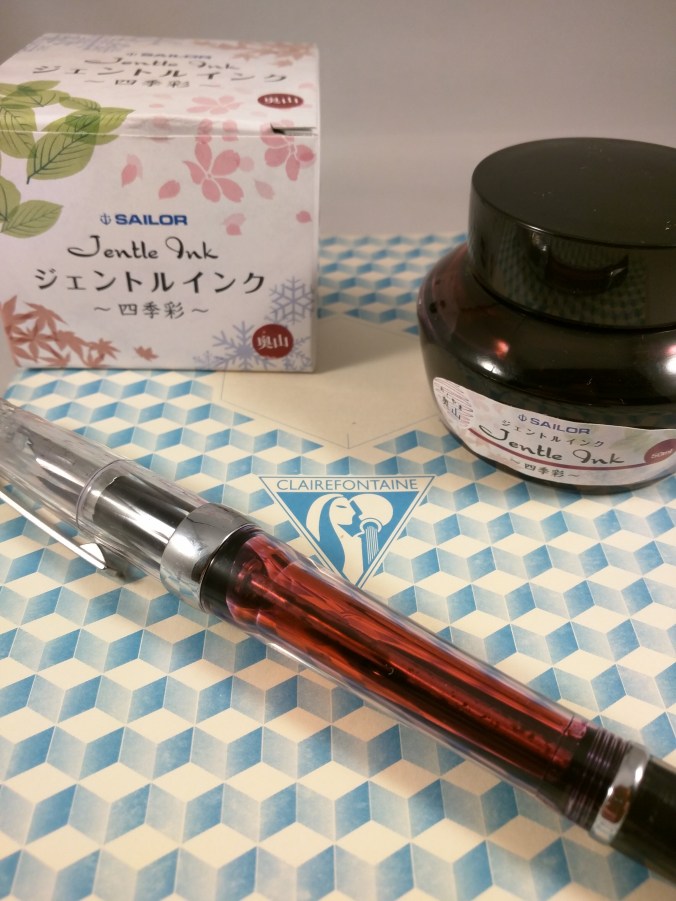
Sailor Jentle Oku-yama is part of the Four Seasons range of inks.  I believe that it was originally introduced as a limited edition ink, but is now a fixture in the range.  Oku-yama apparently translates as “remote mountain” or “deep mountain”, but that’s not much help in trying to figure out what colour it actually is.  Reading other reviews suggests maroon, pomegranate or cranberry.  Garnet is another possible descriptor.  Take your pick.

Despite all the rave reviews, my first instinct was that this is not the sort of ink colour that I go for.  Blues, greys and the occasional green are much more my normal hunting ground.  I decided to buy a sample to see how I got on, and as you can see from the first photo, I liked it enough to buy a whole bottle.  However you choose to describe it, this ink is striking and a really interesting colour.

I bought my bottle for £16.20 from the nice people at The Writing Desk, but it’s fairly  widely available in the UK.  In the US, Jet Pens will sell you a bottle for $14.25, Anderson Pens for $18.  Wonderpens in Canada also have it listed at Can$24.75.  This is definitely not a budget ink, but it’s still way cheaper than inks like Caran d’Ache, Graf von Faber Castell and Pilot Iroshizuku.

As with other Four Seasons inks, Oku-yama comes in a round and fairly squat 50ml bottle.  The bottle contains an insert that is meant to make filling your pen easier.  With the bottle capped, turn it upside down to fill this internal reservoir.  Turn the bottle the right way up, uncap it and fill your pen.  With larger nibbed pens, filling may be tricky depending on how far you need to insert the pen.  Some people seem to find this insert infuriating to use, but so far I haven’t found it too much of a chore.

What’s it like?

Oku-yama is pretty well saturated, although it does get a bit darker with multiple passes when swabbing it.  As I’ve already said, inks of this colour are off my normal radar, so I don’t have a huge back catalogue to compare it with.  Some internet research throws up names like Diamine Syrah, Montblanc Bordeaux and Pilot Iroshizuku Yama-budo as being close.  The only inks I have that come remotely close are from a mixed pack of Diamine cartridges.

As you can see, Diamine Claret is nothing like it.  Oxblood is not dissimilar but Oku-yama has more of a red tint to it.

IMG_20170526_220202

Oku-yama alongside Diamine Claret and Oxblood on Tomoe River paper

A bit of kitchen chromatography throws up an interesting mix of colours as you might expect for an ink like this.

IMG_20170526_220222

Oku-yama in action

I’ve tried this ink out in a Sheaffer Legacy Heritage (medium), a Noodler’s Ahab Flex (fine medium), a TWSBI Vac700 (fine and broad) and a Lamy Safari (1.1mm stub).  As I found with the Vac700, it’s a great ink for a demonstrator pen – the sort of colour you’d want to see and not hide away.

In terms of papers, I’ve used Oku-yama on Tomoe River, Clairefontaine, Life Noble, Rhodia and TWSBI paper.  One observation is that I think it looks better on cream-coloured papers compared to the white of Rhodia and standard-issue Clairefontaine.

It’s most definitely not waterproof, but it doesn’t make itself out to be so.  Dry times are reasonable – a little over 20 seconds on Clairefontaine paper with a broad nib in my Vac700.  Expect it to be longer on something like Tomoe River and allow for quicker drying times with a finer nib/dryer pen.  My non-scientific assessment is that I’ve used it quite extensively for journaling in an A5 notebook and not had any issues with the ink not being dry when it’s time to turn the page.

I’d describe Oku-yama as a “wet” ink, so although it performed well on these papers it won’t come as a surprise to learn that there was some show-through.  There was no bleed-through at all.  In fact the only real surprise was some feathering on Life Noble paper with the Sheaffer.  It’s the first time I’ve experienced feathering on this paper, but the Sheaffer bears more than a passing resemblance to a fire hose in terms of the amount of ink it puts down, so I can forgive that.

IMG_20170526_220506

Feathering on Life Noble paper

Aside from the gorgeous colour, Oku-yama has a reputation for two things – shading and sheen.  I found that it will shade without any need for encouragement.  Even with a relatively dry-writing pen like the Safari, I couldn’t have stopped this ink from shading if I’d wanted to.  Similarly, I found that Oku-yama shaded on all the papers I tried it on.IMG_20170526_220257

IMG_20170526_220452


Oku-yama on Clairefontaine (top) and Life Noble (bottom) paper

The Sheen, What About The Sheen?

As with a number of other Sailor inks, Oku-yama will produce sheen.  In this case it’s a green/gold sheen.  It will come as absolutely no surprise that the easiest paper to see sheen on is Tomoe River.

IMG_20170520_173402

Oku-yama ink splat on Tomoe River paper

It’s there, even with normal writing – you really don’t have to try very hard at all.  My photos don’t show it very well, so you’ll have to take my word for it.

IMG_20170526_215919

Sheen on Tomoe River paper

I also managed to get some sheen on Life Noble and TWSBI papers, but there’s clearly something in the surface finish of Rhodia and Clairefontaine papers that kills it off.

Summary

At the outset, I didn’t know what to expect from Sailor’s Oku-yama or what I would make of it.  In the end I kind of fell for it.  It’s not really a colour for work use, but it’s both cheery and complex and a joy to write with in most other situations.  I’ve used it quite a bit for journal keeping and I haven’t found it to be overpowering when used page after page.

As a measure of how much I like it, I’ve written the Sheaffer dry and am probably down to a fifth of a tank in the Vac700, which has a huge ink capacity.  I’ll certainly refill the Vac700 with it when it runs dry.

This one’s a keeper!