I noted the other day that Bauhaus is 100 years old. Not the pale-faced, pointy-cheekboned goth outfit fronted by Pete Murphy, but the German art and design movement founded by Walter Gropius.
This got me thinking about a pen that has become one of my long-term companions on my particular bus ride – the Lamy 2000. This is a fountain pen that has often been seen as embodying the Bauhaus aesthetic, even if technically it missed that particular bus by 30-odd years. It was also pretty much my first ‘posh’ fountain pen, by which I mean it cost over £100, had a gold nib and filled using a piston mechanism. This was all unknown territory for me at the time, but the 2000 exuded class and almost everything I read said it was great pen and a classic design that any self-respecting penthusiast should have in their collection.
So it was that I gave Cult Pens what seemed (at the time) like a lot of money and they sent me a pen. I chose a fine nib and seem to recall that this was the first time that I’d really given consideration to picking a nib size other than medium. Due to a fortunate combination of personal preference (I think it looks way better) and price, I picked the black Makrolon finish instead of the alternative of brushed steel.
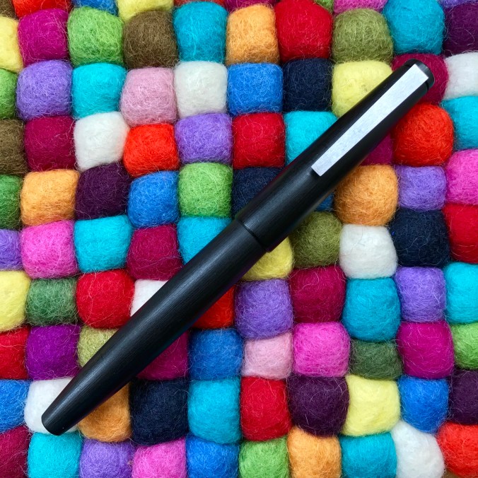
The Lamy 2000 in all its sleek, simple beauty
Pens achieve cult status for all kinds of reasons; some more justified than others. In the case of the Lamy 2000 (first introduced in 1966), I think this is deserved. Capped, its lines are simple and appealing, with flat ends and a brushed metal clip on which you’ll find the only bit of Lamy branding, subtly etched near where the clip attaches to the cap.

In case you forget who made the pen…
The only other accent you’ll find is a brushed metal disc at the tip of the barrel.

Piston cap inlay
It’s a slip cap, so a slight pull is all that is needed to uncap the pen and get writing. Removing the cap really reveals what all the fuss is about. There are no steps between elements or weird changes of angle, just a simple and continuous curve from where the nib emerges from the section to the end of the barrel.
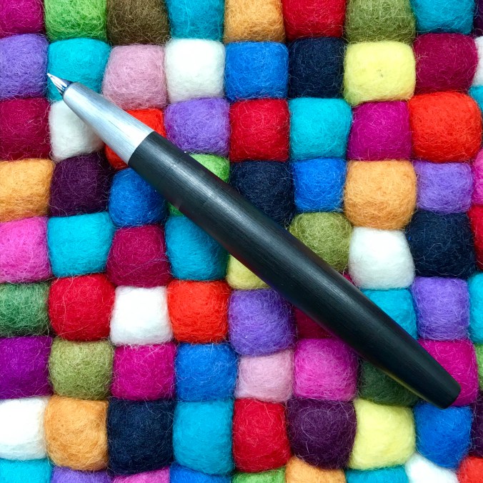
Follow the lines…
Perhaps the only thing that jars ever so slightly is a pair of tabs that protrude a fraction of a millimetre from either side of the section a little below the ink window.

If the cap fits… One of the two cap clutch tabs
I was never really sure what these were for, but in doing some background research I discover they are part of a clutch ring for the cap. In that sense they do their job perfectly well and don’t intrude on the writing experience. My thumb sits right on top of one of them when I hold the pen and I can’t say I’ve ever really noticed it, let alone felt any discomfort even for long writing sessions.
This also marks the point where the section attaches to the barrel. The design of this (and the piston cap) is such that you can barely see the join where the two elements meet. The cleverness of the piston cap end of things was highlighted in a recent post by Anthony over at UK Fountain Pens.

Can you spot the join?
I can certainly remember looking at my newly acquired Lamy 2000 and wondering how I was meant to fill it. As it was my first piston filler, I duly read the instructions, but remained stumped as to where the cap that I was meant to unscrew actually was. Of course now it seems so easy (it always is when you know how), but what impresses me is that even after several years of use and numerous fills, everything has remained tight and these transitions still appear seamless. A tribute to the design, the materials and the manufacturing.
As a counter to all that black Makrolon, there is a short brushed metal section which leads the eye down to a small, partially hooded 14K rhodium-plated gold nib. The only departure from curved lines comes with the underside of the section, which angles up more sharply towards the underside of the feed. Cunningly, this conceals the breather hole – another good piece of design.

The 14K nib in all its glory. Where’s the breather hole?

There it is!
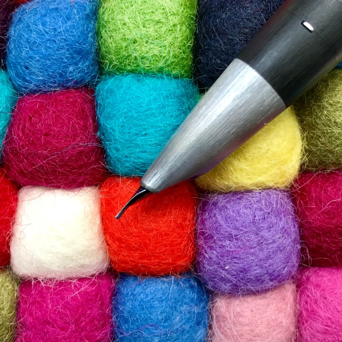
That slight change of angle…
It may have been good fortune, but the nib on mine has written flawlessly since I got it. I have read that some people had bad experiences with theirs, but I have absolutely no complaints with mine and I’m not the greatest lover of Lamy nibs. It’s not the thinnest ‘fine’ I’ve ever owned, but it suits my writing just – well – fine. Mine copes with pretty much whatever ink I throw at it, but it is a very wet writer, so can be a good choice for use with drier inks.
I have to say it, I really love my Lamy 2000. It looks fantastic, writes well and seldom goes uninked for any length of time. It’s also pleasing that Lamy haven’t tried to do anything silly with this pen. The design wears its age well and has evolved by remaining essentially unchanged over the 53 years of its life so far.
The Lamy 2000 is smart enough to use in any setting and, although not cheap, I’ve never felt uncomfortable taking it with me to work. Sure it’s not as glamorous as some other pens, but it does its job with quiet efficiency and (I like to think) pride in being able to do its job well. Definitely a pen where all the plaudits are entirely justified. If you don’t own one already, I’d recommend giving some serious thought to rectifying that oversight.
If you want to know more about the Lamy 2000, when I was doing some researchI came across this amazingly thorough piece on FPN It covers pretty much every aspect of the pen from its design origins through to how to strip it down. Whatever you think of the pen it is well worth a read.
