Ink review – KWZ Walk Over Vistula

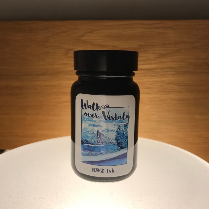
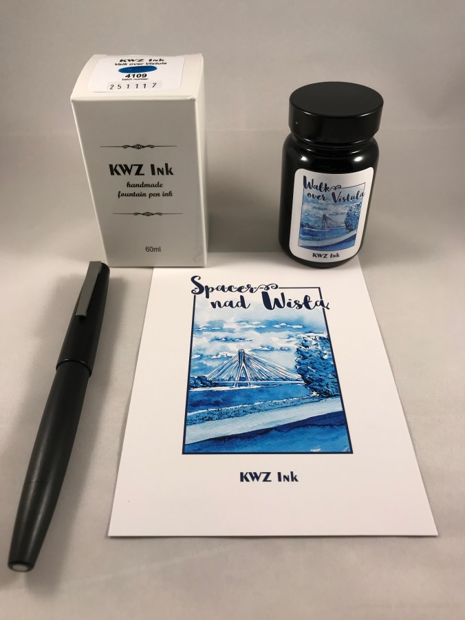
The back story of KWZ inks is pretty well known.  They’re made in Poland by a husband and wife team and include a range of iron gall inks alongside their “normal” inks.  In late 2017, to mark Polish Independence Day, KWZ added three suitably-themed inks to their standard line-up.  I bought all three earlier this year, but have so far mainly used Walk Over Vistula.

9B7C7FB1-C22B-44C7-A06C-6C5F8F193A63

In search of enlightenment

852C4405-6EB1-4733-873E-B6271D59A049

Ink drops seemed a bit dull, but I have no idea what prompted this combination as an alternative

A brief internet search tells me that the Vistula is Poland’s longest river which flows through Krakow and Warsaw.  I have no idea what colour the waters of the Vistula are, but Walk Over Vistula is a turquoise-blue ink.  I’m reluctant to call it teal, because I don’t think it has enough green in it.  This is quite a crowded field with plenty of competition to be found (see swatches later).  As it turns out, it’s also a colour I like.  Of the 11 inks I swabbed for comparison, I own full-sized bottles of 7 of them!

For some reason, the camera on my iPad had some issues with colour accuracy resulting in the ink looking like it is more blue than turquoise.  I tried persuading it of the error of its  ways, but it wasn’t having any of it.  You’ll have to take my word for it about the true nature of the colour.  Sorry about that.

The ink comes packaged in the same way as other KWZ inks.  You get 60ml of ink in a glass bottle, shipped in a fetchingly minimal box.  Handily, the top of the box has a small colour swatch on it.  If you store your inks inks in a box like me, it makes it easy to pick out the ink you want.  The bonus with the “independence” inks is that you get a postcard that showcases the ink colour.

B96D916B-0C27-430C-BC32-CDA9942FF865

So what’s it like?

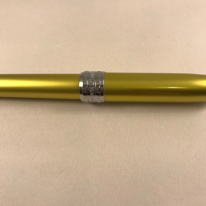
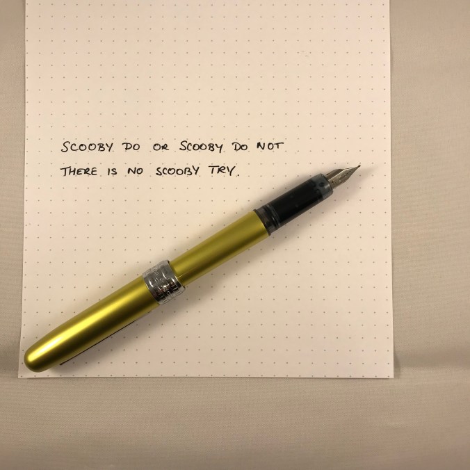
Likes and dislikes about ink are very subjective, but I’m definitely in the “like” camp for Walk Over Vistula.  Aside from the rich colour, you get an ink that is pretty well saturated and which flows well.  In my fine-nibbled Lamy 2000, this equated to a wet line with not a lot of shading.  For comparison I also inked up a Lamy Safari with a stub nib.  As well as getting the benefit of a wider line, the relatively stingy ink flow is a good way of holding back more “enthusiastic” inks, helping to show off colour and shading.

DEDC3538-05BD-4A42-98B3-1B7758F14DBC

0146AB42-B644-4992-9E65-89646142E177

Both samples were written in a Taroko Breeze notebook which features white 68gsm Tomoe River.

What the writing samples don’t show is the sheen that comes with this ink.  As someone who enjoys a bit of sheen, I was very slow on the uptake in spotting the sheen on this ink.       You can’t avoid it on Tomoe River paper.  I haven’t tried any Rhodia, but the sheen was also evident on the paper in my TWSBI notebook.

ACE60EAE-080A-48FF-A65B-752538A8C24E

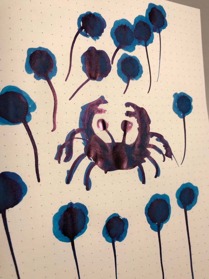
Something tells me that drawing crustaceans is not my strong point

In terms of looky-likeys, one of my first thoughts was Pilot Iroshizuku Ku-jaku.  Looking at the swatches, maybe Blackstone Barrier Reef Blue and various of the Robert Oster inks are nearer to the mark.  I think my reluctance to badge this as a teal ink is borne out by comparison with Sailor Jentle Yama dori.

F9F109AB-5E55-47BC-9E90-44538628A736

Note to self, make sure the page is flat to avoid fuzzy bits

A bit of kitchen chromatography doesn’t reveal any great surprises

991497C6-53F5-4130-B1D0-CB7305D06E9F

I haven’t tested Walk Over Vistula for waterproof-ness, but I’m pretty confident it’s not.  This isn’t a deal-breaker for me as I don’t tend to need waterproof inks.  Similarly, it’s not the quickest drying, but not outrageously slow either.

Despite there being a number of similar alternatives to this colour, I’m enjoying using it. Two pens in my current rotation are inked with it.  I’m more than happy to recommend this ink in its own right, but when you take into account the fact that you get 60ml at the price of KWZ’s standard ink range.

I got my bottle from Bureau Direct for £12.95, but you can also get it from The Hamilton Pen Company.  In the US, you can get Walk Over Vistula from Vanness.

Enjoy.


Platinum Plaisir Bali Citrus Fountain Pen – A Quick Look

Bali Citrus is Platinum’s “limited edition” Plaisir for 2018.  This came as news for me as I wasn’t aware that Platinum issued limited edition Plaisirs.  A bit of digging turns up one possible previous limited edition, the Akajiku, but not much else.  Whether this is an indicator of things to come from Platinum, I guess time will tell.

AA18367E-202A-4AC9-B224-9962F7BDC314

Double Trouble (and not a Rebel MC in sight)

I’ve previously enthused about the Plaisir in Nova Orange.  A metal-bodied pen for less than £10 that does the basics pretty well is a good thing in my book.  This new incarnation is the same pen, just in a different jacket.  As a fountain pen in general, the Plaisir is not everyone’s cup of tea.  In this colour, I suspect opinions might be even more divided.  Bali Citrus turns out to be an acidic greeny-yellowy sort of colour.  You could happily call it citrus, but what makes is particularly Balinese is anyone’s guess.

To rehearse my previous review, the Plaisir comes with a slim, anodised aluminium body and cap and a simple steel nib and plug-in feed.  Impressively at this price, the cap includes “Slip and Seal” technology, which can be found on Platinum’s more expensive pens.  This means that you can leave the pen capped for extended periods of time and it won’t dry out.  I haven’t tested this scientifically, but I’ve left my orange Plaisir inked and unused for several few weeks and it’s written first time without any skipping or hard starts.

Sticking with the cap, the clip is simple, but robust and functional.  Another subtle feature of the cap is a broad, engraved chromed band.  I’m not a huge fan, but can live with it as a “feature” at this price.  I know plenty of people are offended by it, but I’m sure someone somewhere loves it.  I really like a comment on The Finer Point that likened the cap band to a wrestling champion’s belt, which sums it up nicely.  Very bling.

E21C0BDA-11C2-41D6-9041-4CE3A976CE53

That subtle cap band – more lightweight than heavyweight

The nib is a simple steel affair and is common between the Plaisir and the ultra-cheap Preppy, so it’s easy to switch between the available sizes (medium, fine and extra-fine).

82F9B79E-EC98-4A81-BC50-B877CA81B525

The simple, but functional nib and section

I don’t normally post my fountain pens, but the Plaisir is one that I find I have to post to feel right.  It’s not really a balance issue, more that without the cap there’s not enough mass for my liking.

AA569F23-CA17-4709-8C5E-E77B0FE1DC90

With apologies to Yoda…

The Plaisir uses Platinum’s proprietary fittings, so won’t take international cartridges unless you buy an adaptor.  I had the impression that the Plaisir wouldn’t work with Platinum’s converter, but Laura from Fountain Pen Follies pointed out that it does work (with a bit of faffing).  If you try to fill the pen by immersing the nib in ink there’s not enough draw to fill more than the section, but if you use a syringe to fill the converter and then flood the section you can get a decent fill.

You can get the Bali Citrus Plaisir from sources like Cult Pens, Goulet Pens and Rakuten.  For some reason, UK pricing seems a bit more wallet-friendly than elsewhere.

I still like Plaisir.  Sure the Plaisir is not without its limitations, but it does the job well and I can’t get away from the value for money argument.  A well made metal pen at that sort of price?  It seems rude not to.